Spent a couple of hours at ChromaSurge in Calgary yesterday morning. This is a small business print shop that handles all of my canvas and matted paper prints. Kelly (the owner) was recommended to me by another Canmore artist.
There’s a lot to learn about printing, even when you’re not doing it yourself. There are so many different types of machines, canvas, paper, coating, stretcher materials, and frames. As I have no interest in trying to be a jack of all trades, I don’t do any of my own printing. Recently, my printer (the guy, not the machine) bought some new equipment, canvas, paper, and inks. Part of me, the part that doesn’t like change, was thinking, “Hey, my prints looked great, why are you messing with the formula?!”
The other part of me, however, was thinking, “He who refuses to adapt, dies!”
That is true of so many professions these days, and I plan to be doing this for a long time. I made an appointment with the printer (again, the guy, not the machine) to reproof all of my current prints, and set to seeing how I could make them better on my end, in preparation for them being better when they came out of the printer. One of the things I noticed with my prints was that some of the shadows were a little too dark, not something many people would notice, but when you spend as much time painting the details as I do, you don’t want to see them lost. So I lightened them all up a bit, just some simple adjustments in Photoshop. The lighter versions don’t look the way I want them to on the screen, but they look just right on paper.
Many digital artists and photographers become frustrated that their images don’t look the same in print as they do on their screen. No matter what they do, they can’t make it happen. Even with a professional color calibrator, the right printer profiles, and technical adjustments up the wazoo, it never quite gets there. The reason is that a screen is back-lit while paper and canvas are not. Therein lies the difference and it’s a HUGE difference. Took me years to make peace with that.
As in all things, you do your best, and you make compromises. You get your images to look as good as you possibly can and let go of perfection. Those of you who know me well probably don’t believe I can do that when it comes to my paintings, but when it comes to prints, I actually can. I know that nobody sees the imperfections the way I do when it comes to my own work, and that’s true of almost every artist I know. We’re our own worst critics. That’s a good thing, because it means you’re always going to try to become better at what you do.
One of the ways I try to compensate for the back-lighting issue while painting digitally is that I have two monitors. For Photoshop, one is my painting screen, and the other is for all of my tool palettes. My Wacom pen is set to just go between them, so it actually acts like one big monitor. The painting monitor is calibrated. I use the Eye-One calibrator but there are others out there just as good. The brightness on the monitor is also set to 13. Yes, that’s 13 out of a possible 100. If that seems way too low, trust me, you get used to it. It minimizes eye strain for long periods of computer work, and also allows me to paint in more subtle shades and tones because I’m not dealing with harsh contrast. When a painting or cartoon is done and looks good, I’ll often move it over to the other monitor, which is set a lot brighter and is NOT calibrated. This way, I know how it’s going to look on other screens.
It’s a cheat, and one that works very well for me. Because of working this way, there is much less of a screen vs. print shock.
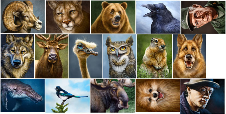
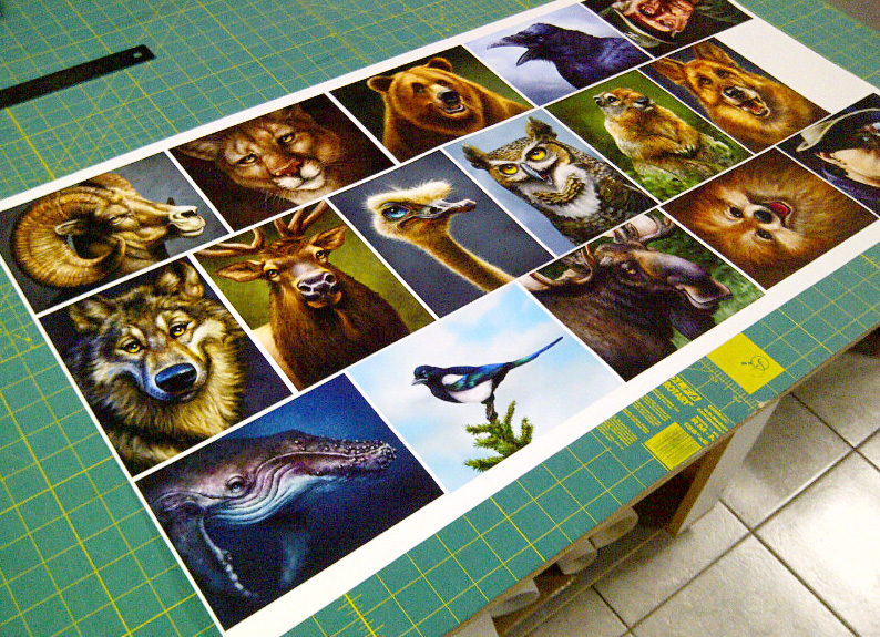
 My printer (the guy, not the machine…do I need to keep saying that?) takes the time to make sure I’m happy with the product he’s delivering, and good service is worth paying a little more for, especially now that it seems so rare. When I told him that I wanted to reproof everything, and that I wanted to do it while I was there in his shop so we could talk about the results and I could ask some questions, he was fine with it. I had all of my current paintings copied and pasted to one image that measured 18″X36″, which meant each image was around 5″X7″, just large enough to see what I needed to. First it was printed on canvas, after which Kelly spray coated it so I could see what it would really look like when it was done. Then he ran the same file on paper, because I sell matted prints in the galleries as well.
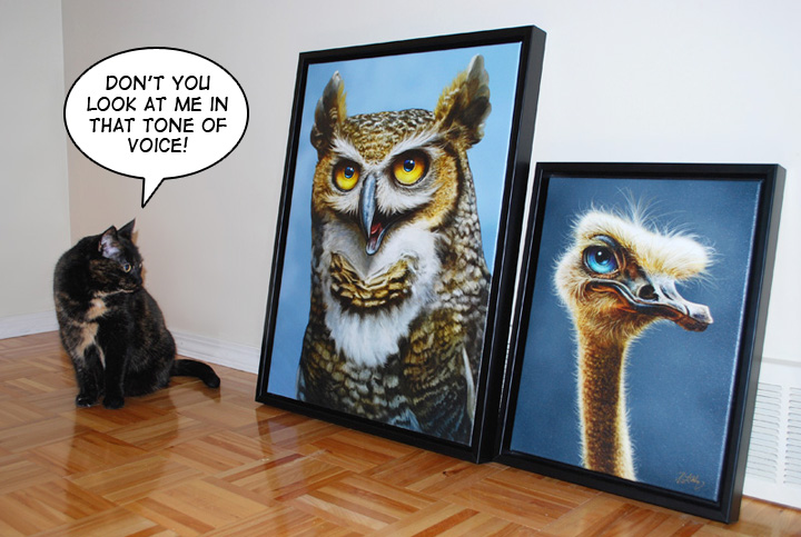
The difference between the two materials is that canvas has a natural texture to it. It’s bumpy because of the weave of the fabric. That adds a little more light and shadow, as does the protective coating. The colours appear more saturated and richer, and there appears to be more depth in the image as a result. I love my work on canvas, even more than on screen. The paper prints have a flatter look, and although there isn’t a ‘shine’ to them like canvas, the quality is great, the colours are very nice and I’m very pleased with them. With a sharp looking black mat, they pop. But canvas is better, which is why it costs a fair bit more, both for me to have printed and for the customer to buy in the gallery. And neither of them look like the other or like they do on screen. Not better or worse, just different. This photo doesn’t even capture what the canvas really looks like. It’s just something you have to see.
 I was very pleased with the prints and glad I took the time to go in and get the proofs done. Cost me a bit of money for the ink and materials, not to mention taking the morning off from drawing and painting, but in the long run, it was a valuable use of my time. My printer (really? again?) also knows for a fact that I’m happy, so that likely makes him feel that he’s done right by his client. Even better, he printed off a copy for himself so that whenever I order prints, he now has an approved standard to compare against, and so do I. We have a baseline with this canvas, paper, ink and machine.
Like I said, I was already happy with my prints, but these new ones have just a little more spark in them. I doubt that others will notice it, but I do, and that matters because it makes me feel better about the product I’m selling in the galleries and to my commission clients. When new and better materials come along, we’ll have to do it all over again, and it will be worth it.


Nothing better than finding the perfect printer to work with and learn from! Love the prints!
So true Patrick! I always recommend my students test out a file or two before doing a large print or big job. Having a local supplier is great too. We are so caught up in buying cheap prints online, that we fail to research local shops. The quality we gain by having that relationship with the printer guy, the hassle we save on cross border importing, and the support of the local economy is worth it.
BTW I get the same “darker shadows” thing happening on photo lab prints. I know that if something is in the shadows I’m going to lose shadow detail in those areas, so better bump it up!
I have a feeling ChromaSurge may be getting some more business out of this!