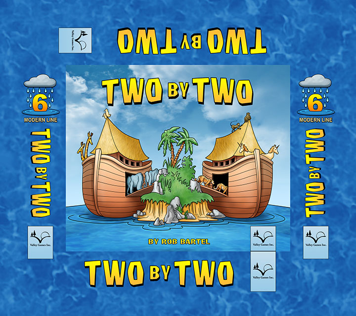
About three and half years ago, I created the artwork for a family board game called Two By Two for Valley Games, a company out of Calgary. Around that time, I actually illustrated four titles for them and they were a lot of fun. A small company at the time, but with great momentum and their board and card games have become popular worldwide with fans. While I haven’t done anything in a couple of years for them, I recently got the call to create artwork for an expansion pack to the original Two By Two game. Here’s the original artwork I did. The box cover…
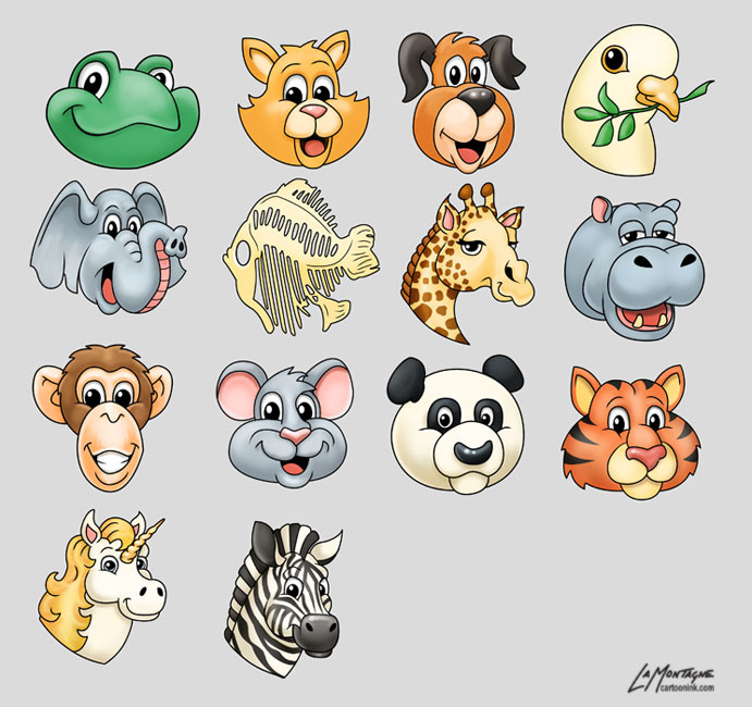
…and the animals…
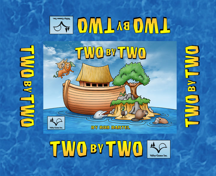
My artwork in general is constantly being refined. While the look of my work years ago is still recognizable as mine, I’m always trying to improve, so while I’m still proud of the work I did on the original Two By Two, the choices I would have made if I’d done it from scratch today would likely have been different. Everything from the animal design to the colour and texture choices, not because I don’t like what I did, but just because artwork evolves. With this expansion pack, however, it had to look very much the same. So rather than designing characters from scratch, I used the old animal style as models for the new animals, and the old cover as a model for the new cover. The titles are still the same at this point, but I know I’ll be asked to change them soon. They don’t quite know what to call it yet. Two By Two 2 doesn’t really have much of a ring to it. The invoice has been sent, but I knew from the beginning that this change would be requested at some point in the future. Here’s the new cover…
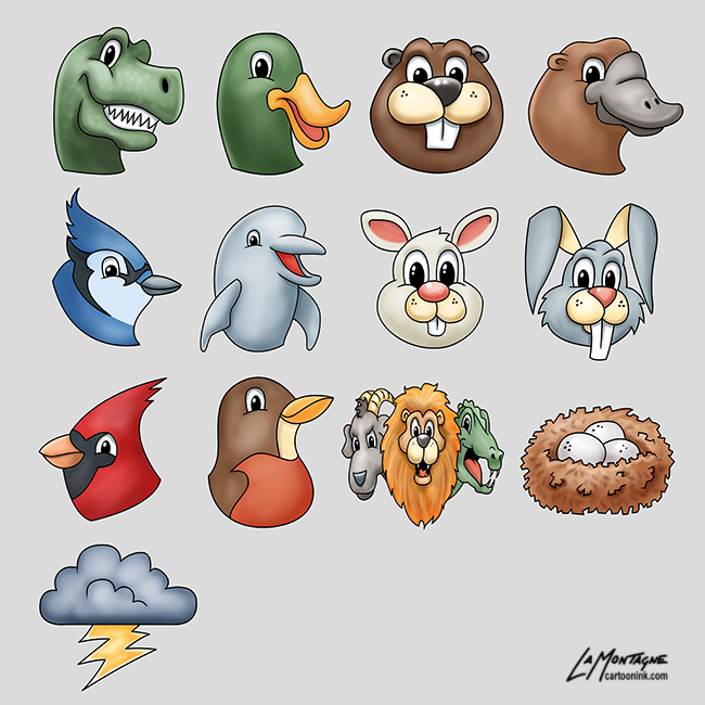
…and the NEW animals…
The beauty of Photoshop files, and designing with layers is that I was able to use some of the parts of the original file for the new cover, which really helped with the continuity of the look. The water texture, sky, clouds, titles, Valley games logos were all re-used. The rest of the cover was new drawing and painting. The animals can’t be all that detailed because they go on small tokens. If you use too much texture for something small, it can look muddy when it’s shrunk. The expansion pack box is a lot smaller and has different dimensions.
One of the problems artists have a hard time getting used to when working for commercial companies is that you’re not creating art for yourself, you’re creating it for a product. Even with licensing on work already done, you have to expect that your work is going to be changed, and it’s up to you how much change you’re comfortable with. For example, my t-shirts with The Mountain are designed from my Totem paintings, but due to the look and texture of their shirts, they don’t want the backgrounds I painted, so I remove them. They may also scale, crop, mask and compose the image differently than I did it, most noticeably with my Ground Squirrel Totem, where they didn’t use the body. I am comfortable with these changes because it’s still my painted work, but they know their business better than I do, and they haven’t ruined my work by tailoring it (pun intended) to their product.
With something like this board game, however, I was hired to create specific illustrations. The work is not based on my vision. I was given a list of animals to draw and I don’t even know why these specific animals were requested. For example, there’s a bunny AND a rabbit. I’m curious as to why, but I can live without knowing. There’s also a mythical chimera, the goat/lion/dragon heads. On the cover itself, all of those elements you see were specifically ordered. Everything from the nest in the tree to the dolphin and platypus in the water.
While I still own copyright of all of these images, I’ll very likely never use them for anything else but my portfolio, because they were drawn specifically for Valley Games. When you’re a freelance artist, a lot of your work is just going to be work based on other people’s ideas. This was still fun to work on, and proved to be a challenge to get everything to look like the older game, but it’s contracted work, which is what most freelancing is about. It’s a great job, but you still have to treat it like a job. That means giving the customer what they want, making sure they’re happy with it, and moving on the next project.
In this video, you can see a review of the original game. I designed the animals for the tokens, and the cover, but not the board or other token textures. They also made changes to the cover layout, which is why I supply the finished product in layers. Changes are expected and they need to have a flexible file.


All of your art is too awesome for words.
I wanted to say something here, because I totally love the animals! The Mallard… the Blue Jay [perhaps because those are two of my favourite birds].
Hope they have luck with the board game. We’ve seen a lot of those, if you’ve ever watched Dragon’s Den 😀
The board game itself is already a big seller. This is an add-on. Thanks for the compliments!