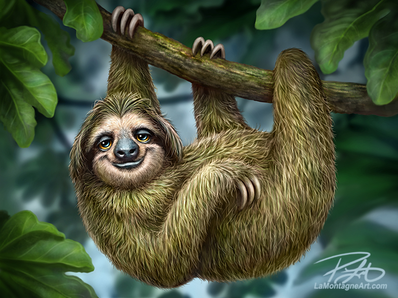
 I’ve had so many requests for a sloth over the years that I decided to make it my first painting of 2023.
As with most paintings, it came with unique challenges and choices.
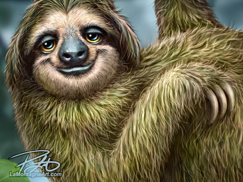
A sloth’s fur is coarse and wiry, with a bad-hair-day look, rather than the soft and smooth fur I enjoy painting most. I chose an entire body pose rather than a closeup of the face and a full-foliage scene over a nondescript background.
I could have painted the sloth in warmer colours for more contrast with the background or added more leaves in front and behind. Even though sloths are light brown, they move so slowly that algae and fungi grow in their fur, giving them a green tint. They use the algae to feed their young, and it provides camouflage. Moths and beetles live in their hair as well.
Many photos I found showed a lot of green, but some almost none. Some sloths have shorter fur, some longer. Some have smooth-looking heads; others look like they’re sporting a bob cut.
I won’t get into boring technical jargon, but there is a much wider range of colours available on a screen than in print, and green is one of the most temperamental colours to print. So even though I would like to boost the greens in a piece like this, I must account for colour shift.
Thankfully, Photoshop provides several methods to detect areas where print problems might occur. However, I can still push it a little because I have years of experience with my printer in Victoria and know what to expect.
When the art is for commercial prints and products, that also affects my composition choices. Most of my paintings are 3:4 aspect ratio because that works best for my needs.
I tell market and Expo customers that every print is 11” x 14”, a typical off-the-shelf frame size you can buy at most stores and that often helps make the sale. It’s annoying to buy a $30 print only to spend $100 or more to frame it because it’s a weird size, so I keep mine consistent.
Painting on a fast and powerful computer, my final pieces are 30” x 40” at 300 pixels/inch. That creates a huge file but allows me to print large sizes without sacrificing detail.
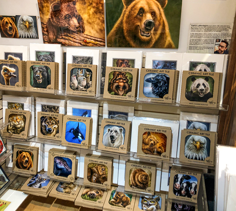
When it comes to Pacific Music & Art products, a painting must work for a long template of a coffee mug design and a square layout for a coaster or trivet. Most licenses don’t require the artist to create format files, but I volunteer to do the layouts for Mike, so I’m happy with how they look.
Here’s a shot I took this weekend at About Canada on Main Street in Banff of some of those products.
 I can separate the sloth from the background and foliage for my own use to make a vinyl sticker. As I’m currently working on layouts for my first puzzles, I thought about those while painting this piece and wondered what composition choices would make it more enjoyable to assemble.
Most of the time, I’ll use one primary photo reference for a painting and additional ones for detail. Ideally, they’re photos I take myself. In some cases, I’ve relied on generous photographer friends or purchased reference I want to use. I bought stock photos for this one and used about a dozen images.
With no vacation plans this year and unlikely I’ll be going back to Costa Rica soon, stock photos were my best option for this sloth. Some photos were good for the pose, others for the face, and others for anatomy clarity and colour. Some sloths are cute; others are downright unattractive, so I looked for common features for accuracy. My versions of these critters might be caricatured and whimsical, but I still need to know what the actual animal looks like to make it believable.
A happy irony with this piece is that my buddy Derek Turcotte and his family went to Panama for Christmas, and he saw protected sloths in the wild. He generously offered some of his photos for reference, and one shot, in particular, was a perfect closeup of a cute sloth. I was halfway through this piece when I got it, and it helped a lot.
Critique is helpful when creating art if it’s asked for and given with goodwill. To have people you trust who can look at your work and offer constructive advice is priceless. Of course, it’s essential that if you ask for critique, be ready to accept it with gratitude.
Avoid asking the opinions of those likely to tell you, “That’s stupid. Looks like crap.”
That won’t help you become a better artist, and that kind of nasty cheap-seats criticism is usually more about them than you.
I’ll occasionally bounce editorial cartoon ideas off Shonna or my friend, Darrel. Most of the time, it’s to confirm that the message comes through. Does it make sense? I’ve been doing this long enough that I usually know, but occasionally, I’ll wonder if an idea is too vague or obscure.
 I often spend ten to twenty hours on a painting. Though I have a few tricks to reset my brain so I can notice an issue, like flipping the canvas and reference horizontally, or looking at it on my phone or iPad, sometimes trouble spots escape me.
Shonna has an excellent eye for problems in my painted work. I’ll admit that even though I ask her opinion on almost every painting, when she points out an issue, I occasionally resist and must bite my tongue. Sometimes I argue against her view, but if I set aside my ego and seriously consider the suggestion, it’s most often correct.
By the time I ask her opinion, she’s seeing the piece with fresh eyes, knows my work very well and sometimes, it’s a small change that makes a big difference, even though most people wouldn’t notice. But once it’s pointed out, I can’t unsee it.
Derek is another valuable critique resource. He’s an exceptionally skilled tattoo artist and traditional painter. He has often asked me for my opinion on works in progress. Most of the time, however, I see nothing wrong. Like most perfectionist artists, he’s already obsessed over it himself. Nevertheless, when I have seen an area I think could stand some improvement, he’s been receptive and often made the change.
Twice this week, I asked Derek for his thoughts on this painting. Both times, he pointed out a couple of clunky composition issues I had failed to notice. Once seen, it was obvious he was correct, and I repainted those sections.
Even after it was finished, I called him and asked about something small that was bugging me. He could see my concern and suggested an easy way to fix it, but it wasn’t a big deal and Derek told me I was probably overthinking it.
That kind of help from another artist is invaluable.
In other cases, criticism is an opinion that might not align with your vision for a piece. For example, I’ve had plenty of people suggest I paint more realistic animals instead of the caricatured or cartoony personalities that define my work.
That’s their preference. My work isn’t for them.
I’ve had gallery owners and other retailers tell me that if I did create traditional wildlife paintings, no matter how good they were, they wouldn’t want them because that’s what everybody else is selling. My ‘cartoony but real’ animals are my signature look, and that niche has allowed me to continue to create art for a living.
As with every painting, my audience and customers will decide if this sloth becomes a popular piece. That’s something over which I have no control. All I can do is paint the critter, have some fun with it, and release it into the wild.
Then it’s on to the next one.
Cheers,
Patrick


Love the sloth! Make a great diamond dotz or puzzle.
.
Thanks, Lisa! I always submit new pieces to my licensees and that includes Diamond Art Club. Whether or not it becomes an actual kit is entirely up to them and their audience. But it will likely become a puzzle eventually. Cheers!