Blog

Posted on

Pet Portrait Commissions

Brisby

So you’re thinking about commissioning a pet portrait.  Well, thanks for considering me for the job.  Here’s some information that should help you out.

Commissions for animal portraits are pretty straightforward, as long as you’re looking for the same style of image that can be seen in my portfolio.  An animal portrait painting, whimsical Totem style or not, is a lot of work, but it’s straightforward and there are usually few surprises.   There are always little differences in each inquiry, but consider this the foundation on which all of my painting commissions are built.  These are the current prices and details.  While they’re unlikely to change in the very near future, prices will go up over time, and with demand.

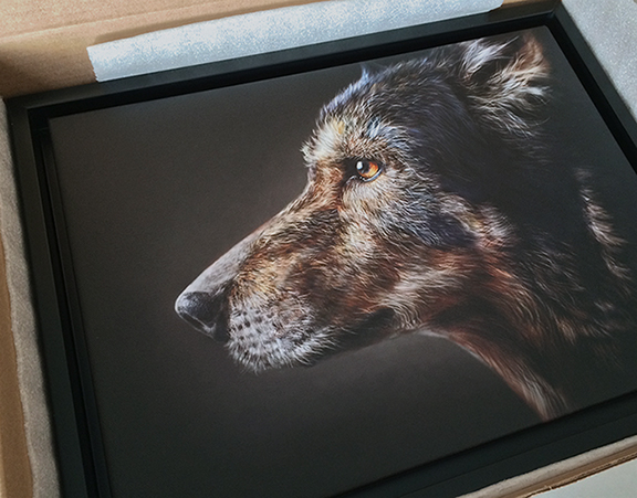
Whether it’s the Totem or realistic style, the price is the same.  For 1 (one) animal, commissions start at $900.00 (CDN), which includes a hand-signed giclee canvas print with shadow box frame, and free shipping anywhere in Canada or the Continental U.S.  The time to complete a commission will vary, depending on my workload, but usually it’s around 4-6 weeks from the time I receive the reference photos.  If you live in Canada, there is GST or HST added to that price, depending on the region.  You can blame the government for that.  I require a 50 percent non-refundable deposit on all commissions once an agreement has been reached, the remainder due upon completion.

Moneypenny

One request I’m getting more and more of these days is for the full-resolution digital file.  While I used to be on the fence about this, as many artists and photographers are when it comes to their images,  I now give the digital file to every client.  I still retain the copyright, but these days, people like to be able to post something like this on a website and social media and maybe print a few extra copies for themselves. As long as you’re not trying to pass it off as your own work, or sell copies of the images, I feel that’s fair.  You’re paying for the work, just as if a company might have paid me for an ad illustration.  That way, if you want to put the painting of Fido on your Christmas card,  you’re free to do so.

While no photos are ever part of the paintings, I can’t very well paint those little freckles you love so much on your cat’s nose if I don’t know what they look like, so I need good photos to work from.  Some of my clients have been photographers.  As a result, many of the reference photos I’ve had to work with have been great.  Since not everybody can be a photographer, it’s often a challenge to find the right photos.  The better the photos I have, the better the painting will be.  In a perfect world, the photos should be sharp, good lighting, fairly close up of the face of the animal, a straight on or 3/4 pose, at eye level, and looking at the camera.  The more photos to choose from, the better.  Problems that occur with some animal photos is that their eyes are highly reflective, and a flash can completely wash out the detail.  If your dog or cat looks sad in all of the photos provided, it can be tough to make him or her look happy, without the risk of losing the likeness.

http://www.lamontagneart.com/wp-content/uploads/2012/05/Montage.jpg

Let’s use fictitious Fido as an example.  Fido is a shaggy dog that is dirty and in desperate need of a haircut.  Can’t see his eyes, he’s looking elsewhere, it’s dusk, the photo was taken from far away, and the only copy available  is a 4X6 low resolution image on Facebook.  The client’s instructions are, “his hair is usually a lot shorter than that, he has big brown eyes.  When we go to our cottage in the woods, he always likes to put his paws up on the window and look out, so I’d like to see him like that.”

Based on this, I’m going to ask for more photos and negotiate that pose.  If this were all I had to go on, I would decline the opportunity, because the client wouldn’t be happy with the finished work, anyway.  Having done a number of these commissions of people and animals over the years, I can usually tell quite quickly if it’s going to work out or not.  Difficult photos double the workload.

Suppose, however, that the client has given me fantastic photos of Fido to work from, great lighting, sharp detail and is flexible on the pose, but then adds, “I’d like him to be wearing his collar with his name tag on it.  He also likes to sleep with his favorite fifteen stuffed animals and toys.”

The collar would be no problem and would not affect the cost.  The same would apply to maybe sticking a bow-tie on Fido, or even a comical pair of glasses if that’s what the client wanted.  Some of that I can make up, and  I would consider that part of the foundation.  All of those toys, however, very specific toys, well, that’s going to definitely be an added cost, as would any other additional specific details that the client would like to include.  Any additional animals would also affect the cost.  While a few have asked, I decline the opportunity to paint a person and an animal in the same portrait.  My styles for both are very different, and they just don’t go together.

Painting these animals is a joy most of the time and I find that I like hearing the ‘back story’, too.  We sure do love our animals, and hearing folks talk about the personality of their furry, hairy, or feathered friend is something I enjoy very much.  I’ve no doubt that it helps me paint a better likeness and hopefully capture some of that personality in the painting.  One of my favorites was Chase, the happy German Shepherd with his titanium tooth.

Chase

I’ve been hired to paint a couple of memorial portraits of furry loved ones, too,  and the importance of that isn’t lost on me.  Being chosen to paint the image that will help you recall all of the happy memories with your best friend is quite an honour.  And if you’re facing the difficult task of choosing photos for that purpose, I would recommend that you find ones that show your pet the way you want to remember him or her.

I enjoy these commissions, and will continue to do them as long as folks keep asking me to.  If you’ve been thinking about a commission, or just have any questions that weren’t addressed here, please do drop me a line, either on Facebook or by email, and I’ll be happy to answer.

Posted on

A Look at the Books

For some reason, I had an overwhelming urge to clear out the books that I was no longer using.  I’ve currently got three bookshelves in my office.  A couple of them hold novels, magazines, binders, some photo albums, and even a couple of novels I wrote years ago that I never published.  Most of what I cleaned out was from those shelves.  My wife cured me of any hoarding tendencies many years ago and now I hate clutter and hanging on to things I don’t need.  When it comes to art books, however, it’s tough for me to let those go and all of those reside on the bookshelf right beside my desk.  Sure, it was easy to recycle the Photoshop World class notes book from 2009 and a Tips and Tricks book from Photoshop CS3, but most of that bookshelf stayed.

Over the years, I’ve seen other artists share insight into what sort of books they have on their shelves, so I thought I’d do the same.  First of all, I like reading books and magazines on my iPad, but when it comes to art books, I still like being able to grab one off the shelf, pour a cup of coffee and spend a half hour on the couch leafing through it.  It’s just not the same with an e-reader. These are the books I still reference, look through for inspiration, or just enjoy revisiting once in awhile, especially if they’re artists whose work I admire.  While I’m not going to go through these book by book, I’ll tell you a little bit about them.  I’ve picked these up at the Calgary Expo, bookstores, or online.  Some I’ve gone looking for, others I’ve just discovered.

Forgive the badly stitched first photo, but this is the top shelf.

Shelf01wbe

In no particular order since you can find the ones I’m talking about.  Drew Struzan is easily my favorite artist and I find endless inspiration from his work.  The days of illustrated movie posters are behind us now, but he was the best at it.  He still does one or two when fans like Writer/Director Frank Darabont ask him to, but he’s mostly retired, now.  Many of these books are instructional by cartoonists and animators I admire and still learn from.  Bruce Blitz, Chris Hart, Tom Richmond, Jack Hamm, Tom Bancroft, Richard Williams.  Both of Bert Monroy‘s books on Painting in Photoshop are here and those are great.  Bert’s style is very photorealistic and while very different from my own work, I’ve learned a lot from him over the years, both in person at Photoshop World and online.  There are a couple of books on sculpting with polymer clay, something I’ve always wanted to try but haven’t yet made the time for.   A lot of great photo reference books here.  Mark Simon‘s Facial Expressions is a fantastic resource.  He has one for adults, and another for Babies to Teens.  I would recommend these books to any cartoonist or animator.  There are a couple of Virtual Pose books, different positions of poses in print and on CD.  The Artist’s Photo Reference Series, and not surprisingly, a number of photo reference books for animals.  Jill Greenberg’s Bear Portraits and Monkey Portraits are two of my favorite books.  She is a master photographer of posed animals and I love her work.  Skin by Lee Varis is a cool book for photographers, all about lighting and retouching faces in photos.  A lot of applied theory in this book directly relates to painting skin as well.

Shelf02webThe second shelf consists mostly of books that feature the work of other artists.  The first two on the left are beautiful photo books of faces.  Celebrities, actors, well known people of accomplishment.  While I’d never use these photos for main reference for a portrait, they’re wonderful for seeing detail in human features, skin texture, lighting.  Love these books.  Tangled is a favorite animated movie for the artwork.  Rustboy was a one man 3D animated movie that never got finished. But the artist had some great ideas, the book is excellent, and he’s moved on to other things.  Some artists represented on this shelf are Stephen Silver, Frank Cho (Liberty Meadows cracks me up!), Greg Horn, Luis Royo, Joe Chiodo, Jason Seiler, Bobby Chiu, Joe Bluhm, J.M. Linsner, DPI Studios, Jenn Llewellyn and Tom Bancroft again.  A few collections from The Calgary Expo, CrossGen Comics, Ballistic Publishing.  Two favorite artists on here that specialize in animal character design are David Colman and Joe Weatherly.  Their work has been a great inspiration to me.  One book on this shelf, Cartoon Animation by Preston Blair is a must have for cartoonists and animators.  I can’t count how many times I’ve referenced this book over the years.  And finally, there are books on the right side that I keep within easy reach.  Fowler’s Modern English Usage, The Complete Color Harmony, Selling Art 101, Licensing Art 101 and the Graphic Artists Guild bible; Pricing and Ethical Guidelines.  While the prices in here aren’t always accurate, due to market fluctuations and the economy, there are great benchmarks for all sorts of freelance artists to base their pricing structures on.

Shelf03webAnd finally on the third shelf down are the comic strip and editorial cartoonists.  Collections of Canadian editorial cartoons by Aislin, Macpherson, Elston, Rodewalt, De Adder, Innes and Raeside as well as a few years of Portfoolio books.  Uderzo’s Asterix books have long been favorites, I’ve always loved his artwork.  Trudeau’s ‘Doonesbury’, Darby Conley’s ‘Get Fuzzy‘, Berke Breathed’s ‘Bloom County‘ (easily my favorite comic strip of all time), Larson’s ‘The Far Side,’ Scott and Borgman’s ‘Zits‘, Lynn Johnston’s ‘For Better or Worse‘ and Watterson’s ‘Calvin and Hobbes.’  On another shelf, I have four books of Frank Cho’s ‘Liberty Meadows’, which I consider a close second or third to Bloom County.

So there’s a vast amount of useless information for you, a look at which books and artists rev my creative engine and inspire me to want to be a better cartoonist, illustrator and painter.  There will always be artists better than you are and it’s in your best interests to seek them out and learn from them.  I’ve always found that the best way to do that is to get to know their work.

Posted on

Chris Hadfield Portrait – “Here Comes Home.”

ChrisHadfield

If you don’t know who Chris Hadfield is by now, especially if you’re Canadian, then you’ve probably been studying in a monastery somewhere, cut off from the rest of the world.  Currently aboard the International Space Station on his third mission in space, Hadfield has become the face and voice of the Canadian Space Program.  With his multiple daily tweets and photos from orbit, his now frequent Q&A communications to schools and media, and his high profile life high above the Earth, Hadfield has Canadians and people around the world excited about space travel again.  I’m 42 and often kind of cynical about our species, largely due to the editorial cartoon portion of my career, but when I see the images and video being sent back from the I.S.S. each day, I feel like a 10 year old kid again, excited about the possibilities, if we can only keep moving forward.

Hadfield seems to have that charismatic personality that so few possess, able to speak to world leaders and grade school children in a way that puts both at ease and allows them to understand what he’s saying, while still being the same guy with both audiences.  Because of his obvious passion for his work, his willingness to share so much of his rare experience with the world, and his ability to be a scientist, engineer, artist and humanist all at the same time, I couldn’t help but be inspired to paint his portrait, especially after seeing the video of the musical event featuring Hadfield, Barenaked Ladies, and the Wexford Gleeks.  The reference and title for this painting came from that video and song.

There is no better legacy than to inspire those around you and the next generation to believe in the possibilities before them.  I can’t imagine how many children are now considering futures in the space program because of Hadfield’s example.  Whether they’ll remain on the ground as part of the team that sends us further into space or actually get to be one of the few who go, will be up to them.

If all goes to plan, Chris Hadfield will take command of the International Space Station on March 13th, the first Canadian to do so.  Just recently, the Canadian Space Agency posted a video where Hadfield demonstrated how he controlled the Canadarm2 from the cupola.  In it he said, “Canada built the Canadarm2.  And Canadarm2 built this space station.  Everybody should be proud of that.”

We are, indeed.

CloseupFor the artists who are always interested in the tech specs.  This was painted in Photoshop CS6 Extended with a Wacom Cintiq 24HD.  Final file dimensions are 32″X24″ at 300ppi.  It’s a big file!  Reference was a screen capture from the YouTube video mentioned above, which meant the quality wasn’t great, but I muddled through.  Photos are never used as part of the painting, all was painted from scratch.  I wanted desperately to put stars in those windows, but they just wouldn’t be visible in real life, so I kept that urge in check.

Posted on

Working for Free and Clearing the Air

This topic seems to be floating around a fair bit lately and that’s a great thing.  Too many artists are doing work for free because many companies expect them to.  While I could write a long post about this, and I have in the past, Stephen Silver says it best in this video below.  If you are a freelance artist and aren’t yet aware of Stephen’s work, I would suggest you follow him.  He is respected for good reason.  He has great advice, is very inspirational and has been working in the animation and design business for a long time.  I’ve even taken an online character design course from him years ago and learned a lot.  While I don’t consider myself as accomplished a cartoonist or character designer as he is, my work is definitely better from having learned from him.  Now this video below is an angry rant, and this is out of character for Stephen, but he’s passionate about protecting artists from being taken advantage of, and you can see that in the video.  If you’re easily offended…well you wouldn’t be here, so never mind.

Before I get to the video, however, I’d like to address something I’ve been taking a bit of flack for the past couple of months, something that has direct bearing on this topic, and that’s the fact that I gave Emilio Estevez the painting of his father for free.  While I could easily dismiss the criticism as ‘some people are just angry at everything,’ I feel it’s important to address this because it’s not just me being slighted in the criticism, it’s Estevez as well.  While I’m sure he has thick skin and is used to being criticized for anything and everything in his profession, it bothers me that some think he got the painting for free because he expected it for free, simply because he’s a celebrity.  That’s not the case.

Throughout our correspondence, he was always offering to buy the painting.  He never expected me to give it to him.  When I explained that I couldn’t sell it because of why I painted it (you can read about that here), he then offered me other incentives from which I could make money from the print and I still declined.  My decision to give the painting was always mine.   I make a good living as a commercial artist, I do not do commission work for free, and nobody is taking advantage of me.  I wasn’t asked to do the painting.  That would have been something entirely different and I would have charged appropriately for my time and effort, just as I would have if the painting was going to be used commercially.

Let’s say that I had been in the same head space I was in when I painted that image of Martin Sheen, but had instead been inspired to paint somebody on the street in Calgary.  Let’s say I took a photo, and painted that person for my own enjoyment.   Let’s also say that person’s son or daughter saw the image and wanted to give that image to their father, the subject of the painting.   I can honestly say that I would have done the same thing, charged them only the printing and shipping and given them the painting, the same arrangement I made with Estevez.  The decision was not about celebrity.  It was about me, where I was at a couple of months ago, and what my instinct told me at the time.  The difference was that the inspiration came from a film, so the painting ended up being a character played by a well known actor.

Estevez was nothing but gracious and genuine throughout the experience and in addition to the signed prints I requested, and paying for the shipping and printing,  he even gave me a copy of the memoir written by him and his father, signed personally to me by both.  Some have suggested I should have gone for the big money grab because he was a celebrity.  That’s just not me.  While the story did get a fair bit of press in Canada and a little bit in the U.S., the experience doesn’t mean anything in the long run to anybody but me and the recipients of the painting.   It’s already long over, as most stories of this nature so quickly are.  To do it all again, I would change nothing.  While I have some very nice souvenirs of the experience,  I’m back to doing what I do best, drawing cartoons, illustrations, and painting funny looking animals for a living.  Throw in the odd portrait for fun and inspiration and that’s where I want to be.

Hopefully that clears a few things up for a few angry people out there.  If not, feel free to continue to wallow in it.  It’s your problem.  For the rest of you, take a look at this video by Stephen Silver.  If you’re an artist, it might inspire you to believe in your own worth.  If you’re not an artist, but someone who might hire one, perhaps this will enlighten you as to the struggles being faced in the industry.  We’re all building our own individual careers, but we also need to look out for one another as well.

Posted on

Painting Choices and Challenges

I’m currently working on a portrait of Canadian Astronaut Chris Hadfield.  The reference that I’m using is from a Youtube video, so even in web HD, the quality isn’t great.  I’m used to working with poor quality reference from time to time, and it’s actually a good thing when it comes to portraits, as long as the quality isn’t too bad.  If the quality were perfect, I might rely too much on the photo and there wouldn’t be enough art in it, just replication.

A common practice in painting from photos is using the grid method.  The short explanation is that you divide your reference photo into grids, then you divide your canvas into equally proportioned grids.  This helps a person establish where the major landmarks fall on the reference photo and suggests that those same landmarks should fall in the same place on the canvas grid.  Here’s a very basic explanation of The Gridding Method if mine doesn’t do a decent job of it.

Norman Rockwell, Leonardo da Vinci and many other artists of note would use the grid method in their work.  Some artists consider it cheating, but then again, I’ve met artists who say I’m not a real artist because I sell my work commercially.  Art for a living is not a profession for anybody with thin skin and there is often no harsher critic than another artist.  I don’t have the rare skill to paint a person’s likeness from memory, so I need photo reference, as do most portrait artists.  My take on the grid method is that it is a tool that has its place, but I wouldn’t rely on it completely.  Photoshop has the ability to apply grids in any configuration over your image.  It’s under Preferences > Guides, Grids, and Slices.  When I do use it, I choose percentages, but you can choose more precise methods of measurement as well.  7 percent is pretty small, but you’ll see why I chose that at the end of the post.

Preferences I never use the grid at all when I’m painting my Totem paintings because they’re not supposed to look like the reference photos.  Nor would I use grids when doing caricature work, because exact proportions would defeat the whole purpose.

Just to prove that I can paint without the grid method, this is a portrait of James Whitmore that I did on the iPad, where grids weren’t possible.  I had a photo, the iPad, and nothing but time.  It did take quite awhile, and a big challenge was the low resolution possible with the first gen iPad,  but I’m pleased with the likeness I was able to achieve.

James Whitmore - iPad painting

I try to only use the grid method when I’m stuck on something in a realistic portrait of a person or know that something is wrong and just can’t quite see it.  For example, when I’m working on a likeness of a person, I may know that there’s something wrong with the eyes, but can’t figure it out.  I’ll flip the canvas horizontally, vertically, try all of my tricks and still be stuck.  By using the grids, I’ll see that it could be something as simple as the corner of the eye is in the wrong place or the iris doesn’t have the correct curve.  I only use the grids when a painting is in the middle stages.  Once the likeness is there, I don’t use them anymore, because I find that relying on it too much makes the subject of a portrait look wooden.  I pride myself in the personality and life in my images and that doesn’t come from accurate placement of features, but from artistic impression of the subject.  This is also the reason I paint people that inspire me or characters I feel a connection with, because that helps me with the feeling of the work.  Having the tools is easy, knowing when to use them comes from experience.

Here’s a challenge I faced this morning on the current painting of Chris Hadfield.  In the reference image I’m using, his mission patch is clearly visible on his shirt.  Because I’m trying to capture a moment, I want to include that in the painting.  I went back and forth on how to do it.  That mission patch is readily available online in pristine condition, just as the designer would have finished it.  One way to do it was just paste the perfect image in position, use the distort and warp tools, maybe rough it up a bit with a texture brush, add a little blur and it’s done, quick and easy.  Another way I could do it, was do a vector trace of the graphic, basically just using the pen tool, trace over the coloured elements, convert them to paths, fill with colour, distort, warp, place, texture, blur, done.

So why didn’t I do either of those?  With a logo in an editorial cartoon, I do that all the time, and I’m fine with it.  Usually on a tight deadline, it’s a satirical commentary, and an accurate logo that I’ve recreated with the pen tool by tracing over it is something I’m comfortable doing because of the context.  It’s part of the job and spending 20 hours on each editorial cartoon would be career suicide.  With the painting, however,  it felt like cheating.  To somebody else, it might not have, and that’s OK.  Everybody needs to make their own choices.  I just know that had I done either of those,  I’d finish the painting, would probably like the end result, but every time I look at that patch, it’s going to bother me.

HadfieldWIP04

So I decided that for the patch, I would use the grid method to help with the accuracy of the pieces in the patch, but paint it as I see it in the reference image.  It’s going to take me quite awhile longer to paint the patch, but I’ll be happier with it in the end.  As you can see from the above reference image on the left and painting on the right, I’ve got a long way to go to get it right, but it’s not like it’s wasted time because I’m still learning from every painting I do.  In the end, I’ll be happier with the painting, so it’s time well spent.

Posted on

Survey Says!
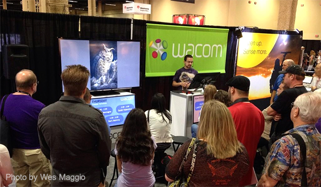
Preparing for the Calgary Comic and Entertainment Expo at the end of April is proving to be an exercise in anxiety.  I already know that my work sells well in the right venues.  I’ve had my Totem prints in four different galleries and retail outlets and while some are better than others, the response has been quite favorable.  Five of the designs are currently licensed to The Mountain and I’m always working on a commission piece for somebody.  While confidence in the work is usually one difficulty faced by newbies to Cons and Expos, that’s not the problem I’m facing.  Even if my work isn’t popular with the crowd that shows up to the Calgary Expo, I’ll still be OK with the work, and just know that it wasn’t the right venue.  I’m not even uncomfortable running the booth, talking to people, or selling, which is something else artists often have difficulty with.  For many years, I worked in the tourism and retail industries,  I ran Wacom‘s booth on my own for a full day at a training seminar, worked a trade show booth on my own up at Fort McMurray for a Banff hotel I used to work for, and have done live painting and training demos quite a few times in the last four or five years.  While public speaking scares a lot of people, it’s honestly not a problem for me.  In fact, the trick is getting me to shut up.

Where the challenge lies is knowing how to stock my booth.  I could spend many thousands of dollars selling everything from cartoon prints, illustrations, paintings, portraits, cards, prints, t-shirts, posters, canvas…it’s  a long list of possibilities.  The key to a successful booth it would seem, is focus.  And, of course, not overextending myself.  I’ve got three full days to sell merchandise at an event that has become so big that with 600 vendors and artists, and 50,000+ attending, there are a lot of things to consider.  I already know that I’m just going to focus on my Totem paintings, for the sake of continuity.  But I don’t want to run out of stock on Saturday morning, nor do I want to be packing up a lot to bring home on Sunday afternoon.

There’s a lot of advice online from people who attend expos like this, telling artists to balance ‘fan art’ with their own work.  Use the fan art to get people to your booth.  That doesn’t work for me.  Fan art is basically just copying somebody else’s popular characters and selling them.  While illegal, most of these offenses go without prosecution, so artists keep doing it.  Considering how many artists complain about being ripped off online, I’m surprised at how many still condone the practice.  I intend to find out if I can support my booth on my own work alone.

As this is my first booth, I will do a number of things wrong, I’m sure.  How can you learn from experience until you have some?  But in an effort to put my best foot forward, I created a small survey earlier in the week to ask people their opinions on a few questions I’m faced with.  Two winners were chosen from the respondents to receive 11″X14″ matted Totem prints of their choice.  I received 100 responses, which was the survey limit, but the results were pretty clear when it came to ranking which of my Totem paintings people liked best, along with opinions on matted prints vs. unmatted.  In an effort to perhaps help somebody else prepare for a show like this, here are my results and how I choose to interpret them.

I asked respondents to rank my Totem paintings in order of preference.  While I have 16 Totems in my portfolio, I’ll only be selling 8-10, so here are the Top 10 in the order the survey indicated.

Results001Some surprises here.  The Humpback Whale is one of my favorites, and even though a few people agree with me, most do not.  But for this survey, I would have included it in my print run for the booth.  Many people did say in their comments that it was tough to choose and that they had a hard time ranking them because they liked them all.  While I can understand that, and appreciate the compliment, the ranking was very clear for the first five, not so much for the last five.  The Bighorn Sheep could have easily been shown instead of the Penguin as they were neck and neck.   But I chose the Penguin because the venue will be in Calgary and with the addition of the penguins at the zoo last year, it’s a safe bet some will buy it based solely on where it’s being sold.

The Wolf Totem has long been a favorite among people who like my work.  It’s a big seller and very popular.  But it was done over two years ago and I’m pleased to see that my two most recent pieces are in the Top 3.  Thankfully, it would appear my best work isn’t behind me, something many artists fear.

Matted prints and cost.  78% of people would prefer a matted print to an unmatted one and 73% said cost didn’t affect that decision.  That was very revealing, however the people who follow me online aren’t necessarily the same demographic as those who will be shopping at the Expo.  A lot of people go to the Expo to buy inexpensive prints and even at a reduced price of $30.00, it will be too much money for some, when they could buy two or three prints for the same amount of money, which means more art from different artists.  If this were a Christmas trade show with an older crowd, I would go entirely matted at regular price with a lot of canvas as well, but at this venue, I’ll be doing a mix of matted and unmatted prints.  But this was very helpful in helping me decide the balance.

The majority of people were interested in a discount on buying two prints, rather then three or four.

Results002When it comes to the T-shirts available from The Mountain, the Wolf was the clear winner, the Ground Squirrel second, but it was an even balance between the other three.  If I do decide to include T-shirts in my inventory, and that’s still undecided, it is obvious that I should include all five.  The large majority of respondents would buy one for themselves or somebody else.  One commenter suggested that she still liked the T-shirts, but wouldn’t buy one because her family just doesn’t wear shirts with designs on them.  Personally, neither do I, so I was curious to see how many thought the same.  Selling T-shirts as well as prints might be a little too much this year as it would require a lot of inventory in different sizes and might make for a very crowded booth.  This first year, I might just stick with prints and have one of each design on hand to let people know that they’re available online from The Mountain.

Finally, more than half of the respondents left comments, which I found very valuable.  Many were complimentary of my work, which I appreciated.  Others told me that ranking the Totems was very difficult and a couple even seemed to worry that they were hurting my feelings by doing so, telling me I shouldn’t think they hated the last one they picked.  No worries, I’ve got thick skin.  Still, others were just very nice words of encouragement and nobody gets tired of hearing those, so thanks for that.  Some suggested that other animals should be on T-shirts.  As they are licensed and not produced by me, it’s actually up to The Mountain which ones end up on T-shirts.  So while these five are the only ones at the moment, who knows what the future will hold?

Here are some other comments I found helpful, and my thoughts on each.

“Your pricing, I would do the multiples on the $10 mark… so $40, $50 etc. Just keeps things simpler.”  This is good advice and something I’m going to seriously consider.

“Would it be too much work to get more mat colors than black? Black looks nice, but can take away from some pieces depending on color. A color mat can really enhance the work. Good luck!!”  and another comment in the same vein “White matte and $40. I don’t like black mattes. Too heavy. Your prices are too low.”  Matting is always tough.  With lighter colour work or black and white, a white mat usually looks best.  With darker work (such as mine), a black mat usually looks best.  And you’ll easily find people who will disagree with both statements.  In a perfect world, a painting looks best when matted to reflect colours in the painting and matches the decor of a room.  How do you do that for every customer?  Well the simple answer is that you can’t.  White or black are the choices and as in all things, people prefer one or the other.  For continuity in an artist’s work and to minimize cost and inventory, it isn’t advisable to offer both, because hanging together on a wall or display, they will actually look bad beside each other.  As for choosing a coloured mat, that’s a minefield.  A number of people said they didn’t like the purple of the Wolf T-shirt, even though it did draw out colours from the painting itself.  Honestly, purple wouldn’t have been my first choice, either.  But it was still the most popular shirt in the survey.

I trust the advice of my printer, as he does both white and black mattes for many different artists.  After seeing these comments, I asked him what he thought and he said he thinks my work looks better with a black mat.  My wife agrees and I think so, too.  Art is a such a tricky business, because everybody likes different things for different reasons, and you can’t please everybody.  So I’m sticking with the black mats, but wouldn’t tell somebody they were wrong if they swapped it out for a white or coloured mat.  Even still, with the choice of only the black mat, the vast majority still preferred to have a print sold with the mat.

“A set of postcards of your totems on a special paper would be pretty cool.”  That’s a great idea.  While I was going to have postcards for promotional reasons, I hadn’t considered doing that for each animal as a little collector piece on their own.  Might sell them for $1.00 or $2.00 each or two or three for $5.00.  I already have art cards licensed through Island Art Publishers, but promotional postcards for the show might be a nice addition.

“Would like to see your totems on ball caps and mugs.”  That’s a licensing thing and while I wouldn’t produce them myself, you never know what might come around in the future.  I’m always talking to other companies and if I find the right one, you may get to see both.

A lot to consider with this survey and I would like to thank everyone who participated.  The expense of this show is significant, thousands of dollars to prep the booth and stock inventory, so I really wanted to put my best foot forward.  The input was very helpful and I imagine there will be other opportunities in the future for me to ask for your opinion and offer prints as prizes.  As always, however, you can always share your thoughts with me  on Facebook, Twitter, or Google+.

Posted on

Comments and Choices

PostitJust as artists discover their own style,  freelance long enough and you’ll discover your business style, too.  As the online world changes, faster today than ever before, so will your way of doing things.  For example, when I began to post editorial cartoons on this site, I disabled comments because I knew it would turn into a melee of differing political opinions.  While I agree with a person’s right to express themselves and argue their point, anybody who strongly disagrees with my point of view can send me an email or write a letter to the editor of one of the publications across Canada in which my cartoons appear.  But all one has to do is look at almost any political story on a news website and you’ll see how quickly it gets turned into a free-for-all brawl.  Pro-Conservatives will seize any opportunity to further their cause, regardless of whether or not the story warrants it.  Pro-Liberals do the same thing.  Any real discussion is lost amid the noise.  To avoid that, comments have never been allowed on editorial cartoons on this site.

An argument has been made by some in recent years to disable comments on blog posts as well.  While I’d never given it much thought, I’ve read some of those arguments, and recently revisited that question.   When it comes to interaction with artists, freelancers, and the folks who just generally like my cartoons, social media is where the action is, at least for me.  Facebook is where I get the most feedback and where people seem to like to comment the most.  It’s also where I get the most questions about how I do things, requests for help, and just general discussion on cartoons, blog posts, and other links.  I regularly get commission work on that platform as well.

Twitter is another form of interaction that has proven to be worth my while lately.  Not only does it grant access to other people I don’t interact with on Facebook, but I get real time information in short bursts.  It also forces me and others to be succinct in posting any links and comments.  It took me a long time to see the value in Twitter, but I get it, now, and am using it daily.

Google+ is still an effort for me.  I don’t get nearly the interaction there that I get on Facebook or Twitter and have been having a hard time finding the value in the platform.  While some would argue that Google+ is where everybody is going, I’m just not seeing it.  For awhile, it seemed to be taken over by photographers or at least hyped to be the place where photographers should be, but I only post there lately because it takes two more seconds after I’ve posted to Facebook and Twitter.

When it comes to blog posts, there are many who will tell you that you must keep a blog, while there are others who’ll say blogging is dead.  I still believe in keeping a blog, but only because I enjoy writing.  If you don’t like writing or teaching, you won’t enjoy it or keep it current.

The point of all of this rambling about my online posting practices is to show that what works for one person may not work for another.  Many self proclaimed authorities will tell you the exact methods and devices you must use when it comes to self promotion, but usually they’re just validating their own choices.  It’s the same reason the Apple vs. PC, Nikon vs. Canon, Coke vs. Pepsi debates still rage on.  If you can get other people to do what you do, then it somehow means you’re right.

The reason so many more people are choosing freelancing as a career is that they want the freedom to make their own choices.  It’s a very big reason why I chose to do it.  I would much rather screw up and learn from my own mistakes, than take orders from a boss who refuses to admit he ever makes any.  With that freedom of choice, it’s important to listen to other professionals and find out what your options are, but then make your own choices based on what you feel is right for your business.  Weigh the facts, but trust your gut.  We’re all just winging it, even the so-called experts.

When it comes to my website, I think of it like a storefront or a brochure.  It’s the image of my business that I want to project.  That means controlling the content, the look, and what gets posted.

I don’t get  a lot of comments on this site in the first place, largely because most people choose to interact with me on social media, and to be honest, that’s the way I prefer it.  While many of the comments I do get are positive and supportive, I regularly have to weed out the ones that are argumentative, ill-informed, and some that are so long, they’re blog entries all on their own.  It’s a time suck, and lately, it’s just not working for me.  By censoring comments, as well as picking and choosing which I want to show, it would be hard to argue that it’s real interaction, anyway.  Consequently, if I allowed anybody to post whatever they want, it would quickly begin to look like a business where the front window is covered in leaflets, announcements, and propaganda for other businesses, agendas, and personal causes.  I find neither of those options particularly appealing.  The main reason I chose not to sell ad space on my site was to avoid that problem.

Freelancing is a tough gig most of the time, but if you try to please everybody, you’ll be miserable.  Make your own choices, judge their effectiveness, make new choices.  Keep what works, discard what doesn’t.  Repeat ad infinitum.

Today, I’ve decided that even though blog comments used to be mainstays in online interaction, I believe that social media has replaced their usefulness, so I’m disabling them on my website.

Thank you for those who have commented on this site in the past, and just because I’m turning comments off here, doesn’t mean I don’t want to hear from you.  I’m on social media every day and am happy to talk with you there.  Chances are you found this link on social media in the first place.  But if not, here are the links to my social media accounts.

Facebook: LaMontagneCartoonInk

Twitter: @CartoonInk

Google+: Patrick LaMontagne


Posted on 10 Comments

Martin, Emilio, and Tom’s Road.

PromoSheenFinalSometime around the middle of December, I finished painting a portrait of Martin Sheen.  More accurately, the portrait was of his character, Tom, from the movie The Way, written for the screen and directed by his son, Emilio Estevez.  While the painting was done purely for my own enjoyment, sometimes a seemingly innocent pursuit will take on a life of its own.  Since the movie inspired me to paint the portrait, as did their father/son memoir ‘Along the Way,’ I wrote about that when I posted the painting.  Click here, if you’d like to read it.

As is my practice, I posted the link on social media and also tagged Estevez’s account on Twitter, especially since he has used that vehicle to promote the film.  I thought that if he saw it, he might like what I wrote and painted, but didn’t actually expect anything to come of it.  Twitter is a busy place and it’s impossible to keep up, so a lot more gets missed than noticed.

Imagine my surprise when just a couple of hours later on that same Saturday, an email arrived from Estevez via my website.  He thanked me for my support of the film and then asked about buying a print, with the intent of giving it to his father for Christmas.  With just five business days remaining, I had to tell him that even a rush job would have been impossible by the 25th, especially considering that I’d want to be meticulous about the proofing, given the recipient.   I told him I’d be happy to set things in motion in January, if he was willing to wait.  He was very gracious, completely understood, and we began talking about it again after the holidays.

In the meantime, his mother had seen the painting and wanted him to inquire about buying the original.  Here’s the technology hiccup when you start talking originals and digital painting.  A digital painting exists only on a hard drive and screen until it’s printed, so there really is no original in the traditional sense.  One solution is to supply documentation that certifies a specific print to be the original.  Mine are always printed on canvas and I gave Emilio the option of choosing the size.  After a month of proofing, printing, signing, and packaging, the original 18″X24″ stretched canvas shipped last Friday.  I also certified the canvas itself by writing the title of the piece and an additional signature on the back.  Incidentally, until all of this occurred, I hadn’t titled this painting, but decided it needed one before it shipped.  Yesterday, “Tom’s Road”  arrived at Martin’s home.

MartinSheenThe reason for this piece in the first place was to take a small break from the commercial work, as every image I’ve created lately has been a product.  The whole point was to get away from everything being about money and marketing, if only for a moment.  I wanted to paint my best portrait work, for no other reason than that.  I am a commercial artist, no doubt about it, and I make a good living at it.   This is my business, my livelihood, and my career.  But this piece was special, inspired by a movie I loved, which was, in a way, a light at the end of a tunnel.  My gut instinct told me that to try and make money from this would have tainted the whole experience, something that was worth much more to me than a paycheque.  So, when Emilio asked to buy the original, I chose not to put a price on the work, but still offered the painting, charging only my printing and shipping costs.

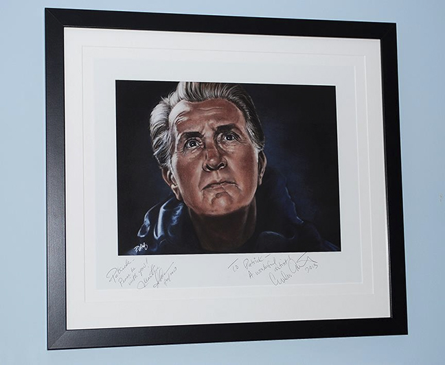
Sometime in the near future, I’ll be receiving a paper print that I’ve asked them to sign.  I’ll have it framed for my office, a souvenir of the experience, and a constant reminder that I must make time for personal work.  I’ve also asked Emilio to have Martin sign one more print, something I can reserve for a charity auction sometime in the future.  He was happy to oblige, and you can bet that I’m going to be very picky about which cause benefits from this unique item.

There is no doubt in my mind that had I attempted to orchestrate any of this, had I painted the portrait with the intention of bringing about these events, none of it would have happened.  I created this portrait for me, to remind myself why I paint, and since I truly enjoyed working on it, that was enough.   But to have it appreciated by his family, was a wonderful and unexpected bonus, not to mention a validation of my recent choices.

If all that weren’t enough, the greatest compliment I received was something offered by Estevez in one of his e-mails this past month.  He said, “…the image is gorgeous and you have captured my father in a way that few have.”

It just doesn’t get much better than that.

Posted on

A couple of hours at the zoo

Penguin2

This past Thursday found me in Calgary, running a few errands that had been piling up.  Had to exchange a faulty hard drive, buy some office supplies, and meet with the Retail Manager at the Calgary Zoo.  I’ve had Totem prints in their store for a little while now, and we’re still learning what works and finding new ways to promote the work.  I also wanted to show her the shirt samples I received recently, as the zoo sells The Mountain tees already.  So while I did get a cartoon out that morning before I left, it was largely an out-of-office day.  I had been trying to get into the city for about a week, but the roads and weather kept putting the kibosh on that.  Calgary is only about an hour drive from Canmore, but Hwy 1 can get slick and the main city routes are even more treacherous in bad weather, especially considering that many Alberta drivers are notoriously aggressive.  My rule of thumb has always been, if the weather is bad and I don’t have to be on the road, don’t bother.   It only takes one wing-nut in a hurry to ruin your whole week.

Turns out that the repeated delays benefited me a great deal.  When I finally did get into the city, the weather was downright warm for winter, thanks to Chinook winds, and a day running errands turned into a great outing.  Considering I was at the zoo already and have an annual membership, I brought my camera to see if I could get some reference photos.  I’ve said many times that I’m not a good photographer, largely because I have no interest in putting in the work required to become one.  I take snapshots.  On recent trips to the zoo, I had a borrowed zoom lens and tripod for our camera, an older Nikon D-60, which is basically just a higher end point-and-shoot, or at least it is the way I use it.  With the zoom lens, I just couldn’t take a decent shot to save my life, so this time I left it at home.  Setting the camera on automatic, I figured I’d wing it and take what I could get.

The strategy worked well.  The Calgary Zoo is very popular and is often quite busy.  Their newest exhibit, the Penguin Plunge that opened last year, can often have very long lineups in the summer months.  When you do get in, you only have a limited time to spend, as others are waiting.  It’s a great enclosure, designed so that you’re so close it would be simple to reach out and touch a penguin as it swims by, the water’s surface at chest level.  Of course, there are attendants on hand to ensure people don’t touch them, but it’s great to have that proximity.

Penguin

On Thursday, the zoo was so quiet, that after my meeting, I just walked into the Penguin Plunge, and spent almost a half hour in there just snapping photos.  The penguins were active, talkative and a lot of fun to watch.  At any one time, there were only about 10 people in the enclosure.  Must have taken a hundred or more photos, and about 10 of those ended up being great for painting reference.  While I’ve already painted a Rockhopper Totem, I’ll be painting a Gentoo at some point as well.  That’s the species in the above image.

Meerkat

Once I got to this little meerkat, she seemed to have no issues with me taking photos of her.  Turning her head this way and that, only about three or four feet away, she stood tall, crouched down, gave me almost every angle I could want.  A gentleman standing near me actually said, “She’s posing for you!”  It certainly seemed that way.

And finally, while I was hoping for some photos of the red pandas, just before I reached their enclosure, a woman deliberately changed her direction, walked over to me and said, “They just fed the tigers.  They’re all right there if you want to get some pictures.”

I thanked her (it really was a nice gesture on her part) and walked over to their nearby enclosure.  Sure enough, the mother and her three cubs, who aren’t small anymore, were lying down together eating whole raw chickens.  A real treat to see as one cub snarled at another for getting too close to his meal, the mother grooming one of the other cubs, just getting to see them so close and active on a such a nice day, with very few people around.  Even through glass, the shots turned out quite well.

KittyWhile I`d thought I’d taken 500 photos,  turns out it was around 400 as there were already a bunch on the card.  The wonders of digital cameras, taking as many shots as you like without incurring any expense.  Once I got home, I just opened up the card in Adobe Bridge and started deleting everything with bad focus, light, composition and within 10 minutes, I had about 20 photos that will serve me well for future painting reference.  I had a very enjoyable day, one of the best I’ve had at the zoo.  Not bad for an errand day in the city.


Posted on

Spec Work and why you should avoid it

When freelancers are first starting out and are very hungry, both literally and creatively, they’ll pretty much work for anybody.  Almost all of us get taken at one time or another, and often more than once, by the promise of exposure, low pay now/higher pay later, or just cheap clients.  Most of these lessons have to be learned the hard way, and while it’s easy to blame the client, it’s really our own fault for agreeing to the work in the first place.  Spec work falls into the same category of ‘should have known better.’  In the case of a graphic designer, for example, a ‘client’ will ask you to submit a logo and if they like it, they’ll pay you for it, but if they don’t, they won’t.  Basically all of the risk lands on the creative and the client gets free work done.  Try doing that in a restaurant, ordering five meals and only paying for the one you really liked.

“Spec work (short for speculative) is any job for which the client expects to see examples or a finished product before agreeing to pay a fee,” a quote by Eric Miller in an About.com article.

This is also how many design and illustration contests work as well.  They solicit many entries with the promise of big prizes or cash to the winner, and often second or third prize as well.  What they’re really getting is a ton of submissions for their project at a fraction of what it would normally cost them.  If you read the fine print for most of these contests, you’ll see that they still have the right to use all submitted images in a collection, book, future project and online with no compensation to the designer or artist as well.  This is why I don’t submit to editorial cartoon contests, unless it’s work I’ve already done.  I’ll frequently see ads for cartoon contests out of places like Romania or some other foreign country where you have to draw a cartoon or caricature on a theme, usually a politician you’ve never heard of.  All of the above mentioned criteria apply.  And while the contests are legit, and the prize money is real, the benefit is almost entirely to the company, organization, or person holding the contest.

Spec work is something to be avoided,  especially if you already have a body of work where your skill can be adequately measured.  If somebody asked me to paint their dog and told me they’ll only pay me if they like it, the conversation is going to end pretty abruptly.

So why did I just complete a spec project this morning?

Well, there are a few reasons.  First of all, it was an interesting challenge, something I hadn’t done before.  I was tasked with painting somebody else’s artwork, a cartoonist/animator whose work I greatly admire, because this person has drawing skills that I don’t.  A chance to paint a character designed by this person was intriguing.  Also, the company in question is well established and one I would like to work for on a contract basis doing just this kind of work.  While it’s work I can never claim as my own, and likely never show on my own site, it’s good practice of my painting skills.  To be considered for this work, I had to submit a painting test, and I’m sure I wasn’t the only artist tasked to do so.  There was no ambiguity in what I was agreeing to.  Paint the character, deliver it on a tight deadline (something I didn’t know going in), and if they like the choices I made and the look I came up with, I get paid for the work and will likely get additional work as a result painting this and other characters.  It was basically an audition.  And even though I have no doubt at all that I will be paid if my work is chosen, it’s still spec work.

Along with my other deadlines, I suddenly had a new one which meant working late last night and getting up very early this morning to submit the work on time.  It was hours of work that I may not get paid for.  As I’ve worked very hard to develop my painting skills, I have no doubt in the quality of my work.  That being said, there are many painters out there a lot better than I am and they could have submitted a test as well.  Also, if I don’t get chosen, it could simply be a fact that my style doesn’t suit the project.  My work may not be chosen for any number of reasons and I’m OK with that.  I went into this with my eyes wide open, basically expecting that I was working for free, with no assumption that I’ll ever get paid for it.

Now, all that being said, I thoroughly enjoyed the test.  It was a great character I was painting, the drawing of which is currently beyond my cartoon skills.  And even though I’m pretty tired right now, it was a bit of a rush this morning, getting up an hour earlier at 4AM, and scrambling to get it done, not to mention I had two editorial cartoons to get done this morning as well.  I feel good about the work I submitted and have divorced myself from the outcome.  If I get the gig, great, if I don’t, that’s fine, too.  I have plenty of work without it.

But this is a strong warning.  Think very carefully before accepting any spec work.  Know what you’re getting into and if it seems like you’re being taken advantage of and you’re uncomfortable with that, turn it down.  If you don’t value your work, then nobody else will.  And if you do choose to take the occasional spec job just because you find it interesting and are willing to do the work for free, know that you’re doing it for that reason, and have no expectations afterward.