Blog

Posted on 1 Comment

My Wacom Cintiq 24HD Settings

For this second blog entry on the Wacom Cintiq 24HD (read the first one here), I wanted to show all of the different settings I’ve chosen for the Express Keys, Touch Ring and Radial Menu.  I’m very comfortable using these hardware features on the Intuos tablets, but had to change everything up for the Cintiq for two reasons.  The first is that there are more settings to choose from.  The second is that working directly on the screen changed how I do things.

These Photoshop settings are in no way being shared in order to tell you what you should do.  Feel free to borrow anything you see here, of course, but I would encourage you to experiment with the settings and find ones that work best for you.  There are so many possible configurations that you can almost program each of the Express Keys, Touch Rings, and Radial Menu for anything you want Photoshop to do.  The feature I like best is that you can even program different settings for every piece of software you have.

My buddy Jeff Foster is an Author, Producer and VFX Artist at Sound Visions Media.  My setting for brush size on the pen, which I’ll explain later, was his suggestion and it works very well.  Since I’m no longer using the Touch Ring for brush size, he also suggested that the Touch Ring can be used for any keystroke operation at all, so it’s important to think differently and creatively.  I still haven’t finished experimenting with my Touch Ring settings, so some of the ones I show here will likely change.

Because there are so many settings to explain, I’ll just get right to it.  Here are some photos that show you what the buttons I’ll be talking about look like on the actual hardware.  I got these images directly from the Wacom site, so if you want to know even more about the Cintiq 24HD than what I’ve shown here, just click on any of the images and you’ll be instantly transported to their website.  It’s like magic, don’t you know?

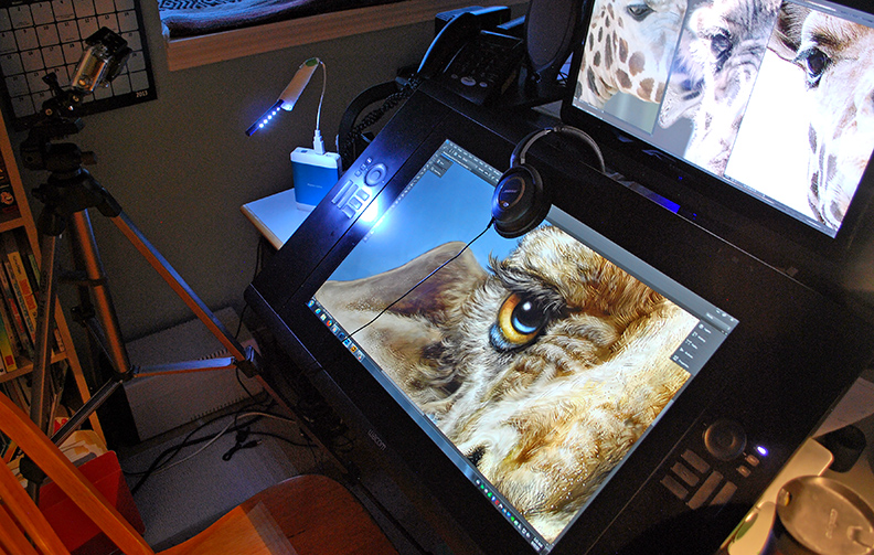
As you can see from the image at the beginning of this post and the ones above and below, there are five Express Keys and a Touch Ring, with three settings each, on either side of the display.  Additionally, there are three buttons above the display for features I’ll explain later.  On the top edge of the display, which you can’t see here, there are a series of buttons like you would find on any monitor, to adjust your display color, brightness and contrast settings.  Incidentally, I like to work with my monitor brightness a lot lower than most people.  I have my Contrast set to 50, my Brightness to 13, and my Backlight to 0 (Zero).  You might think that a little odd, but it works very well for me.  My monitors have always been set to low brightness and my eyes don’t get strained as easily from long hours in front of a display.

Let’s talk about those three little buttons at the top right above the display.  From left to right, there is one that has a lower case letter i, one that looks like a keyboard, and one that looks like a wrench.  The i is for information, and when you press that, you get the image that you see below.  It fills the display, regardless of the software you’re using, BUT the settings you see displayed will be the ones you have set for that particular piece of software, or the default settings.  What you see here are my settings for Photoshop.  This is a great feature because you might forget what you have a button set for and this will show you in real time.  We’ll zoom in on all of these in a minute.

The second button will bring up the on-screen keyboard, which is pretty self-explanatory.  Sometimes you just want to type in a layer name, or press a number, and you don’t want to have to go fishing for your actual keyboard, especially since it might be under your Cintiq.

Finally, there is the button with the wrench on it, which will bring up your Wacom Tablet Properties.  I just think this is very clever to include this as a hardware button because sometimes you just want to make a quick change to your settings, and you don’t want to leave your software or go searching for it in your menus.  Press the button, it will bring up the panel you see here, make your change, close it and go right back to work.

Now let’s take a closer look at how I have my Express Keys, Touch Rings and Radial Menu set up.  I won’t show you how to make these changes, because that will require a whole new post.  If you want some help, I recorded a couple of videos for the Intuos5 and those will show you how to change your settings, even on the Cintiq.  Here are a couple of links, one for the Express Keys and Touch Ring and another for the Radial Menu.

Let’s take a look at the Express Keys and Touch Ring Properties.  As you can see below, the three buttons for the Touch Ring are currently set to Zoom, Brush Size, and None.  Rather than use the default Zoom, however, I have mine set to Ctrl- and Ctrl+ (Cmd- and + on the Mac) shortcut for Zoom.  The reason is that will zoom in and out in increments that keeps my painting sharp and crisp.  Some of the other increments in between can make images a little blurred and I don’t like that.  So my zoom isn’t a smooth transition, it goes in steps.

Brush Size is self-explanatory, although I now have that on my pen, so I’ll be finding another use for this spot, I think.  The third one is normally set for Rotate, as in rotating the canvas, but I have it set to None simply because I was recently recording a video and didn’t want to accidentally zoom in while recording if my finger touched the ring, so I set this to none and left it there while I recorded.  Again, I’ll be finding another use for this one, too.

For the Express Keys on the left of the display, I have them set as follows:

1) Undo – Ctrl-Alt-Z. (Cmd-Option-Z on the Mac).  When I’m painting, I pretty much keep a finger on this most of the time and it allows multiple undos.

2) Color Picker – This is not a normal keyboard shortcut, so I had to create one, which is fairly easy to do in Photoshop.

3) Shift – a Modifier Key that will give many tools more options.

4) Ctrl – (Cmd) another modifier key.

5) Pan/Scroll – In Photoshop, this is the Hand Tool and it will allow you to move around the canvas.

On the right side of the display, the Touch Ring again is still set for the default settings.  I know I’ll find a use for it, I just have to get creative and even more efficient.

For the Express Keys, they’re set as follows:

1) Gamut Check – Ctrl-Y (Cmd Y).  I draw and paint in sRGB, but I’m always aware that my editorial cartoons are printed in CMYK and some of my paintings and illustrations may be printed that way as well.  My color picker is set so I can only choose colors that are ‘in gamut’, which means when converted to CMYK, they won’t shift.  But sometimes when I make a Levels or other Color adjustment, it will shift colors too far, so I’m always checking Gamut to make sure everything looks as it should.  Newspapers do not have universal color settings.  Some publications have downright hideous printing, so I try to find a happy medium to please everybody.  Yeah, I know…good luck with that.

2) Hide – Ctrl-H (Cmd-H) When I’m working with selections, this hides the little ‘marching ants’ that define a selection, because I hate looking at the moving dotted lines when I’m painting.

3) Radial Menu – This is Wacom’s way of giving you even more choices.  It’s an onscreen heads-up display that gives you an opportunity to program your own menus and submenus.  I’ll show you my Radial Menu settings in a minute.

4) Fit Screen – Ctrl-0 (Cmd-0) Zooming in and out of a painting or drawing, often I just want the image to reset to fit screen.

5) Display Toggle – I have multiple displays, my other one is above the Cintiq.  When I want to access the other display, I press this button and my pen can move the cursor to my other screen, which makes the top half of the Cintiq display work just like a traditional Wacom tablet.  It’s a great feature.

My Pen Settings are as follows:

Erase – This button is a waste for me and I can’t even think of a reason to use it for something else, either.  I’m sure other people do use it, but I never have.

The button on the pen is actually two buttons.  Originally, it’s set for a Left Mouse and Right Mouse configuration, but as mentioned previously, my friend Jeff gave me a reason to consider other options.  For the left Mouse Button, the one furthest from the tip, I have it set to the keystroke configuration you see in the image.  What this allows me to do, when I have the Brush selected in Photoshop, is change brush size very fluidly.  I press the button, move the pen left or right and I can see the brush size change on the screen.  This was one of those, “I wish I’d known this sooner!” moments, because I would have had my Intuos tablet set to this as well.

The Right Mouse button, the one closest to the tip, is set to Alt (Option on the Mac).  When I have the brush selected in Photoshop, this toggles the Eyedropper Tool for easy selection of color in a painting.  I use this constantly for better blending and color transitions in my work.  So now I can change brush size and select color quickly and easily right from the pen.  It’s a very enjoyable way to paint.

And finally, here are my Radial Menu settings.

When you press the Radial Menu button, you get the circle on the right, which is fully customizable.  If you wanted to, you could make every one of those pie pieces into a submenu.  I currently only have three.  When you click on each of those submenus, you get  the images on the left.  Each submenu can not only have a full selection of pie pieces, but those can be submenus as well.  I’m no math wizard, but that gives you a LOT of choices for custom configuration.

Obviously I don’t need to explain every one of them, but I’ll give you some thoughts on what some of the more unique ones do.

Blend Modes Submenu – I use four Photoshop Actions for Blend Modes all the time in my drawing and painting.  OK, that one that reads ‘Cartoon Websize’ is an Action for something else, but I had nowhere else to put it and I use it every day.  But the rest are for Blend Modes, I assure you.  If you don’t know about Blend Modes in Photoshop, my buddy Scott Valentine just wrote a great new book that explains them very well.  I’ll have a review of the book very soon, but if you want to check it out, here’s the link.  The Hidden Power of Blend Modes in Adobe Photoshop.

Flip Canvas – Often when I’m painting, I want to shift my perspective, so I’ll flip the image I’m working on horizontally.  You’d be surprised how helpful this can be, especially when it comes to likeness in portraits.  Sometimes I’ll just know that something doesn’t look right but I can’t put my finger on it.  By flipping the canvas, the problem will almost always become immediately apparent.  Your brain gets lazy and this will often give your perception a bit of a slap.

So there you have it.  These are my settings on the Cintiq 24HD…for now.  I fully expect to make little changes and tweaks as I get more used to the display, but these settings are working very well for me at present.  There really is no excuse for not being able to customize this display to work exactly the way you want it to.  Yes, it will take some time to get it perfect, but it’s worth it.  Wacom has not only provided hardware that will allow you to create the best drawing and painting experience possible, but the software takes it even further.

Don’t be afraid of making changes.  There is a default button in the Wacom Tablet Properties.  If you mess it up too much, you can always start again.  When you do get the settings you want, however, back them up!  I can’t stress this enough.  Computers aren’t perfect, software can conflict with other software, and stuff happens.  There is a Wacom Tablet Preferences Utility included with the software.  It will allow you to save and restore your preferences should the unthinkable happen.  Just as you should back up your images and files, you should also back up your preferences.

If you have any issues, Wacom’s technical support is very helpful.  And finally, if you just have any questions, I’m happy to help, too.  Thanks for stopping by and hopefully this helped you see some possibilities you might not have considered, whether you’re using Wacom’s Intuos tablets or their Cintiq displays.


Posted on 2 Comments

What I like best about the Wacom Cintiq 24HD

A couple of weeks ago, I finally got the new Wacom Cintiq 24HD Display.  There are two versions of this device, and people keep asking me if I got ‘the Touch,’ meaning the one that has touch features along with pen input.  The answer is ‘No,’ and the reason is because even though I like touch features on my iPad and phone, I don’t feel the need for it on my main display.  I know a lot of people want that, so it’s great that this display is available with and without the option.  Keep in mind, there is also a significant cost difference between the two.

I’ve had my eye on the new Cintiq since it was launched earlier this year.  Many of the new features that Wacom included finally pushed me over the edge to get one.  Rarely do I develop an infatuation for new and shiny tech.  I waited two months before I got my first-gen iPad, just to be sure it was going to be useful and not just a toy.  Having used it every day since, I wasn’t disappointed.  That being said, it’s two years old and I’ll only replace it for a newer version when it stops working well.  I’ve never owned an iPhone and can’t think of any piece of technology I would line up for.

Now you might be thinking, why am I talking about Apple stuff, I thought this was about Wacom.  The reason is that I want to be clear up front that I’m not a gadget person who gets something just because it’s new and trendy.  If it’s not useful, I’m not interested.  So with years under my belt with the Intuos line of tablets and being very pleased with those, why did I suddenly feel the need to get the high performance sports car of Wacom tablets?

I’ve never had a problem doing all of my detailed painted work on the Intuos tablets.  They’re solid, they work well, they last forever and they get the job done.  The size wasn’t an issue, working off the screen wasn’t an issue, resolution and pressure sensitivity worked well.  The simple answer is that it was time.  This is the top of the line professional tablet and I want my work to be the best it can be.  From all I’ve heard from colleagues and other reviewers, their endorsement of what this display does for their workflow and better use of their time was enough for me to feel I needed to make the jump.

I’ve had the Cintiq 24HD for almost two weeks now.  Normally I’d write a review for something new a lot sooner than this, but I’ve been swamped with work, which as a freelancer is not a bad thing at all.  The upside of waiting this long for the review is that I’ve used it a lot.  There is nothing that I do in my scope of work that I now haven’t done on the Cintiq.  Daily editorial cartoons, illustrations, writing, and a brand new Totem painting from start to finish, I’ve really put it through its paces, and I am incredibly impressed.

There is just too much to talk about to do this in one post, so I’ll be spreading it out over two or three.  For this one, I just wanted to talk about the features that impressed me most.  I’ve never been one to do those ‘let’s unpack it’ reviews.  There are plenty of those out there.  As for the technical specs, you can see all of that as well as videos and other images on Wacom’s website.  I just want to tell you how this will impact my own work and why I like the display so much.  I made note of things that made me raise my eyebrows over the last couple of weeks.  A few of these things even made me say, “oh cool!” out loud.  They are in no particular order of importance.

1)  With a dual monitor system, I used to have my Photoshop palettes on a separate monitor.  The Cintiq is so big and has so many Express Keys along with the Radial Menu, that I don’t need that anymore.  I can do everything on this big screen.  But I still like my second monitor, so I have it positioned above the Cintiq, and I can keep all of my other windows, browser, music player open on that display.  By pressing one of the Express keys to ‘Toggle Display’, I can temporarily jump to the other monitor, and the Cintiq becomes just like a traditional Wacom tablet.

LOVE the new monitor configuration for reference photos!  Just feels so natural to look up from my ‘drafting table’ to see the pics.

2) They put a USB port right on the display itself.  Might seem like a small thing, but I frequently take images with me or grab them from a USB key.  This is just convenient.

3)  Wacom put a Tablet Properties button on the device itself.  This is great because it gives you quick options to open the properties, make changes, then get back to work.  It’s important to experiment with the Tablet Properties and more than a few times, I found myself thinking, “I should be able to program an Express Key to (insert operation, tool selection, or toggle here.)  They made it easier to do that.  I’ll detail all of my new settings in another post.

4) Pulling the device down over the edge of your desk, means forcing yourself to avoid using your keyboard.  This is a good thing!

5)  More buttons!  I really like the fact that with Express Keys on both sides of the screen, plus two (count ‘em, TWO) touch rings, you get plenty of options on how to customize your Cintiq so it works perfectly for the way you work.  A word of caution, however.  Computers aren’t perfect and sometimes program conflicts or an accidental pressing of the Default button in the Wacom Tablet Properties can erase all of your settings, so be sure to backup your settings with the Wacom Tablet Preference Utility.  I learned that lesson the hard way last week.

6) The display was so easy to set up.  OK, I did have to wait for my wife to get home from work so she could help me bring it up two flights of stairs from the garage to my office.  It’s 63lbs out of the box, quite large, and awkward to carry.  I wasn’t about to risk any damage by trying to do it myself.  Once I got it on my desk (oh, it’s staying there, now), the instructions were simple and straightforward.  It was very much like setting up any new display.  I use the Eye-One Color Calibrator and it was just as simple to calibrate the Cintiq as it is for any other type of monitor.

7)  The Cintiq is just a joy to work on.  The base is so well designed that I can’t think of any way to improve upon it.  As shown in the images here, it locks in place when it’s fully upright, so it can be used like a standard display (a BIG standard display) or it can be used flat in the upright position.  As someone who sits all day long while I work, I have contemplated getting one of those very expensive adjustable desks that allows a person to work standing up once in awhile.  I no longer have to think about that, because the Cintiq lets me do that when I need a break from the chair.  I did that a number of times in the past couple of weeks and loved having the option.

8)  Word of caution.  This thing is BIG.  I have a great coffee cup that I got at Costco (three of them, actually) made by Contigo.  You can see it to the left of the display in the photos.  It seals completely and to take a drink, you have to press a button on the back to open it.  It’s great because it not only keeps coffee hot for well over an hour, but it if you drop the cup or knock it over, it doesn’t spill.  Because I start work very early in the morning and work in low light as often as possible, my office is usually near dark.  In the first week of using the Cintiq, I knocked over my coffee cup three times when I went to adjust the display with the handles on the sides.  It’s just so big!

And finally, it’s solid!  There is nothing about this display that feels cheaply made.  The enjoyment I’m having drawing and painting on the screen is difficult to explain.  Working on little hairs with the pen at the same point of contact as my brush strokes just feels so much more natural.I’ve often dealt with back pain off and on over the years, usually stress related from working hunched over too much.  As I said, I was so busy with deadlines that I’ve spent a LOT of time on this device.  One thing I noticed, a great surprise, is that I had no significant neck or back pain as a result.  Sure, tight shoulders and strain just from sitting so long and working, you’ll get that in any job when you’re working long hours, but nothing that didn’t go away with rest and nothing that I had to take an Advil for.

So, yes, I’m enjoying the Cintiq 24HD a great deal, and I’m sure I’ll continue to discover things that make me say, “Oh, cool,” and I’ll be sure to share them.  Next time, I’ll talk about having to change all of Express Key, Touch Ring and Radial Menu settings.  When you’re working directly on the screen, it’s a whole new ballgame.

Posted on Leave a comment

Another Photoshop World

Photo courtesy of Chuck Uebele.

This past week, I once again found myself in Las Vegas for Photoshop World.  Following last year’s event, I wrote that it was unlikely I would attend again as the classes no longer offered me any significant benefit and that it had become very much a conference about photography rather than one about Photoshop.  Since I still believe that, you might wonder why I returned, especially since I only attended a few classes.

I got to hang out with many friends from all over Canada and the U.S., a number of whom I’ve worked with on projects or have plans to in the coming year.  I rely on these folks for reference photos, business contacts, and often just critiques of my work and moral support throughout the year, so it was great seeing them.  There is a great benefit to spending time with likeminded creatives with whom you can connect.

One of those was my good friend Jeff Tamagini from Boston.  Jeff is an architect, 3D designer and photographer whose work I really admire in all three disciplines.  Jeff was a big part of the reason Vegas was fun last week.  In addition to his introducing me to the amazing food at Julian Serrano at Aria (my wife was very jealous of that one), it was just guys hanging out, attending parties, dinners, and laughing an awful lot.  But I hired Jeff as a photographer while we there, too.

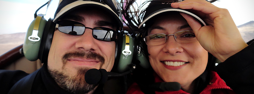
I plan to have a new PhotoshopCAFE DVD coming out this Fall, this one on painting portraits of people.  To avoid having to worry about model releases and licensing issues, I’ll be using myself as the subject.  The other reason is that anybody hired to paint a portrait is unlikely to have a model as their subject.  By using myself, I get to talk about how to minimize flaws (I have those in abundance) and to paint your subject in the best possible light, working with what you have.  I even woke with a zit on my nose that day, so I set aside my ego and told Jeff not to correct it from the shot, so I could show how to prep your reference photo as well.  The sacrifices I make for my craft, I tell ya.

Since I really like Jeff’s work and he’s a friend who’s also not going to make me look bad, I trusted him for the gig.  The shoot didn’t take long; I got the light and scene I wanted, to see the images in real time, and as a bonus, I have a little anecdote to share to make the DVD a little more engaging.

The second reason for attending was networking.  It’s an overused buzz word these days, but it basically means building new and reinforcing existing relationships to the benefit of your professional interests.

I was able to spend time with people from different companies, some of whom I’ve met before, but also a few with whom I’ve had no prior connection, but now have opened doors and dialogue for opportunities in the coming year.  There’s no online substitute for being introduced to a department head over lunch, and then realizing you’ve segued into discussing potential projects you might work on together.  You’re also a lot more likely to find out inside information about a great many things while sharing a drink with somebody at a social event than you will over email or social media.

At one point this week, I participated in an on-camera interview for an Adobe promotional video.  They asked me to show my painted work on camera.  At the end of the shoot, one of the camera crew gave me his card and asked for mine; because he might have a project he wants to hire me for.  Who knows if anything will come of it, but you just don’t find yourself in those moments when you only exist to people online.  I also had the opportunity to participate in an informal forum discussion with Adobe designers to discuss expectations and share thoughts on future releases and possibilities, a process I enjoyed very much.

And finally, I was invited to demo for Wacom in their booth on the Expo Floor.  I will admit to being a little nervous about that, but I’m also a firm believer that if you don’t step out of your comfort zone on a regular basis, you stagnate, especially as a creative.

Over the past couple of years, I’ve been able to build relationships with a few key people at Wacom and I count myself lucky.  Wes, Joe and Pam have been very supportive of my work, and have treated me very well.  The trip alone was worth my time just to spend some with them. While the demo didn’t go completely according to my plan, (does it ever?), apparently nobody noticed and many told me afterward that they enjoyed the presentation.

Once I got rolling, it really did feel quite natural.  As Joe from Wacom said to me in an email the week before, “It is 45 minutes of doing what you do so well.”

You see why I like these folks?

After giving it some thought, I’m not going to make a ruling on whether or not I’ll go to Photoshop World again, but I can honestly say that I won’t be there as a conference attendee.  Without any advanced classes on painting and illustration, there’s just nothing there that I can’t learn online.  I may be back, however, for the reasons I’ve mentioned here.  What made the conference worth attending were the conversations and experiences I had at the Expo, as well as the number of meetings, planned and otherwise, in which I participated.  Some of my friends have said they won’t be back next year, so that will factor into it as well, but for now, I’m just leaving my options open.

All in all, I enjoyed the week.  While it was technically a business trip, it was also a bit of a vacation from the office, too.  Sometimes, even that’s just reason enough to go.

Posted on 2 Comments

Brisby

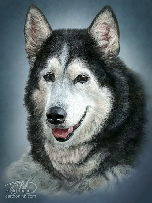
A little while ago,  I just happened to see the reference photo for this one on a friend’s Facebook page and asked her if I could paint it.  I was thinking sometime in the Fall.  It was clear to me from the beginning that this was not going to be a Totem style rendering.  I just loved the winter scene that was captured here.   Brisby is a 14 year old Australian Shepherd/Red Heeler cross and the photo not only showed her senior years, but just spoke to me.  I’ve never met her, but there’s a gentle soul behind those eyes.  I especially liked the reflections of her people in her eyes and even though I briefly experimented with painting her eyes without those reflections, it didn’t take me long to realize they belonged in the painting.  I enjoyed working on this one a great deal and for most of the time, it just seemed to paint itself.

Coincidentally (yes, I know, there are none), Brisby belongs to a friend who works for Wacom.  When they recently invited me to demonstrate my painting techniques at their Photoshop World booth, I realized I’d only do a good job of it if I painted something especially for that demo.  Since I already had the reference, I figured this was as good a time as any to paint this image.  As it wouldn’t be possible for me to create a painting from scratch and complete it in a 45 minute presentation, I saved this painting at multiple stages from beginning to end.  With each stage, I’ll show how I paint and talk about what I’m thinking and looking for at that particular point of the process.

If you’re going to be at Photoshop World, stop by the Wacom booth at any time during the conference when the Expo is open, but if you’d like to learn more about my process and this painting in particular, I’ll be presenting on Thursday, September 6th, from 3:00-3:45.  I’ll be available following the presentation to answer questions as well.  See you there!


Posted on 3 Comments

Totems come to The Mountain

For those who regularly follow my work, you’re already aware that my Totem paintings are very important to me.  I consider them my best work to date and I put a lot of time and energy into painting my whimsical animal portraits.  These images are the most fun I have while painting.  While they have been available as limited edition giclée canvas prints and matted paper prints in local galleries for quite awhile now, they have not been offered on any apparel, despite the many times folks have asked me about it.

It is my great pleasure to announce that a selection of my Totem paintings will soon be available on T-shirts, exclusively from The Mountain.

The Mountain is a wonderfully original T-shirt company out of Keene, New Hampshire.  While they have a number of diverse styles of artwork available, one look at their catalog and it’s easy to see that animals are their specialty.  The quality of the artwork on their apparel is second to none and I’m very pleased to have some of my work included with that of these talented artists.  The Mountain (as a printing company), has been in operation since 1993, although its roots go back to the early 70’s,  and today their T-shirts are available online and in retail outlets worldwide.

There are a number of impressive details that sets this company apart from others.  One is the nature of their product.  Not only is the printing some of the best I’ve seen, but these shirts just feel like quality.  The Mountain prides itself on being ‘America’s Greenest T-shirt Company,‘ and while many companies are trying to jump aboard the eco-bandwagon and say they’re environmentally friendly, The Mountain can actually back it up.  They introduced a ground breaking ‘Dye Oxidation System’ early last year, which cleans all of their dye waste without the use of chemicals.  To read more about that, check out this link.

You can also visit their website here to see all of the details on why and how they’re not only being environmentally responsible, but socially responsible as well.  All of their T-shirts are created and printed in the U.S., and 80% of the cotton used is grown there.  When so many companies are outsourcing their production to other parts of the world, it is commendable that The Mountain has chosen to support their own community.

As for my paintings, the five images that will soon be available on t-shirts from The Mountain are the Wolf, Ostrich, Great Horned Owl, Penguin and Ground Squirrel Totems.  While I don’t know the exact date of their launch, I can tell you that it will be soon.  When they’re available, you can be certain that I will let you know.  I’m really looking forward to seeing my work under The Mountain label.

One final note.  As an artist, I’ll admit to sometimes interpreting coincidence as perhaps more than that.  It’s just part of my nature.  So you’ll understand my amusement at the serendipity regarding the name of this company.  LaMontagne is French.  It means The Mountain.


Posted on Leave a comment

Farewell to Two Wolves

It is with mixed emotions to report that Two Wolves Trading Co.  is closing its doors in September.  As many of you know, this is the place where my work is currently sold in Canmore, but it has meant a lot more to me than that.

As owners for the past eight years, Andrea and Michelle have worked very hard to create a unique store and gallery that sold more than just the ‘wooden mountie’ fare you find in most tourist stores out here.  It has been an oasis of unique items, products, and artwork and I’ve been proud to have been a small part of it.  While I enjoyed seeing my work on the walls, the best part about Two Wolves was getting to know the staff and owners over the past two and half years.  Rarely a week goes by that I don’t stop in two or three times, just to say Hi and kid around with whomever happens to be working.  I’m really going to miss that as they are all wonderful people who have always made me feel like I belonged there.  I will also miss sharing the art side of things with Fraser McGurk and Beth Cairns, two very talented local artists whose work and friendship I enjoy and from whom I’ve learned a lot.

I was pretty new at the retail art game when I approached Two Wolves to sell my work, but they gave me a shot and I appreciate that more than they know.  Over the past couple of years, they’ve been encouraging, shared their knowledge of the art retail business with me, had me in for painting demos, opened a few doors for me and have been very supportive of my efforts.  They’ve treated me very well and I consider them all friends.  The good news is that Canmore is a small community and while I won’t be able to stop in and annoy them with my eye-rolling sense of humour whenever I want to, I’ll still see them all around town.

From a business standpoint, it’ll be an adjustment.  While my work is still for sale at ‘About Canada’ in Banff, I’ll be on the lookout for a new location to show and sell my work in Canmore.  I have no intention, however, of rushing it.  After being treated so well by the folks at Two Wolves, anywhere else is going to have a lot to live up to and I’m willing to shop around.

Best of luck to Michelle, Andrea, Sheshoyna, Angela, Fraser and Beth in whatever future opportunities you pursue.  It has been a privilege.

Posted on 1 Comment

Fear and loathing of photo-painting

Anybody who knows me in professional circles knows that I’ve never been a fan of photo-painting.  While I don’t go out of my way to rant and rave about it, I’ve been pretty clear that I don’t like the practice of painting on top of a photo, that I’ve always felt it had a cheat quality to it, very much like paint by numbers.  I’ve had to bite my tongue and hold my anger in check whenever somebody has suggested that my paintings are just photos that I’ve painted over or manipulated.  It happens often enough that I have a chip on my shoulder about it.

I’ve always felt that if you’re going to learn how to use paint brushes in Photoshop, how to make them work for you, why not go all the way and just start with a blank canvas?  Use the photo for reference, but don’t go sampling the colours and painting on top of it.  I’ve pretty much dismissed it as something not worth my attention, resigning myself to loathing the practice, and making a concerted effort to ignore it.  People are going to do it, regardless of what I think, so why bother wasting my energy on it?

Now, I’ll admit to thinking twice (three, four times) about writing this piece, because it reveals flaws in my character.  While we all have them, of course, most of us don’t like to out ourselves when it comes to the things we keep hidden under the image we like to project.  But, there is rarely an opportunity to grow when you lie to yourself and as someone who follows the antics of politicians for a living, I can only stomach so much hypocrisy without pointing a finger at it, even when it comes to my own.

This week, I had occasion to throw open the door to my feelings on photo-painting for three reasons, all of which were revealed through posts on social media.

The first, was a link posted by a friend, an article by a vegetarian who had to deal with some of her ‘friends’ shunning her when she chose not to eat meat anymore, even though she wasn’t expecting them to do so as well.  I went looking for the article to include here, but I couldn’t find it.  Suffice it to say, it spoke a lot about our innate fear of change and how often the things we hate (strong word, there) are things we fear.

The second, was a piece written by Sam Spratt,  a guest on Scott Kelby’s blog this week.  While I enjoyed the whole blog entry about his thoughts on digital painting, the part that resonated most with me, was about artists who fear technology and how people skilled in one medium will often look down on those who work in a different medium.  I’ve talked about the latter myself in previous blog entries.

Third, and finally, Russell Brown, one of the pioneers of Photoshop and somebody who continues to look for new ways to push the technological and creative envelopes, revealed an add-on extension for Photoshop called the “Adobe Painting Assistant Panel” which is designed to help turn photos into paintings.  To be clear, I have nothing but the utmost respect for Russell.  In fact, I even painted his portrait recently.

I’ll admit that if somebody ever told me that I feared technology, I’d be taken aback.  My tools of the trade are all about technology.  Photoshop, Wacom tablets, my computer, laptop, painting on the iPad, I am a digital artist.   But after being exposed to those three sources this week, I began to ask myself, “Is it possible that I might be afraid of technology?”

The answer, it turns out, is No.  It’s not technology that I’m afraid of.  What I am afraid of, is obsolescence.

I know a lot of photographers who lament the fact that anybody can buy a DSLR camera these days, set it on automatic, take a photo and call themselves a photographer.  If you go looking for them, you’ll have no trouble finding MANY discussions online, often heated, that complain about people who are being hired to shoot weddings, portraits, and events, who are mediocre at the craft, essentially taking money away from ‘real’ photographers.

This is clearly a case of anger motivated by fear.  If the paying public can’t tell the difference between somebody with a point-and-shoot and a dedicated professional photographer, then how is anybody expected to continue making a living at it?

I’m not a photographer, so whenever I see this fear being played out in arguments and discussions, it’s pretty easy for me to see what’s going on.  It’s easy for me to pass judgment.

And yet, I didn’t see it in myself until just this week.

The reason I don’t like photo-painting is because I’m afraid that the paying public can’t see a difference between painting over a photo and the work that I have devoted years of my life to becoming skilled at.

That wasn’t easy to admit.  In fact, it’s downright humbling.

I’ve also realized that the same thing applies to how I feel about similar practices playing out in editorial cartooning.  I’ve seen competitors take a photo they found on the net, apply a few filters to it, slap on a caption and it gets published in a major daily newspaper.  This is happening quite often these days and I’ll admit to being pretty angry about it, upset that they were cheating.  The reality is that I’ve been afraid that if that’s all it takes to get published, then anybody can call themselves a cartoonist and they won’t need me, that the time I spend drawing is wasted, because some editors just don’t see the difference, or they don’t care.

My wife, Shonna, always a sobering voice in discussions where my emotions get the best of me, spelled it out quite well when I broached the subject with her this week, about my realized fear of photo-painting.

While I can’t recall her exact words, she basically suggested that it doesn’t matter how somebody creates their work.  If they take a photo, apply a few filters to it and call it a painting, it doesn’t really affect me at all.  They still have to sell it.

That was my moment of clarity in all of this and what will finally enable me to put it behind me.

Art isn’t about how it’s done.  Art is about how you feel when you experience it.  That applies to photography, sculpture, painting, music, performance, etc.  If you take a photo-painting that somebody has done and put it beside one of my paintings, the viewer most likely won’t care how it was created.  They’re just going to care if they like it or not.  If both pieces are for sale, they’re going to buy it based solely on that.  That’s how it has always been with art.

Some people really like my whimsical animal paintings and some don’t like them at all.  Some people buy them, some people don’t.  The fact that there are folks out there painting on top of a photo in Photoshop doesn’t change that in the slightest.

I’m still afraid of obsolescence.  I can freely admit it.  But I can use that, because fear is a great motivator.  It makes me try harder and scramble, eagerly seeking out opportunities to further my business and to ensure that I remain self-employed doing what I love to do.  While I have no intention of doing any photo-painting myself,  I’ve decided to no longer fear it.   As a consequence of that, I choose to no longer despise it, either.  It’s just another method for creative people to express themselves and that’s a good thing.  That’s art.

Posted on Leave a comment

Live in Vegas!

While it’s true that I’ve only got a few more skills than a professionally trained monkey (hey, I’m a self-trained monkey!), you know you’ve hit the big time when you’re invited to perform in Vegas!

Those wonderfully shortsighted folks at Wacom could have chosen to file a restraining order, but instead they invited me to present at their Expo booth at Photoshop World in Las Vegas next month.   Anybody who’s read anything on this site knows that I really enjoy working with these people, so all kidding aside, it’s an honour to be included with the other names in their guest roster.

That’s me with Wacom’s Joe Sliger at the booth last year.  Seriously, what’s with all the guys in glasses and beards?

I’ve been presenting to schools and other small groups for years, have done a number of painting demos at a few different galleries, and have had a couple of occasions to be a guest presenter for Wacom webinars over the past year.  I’ve even run a small demonstration booth for Wacom on my own about a year ago during Scott Kelby’s ‘Light it, Shoot it, Retouch it’ tour when it stopped in Calgary.  This will be the first time I’ve been invited to present live at their booth at Photoshop World, however, and I’m really looking forward to it.  I’m actually quite comfortable talking to people, especially when it comes to digital painting, as I enjoy this work a great deal. In fact, the real trick is getting to me to shut up,  which is probably why the session is only 45 minutes long.  I fully expect someone to be standing in the wings with a big hook, right around the 43 min. mark, ready to pull me away from the podium. (Yeah, I see you, Wes!).

The great thing about this opportunity is that it gives me a reason to paint something brand new,  something I can show during the demo in different stages, painting a little at each stage and talking about the different ways a Wacom tablet allows me to create the work I love so much.  The bad news, however, is that I have only two weeks to complete it, which means I need to stop typing, and start painting.

For those of you who will be attending Photoshop World in Las Vegas this year, stop by the Wacom booth whenever the Expo is open.  Check the schedule on the Photoshop World site for the Expo Floor hours.  They’ll have a number of different tablets on hand that you can try and a great group of pros eager to show you the tablet ropes or answer any questions you might have.  My presentation on the Wacom demo stage will be on Thursday, September 6th, from 3:00-3:45, but I plan to be spending time in their booth at other times during the conference, helping people out.   I wonder how long it’ll take before they call Security.


Posted on Leave a comment

The Exposure Card

This was a cartoon I did just for fun and for my fellow freelancers, whether they’re photographers, designers, illustrators, or any of the myriad professionals out there who make their living doing piecework for clients.  Ask any freelancer that’s been in the business longer than five minutes and they’ll have a story (probably many of them) of clients who’ve tried to pay with exposure.  For the uninitiated, that simply means that instead of paying for the work, the client cries poverty, but offers to put a link to your website on their website (or Facebook page, or Twitter feed, or on their bathroom wall) so that others who do have money will find you and hire you.

Most of us have fallen for this at least once.  Some of us more than once.  A certain cartoonist painter type I know (who shall remain nameless) has fallen for this at least a few times, because I’m such a…I mean he’s such a nice guy.

Unless the exposure comes from a company that has a lot of clout and comes in the form of more than just a link, but an actual testimonial, blog entry, press release or genuine concerted effort on their part to let others know about you, then exposure isn’t worth the paper your bounced mortgage cheque is printed on.  If you do end up working for a big company whose reach with all of that press is genuine, it’s a safe bet that they’re already paying you or offering perks that really do benefit your business.

To really see the value of exposure, consider the average Joe searching for an accountant in the yellow pages or online.  Joe gets the website address, goes to the site, finds the contact info and just before he phones or emails the accountant, he stops and thinks, “well hot damn, who designed that logo?”  or “who took that photo?” or “who designed this website?” and instead of calling the accountant he desperately needs to ward off the tax man, Joe clicks on that tiny link at the bottom of the page with your name on it and not only hires you, but pays you well for the privilege.

Those stories usually begin with ‘Once upon a time…”

That’s the sales pitch that exposure clients are basically giving you.  The irony is that the freelancer works long hours on the project that ultimately isn’t appreciated by the client (because they didn’t pay for it) and when the exposure results in absolutely nothing, many freelancers blame the client.   Worst of all, even if the exposure does result in a referral, it’ll most like be for another client who doesn’t want to pay you anything for your work.  Cheapskates tend to associate with other cheapskates.

Freelancing is a tough profession, and not for the thin skinned.  Most people will not value your services as much as you need them to and you’ll have to say “No” to a lot of people who want something done for nothing.  At least once a week, I get kidded about not having a real job because I draw cartoons.  I have a sense of humor, so I’m used to it, and usually let it roll off my back.  Occasionally, if I’m caught on the wrong day, I may get defensive, however,  and tell them in no uncertain terms,  they have no idea what it takes to do my job.

But I love my work, and many of my freelancing friends feel the same about theirs.  Sure, we’ll complain about it sometimes, just like everybody does about their job, but for a certain personality type, working for somebody else from 9 to 5 is one of the seven circles of hell.  We still have our bosses, though, they’re just usually temporary.  The big difference, however, is that we hire our bosses just as much as they hire us and when one of them pulls the exposure card, the correct response is, “I’m sorry, you’re just not the right fit for this company.”

Posted on 3 Comments

Wacom’s Bamboo Splash Tablet and ArtRage Studio

Wacom just released a new entry level tablet, the Bamboo Splash, and I had an opportunity to put it through its paces.

The Bamboo Splash tablet is designed for the amateur or beginner digital artist.  It’s perfect for kids and teenagers, allowing them to experiment with digital art without having to spend a bundle to do so. Best of all, even though it lacks the bells and whistles of the more advanced tablets, it doesn’t sacrifice much in performance.

As I draw syndicated editorial cartoons almost every day, I wanted to see if I could still get real work done using the Bamboo Splash, rather than with the medium sized Intuos5 that I use every day.

The Wacom Intuos5 is a professional tablet.  With the programmable Express Keys, the Touch Ring, high end pen, and the onscreen customizable features, not to mention the larger size, it’s unfair to compare the two tablets as they are designed for different skill levels.  As I’ve been doing this for a living for many years, I’ll admit that the Bamboo Splash isn’t tablet enough for my daily needs, but then again, it isn’t meant for me.

The Bamboo Splash tablet was simple to set up.  Plug it in; install the drivers from the CD, restart the computer and it was working flawlessly.  Visiting the preferences utility, I found that very little aside from ‘Tip Feel’ was changeable.  For a beginner, that’s ideal.  It’s ready to go, out of the box, nothing confusing.

Put simply, it’s a great device.  The Bamboo Splash has 1,024 levels of pressure sensitivity, which is plenty.  While a number of people may wonder about the size, your mind figures it out fast.  I work on a larger tablet every day, mapped to two screens.  I keep all of my Photoshop tools on one screen and draw on the other.  That means I’m really only using half the tablet for drawing.

When using the Bamboo Splash, I didn’t change my screen mapping, so I was only drawing on half of the smaller tablet, too.  After a few minutes, I didn’t even think about it.  My mind just figured out that brush and pen strokes required less movement.

This cartoon (with the political commentary left out) was drawn and painted entirely with the Bamboo Splash in Photoshop and it worked very well.  While I did keep reaching for the Express Keys and Touch Ring of the Intuos5 out of habit, once I got used to their absence and reverted to using keyboard shortcuts or drop down menus in Photoshop, I was able to work smoothly and still got my cartoon out to my newspapers on time.

Trying to draw with a mouse is an exercise in futility.  You really do need a Wacom tablet to draw with a computer.  While the Intuos5 tablets and Cintiq devices will represent more of a financial investment, you’re not risking too much with the Bamboo Splash.  The tablet comes in at well under $100.  Best of all, it comes with two very nice pieces of creative software.  One is Autodesk’s Sketchbook Pro and the other is ArtRage Studio.

I spent some time with ArtRage, and it was very enjoyable to use. While it’s not designed to be a professional illustration and painting tool like Photoshop or Painter, it offers a lot to anybody wanting to try their hand at digital art.  With pencils, crayons, chalk, oils, watercolors and a number of other tools, there’s very little to limit your creativity.  It even supports layers and blend modes, and has a number of other fun tools and settings to mess around with.

Pairing ArtRage Studio with the Bamboo Splash was a great idea, because they’re both designed to allow you to create digital art, without a steep learning curve.  You can start working with both right away and if you’re like me, preferring to figure it out as you go along, you’ll be able to get pretty far without having to look through the manual.

When you do want more info, the ArtRage website has plenty of tutorials.  You can also upgrade the software to ArtRage Studio Pro and they have iPhone and iPad drawing apps as well.  If you do want to try out the mobile apps, I’d recommend the Wacom Bamboo Stylus as a drawing device to go with them.

Here’s a video I recorded for Wacom’s ‘See What You Can Do’ campaign, designed to share a little bit of my thoughts on digital painting, and to show some of the drawing and painting tools available in ArtRage Studio.