Blog

Posted on 3 Comments

Welcome to the Wacom Intuos5 Touch

One of the things that sometimes irks me about product reviews is that they can often end up being many pages long and nobody really has that kind of time anymore.  With that in mind, I thought I’d talk about my new Wacom Intuos5 tablet in a few different blog entries, this being the first, partly because I need to use it for a little while before writing about the new features in detail.

Anybody who reads this blog, has watched my DVDs or heard me talk about my work knows that I’m a big fan of Wacom tablets.  In fact, without a tablet, I couldn’t paint the way I want to paint.  I’m usually pretty ‘live and let live’ when it comes to painting software and when people ask about Painter vs. Photoshop or other choices out there, I’ll usually say to try a few of them, and see what you like best.  But when it comes to hardware, you absolutely need a tablet to draw or paint digitally, and Wacom is the gold standard.

I’ve had a number of different tablets over the years, my first one in the late 90’s.  That was the first generation Intuos 4X5 tablet, and it worked so well, that despite changing nibs and a couple of transparent overlays, the only reason I upgraded was because I’d bought a new computer.  The original Intuos had a 9-pin connector and the new computer only had USB ports.  But that original Intuos tablet never failed me over many years.

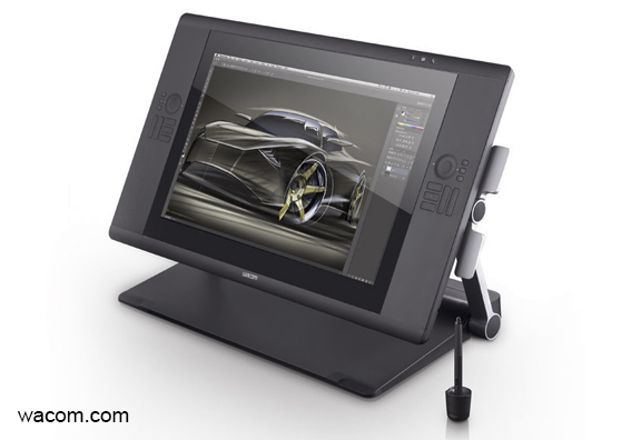
In addition to that tablet, I had a 4X5 Graphire for my laptop.  Since then, I’ve had a medium Intuos3, a medium Intuos4, a small Intuos4, and a Cintiq12wx.  The Cintiq12wx  may be smaller than the latest massive 24″ HD Cintiq (which I am currently saving up for), but it’s a great tablet for live painting demonstrations.  Sometimes, when I’m tired of working in my home office, I’ll often set up in front of the TV in the living room with the Cintiq and paint while watching a movie, too.  The small Intuos4 has always been a great travel tablet, and since I worked on that size for years at the beginning of my career, I’ve never felt hindered by the smaller work space.  If I needed to, I could still do all of my work on the small size tablet today, even the paintings.

But the tablet that fits right into the Goldilocks zone (just right!) is the medium sized Intuos.  A few years ago, when I heard they were launching the Intuos4, I remember thinking that my Intuos3 was just fine.  Why would I bother upgrading?  Of course, once I saw the  new configuration of the Express keys and the Touch Ring, not to mention those pretty blue LED lights, I knew I’d be getting one.  The Intuos4 medium has been my day to day tablet every day since it was launched in 2009 (has it been that long?) and to be honest, I’m a little sad to see it go.  It has now been relegated to my laptop bag, and I’ve donated my small Intuos4 tablet to a graphic designer friend who didn’t have one yet.

I’ve been watching videos online and read some reviews about the Intuos5 before mine arrived, so there were really no surprises about the new features.  However, hearing about it and watching somebody else talk about it pales in comparison to actually using it.  Even though I’m not going to show pics of me un-boxing the thing, because it’s already set up, one of the things I do like about Wacom products is the packaging.  The devices themselves have always felt sturdy and I’ve never questioned the quality of the materials.  But when a product arrives in slick looking packaging, it makes you feel just a little bit better about your purchase, and this tablet came in a very nice, well designed box that almost looks like a case.

All of the individual pieces, as few of them as there are, were well wrapped and configured inside.  The tablet, connection cord, pen, and pen holder (which contains ten spare nibs of different design), along with the documentation, are all that you need.  The physical look of this tablet has changed, as should be expected, but the texture of the materials is also different, although the pen itself feels pretty much the same.  The main body of the tablet now has a bit of a rubbery feel to it.  Not as pliable or spongy as the pen grip, but not the typical hard plastic of most computer components either.  This rubbery surface now completely covers the express key buttons and most of the touch ring, and the LED lights are absent.  A little disappointed those are gone, because I kind of liked them, but I really like the look and feel of this new design.

The main drawing area feels different to me as well, a little more textured, but still smooth enough for easy pen movement.  Not that I’ve ever disliked a tablet surface, but I think I prefer the way the pen feels on this surface over any that I’ve used before.  I’ll reserve my final opinion on that until I’ve spent some real time painting with it.

Apparently I’m a slow learner.  When Wacom first announced the Intuos5, I once again thought, “What could they have possibly done to make it better than the Intuos4?”

Well, they added touch features.  In my mind, that changes everything.  After downloading the new driver from the Wacom site, and restarting my computer, all of the new touch features on this tablet came to life.  I’ve never really liked track pads on laptops, as I found them too small.  What the touch features have done on this new tablet, however, is turned it into a BIG track pad, and it’s great.  I normally use the pen to navigate my way around the computer, no matter what program I’m using.  Now, I’ll only need to pick up the pen when I’m drawing and painting.

After an initial exploration of what each of the touch features does in the Tablet Properties and testing them out in Photoshop, I don’t mind admitting that I might have giggled a little.  I’m such a nerd for this stuff, and I can see having a lot of fun learning how to incorporate these new touch features into my workflow.  The whole goal with a tablet, at least for me, is to eliminate using the keyboard at all.  I’ll have to spend some time configuring and using the new features, but that’s what I’m aiming for.  I’ll talk about setting up those features in the next blog entry on this tablet, and I’ll include some video.

First impression, I love this thing, but I never expected not to, having never been disappointed by a Wacom tablet.  More later once I get a better feel for it, but right now, I want to get painting.

.

Posted on 2 Comments

Photoshop Quiz Game by Dave Cross

Awhile ago, I was commissioned to draw a caricature cartoon of Dave Cross for his new app, “Photoshop Quiz Game” which will be released today.  Many of the people who travel in my circles will need no introduction, but Dave is an author, trainer, photographer, one of the original NAPP Photoshop Guys, and owner of Dave Cross Workshops in Tampa, Florida.  Best of all, he’s Canadian.

The designs have been completed for some time, and as is normal for commissions of this nature, I’ve had to keep them to myself until now.  This was a fun project, so I’ve been anxiously waiting to share it.  Working with someone who knows Photoshop REALLY well helped a lot, because I could leave pieces on different layers, use layer styles, and provide options in the file without having to explain how to use anything.  Not only did this allow me to design a more versatile file, but it offered choices to Dave that other clients might not be able to benefit from.

For example, I offered two different head sizes.  Some people like the really large bobble head caricature noggins while others want the smaller.  Personally, I liked the smaller size, and judging from the launch site image, looks like Dave did, too.  There were four bodies to choose from, separated on their own layers, and the circular ‘shadow’ under the feet was a separate layer as well.  When I use shadows like this, I often like to set the blend mode of the layer to ‘Multiply’ so the background will show through.  From a screen shot I saw, looks like Dave did that, too.

While I haven’t seen the full app yet, I’m looking forward to seeing how the caricature was used throughout.  For more info about Dave’s training, the launch of the app today and more, visit his website at www.dcross.com or you can follow him on Google+, Twitter or Facebook.


Posted on 2 Comments

The proof is in the printing

Spent a couple of hours at ChromaSurge in Calgary yesterday morning.  This is a small business print shop that handles all of my canvas and matted paper prints.  Kelly (the owner) was recommended to me by another Canmore artist.

There’s a lot to learn about printing, even when you’re not doing it yourself.  There are so many different types of machines, canvas, paper, coating, stretcher materials, and frames.  As I have no interest in trying to be a jack of all trades, I don’t do any of my own printing.  Recently, my printer (the guy, not the machine) bought some new equipment, canvas, paper, and inks.  Part of me, the part that doesn’t like change, was thinking, “Hey, my prints looked great, why are you messing with the formula?!”

The other part of me, however, was thinking, “He who refuses to adapt, dies!”

That is true of so many professions these days, and I plan to be doing this for a long time.   I made an appointment with the printer (again, the guy, not the machine) to reproof all of my current prints, and set to seeing how I could make them better on my end, in preparation for them being better when they came out of the printer.  One of the things I noticed with my prints was that some of the shadows were a little too dark, not something many people would notice, but when you spend as much time painting the details as I do, you don’t want to see them lost.  So I lightened them all up a bit, just some simple adjustments in Photoshop.  The lighter versions don’t look the way I want them to on the screen, but they look just right on paper.

Many digital artists and photographers become frustrated that their images don’t look the same in print as they do on their screen.  No matter what they do, they can’t make it happen.  Even with a professional color calibrator, the right printer profiles, and technical adjustments up the wazoo, it never quite gets there.  The reason is that a screen is back-lit while paper and canvas are not.  Therein lies the difference and it’s a HUGE difference.  Took me years to make peace with that.

As in all things, you do your best, and you make compromises.  You get your images to look as good as you possibly can and let go of perfection.  Those of you who know me well probably don’t believe I can do that when it comes to my paintings, but when it comes to prints, I actually can.  I know that nobody sees the imperfections the way I do when it comes to my own work, and that’s true of almost every artist I know.  We’re our own worst critics.  That’s a good thing, because it means you’re always going to try to become better at what you do.

One of the ways I try to compensate for the back-lighting  issue while painting digitally is that I have two monitors.  For Photoshop, one is my painting screen, and the other is for all of my tool palettes.  My Wacom pen is set to just go between them, so it actually acts like one big monitor.  The painting monitor is calibrated.  I use the Eye-One calibrator but there are others out there just as good.  The brightness on the monitor is also set to 13.  Yes, that’s 13 out of a possible 100.  If that seems way too low, trust me, you get used to it.  It minimizes eye strain for long periods of computer work, and also allows me to paint in more subtle shades and tones because I’m not dealing with harsh contrast.   When a painting or cartoon is done and looks good, I’ll often move it over to the other monitor, which is set a lot brighter and is NOT calibrated.  This way, I know how it’s going to look on other screens.

It’s a cheat, and one that works very well for me.  Because of working this way, there is much less of a screen vs. print shock.

My printer (the guy, not the machine…do I need to keep saying that?) takes the time to make sure I’m happy with the product he’s delivering, and good service is worth paying a little more for, especially now that it seems so rare.  When I told him that I wanted to reproof everything, and that I wanted to do it while I was there in his shop so we could talk about the results and I could ask some questions, he was fine with it.  I had all of my current paintings copied and pasted to one image that measured 18″X36″, which meant each image was around 5″X7″, just large enough to see what I needed to.    First it was printed on canvas, after which Kelly spray coated it so I could see what it would really look like when it was done.  Then he ran the same file on paper, because I sell matted prints in the galleries as well.

The difference between the two materials is that canvas has a natural texture to it.  It’s bumpy because of the weave of the fabric.  That adds a little more light and shadow, as does the protective coating.  The colours appear more saturated and richer, and there appears to be more depth in the image as a result.  I love my work on canvas, even more than on screen.  The paper prints have a flatter look, and although there isn’t a ‘shine’ to them like canvas, the quality is great, the colours are very nice and I’m very pleased with them.  With a sharp looking black mat, they pop.  But canvas is better, which is why it costs a fair bit more, both for me to have printed and for the customer to buy in the gallery.  And neither of them look like the other or like they do on screen.  Not better or worse, just different.  This photo doesn’t even capture what the canvas really looks like.  It’s just something you have to see.

I was very pleased with the prints and glad I took the time to go in and get the proofs done.  Cost me a bit of money for the ink and materials, not to mention taking the morning off from drawing and painting, but in the long run, it was a valuable use of my time.  My printer (really?  again?) also knows for a fact that I’m happy, so that likely makes him feel that he’s done right by his client.  Even better, he printed off a copy for himself so that whenever I order prints, he now has an approved standard to compare against, and so do I.  We have a baseline with this canvas, paper, ink and machine.

Like I said, I was already happy with my prints, but these new ones have just a little more spark in them.  I doubt that others will notice it, but I do, and that matters because it makes me feel better about the product I’m selling in the galleries and to my commission clients.  When new and better materials come along, we’ll have to do it all over again, and it will be worth it.

Posted on Leave a comment

Chase

Meet Chase, a German Shepherd who was an absolute joy to paint.  Chase spent his youth in Schutzhund Training.  I had to look it up, but according to one site, “Schutzhund is a German word meaning “protection dog.” It refers to a sport that focuses on developing and evaluating those traits in dogs that make them more useful as breeding dogs and happier companions to their owners. “

Chase has a stainless steel hip and two titanium teeth, apparently due to the competitions and excesses of his youth.  He is now happily retired, but according to his owner, ‘studly-looking nonetheless.”  It is obvious this dog is well loved and all of the reference photos showed a happy looking 10 year old dog, who is quite big when shown beside other dogs.  The client wanted one of those titanium teeth to be visible in the painting, and rather than a portrait style, he wanted my signature Totem style that I use for my wildlife paintings.  I was more than happy to oblige.  In the end, the client was very pleased with the final painting, as was I.

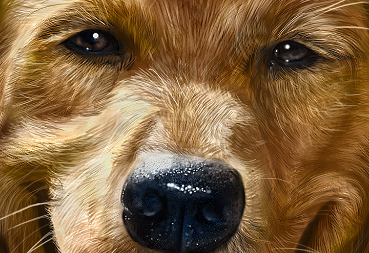
I hear from a lot of people asking about how I paint fur, and which brushes I’m using.  The brushes themselves aren’t complicated.  I go through the process in detail on my painting DVD from PhotoshopCAFE and recently wrote an article explaining their construction for Photoshop User magazine.  As much as I would like to say that the secret to these paintings is in the fur, I honestly don’t find that part of it difficult, anymore.  Having done many animal paintings, I’m very comfortable with using the fur brushes.  While it still takes many long hours to get it right, painting the fur is the easy part.  Getting the likeness is tough.

Sure, it’s a dog, but anybody who has shared their life with a pet, will know that each one’s face is as distinctive as any other family member. The owner will know if it’s wrong.  Dark and light areas of fur, lines in the right places, shape of the head (even in caricature), and a number of other little nuances contribute to whether or not the painting is going to be accurate.

It is likeness that causes me the most stress when working on a portrait or caricature of an animal.   Throughout the painting process, I alternate between feeling like I’ve got it right, and knowing that I’ve got it completely wrong.  When it’s wrong, it’s incredibly frustrating because I’ll often have difficulty seeing where the problem lies.  That’s often a cue to walk away from my desk, even if just for an hour, in order to let my mind reset.  When I come back, I’ll often instantly see what the issue is, and then I can get to work fixing it.

I worked on this painting off and on for the last month, in and around my other daily deadlines.  After a nine hour session on Saturday, I got through the best of it.  When I decided to call it a day,  I couldn’t save copies of it to my external drives fast enough, just in case the unthinkable happened.  A couple more hours very early Sunday morning, and it was signed, saved and delivered.

For the technical folks, this was painted in Photoshop CS5 using a medium size Wacom Intuos4 tablet, and photos were used only for reference.  The final image dimensions were 18″X24″ at 300 ppi, and at one point the working file size was just shy of 500MB.   As for how long this took to paint, I honestly have no idea.  But I do know that most of it was a lot of fun.

Posted on Leave a comment

Much ado at the zoo

With my focus on painting animals the past couple of years, my thoughts are often on trying to figure out the best way to sell the prints and the images themselves.  While I’m pleased with where the paintings are sold here in Canmore at Two Wolves Trading Co. and at About Canada in Banff, I’m now looking for venues in Calgary and for licensing opportunities.

With that in mind, I sent off an inquiry email to the Calgary Zoo.  I figured if there was one place in the city that people were looking for animals, that would be it.  While it took me a few tries to get to the right person, I eventually did get a meeting yesterday morning with the Retail Manager who liked my work,  and I learned a few things.  First, they don’t currently license images in the manner in which I was hoping, so for the time being, that one is out.  Second, they’re just beginning to sell art prints like mine in one of their venues.  I had brought in a 12″X16″ canvas print of the Wolf Totem, a small wolf matted print and a large moose matted print as samples.  To my surprise, I was asked to leave them there on consignment, which is a pretty standard arrangement for art for many venues.  I honestly didn’t expect that right away, or I might have brought more.

So, my foot is in the door and a small sample of my work is now for sale at the Calgary Zoo.  I mentioned that I was going to be painting a penguin or two as part of the series, and chances are that when it’s done, they’ll be hanging one or two of those as well.  Penguins are very hot (cool?) right now at the Calgary Zoo as they just opened their ‘Penguin Plunge’ habitat, right next to the store where my art is hanging.  For purely commercial and obvious reasons, my next Totem painting is going to be a penguin.

Throughout my career, I’ve often had things turn out better than I’d hoped by not getting exactly what I wanted.  I have a good feeling about this first step, and I think it’s going to lead to something very positive, even though I have no idea what that will be.  I’m certainly pleased that I took the shot, which leads me to the other shots I took at the zoo.

It’s no secret that I find photography frustrating.  Aside from enjoying capturing moments and memories with point-and-shoot snapshots, how I feel about the technical aspects of photography is close to how I feel about doing my taxes.   It’s very clear to me that I already know how best to express myself with images and it’s not with a camera.

I know a little about what it takes to be a photographer, mostly because I hang out with a lot of them.  I see what they have to learn, how much dedication is required, and how very much more it is than just pointing a ‘good camera’ and pressing a button.  Still, I naively headed for the zoo thinking I’d get some really great reference photos, because I just needed decent light and  sharp detail, not great composition.  My buddy, Joe, gave me an old zoom lens of his recently, because it has sand in it, so a few grains end up in shots.  Bad for him, fine for me.  Attaching it to my very basic Nikon D60, I figured the lens would make all the difference.  The actual difference was that my shots were worse than they normally are.   I couldn’t use auto-focus, I had it fully extended with no tripod, was using a flash, and there was one other thing…oh yeah, I have no skills with a camera, whatsoever.  A common joke among photographers is people who shoot with the automatic setting.  That would be me.

A little sidebar here.  I spent a beautiful morning watching animals.  The new penguin habitat is a wonderful addition to the zoo, and I got there early, so no lines to contend with.  Had a great conversation with one of the staff about the care and feeding of the penguins, and wandered around in the sunshine for a couple of hours.  Despite what follows here,  I really did enjoy myself.

I shot over 250 shots of the penguins, a giraffe, a meerkat, and red pandas, all with the intent of getting GREAT reference to paint from.  After pressing the delete button far too many times in Adobe Bridge, I ended up with about 5 good shots of the penguins and one of the meerkat.  Not great shots, not even very good shots, but good shots.  That means, good enough for reference, not good enough to publish anywhere except here.  It was a very humbling experience.

Like I said, I already knew that photography was difficult.  This being my first time using any lens but the one that came with the camera, however, I learned the hard lessons you only learn through experience.

When mentioning my tale of woe on Facebook yesterday, a number of my supportive photographer friends chimed in with advice and observations.  Here were two of my favorites.

My talented photographer friend, Christine, said, ” Practice, practice, practice. I remember a post you put out the other day about the same concept with your paintings, and the work involved.”

My friend Lu Douce, whose husband Craig is another talented photographer, right here in Canmore said, “250 photos? There’s your problem right there! Craig would have taken at least a thousand!”

Both of them are absolutely right.  A real photographer will often take many more shots than I did just to get ONE good one they can use.  My 250 was nothing.  And when I read the comment about practice, I thought, ‘touché.’  Why I expected to get great (not good, but GREAT) reference photos first time out, just because I could zoom in closer with the lens,  is beyond me.  Chalk it up to enthusiastic shortsightedness.

A few others on Facebook graciously offered advice on shutter speeds, lighting, stabilizing the camera and other helpful tips that made me realize that even though I have no interest in photography, I should still  learn a lot more of the basics if I want to take my own reference shots.

I’m a good painter.  I’m confident that I can say that without it sounding arrogant.  The reason is that I love doing it.  It’s fun, it’s a challenge, I feel at home while painting.  I’m very passionate about my work, and that’s why I’ve gotten skilled at it, because I don’t know how NOT to put the time into it.  This is also the reason I am unlikely to ever be a good photographer.  Passion is a key ingredient to becoming good at any creative pursuit, and I just don’t have it for photography.  The spark is absent.

Up until now, I’ve relied on buying or trading for reference photos from photographers who really know what they’re doing, with great appreciation.  That’s unlikely to change.  But I anticipate many more trips to the zoo in the coming year, trying to learn more of the basics and about my camera.  While I have no ambition to be a photographer, I am willing to put in some book learnin’ and practice time to become at least good enough to take some photos that will help me with my paintings.

To my photographer friends out there who do enjoy their work, and have that passion, you already had my respect.  Now you’ve just got a little more.

Posted on 1 Comment

Unexpected benefits of painting on the iPad

This little caricatured  critter is a Golden-Mantled Ground Squirrel, easily found in different parts of the Rockies if you know where to look.  It is often mistaken for a chipmunk because of the stripes, although they have none on their face.  I shot the reference photo for this up at Grassi Lakes here in Canmore a couple of summers ago, and I just did this as a practice piece.

For those that always ask for the technical details, this was painted on a first generation  iPad using the procreate app and a Wacom Bamboo stylus.  One of the most difficult parts of painting on the iPad for me is getting the correct brightness.  I’m not a fan of bright screens, so I usually have my iPad set to half brightness, which means the image is a little bit dark when it’s done.  I bring it into the Snapseed app and make some brightness and contrast adjustments.

The process for painting on the iPad is very similar to how I paint in Photoshop, with a few exceptions.  One, I’m stuck with one resolution and must work with what I’ve got.  Two, although I can create my own brushes, there’s a limit to how well they work, so patience is required, and quick brush strokes aren’t really possible.  When you hear what people say about painting on the iPad, a lot complain that it’s not pressure sensitive, so you can’t do any real work on it.  Personally, I think that’s a poor excuse.  Many of the painting apps allow you to create layers and change the opacity of not only the brush, but the layer as well.  Many of the apps have blend modes, just like Photoshop, and all of this easily compensates for the lack of pressure sensitivity.

I began painting with the iPad as an experiment, just to see if I could do it.  Most of the time, the things I paint on the iPad aren’t going to become full paintings that I print and sell, so there’s no pressure.  It’s entirely a personal challenge, and I find that I’m enjoying it very much.  I also have no doubt that every successive iPad will have better and better resolution, and while I’m in no rush to replace my first-gen tablet, as it’s working very well, someday I will upgrade and I’m looking forward to seeing how well I can paint on a better device.

I’m always working on a few commissions, Totems and personal painting projects.   Last week, I began a new portrait in Photoshop, and suddenly realized a significant benefit to painting on the iPad.  Anybody who has seen my painting DVD will know that I begin a painting at low-resolution so that the brushes will work freely and fast.  As the painting progresses, and I get into more details, I increase the resolution a couple of times, until finally it’s at full size for the super fine detail work.  What I noticed last week, however, is that I’m staying in low resolution for a lot longer now, and am ending up with a much tighter and detailed painting at 72ppi than I could have achieved at 300ppi just a few years ago.

The portrait I’m working on at 12″X16″ at 72 ppi looks almost print ready and I did most of the work without zooming in, pretty much full screen work the whole time.  It took me by surprise and after thinking about it, I don’t think it’s simply a matter of ‘practice making perfect,’ but an unexpected side benefit from painting on the iPad.  By being forced to paint at low resolution, and by trying to create as close to finished work on a tablet with technology that is less precise, I can paint so much better at low res in Photoshop with my Intuos4 Wacom tablet.

Something I used to have a great deal of difficulty with was creating a solid painting first, and only after that, creating the fine details.  I would often zoom right in and start painting skin texture on a face that wasn’t structurally sound.  I forced myself to stop doing that because it would add hours to a painting, having to redo details all the time when I realized the features weren’t right.  Now that I’ve become a much better painter at low resolution, painting the details is not only easier, but a lot more enjoyable.

The last thing I would want you to do is rush out and buy an iPad if it isn’t in your budget.  You do not need it to become a better painter.  The thing that will really improve your painting skills all around is putting a lot of time into becoming better at your craft, and that is true for any skill.  But if you do have an iPad already, you may find that it could help you become a better digital painter, simply because it will present you with obstacles to work around, the benefits of which you will see in all of your work.

Posted on Leave a comment

Brush Design in Photoshop User Magazine

The March issue of Photoshop User magazine has now been released.  If you’re a subscriber, it went out in the mail today or you can download it on the Zinio reader right now.  In the ‘Down and Dirty Tricks’ sections, I’ve got a four page step-by-step on Designing Dynamic Hair and Fur Brushes with some tips on how to use them.  This article was a challenge to write, as I wanted to make sure that I didn’t miss anything crucial, and I’m pretty pleased with how it turned out.  While brush design in Photoshop is an art form in and of itself, this should get you started.  The rest you get from putting in a lot of time and practice.

For more on how to paint fur and hair in Photoshop, check out my DVD, “PhotoshopCAFE Masterclass: Animal Painting in Photoshop.

Posted on 2 Comments

Wacom’s Inkling – Lowering Expectations

Anybody who knows me or follows my work is well aware that I’m a big fan of Wacom tablets, so when I had the opportunity to put the new Inkling through its paces, I really wanted to like it.  If I drop all pretense, I’ll admit to being a little apprehensive about writing an honest review, as I really enjoy working with these folks.  But I also didn’t want to mislead any artists into buying the device and have them hold me responsible when it didn’t live up to their expectations.

The purpose of the Inkling is ingenious.  Attach a small clipped box to whatever page you’re working, use a pen device that draws just like a ballpoint pen, albeit a little larger in size, and whatever you draw is saved as a file, ready to be imported into your computer.

Let’s start with what I liked.  The device itself is elegant.  I doubt I could come up with any improvements in the case design, as everything fits together nicely, the pieces feel solid, and the case itself has a nice weight and construction.  Definitely doesn’t feel like a cheap piece of plastic that will break in a month.  While I’m normally a pencil sketcher, I did enjoy drawing with the pen.

Unfortunately, there’s a lot more that I didn’t like about the experience.  Frankly, the software is clunky.  While I’m not an engineer and can’t quite give a lot of specifics on where the shortcomings lie, it just didn’t seem comfortable to work with.  While it has a feature that records all of your strokes, enabling you to scrub or play them back, I didn’t really see the point.  Additionally, the layers didn’t really seem to work well for me, either.  I never felt the need to separate my sketches into components.

The biggest issue I had with the device is that it has serious accuracy issues.  In an effort to test this, I created a pencil drawing in my sketchbook, erased it until it was faint, and then traced over it with the Inkling pen, trying to get as clean a drawing as I could.  I created a total of four new layers, going over the same lines in places, just to test the accuracy.  Here is the result of that particular drawing experiment.

As you can see, the layers don’t line up and the recorded lines aren’t very accurate.  I repeated this experiment a few more times over a couple of days, just to make sure I didn’t bump the device or accidentally move it the first time out, and judging by the similar results, that wasn’t the case.  Even with only using one layer, the accuracy had noticeable issues.  Having imported the Inkling sketches into both Photoshop and Illustrator, I can verify that bringing the sketch and layers into both programs works as advertised.  It was a smooth import and looked the same as it did in the Inkling Sketch Manager, layers intact.  The problem seems to be in the capture itself.

In an effort to be fair, my expectations for the Inkling were pretty high, and I think the disappointment lies primarily with that.  I was expecting the same level of accuracy I get from an Intuos tablet.  If you look at the Wacom site, it says that the Inkling is  “Designed for rough concepting and creative brainstorming, Inkling is ideal for the front end of the creative process. Later, refine your work on your computer using an Intuos4 tablet or Cintiq interactive pen display.”

Using this device for solely that purpose, it works as advertised.  I did a page of rough sketches using the pen alone, the results you can see here.

If you weren’t being a stickler for accuracy and comparing it to the original sketch line by line, the Inkling does what it was designed to do.  For rough sketches and concept ideas, to simply record something you can throw into your laptop and email to a client or collaborator, it works just fine.  It just wouldn’t do what I wanted it to do, which basically was to replace my scanner.  I know a number of other artists that were hoping for the same thing, and for this purpose, the Inkling is not the right tool.

When it comes to creative tools, the goal should be to find ones that will make your life better and fill a need.  When it comes to the Inkling and my own personal workflow, I find myself struggling to invent a use for it, in order to justify having it.  Unfortunately, I can’t.  When I import a drawing into Photoshop, I need it to be clean, and I will rarely have any use for a rough unfinished sketch like the ones you see above.  Will this device be useful to others?  Yes, I’m sure that it will, but it’s not for me.


Posted on Leave a comment

The things I cannot say.

A recent chat with a colleague began with, “now promise me you won’t tell anybody about this.”

More and more of my discussions these days begin with a sentence very much like that.  Often in the freelancing business, it’ll be referred to as ‘consider this under NDA’ as well, without actually having a document to sign.  An NDA, for those who are unfamiliar, stands for Non-Disclosure Agreement, which is usually a legal document that basically says that if you sign it, you’re agreeing to keep your lips zipped about any information the client shares with you.  In my experience, it usually refers to an upcoming book, project, app, software or hardware release, and anything else where the launch would be severely damaged if word got out to customers and competitors.  NDAs are serious business and I’ve been asked to sign a few, even just to hear about a project that I either ultimately turned down, or it turned out that I was not right for.

As my time has worn on in this business, I’ve come to the conclusion that unless the person I am speaking with has specifically told me I can talk about it, whatever ‘it’ is, everything is under NDA, even if I haven’t signed anything.  In any business, trust is an immeasurable asset when it comes to forging and maintaining long-term relationships.  Work with people long enough, and show them that their confidence is not misplaced, and pretty soon, they won’t even bother to ask you to keep it confidential because they already know you will.

One of my biggest pet peeves is the excuse some will use for unethical behaviour, ‘it’s not personal, it’s just business.’  As long as you’re talking to a person, business IS personal, and if you tick that person off, you’ll likely never do business with them again.

Gossip is rampant.  Always has been.  With social media, however, people are sharing far too much information, far too often, simply to be popular and dish the dirt on anything and everything.  If a company hires you to do a job, it can be tempting to spill the beans in order to inflate your image in the eyes of your colleagues, but if that company has taken a risk on you and finds out they can’t trust you to be discreet, it will be the last time they hire you.  Popularity on social media doesn’t pay the bills, but a solid reputation as a professional certainly does.

Over the past year, I’ve worked on a number of projects that I couldn’t talk about while working on them.  There have been paintings I couldn’t share for a month or more after delivery, because they were gifts and the risk of the recipient seeing them would irreparably damage my relationship with the clients who hired me.  I’ve had illustration clients who’ve hired me for jobs where my contribution has long been finished, but their project is still in development and to this day, I can’t share even a sneak peek until they launch.  Just recently, I wrote an article for Photoshop User magazine that was written, finished and submitted well over a month ago, but I was only allowed to talk about it last week.  I made a point of asking early on, and was given the exact date after which I was allowed to reveal my involvement, and I even double-checked with the editor on that date to make sure.

The only way to gain a reputation for being trustworthy is to consistently prove it to every client and professional with whom you come in contact.  This is beneficial in many ways.  A client that trusts you will not only hire you again, but they”ll refer you.  Just as important, people that trust you will share information with you, and in this industry, information is power.  You can find out when new products, software, and projects are being launched, what advancements are coming soon from which companies, and most importantly, which people and companies are great to work with and which ones you want to avoid.

Trust is always a gamble, and sometimes those with whom you place your trust will abuse it and make you regret it.  If you’re smart, you won’t allow them to do it twice.  Word spreads fast and people don’t want to work with those who can’t keep their mouths shut.

To be trusted, you must be trustworthy.

Posted on 2 Comments

Why I Paint on the iPad

This is a painting I recently finished on the iPad.  For those who want the technical specs,  I’m using the first generation iPad, the Wacom Bamboo Stylus, and the procreate app.  The actual size and resolution of this image is roughly 13″ X 9″ at 72 ppi.  The only photo used was for reference (thanks, Pete!) and I designed my own brushes.  I have no idea how long it took me to paint as I worked on it over four or five days, an hour or two here and there.  I’ve never done a painting in one sitting and doubt I ever will.

Since the resolution and size for the iPad is so low, I’ll likely never be able to do what I call ‘finished work’ on it, so you might wonder why I bother at all.  As a sketch pad, it’s great, but why put all the time into painting in detail, light and shadow?  Very simply put, it’s a challenge, and it’s fun.

At the risk of sounding immodest, I already know how to make Photoshop sit up and do the boogaloo when it comes to painting.  I know what it takes to get the fine details and I’ll always keep working to add more realism and texture to my paintings, but any limitations I have in my painting are my own.  If my paintings aren’t as good as I can possibly make them, the fault doesn’t lie in Photoshop or my Wacom tablet, it’s in my ability.  I can’t remember the last time I thought, “I wish Photoshop could do…”

With the iPad, however, the challenge is to see just how far I can take a painting before I’m limited by the tools I’m using.  The resolution tops out at 72ppi.  The size is finite.  I have to work with what I’ve got, which is a combination of the device, the stylus and the app, all three I feel are the best I can find for my needs at the moment.  I’m not about to buy a new iPad while this one still works very well.  By working with limited hardware and software, it forces me to become a better painter, to find new ways of achieving the best I can from an image, with the tools I have at my disposal.  That stretching of skills can’t help but translate to better painting when I’m NOT limited by the hardware and software.

The fun part comes from being able to paint on a portable device.  As much as I enjoy working with the Wacom Cintiq 12wx and a laptop, or even just the Wacom Intuos4 small tablet and a laptop, neither option is REALLY as portable as a pencil and sketchbook, or an iPad and stylus.  Even though I work all day in my office, I often sketch the next day’s cartoon or paint on the iPad while sitting in front of the TV with my wife in the evening.

When I began to paint this ring-tailed lemur, I really had no intention of taking this image any further than this.  It was fun to work on, but it wasn’t supposed to be a finished painting.  But, much like the ostrich painting that was first started on the iPad, I’m pretty happy with it, and I love the manic expression in this little fella.  There is a very good chance I’ll be taking this painting into Photoshop, bumping up the size to 18″X24″ at 300 ppi and spending many more hours finishing it.

For the difference in iPad painting vs. Photoshop painting, here’s a comparison of the Ostrich Totem.