Blog

Posted on Leave a comment

Of Paint and Penguins

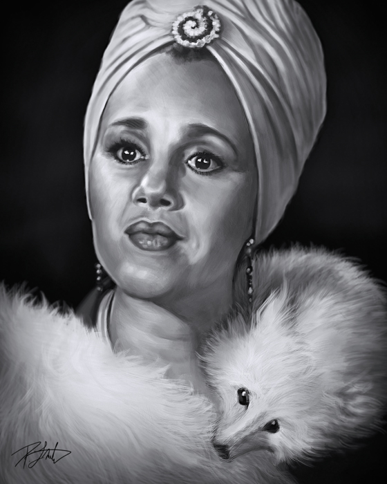
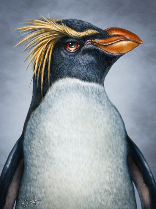
Seems strange that I was excited to have a day to do nothing but paint this morning and then woke to find little motivation to do so.  Just wasn’t feeling it.  While it’s true that drawing and coloring for a living (I love saying that) sounds like the greatest gig going, and it really is, there are some days that it just feels like work.  Editorial cartooning often feels like that, especially when I’m cartooning about a political topic that I really care nothing about, but if it’s making headlines, I have to address it.  Painting, however, is usually the dessert after eating all of my veggies, so it’s rare for it not to be a welcome experience.  This morning, it felt like work, but just as I have to do with cartooning, I plowed through and managed a couple of hours, anyway.

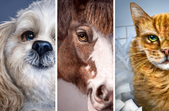
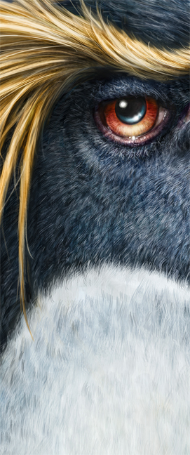
I was inspired to put on the headset and record ten minutes of painting and talking about whatever popped into my head while doing it, though.  None of it was scripted or prepared ahead of time, although I did throw up a quick DVD ad at the end of it.  Hey, we all have to make a living, right?  Obviously, I haven’t shown the full painting here, just a closeup of the head.  At one point, I mistakenly said, ‘radial wheel’ when describing the touch ring on the Wacom tablet.  Like I said, not scripted.

Anyway, hope you get something useful out of it.  Cheers!


Posted on Leave a comment

Wacom Intuos5: The Radial Menu

Here’s the third post about the new Wacom Intuos5 tablet.

I tried to show how to customize the tablet in one video, but it ended up being over 30 minutes long.  Since most of us have trouble sitting still for that long these days, I figured I’d break them up.  The previous one was on the Express Keys and the Touch Ring, while this one is about the Radial Menu.  The third one will be all about the new Touch features on the Intuos5, saving the best for last.

So here’s the second video, hope you like it.  It’s all technical stuff, but if you’re using Photoshop and a tablet in your work, this might give you a couple of tips and tricks to customize your tablet and get the most out of it.  Probably best to watch it at full screen, too.

Posted on 2 Comments

Cartoons and Catastrophe

Somebody asked me if I was going to be doing a cartoon about the 100th anniversary of the sinking of the Titanic.

It’s important to understand that the Titanic has long been one of the most overused clichés in editorial cartooning.  Although I’ve never actually drawn the iconic ship, I’ve put a Prime Minister at the front of a ship referencing the ‘king of the world’ line.  in 2004, I put a submersible at the bottom of the sea, with lights illuminating the words Liberal Popularity on the hull,  talking about the difficulty of raising it.  The ship obviously wasn’t the Titanic, but the reference could be interpreted that way, so I’m willing to concede that as ‘a Titanic cartoon.’

There are many clichés in editorial cartooning, another being ‘the pearly gates’ cartoon.  Somebody passes away and they’re almost always drawn exchanging words with St. Peter at the gates of heaven.  While I have been guilty of picking the low hanging fruit from the idea tree, and using clichés from time to time, I’ve never actually depicted anyone at the pearly gates, and it’s doubtful I ever will.

I’m very fascinated by the story of the Titanic, and have been ever since I was a kid.  While skiing in Kitzbuhel, Austria on a family vacation, (we lived in Germany for many years) my father, sister and I were stranded at the restaurant/chalet at the top when a wind storm rendered the cable car unsafe to take skiers down the mountain.  I think I was 13 or 14.  It became a party atmosphere and we ended up skiing down by torchlight later, but I remember sitting with some very kind University students from Southampton and being fascinated that they were from the same place that had launched the Titanic.   Where the interest came from, I don’t know.

I’ve been to the Titanic exhibit twice, once in Las Vegas, and again when the traveling exhibit came to Calgary.  I’ve seen a number of the movies more than once.  I’m one of the few guys who will admit to seeing the movie in the theatre, not once, but three times.  It just fascinated me to see it all unfold on the big screen, and I’ve always enjoyed James Cameron as a film maker.   While I’m not obsessed with every detail of the story, I do know quite a bit of the trivia.   I’ve got the DVR set to record all of the National Geographic specials this week, and watched James Cameron and crew dissect every last detail last night on how the ship ended up on the bottom looking the way it did.  A forensic archeological  deconstruction of the event, that even had him admitting he got a few details wrong in his larger than life movie.

The London Bombings, July 2005

When bad things happen, it’s difficult to draw cartoons about it.  Even worse is the pressure to get it out quickly, because after all, the goal is to be published in that empty space before a competitor can snag it with another cartoon, one they’re also feverishly drawing at the same time.  I often feel like a vulture picking over the fresh carcasses of whatever unfortunate souls perished in the news event.  Sounds pretty morbid, doesn’t it?  That’s how it feels, too.   How does one draw something appropriate, respectful, and sincere with very little time to mull it over?  When the disaster or event is fresh and acute, that’s the time to get the cartoon done.  I remember drawing a cartoon about the 2004 Tsunami in the Indian Ocean the day after Christmas, because it was big news.

Hurricane Katrina. Found out later that Bourbon Street was largely spared.

If it’s a big enough disaster, like Hurricane Katrina, there will be many cartoons in the days and weeks following, but that first cartoon is the most difficult.  The other goal is to avoid the ‘yahtzee’ as it’s come to be known.  That’s when two or more cartoonists come up with the same idea for the same situation at the same time.  When the twin towers fell on 9/11, a number of cartoonists drew the same images.  The towers as the number 11, with smoke coming from them was one.  Another was tears in the eyes of the Statue of Liberty.  Two of Quebec’s most celebrated cartoonists, Terry Mosher (Aislin) of The Gazette and Serge Chapleau of La Presse, drew the very same image.

I began my syndicated career at the end of September, 2001, so I never had to draw a cartoon about 9/11.

Situations like this, people are hurt, suffering and dying, and I have to draw a cartoon about it.  It’s never supposed to be funny in a situation like that, but the goal is that it be moving, if only a little.  If it’s a major news story, if an editorial is likely to be written, then an editorial cartoon needs to be drawn.  It isn’t something I want to do most of the time, but it’s part of the gig, one I dislike very much.  When somebody famous dies, I have to make the unenviable distinction between whether it’s newsworthy enough to warrant a cartoon.  Was this person important enough that a newspaper will want to highlight it?

These are not my proudest moments.

So what about the Titanic?  The disaster itself was one of the worst of its time.  It shook the world and haunted the news pages for a long time.  Countless books have been written on it, and historians still debate to this day, what happened on that night in April, 1912.   But let’s be fair.  It was 100 years ago.  Had the ship made it to port in New York, everyone would still be deceased today.  A tragedy, yes, but one that needs to be put into the proper historical perspective.

Each year, I have to do cartoons about Remembrance Day, to commemorate the Canadian men and women who’ve lost their lives in this century’s armed conflicts.  It gets more and more difficult with each passing year.  It will often be a respectful image, perhaps of a cenotaph or other memorial, an image of a poppy, and a quotation or a couple of lines.  Over a decade of Remembrance Day cartoons and I’ve realized that I am unlikely to come up with anymore original ideas.  It feels incredibly insincere, and definitely not the tribute owed to the sacrifice.

Remembrance Day, 2011. The cenotaph in Victoria, BC.

If I have a hard time mustering the sincerity for something as important as that, due to the fact that it has become routine, anything I draw to commemorate the Titanic tragedy, will simply be paying lip service, and rehashing imagery that others have already thought of.  If you don’t believe me, do an image search on Google.  I still have a lot of interest in the story, the details fascinate me, but not because I feel anymore for those people than I do for those who perished on the Hindenburg or in the Civil War.  It happened a century ago to people for whom I feel no connection.

The hubris of those involved in the Titanic’s conception, construction and operation caused the demise of the ship.  There is a lesson we’re supposed to learn from the arrogance of believing we can ever conquer the forces of nature.  Aside from a few changes to maritime law, those people died in vain, and therein lies the real tragedy of the event.  We continue to choose to ignore the lessons of history.

I did wrestle with possible images on the subject.  An image of the name of the ship in dark water with an appropriate memorial quote, something nautical perhaps.  Maybe the flag of the White Star Line and some cautionary words about humility.  Took me a couple of days to realize that everything I came up with made me feel like a hypocrite, trying to create an image to stir emotion about an event for which I feel none.

While I don’t always have the luxury of ignoring a news story,  I think I’m just going to let this one go.

Posted on 4 Comments

Wacom Intuos5: Express Keys and Touch Ring

Here’s the second post about the new Wacom Intuos5 tablet.  While my original intent was for these videos to just be reviews, I figured I’d make them more of a tutorial style.  If you’re looking for a review of the new features, I’ll just be up front and tell you that there’s really nothing I don’t like.  In my opinion, Wacom hit it out of the park with this tablet.  I’m really pleased with it.

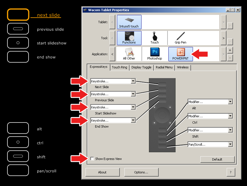
I tried to show how to customize the tablet in one video, but it ended up being over 30 minutes long.  Since most of us have trouble sitting still for that long these days, I figured I’d break them up.  This one is on the Express Keys and the Touch Ring, while the next one will be on the Radial Menu.  The third one will be all about the new Touch features on the Intuos5, saving the best for last.

So here’s the first video, hope you like it.  It’s all technical stuff, but if you’re using Photoshop and a tablet in your work, this might give you a couple of tips and tricks to customize your tablet and get the most out of it.  Probably best to watch it at full screen, too.

Cheers!

Posted on 2 Comments

A portrait of Jim

My buddy Jim and I have been good friends for over 15 years, and last night was his 50th birthday, so another good friend of his and I threw him a party.  Not a huge affair, about 25-30 people, I think,  but a good time sharing laughs with friends.  Whenever I go camping at a lake in B.C.  or to my buddy’s cabin, it’s usually Jim that I’m going with.  He loves taking snapshots of his friends and road trips, and has collected many memories on film over the years.  As he recently bought a new computer, a digital camera wasn’t going to be far off, so my wife and I, along with two other couples went in on a very nice camera, a Canon Powershot SX40, a higher end but user friendly camera, great for high quality point and shoot photos with a fantastic 35X built-in zoom lens.  Came very close to getting him a DSLR, but this was a better choice for someone who just wants to capture memories of people and places, without requiring a ton of photography knowledge.  Along with some other accessories we bought him, he was very pleased with the gift and I’m sure he’ll get a lot of use out of it.

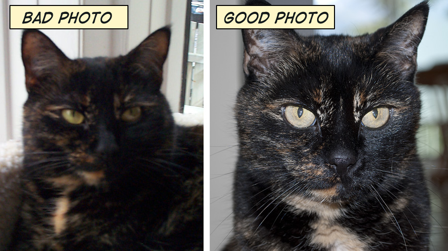
One of the great things about my profession is that on rare occasions, I can create a gift that is unique to me.   While he would have been pleased with the camera alone, I decided that I wanted to paint a portrait for Jim’s 50th as well.  Fortunately, those times you can count on me having a decent camera with me is when I’m out camping or at the cabin, so it turns out that I’ve taken quite a few photos of Jim over the years, and had many to go through.  Only a couple were good candidates for reference photos, however, and I count myself lucky that the one I ended up using was only two years old.

Painting a portrait like this has a few challenges.  Over the years, Jim has had a mustache, a goatee, a full beard and will often alternate between them.  So even though he doesn’t have a full beard right now, he did in the reference photo and he will again in the future, I’m sure.  He’s got a little more grey now than he did a couple of years ago, but I only added in as much as I had to.  After all, he was supposed to like the painting.  While the little details are important, creative license is as well.  My intent was to capture his likeness, but more importantly, his personality, and I think I did that.  As is my nature, I obsessed over the details on this one, as I’ll have to see it for years to come, but I was very pleased with the finished work, and it looks great on canvas.

As much as I’d love to be able to paint portraits for a few other people, the reality is that Jim is probably the only one for whom I could have done this, as most of the time, I’m not snapping photos of people on a day to day basis, and certainly not with anything better than my phone.  If I suddenly started taking head-shots of my friends with my DSLR, it would be pretty obvious to any of them why I was doing it.  This is also the reason I had to rely on photos I already had, so as not to give it away.  This was a unique gift that I was happy to give, and one I’ll unlikely be able to do for anyone else, at least not anytime in the near future.

The background for the portrait is Cleland Lake in B.C., a forestry lake that we’ve been going to for many years, Jim for over two decades.  That particular view is from his favorite spot on the lake.  The painting was printed at 12″X16″ on canvas and framed, and he really seemed to like it.

Posted on Leave a comment

A nice mention in Photoshop User

It was pointed out to me yesterday that I received a mention in the April issue of Photoshop User magazine regarding my article on brushes in last month’s issue.  Pete Collins, one of the NAPP Photoshop Guys and an all around great guy (don’t tell him I said that) was kind enough to give a tip of the hat to my tutorial in his current feature, “What Would MacGyver Do?”  (April issue, Page 46)   Pete’s article is a very interesting read that talks about different resources and solutions available to designers in Photoshop when faced with a tight deadline and a limited budget.

Posted on 3 Comments

Welcome to the Wacom Intuos5 Touch

One of the things that sometimes irks me about product reviews is that they can often end up being many pages long and nobody really has that kind of time anymore.  With that in mind, I thought I’d talk about my new Wacom Intuos5 tablet in a few different blog entries, this being the first, partly because I need to use it for a little while before writing about the new features in detail.

Anybody who reads this blog, has watched my DVDs or heard me talk about my work knows that I’m a big fan of Wacom tablets.  In fact, without a tablet, I couldn’t paint the way I want to paint.  I’m usually pretty ‘live and let live’ when it comes to painting software and when people ask about Painter vs. Photoshop or other choices out there, I’ll usually say to try a few of them, and see what you like best.  But when it comes to hardware, you absolutely need a tablet to draw or paint digitally, and Wacom is the gold standard.

I’ve had a number of different tablets over the years, my first one in the late 90’s.  That was the first generation Intuos 4X5 tablet, and it worked so well, that despite changing nibs and a couple of transparent overlays, the only reason I upgraded was because I’d bought a new computer.  The original Intuos had a 9-pin connector and the new computer only had USB ports.  But that original Intuos tablet never failed me over many years.

In addition to that tablet, I had a 4X5 Graphire for my laptop.  Since then, I’ve had a medium Intuos3, a medium Intuos4, a small Intuos4, and a Cintiq12wx.  The Cintiq12wx  may be smaller than the latest massive 24″ HD Cintiq (which I am currently saving up for), but it’s a great tablet for live painting demonstrations.  Sometimes, when I’m tired of working in my home office, I’ll often set up in front of the TV in the living room with the Cintiq and paint while watching a movie, too.  The small Intuos4 has always been a great travel tablet, and since I worked on that size for years at the beginning of my career, I’ve never felt hindered by the smaller work space.  If I needed to, I could still do all of my work on the small size tablet today, even the paintings.

But the tablet that fits right into the Goldilocks zone (just right!) is the medium sized Intuos.  A few years ago, when I heard they were launching the Intuos4, I remember thinking that my Intuos3 was just fine.  Why would I bother upgrading?  Of course, once I saw the  new configuration of the Express keys and the Touch Ring, not to mention those pretty blue LED lights, I knew I’d be getting one.  The Intuos4 medium has been my day to day tablet every day since it was launched in 2009 (has it been that long?) and to be honest, I’m a little sad to see it go.  It has now been relegated to my laptop bag, and I’ve donated my small Intuos4 tablet to a graphic designer friend who didn’t have one yet.

I’ve been watching videos online and read some reviews about the Intuos5 before mine arrived, so there were really no surprises about the new features.  However, hearing about it and watching somebody else talk about it pales in comparison to actually using it.  Even though I’m not going to show pics of me un-boxing the thing, because it’s already set up, one of the things I do like about Wacom products is the packaging.  The devices themselves have always felt sturdy and I’ve never questioned the quality of the materials.  But when a product arrives in slick looking packaging, it makes you feel just a little bit better about your purchase, and this tablet came in a very nice, well designed box that almost looks like a case.

All of the individual pieces, as few of them as there are, were well wrapped and configured inside.  The tablet, connection cord, pen, and pen holder (which contains ten spare nibs of different design), along with the documentation, are all that you need.  The physical look of this tablet has changed, as should be expected, but the texture of the materials is also different, although the pen itself feels pretty much the same.  The main body of the tablet now has a bit of a rubbery feel to it.  Not as pliable or spongy as the pen grip, but not the typical hard plastic of most computer components either.  This rubbery surface now completely covers the express key buttons and most of the touch ring, and the LED lights are absent.  A little disappointed those are gone, because I kind of liked them, but I really like the look and feel of this new design.

The main drawing area feels different to me as well, a little more textured, but still smooth enough for easy pen movement.  Not that I’ve ever disliked a tablet surface, but I think I prefer the way the pen feels on this surface over any that I’ve used before.  I’ll reserve my final opinion on that until I’ve spent some real time painting with it.

Apparently I’m a slow learner.  When Wacom first announced the Intuos5, I once again thought, “What could they have possibly done to make it better than the Intuos4?”

Well, they added touch features.  In my mind, that changes everything.  After downloading the new driver from the Wacom site, and restarting my computer, all of the new touch features on this tablet came to life.  I’ve never really liked track pads on laptops, as I found them too small.  What the touch features have done on this new tablet, however, is turned it into a BIG track pad, and it’s great.  I normally use the pen to navigate my way around the computer, no matter what program I’m using.  Now, I’ll only need to pick up the pen when I’m drawing and painting.

After an initial exploration of what each of the touch features does in the Tablet Properties and testing them out in Photoshop, I don’t mind admitting that I might have giggled a little.  I’m such a nerd for this stuff, and I can see having a lot of fun learning how to incorporate these new touch features into my workflow.  The whole goal with a tablet, at least for me, is to eliminate using the keyboard at all.  I’ll have to spend some time configuring and using the new features, but that’s what I’m aiming for.  I’ll talk about setting up those features in the next blog entry on this tablet, and I’ll include some video.

First impression, I love this thing, but I never expected not to, having never been disappointed by a Wacom tablet.  More later once I get a better feel for it, but right now, I want to get painting.

.

Posted on 2 Comments

Photoshop Quiz Game by Dave Cross

Awhile ago, I was commissioned to draw a caricature cartoon of Dave Cross for his new app, “Photoshop Quiz Game” which will be released today.  Many of the people who travel in my circles will need no introduction, but Dave is an author, trainer, photographer, one of the original NAPP Photoshop Guys, and owner of Dave Cross Workshops in Tampa, Florida.  Best of all, he’s Canadian.

The designs have been completed for some time, and as is normal for commissions of this nature, I’ve had to keep them to myself until now.  This was a fun project, so I’ve been anxiously waiting to share it.  Working with someone who knows Photoshop REALLY well helped a lot, because I could leave pieces on different layers, use layer styles, and provide options in the file without having to explain how to use anything.  Not only did this allow me to design a more versatile file, but it offered choices to Dave that other clients might not be able to benefit from.

For example, I offered two different head sizes.  Some people like the really large bobble head caricature noggins while others want the smaller.  Personally, I liked the smaller size, and judging from the launch site image, looks like Dave did, too.  There were four bodies to choose from, separated on their own layers, and the circular ‘shadow’ under the feet was a separate layer as well.  When I use shadows like this, I often like to set the blend mode of the layer to ‘Multiply’ so the background will show through.  From a screen shot I saw, looks like Dave did that, too.

While I haven’t seen the full app yet, I’m looking forward to seeing how the caricature was used throughout.  For more info about Dave’s training, the launch of the app today and more, visit his website at www.dcross.com or you can follow him on Google+, Twitter or Facebook.


Posted on 2 Comments

The proof is in the printing

Spent a couple of hours at ChromaSurge in Calgary yesterday morning.  This is a small business print shop that handles all of my canvas and matted paper prints.  Kelly (the owner) was recommended to me by another Canmore artist.

There’s a lot to learn about printing, even when you’re not doing it yourself.  There are so many different types of machines, canvas, paper, coating, stretcher materials, and frames.  As I have no interest in trying to be a jack of all trades, I don’t do any of my own printing.  Recently, my printer (the guy, not the machine) bought some new equipment, canvas, paper, and inks.  Part of me, the part that doesn’t like change, was thinking, “Hey, my prints looked great, why are you messing with the formula?!”

The other part of me, however, was thinking, “He who refuses to adapt, dies!”

That is true of so many professions these days, and I plan to be doing this for a long time.   I made an appointment with the printer (again, the guy, not the machine) to reproof all of my current prints, and set to seeing how I could make them better on my end, in preparation for them being better when they came out of the printer.  One of the things I noticed with my prints was that some of the shadows were a little too dark, not something many people would notice, but when you spend as much time painting the details as I do, you don’t want to see them lost.  So I lightened them all up a bit, just some simple adjustments in Photoshop.  The lighter versions don’t look the way I want them to on the screen, but they look just right on paper.

Many digital artists and photographers become frustrated that their images don’t look the same in print as they do on their screen.  No matter what they do, they can’t make it happen.  Even with a professional color calibrator, the right printer profiles, and technical adjustments up the wazoo, it never quite gets there.  The reason is that a screen is back-lit while paper and canvas are not.  Therein lies the difference and it’s a HUGE difference.  Took me years to make peace with that.

As in all things, you do your best, and you make compromises.  You get your images to look as good as you possibly can and let go of perfection.  Those of you who know me well probably don’t believe I can do that when it comes to my paintings, but when it comes to prints, I actually can.  I know that nobody sees the imperfections the way I do when it comes to my own work, and that’s true of almost every artist I know.  We’re our own worst critics.  That’s a good thing, because it means you’re always going to try to become better at what you do.

One of the ways I try to compensate for the back-lighting  issue while painting digitally is that I have two monitors.  For Photoshop, one is my painting screen, and the other is for all of my tool palettes.  My Wacom pen is set to just go between them, so it actually acts like one big monitor.  The painting monitor is calibrated.  I use the Eye-One calibrator but there are others out there just as good.  The brightness on the monitor is also set to 13.  Yes, that’s 13 out of a possible 100.  If that seems way too low, trust me, you get used to it.  It minimizes eye strain for long periods of computer work, and also allows me to paint in more subtle shades and tones because I’m not dealing with harsh contrast.   When a painting or cartoon is done and looks good, I’ll often move it over to the other monitor, which is set a lot brighter and is NOT calibrated.  This way, I know how it’s going to look on other screens.

It’s a cheat, and one that works very well for me.  Because of working this way, there is much less of a screen vs. print shock.

My printer (the guy, not the machine…do I need to keep saying that?) takes the time to make sure I’m happy with the product he’s delivering, and good service is worth paying a little more for, especially now that it seems so rare.  When I told him that I wanted to reproof everything, and that I wanted to do it while I was there in his shop so we could talk about the results and I could ask some questions, he was fine with it.  I had all of my current paintings copied and pasted to one image that measured 18″X36″, which meant each image was around 5″X7″, just large enough to see what I needed to.    First it was printed on canvas, after which Kelly spray coated it so I could see what it would really look like when it was done.  Then he ran the same file on paper, because I sell matted prints in the galleries as well.

The difference between the two materials is that canvas has a natural texture to it.  It’s bumpy because of the weave of the fabric.  That adds a little more light and shadow, as does the protective coating.  The colours appear more saturated and richer, and there appears to be more depth in the image as a result.  I love my work on canvas, even more than on screen.  The paper prints have a flatter look, and although there isn’t a ‘shine’ to them like canvas, the quality is great, the colours are very nice and I’m very pleased with them.  With a sharp looking black mat, they pop.  But canvas is better, which is why it costs a fair bit more, both for me to have printed and for the customer to buy in the gallery.  And neither of them look like the other or like they do on screen.  Not better or worse, just different.  This photo doesn’t even capture what the canvas really looks like.  It’s just something you have to see.

I was very pleased with the prints and glad I took the time to go in and get the proofs done.  Cost me a bit of money for the ink and materials, not to mention taking the morning off from drawing and painting, but in the long run, it was a valuable use of my time.  My printer (really?  again?) also knows for a fact that I’m happy, so that likely makes him feel that he’s done right by his client.  Even better, he printed off a copy for himself so that whenever I order prints, he now has an approved standard to compare against, and so do I.  We have a baseline with this canvas, paper, ink and machine.

Like I said, I was already happy with my prints, but these new ones have just a little more spark in them.  I doubt that others will notice it, but I do, and that matters because it makes me feel better about the product I’m selling in the galleries and to my commission clients.  When new and better materials come along, we’ll have to do it all over again, and it will be worth it.

Posted on Leave a comment

Chase

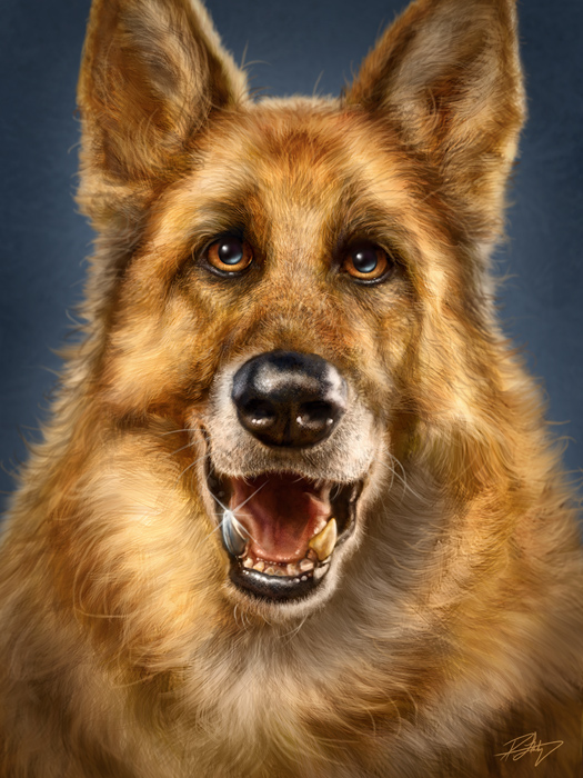
Meet Chase, a German Shepherd who was an absolute joy to paint.  Chase spent his youth in Schutzhund Training.  I had to look it up, but according to one site, “Schutzhund is a German word meaning “protection dog.” It refers to a sport that focuses on developing and evaluating those traits in dogs that make them more useful as breeding dogs and happier companions to their owners. “

Chase has a stainless steel hip and two titanium teeth, apparently due to the competitions and excesses of his youth.  He is now happily retired, but according to his owner, ‘studly-looking nonetheless.”  It is obvious this dog is well loved and all of the reference photos showed a happy looking 10 year old dog, who is quite big when shown beside other dogs.  The client wanted one of those titanium teeth to be visible in the painting, and rather than a portrait style, he wanted my signature Totem style that I use for my wildlife paintings.  I was more than happy to oblige.  In the end, the client was very pleased with the final painting, as was I.

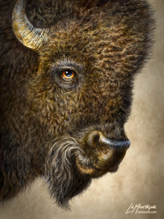
I hear from a lot of people asking about how I paint fur, and which brushes I’m using.  The brushes themselves aren’t complicated.  I go through the process in detail on my painting DVD from PhotoshopCAFE and recently wrote an article explaining their construction for Photoshop User magazine.  As much as I would like to say that the secret to these paintings is in the fur, I honestly don’t find that part of it difficult, anymore.  Having done many animal paintings, I’m very comfortable with using the fur brushes.  While it still takes many long hours to get it right, painting the fur is the easy part.  Getting the likeness is tough.

Sure, it’s a dog, but anybody who has shared their life with a pet, will know that each one’s face is as distinctive as any other family member. The owner will know if it’s wrong.  Dark and light areas of fur, lines in the right places, shape of the head (even in caricature), and a number of other little nuances contribute to whether or not the painting is going to be accurate.

It is likeness that causes me the most stress when working on a portrait or caricature of an animal.   Throughout the painting process, I alternate between feeling like I’ve got it right, and knowing that I’ve got it completely wrong.  When it’s wrong, it’s incredibly frustrating because I’ll often have difficulty seeing where the problem lies.  That’s often a cue to walk away from my desk, even if just for an hour, in order to let my mind reset.  When I come back, I’ll often instantly see what the issue is, and then I can get to work fixing it.

I worked on this painting off and on for the last month, in and around my other daily deadlines.  After a nine hour session on Saturday, I got through the best of it.  When I decided to call it a day,  I couldn’t save copies of it to my external drives fast enough, just in case the unthinkable happened.  A couple more hours very early Sunday morning, and it was signed, saved and delivered.

For the technical folks, this was painted in Photoshop CS5 using a medium size Wacom Intuos4 tablet, and photos were used only for reference.  The final image dimensions were 18″X24″ at 300 ppi, and at one point the working file size was just shy of 500MB.   As for how long this took to paint, I honestly have no idea.  But I do know that most of it was a lot of fun.