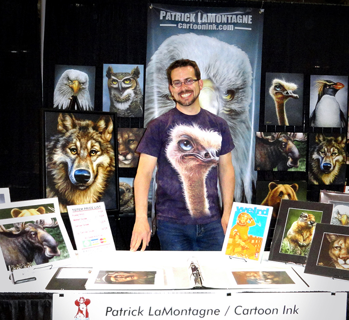
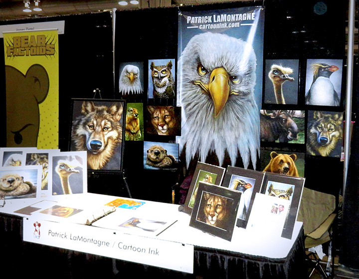
 This weekend found me running my first retail booth at the Calgary Comic and Entertainment Expo. All day Friday, Saturday and Sunday, I was selling my wares to attendees of the second largest event of its kind in Canada, along with many other artists and vendors. As this was my first ‘con’, here’s a bit of a review to show how the reality of the experience met with my expectations.
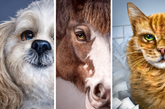
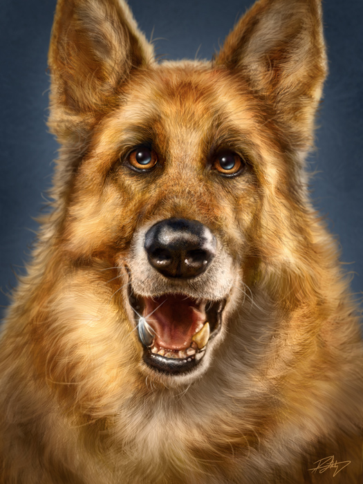
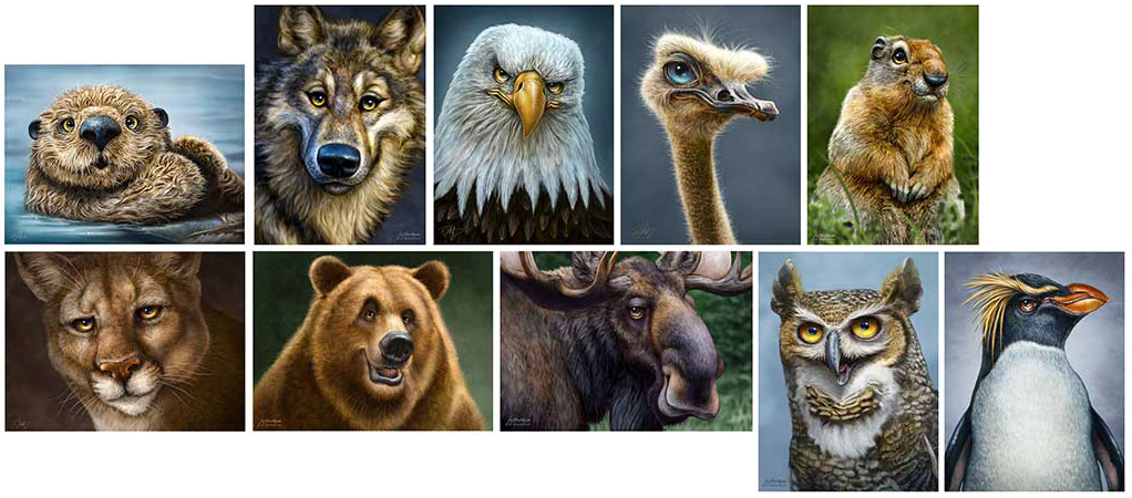
At this event, I was selling prints of ten of my original creations, my Totem paintings. I prepared as best I could by reading blog entries and articles online by those in the know. A talented animator friend, Jennifer Llewellyn has had a booth at this Expo six times now and she graciously shared a lot of information with me both before and during the event. There’s a distinct culture at this sort of show and as I’d requested a booth beside hers when I registered, Jenn served as my guide throughout and was a big help to me.
The first year is where you’re going to spend the most amount of money if you want to do it right. I wasn’t content to have a booth that looked bargain basement as many will do to save on expenses, so I put my best foot forward. I bought retail grid walls that stand on their own, had a professional banner printed, bought bins to hold my prints, and other assorted retail hardware. For product, I offered poster prints for $15.00 apiece, with backer board, artist bios and cellophane sleeves. I also offered the usual matted giclée prints for a discounted show price of $35 (regular $44) and my limited edition 12″X16″ canvas giclée prints at a discounted show price of $220.00 (regular $295.00). As this was my first foray into the show, I had no idea how much inventory I would need. Considering that I regularly keep prints on hand for online sales and supplying the local retailers who sell my work, I figured I should aim high, so that anything I didn’t sell would just become part of my regular inventory, stock I would need anyway.
Last year, this Expo experienced some significant growing pains. The Fire Marshall essentially shut it down on the Saturday of the 2012 event, as there were far too many people inside the venue. Many who had bought tickets and waited in line weren’t allowed in and others who had just stepped outside for some lunch or some air were locked out for the duration. I was on a research trip to this event last year, and I experienced the lockout firsthand. Our weekend passes became null and void early Saturday afternoon. This year, they capped the number of tickets at close to 60,000 and sold out well before the Expo itself, increased the size of the venue, and vowed to fix all that went wrong with last year’s event.
So how did it go? Well, lets start with the cons of the con, from this vendor’s point of view.
My only reference to how things should have gone was from other artists who had done this event before. As the weekend wore on, a number of them said that this was one of the slowest years for sales. Saturday is supposed to be one of the biggest and best selling days, and yet even though I was in a good location, there were hours on Saturday afternoon (yes, hours) where it felt like a ghost town in our corner of the world. The first two hours of Sunday morning were exactly the same. Quite discouraging as I was looking at the many prints still sitting in bins in my booth, wondering how many of them I was taking home with me. Speculation seemed to be that because they had spread the celebrity guest signings and panels out to other buildings and with the limited ticket sales, many people didn’t make it to the vendor booths in the small press section (where I was located) or if they did, they didn’t make it back when it came time to make their purchases.
A big question mark was whether or not I was even in the right place to sell my particular brand of artwork. Here was a typical situation my wife and I noticed throughout the weekend. A person would walk up the aisle in front of my booth, scanning left and right as they walked. When they saw my work, they’d smile or laugh, say something like, “Oh, cool!” or “These are great!” They’d come over to the booth, look through my book, ask questions, and appear thoroughly engaged with the work and have many complimentary things to say. Then they’d often say “Thanks” and wander off to the next booth or say, “I’ll be back later on.” Both my wife and I have worked in retail years ago and have experience with the ‘just looking’ crowd but when the reactions seemed very genuine, we couldn’t figure out the reluctance to buy by many of the enthusiastic visitors. Money didn’t seem to be the issue as our pricing was comparable to the wares of many other artists. One of the most common comments we got was that my work looked like nothing people had ever seen before. As an artist, that’s a great thing to hear, but whether or not it also prevented them from buying it because they didn’t know where to put it, who knows?
One quirk of this con is that when people had multiple day passes, they didn’t want to be carrying their purchases around with them all day, so they said they’d come back later in the day or on Sunday to buy. Anybody who has ever worked in retail knows how that goes. One way around that was we offered to hold on to their purchases until they came back for them and that did work for a few of them, especially one woman who bought a canvas print of the Ostrich Totem. Others, however, just never came back.
Something that really began to annoy us as the weekend wore on was cellphones. We easily had half a dozen potential good sales ruined by somebody getting a text or phone call while they were talking to us. The phone would distract them and they would wander off while taking the call. Or if they stayed at the booth, following the call or text, their entire demeanor changed, as if that distraction had broken the spell of their interest. Cell phones are not your friend when you’re trying to make a sale.
These were the less than ideal parts of this show, but now I’ll talk about all of the positives that came from this event.
There was a noticeable difference in the organization level of this event this year. There were a lot of volunteers, all of whom were exceptionally helpful, friendly and receptive to feedback. We heard nothing but good things from attendees and vendors with how well the folks at the Expo handled everything this year. They really should be commended on how they turned lemons into lemonade following last year’s event and I personally made a point of thanking a few volunteers for their efforts and I noticed a number of other vendors did the same.
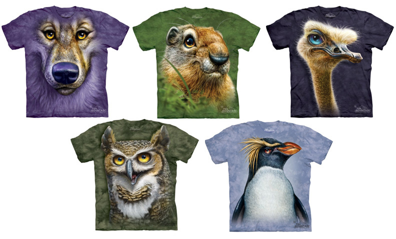
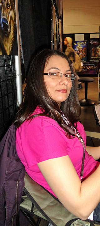 First and foremost, there is no substitute for experience, and the amount I learned about trade shows and expos this weekend is immeasurable. It was truly an education, one that was quite enjoyable. One of the best parts of this event was that my wife, Shonna worked it with me. She even wore her two Ostrich Totem shirts proudly on Friday and Saturday. The pic at left was Sunday. Her opinion and insights are always of value to me and the fact that I didn’t have to come home and try to explain everything to her is a relief. She went through it all with me, saw and heard everything I did and worked just as hard. Her help and support was incredibly valuable to me at this event. I could have done this without her, but I wouldn’t have done it nearly as well and it wouldn’t have been as much fun, because yes, as hard as we worked, it really was a good experience for both of us.
One of the benefits of having a booth at the con is that even though we didn’t get to see as much around the venue as I would have had I been an attendee, eventually a lot of the people came wandering down to our end. So, we still got to see many of the creative and elaborate costumes, a highlight of this show for many.
Neither Shonna nor I are big on crowds at the best of times. While I have plenty of experience in sales and working with people, having worked in retail and hotels before I was a full-time artist, these days I spend the majority of my working time alone in my office and I quite enjoy my solitude. But having a booth at a show, you have to be ON all the time. Smiling, laughing, saying Hello and making eye contact, inviting people in, being friendly and engaging, making people feel welcome to come and look at your wares, answering the same questions and telling the same stories over and over again for three days straight. I wondered if I still had it, and thankfully I did. Best of all, I really enjoyed myself and so did my wife. The people were the best part of this Expo because they were all there to have a good time. Even if they weren’t buying, it was fun to talk with them, hear their thoughts, and explain my work to them. Everybody I talked to seemed to really like my paintings and style of artwork, which was a nice boost. Every artist wants to find their own look and I’ve successfully done that.
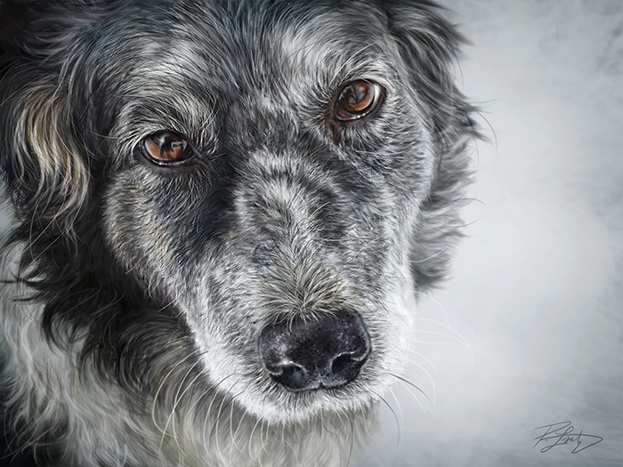
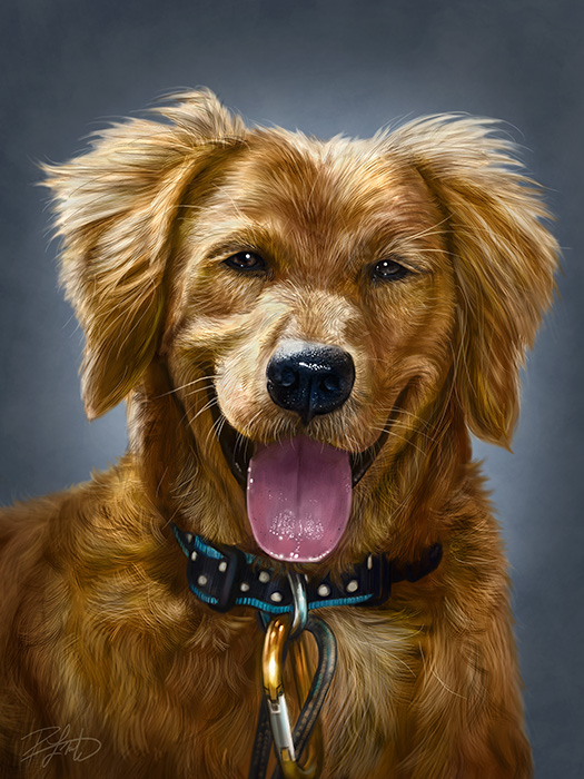
Commissions! We couldn’t believe how many people asked about commissions of their pets. While many seemed content to just take a card, Shonna had the bright idea to start taking email addresses from those who made inquiries and today I’ll be sending a lot of personal messages to people with the blog entry link that explains all of the information about commission work. If even a small percentage of those who inquired take the plunge, I’ll be busy painting custom pet portraits for a long time.
Suggestions! It is very clear that a panda and giraffe need to be added to my Totem list. A number of people asked if I had those paintings. Others I found intriguing were a Hedgehog, Alpaca or Llama, and a Lizard. All of these would be enjoyable to paint and add to my funny looking menagerie.
Networking! We spoke to many other experienced trade show and expo artists who were very happy to share the information they’ve gathered. One couple who attend many of these shows as vendors stood at our booth when it was slow and took Shonna and I to school. They told us which shows were profitable, which ones were not, which ones were expensive and vice versa. We honestly didn’t meet anyone who was in a bad mood or wasn’t genuinely willing to share information with us and we tried to do the same. There is a thriving community of professionals and amateurs on the show circuit and we were welcomed into it.
Validation! Everybody is warned to have cash on hand to purchase items at the show. Most vendors will not have the ability to take credit cards. I went with the Kudos system, however, so I could take credit card payments on my iPad and I’m glad I did. More than half of my sales were credit card transactions. I would not have sold the canvases I did had I only taken cash.
People really did seem to like my work. We got used to seeing big smiles and exclamations of, “Oh, look at these!” and “These are wonderful!” from people. They would also say things like , “they look real, but cartoony. How do you do that?” And best of all, the adjectives. Everybody sees something different in the expressions of my Totems and since I have no idea where the personality comes from as I paint, nobody is wrong. The same Totem would be called, ‘sarcastic,’ ‘angry’, ‘scary,’ ‘mischievous,’ ‘happy,’ and ‘goofy,’ among other things. They would tell me and others what the Totem was thinking. “Oh he’s thinking, don’t worry, I’ll eat you quickly,’ and ‘what are you lookin’ at?” I loved it.
On Sunday, a gentleman approached me about licensing my Totems for a specific line of products (that’s all I’ll say for now), took me to his booth, showed me what he was talking about and I was very interested. I’ll be talking to him again today via email. Best of all, some of the work on his products was that of another artist at the show, so I went to her booth and asked her opinion of the arrangement. She gave a ringing endorsement, so I can go into these negotiations with a better understanding of the person and company I’m dealing with. Apparently this sort of thing happens at a lot of these events as well. And the reason I was approached? He had never seen anything like my work before.
To sum up, having a booth at this Expo was a LOT of work and expense, both in prep and at the venue, but it was well worth my time. Because the Internet and social media is so much PR and hard to tell where the truth lies, I’ll be honest. While I still came away with good sales, I did not make money at this event, but both Shonna and I are fine with that. The reason is that the first year is the most expensive and costs range from buying the prints and retail hardware to food and lodging and other expenses, all of which have to be considered on the balance sheet. I brought WAY too much inventory, but only because I had no way of knowing where to draw the line, having never done this before. I’m so glad I didn’t try to sell T-shirts and postcards as well this first time out. The great thing is that none of the inventory goes bad. It sells at the Calgary Zoo, About Canada in Banff and in my online store on a regular basis. All it means is that I have plenty of stock for awhile and I don’t have to buy anything in the near future. So I didn’t really lose any money, especially because I didn’t go into debt for this show. All of my expenses have been paid, so this wasn’t a hardship.
In the end, this was an investment in experience. The knowledge we now have could not have been learned without taking the risk and it was well worth it. Was this the right venue for my work? I still don’t know. Will I do this particular Expo again next year? I’m still thinking about it, leaning toward the affirmative, but I still don’t know. Sometimes a first year or two is required just to get people to know your work and develop a following. Will I be doing other trade shows like this to test the waters? Most definitely, especially since I already have the booth fixtures at hand. We’re already looking at a number of possible venues and figuring out our next move.
We came away from this event with a lot to think about and I’ve taken a new step in marketing my work. Best of all, I took another risk and that’s the only way to move forward. In the next couple of weeks, I’ve got a fair bit of post-con work to do from emailing potential clients about commissions and negotiating a licensing deal, not to mention reassessing the inventory I have in stock and figuring out the best way to make use of it. It was a really good weekend and I’m glad I did it.
Even before this show, I had a lot on my plate, so right now, it’s back to drawing and painting, which is what got me into all of this in the first place.

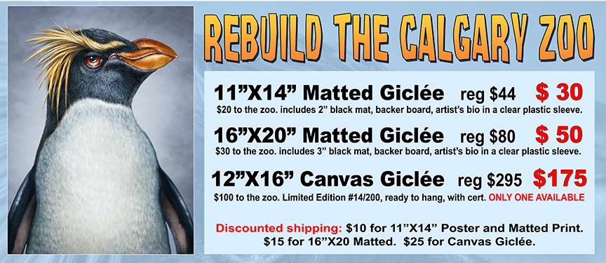
 The flooding in June of this year was the worst disaster in Alberta’s recorded history. One of the casualties of that flooding was The Calgary Zoo. The closure of the zoo has resulted in layoffs of the majority of the staff, a significant loss of revenue, relocation of some animals to other cities and a massive cleanup and fundraising effort.