Posted on

Raccoon Totem

RaccoonTotemHere’s the last painting of the year and another addition to my Totem series.  At present, I’ve got about eight to ten animals waiting in the wings to be painted.  I’ve had the reference photos for a number of them for quite some time and even though I don’t have an order in mind, it just seems that each gets their turn whenever it feels right.  I had not expected to be painting the Raccoon Totem this year, but when choosing which would be my last painting of 2013, I went through the different folders and reference images, and it just seemed the right time to paint this one.

Whenever I try to manipulate which Totem I’ll paint, whether it’s for commercial reasons or a request from the gallery, I never feel completely good about it.  I learned a while ago to just paint whichever one feels right for the time I’m ready to start a new one and my best work will come through.  This time, it was the raccoon, and (say it with me)…I had a lot of fun with this one.

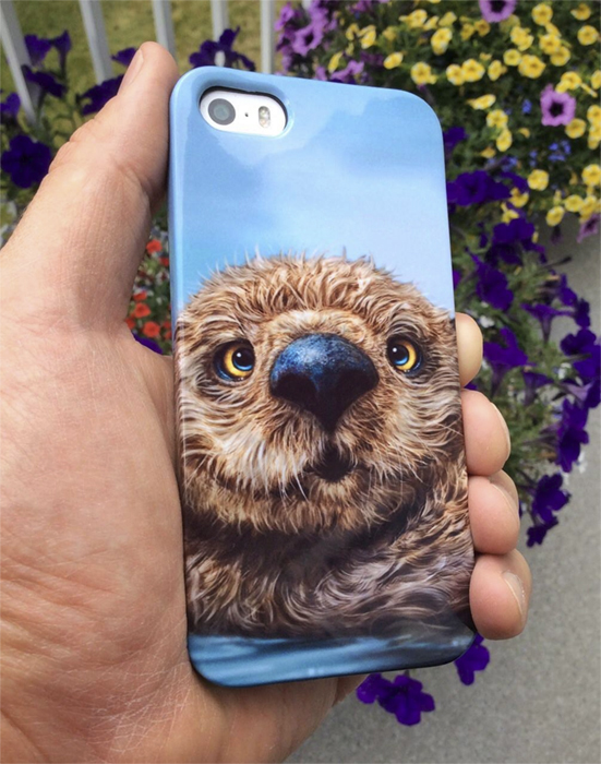
There appear to be new challenges with each Totem, whether it’s features or fur and for this one, the fur and hair was different.  It wasn’t particularly difficult, but the wiry raccoon hair is unlike any of the animals I’ve painted before.  Just as the Bison and Otter Totems required me to paint hair a little differently, the Raccoon required me to paint on more layers than I normally would, in order to get that deeper layered look I achieved with the hair in this painting.  I’m pretty pleased with how it turned out.

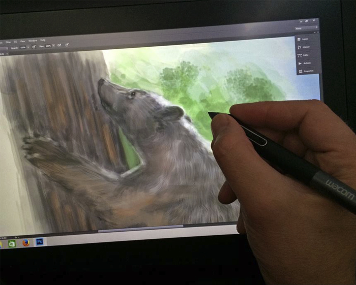
RaccoonCloseThis was painted on both the Wacom Cintiq 24HD and Wacom Cintiq 13HD displays, using Photoshop CC.  No photos or overlaid textures were used in this image, it was all done with brush work.  I don’t keep track of how long it takes to paint these anymore, because I usually spend an hour or two here and there over a two or three weeks when my other deadlines allow it.  As always, I relied on a few reference photos for this painting and would like to thank my friend Susan Koppel who provided me my main reference for this Totem.  Susan takes wonderful pet portraits, and also donates her time to her local Humane Society in Nevada and you can’t help but want to adopt all of the pets she photographs as she makes them look their absolute best.  Rather than me ramble on about her skill and talent as a photographer, check out her website and you’ll see for yourself.  You can find her at susankoppel.com

Happy to end the year with a Totem painting and looking forward to painting a lot more of them in 2014.


Posted on

Commission – Duke

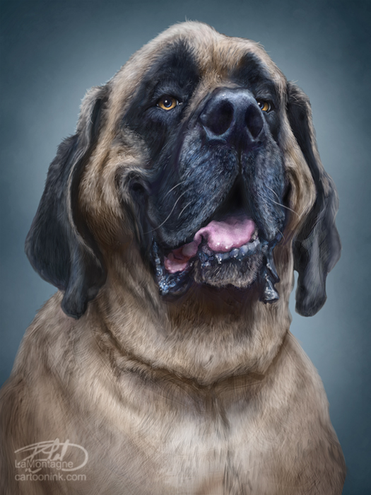
DukeMy latest commission, this is Duke, painted in my Totem style.  While I often like to post work-in-progress shots online with paintings I’m working on, the first look at this one is the final image.  As it was a birthday gift for the client’s wife, and the client is also a friend, there was a slim chance that she might see it online and recognize it as her dog.  Let’s face it, ruining a surprise is just bad for business.  This was completed at the end of last month then sent off to my printer in Calgary.  The final print was a giclée on canvas, 18″X24″ with a shadowbox frame.  Shipped to Dallas, it arrived yesterday and thanks to the magic of online video, I was able to see the reaction when it was opened.  That’s just icing on the cake.

I know I say this a lot about paintings, but this was  a lot of fun.  I had a number of reference photos to work from and the client chose my exaggerated caricature Totem style of painting over my portrait style and I really enjoyed painting Duke with his happy goof expression.  It’s true that I enjoy both painting styles in which I work and I allow clients to choose which one they prefer for their image, but the Totem style is my favorite.  I laughed out loud a few times while painting this image and am glad I finally get to share it.

For those who like the tech details, I painted this digitally in Photoshop CC using both a Wacom Cintiq 13HD and a Wacom Cintiq 24HD display.

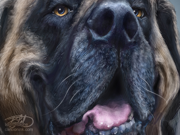
DukeClose


Posted on

The Highlights of 2013

All things considered, I’m pretty happy with the work I accomplished in 2013.  I wanted to focus more on painting, so I turned down more illustration gigs than I accepted this year and about that, I have no regrets.  Along with the daily editorial cartoons, I worked on a number of pet portrait commissions, added more Totem paintings to my portfolio and managed to squeeze in a couple of portraits of people, too.  Regardless of subject, each painting was a thoroughly enjoyable experience and as soon as I finished one, I was itching to start another.

If I were to choose the top three personal highlights of this year, they would be two portraits and one Totem.

MartinSheenAt the very end of 2012, my painting of Martin Sheen as Tom from the movie, The Way, had come to the attention of his son, Emilio Estevez, who wrote and directed the movie.  I had tagged him on Twitter, but didn’t really expect anything from it.  Much to my surprise, he contacted me the same morning asking about buying a print, then the original.   He said, “…the image is gorgeous and you have captured my father in a way that few have.”

Over the next few weeks of back and forth and having the canvas produced, it was delivered to Estevez at the beginning of February and he gave it to his father as a gift.   I had asked them both to sign a paper print for me as well, which I’ve now framed and have hanging in my office.   I was pleasantly surprised to later receive a copy of their co-written book ‘Along the Way,’ personally signed by both of them and a ‘Thank You’ note from Estevez.  The card is still tacked to my bulletin board.  What can I say, I’m a fan.

While the story received some attention in a number of media outlets, that sort of thing is fleeting and in the long run, just another blip in a rapidly changing entertainment news cycle.  But, what I enjoy most about the experience is that each time I come up the stairs into my office, the first thing I see is the signed painting and it frequently makes me smile.  It is still one of my favorite pieces both for the enjoyment I had painting it and the story that goes with it.  And I still love that movie.

ChrisHadfieldIn the Spring of this year, astronaut Chris Hadfield became the first Canadian to command the International Space Station.  With his daily tweets and seemingly endless supply of jaw dropping photos taken from a place few have ever been, he captured the imagination and excitement of the world, including me.  I was inspired to paint his portrait and was thrilled when I received a complimentary tweet from space from Hadfield himself.  If that weren’t enough, I drew an editorial cartoon about his taking command and in the toon, I mentioned Flin Flon, Manitoba.  This prompted an interview from that town’s local paper which again caught the attention of Hadfield and I received a second short message from the I.S.S..  Apparently all it takes to make a 43 year old man feel like a ten year old kid again is getting messages from an astronaut in space.  That was just cool.

CoyoteTotemFinally my favorite painting from this year was the Coyote Totem, because it’s one that’s been waiting to be painted for 20 years, even before I knew how to paint.  For reasons I don’t wish to share publicly, and couldn’t even explain if I did, this is the most personal of all of the Totems I’ve painted and the only one I’ve had printed on canvas and framed for myself.  It hangs in my office on the wall to my right, where I can easily see it.  I look at it often and it reminds me how fortunate I am and how I got from there to here.

I just wasn’t skilled enough to do it justice until this year, but of any image I’ve created, it’s the painting I love most.  And I’m grateful that the personality showed up.

BillParrish

I would like to give honourable mention to my most recent portrait of Anthony Hopkins as Bill Parrish from ‘Meet Joe Black.’  This was another personal painting because I did it just for me.  I started the year focused on a painting of a character and actor I admire, an image that got a lot of attention and ended the year with a painting of a character and actor I admire, an image that got very little.  And yet, I loved working on both portraits equally, the work itself brought me the most joy.

That’s the lesson I learned this year and the one I’m taking into the next.

Posted on

Anthony Hopkins – Portrait

BillParrishMy latest painting of the character William ‘Bill’ Parrish, played so brilliantly by Sir Anthony Hopkins in the film, ‘Meet Joe Black.’

I’ve mentioned before that I enjoy painting characters from movies, rather than just the actors who play them.  The primary reason is that I believe I can know characters, but despite what the tabloids would have us believe, I don’t know the actors who play them.  When Anthony Hopkins was filming ‘The Edge’ here in Canmore, however, he had a reputation of treating everyone he met with kindness and sincerity and is remember fondly around here, so I must confess, this one was also about painting the actor, simply because I like him and his work.

Meet Joe Black is a loose remake of ‘Death Takes a Holiday.’  Anthony Hopkins plays the role of Bill Parrish, a very wealthy man of character and presence who finds himself reluctantly playing tour guide for Death, played by Brad Pitt.  Knowing he is about to die and not having any real idea of how long he has to make peace with it, Hopkins expertly runs the gamut of emotions, with the character sworn to secrecy but trying to say his goodbyes, nonetheless.

The movie received mixed reviews, with criticisms that it was too long (the run time is just under 3 hours) and that it dragged in places.  As it is one of my favorite films, and I frequently disagree with critics, I’ve watched this movie a few times and have never been disappointed.  I believe the story lends itself to the slower pace and the movie contains a wealth of well played characters brought to life by a very talented cast.

ParrishCloseFor this portrait, I watched the film again and made notes in different places where the emotion of the character touched me most and I settled on six different possible references.  In the end, it came down to two, the final scene with Parrish dressed in a tux at his birthday party, or the scene when he is finally committed to accept his fate and tells Death that he is ready.  I chose the latter.

I thoroughly enjoyed this painting, listened to the musical score a few times while working on it and I was sorry to see it end, knowing I could have spent another week nitpicking every little detail and still not wanting to put it away.  But to quote Bill Parrish in his final line of the film. “Well that’s life. What can I tell you?”

For those artists who always like to know the technical details, the final size for this image is 15″X20″ at 300ppi.  Painted on a Wacom Cintiq 13HD and a Wacom Cintiq 24HD in PhotoshopCC.  Photos were only used for reference and the painting consists entirely of brush work.  No textures or photos were used in this image.  As for how long it took, I didn’t keep track, but I would guess about 10-15 hours.


Posted on

Cajun – A Portrait

CajunThis is another commissioned piece, a portrait of Cajun who sadly passed away earlier this year.  She lived a long life and the family wanted a painting to remember her.  I had plenty of reference photos to choose from, but only one or two that I felt would work well for the painting and thankfully the family agreed with the pose I chose.  This painting goes to proof this week and once everything looks the way I’d like, it will be printed as a 15″X20″ canvas giclée with a black shadowbox frame.  I don’t mind saying that I always get a little teary eyed when I finish these memorial paintings, which to me means I did my job.

Posted on

Photoshop Brush Maintenance

The other day I found myself wanted to do a little housekeeping with my Photoshop brushes, and I figured I’d share some thoughts.  I won’t be teaching anything about how to create brushes in Photoshop here as I’ve already detailed all of that in both of my DVDs, an article I wrote for Photoshop User Magazine and in a webinar or two that I recorded for Wacom.  Creating Photoshop brushes is an easy topic to find online and I would encourage anyone who wants to paint digitally to learn how to create and customize your own brushes.

Brush Hoarding

With an almost limitless supply of free brush sets online, digital artists of all levels seem to have a habit of downloading anything they can find on the off chance that one day; they might have use for the Valentine’s Day Zombie Cupid Brush Set.

I’ve seen artists who not only have hundreds of brush sets at the ready, most of which they’ve looked at once, but also those who have a hundred or more brushes in the set they use every day, most of those going untouched as well.  Before downloading a brush set, ask yourself if you’re really going to use it.

Stamp or Paint

There are two main brush types that I’ve come across and both have their uses.  The first are stamp brushes.  Usually it’s the type of brush that is meant to be tapped onto an image just like a stamp.  For my editorial cartoon work, my signature is a stamp brush.  As I want my brand to be consistent, it is comprised of my editorial cartoon signature (different than my actual signature), and my website address.  On every cartoon I’ve done for the last few years, my signature looks exactly the same because of this stamp brush and it’s the only stamp brush I use consistently.

Paint brushes on the other hand are ones intended to be used with a brush stroke.  With a little imagination and experimentation, a well-crafted stamp can be turned into a versatile and powerful paint brush.

Brushes004

Brush Sets

Some of the free downloads out there are really great.  You can find specific sets for holidays, environments, themes, moods, and weather.  I’ve spent many hours exploring brush sets over the years.  As time went on, however, I found that less is more and I pretty much stick to one brush set, most of which I designed myself.

Brushes001

Here’s the set I started with and what it looked like after I was done editing.  Some were even duplicates, although I don’t know how I managed that.  Some look like duplicates but because of different settings, the brush stroke is very different, even if the stamp doesn’t reveal that.   To clean them up, I just went through them one by one and asked myself how often I really used a brush.  If the answer was ‘almost never’ then I deleted it.

I still have and use other brush sets from time to time.  For example, I have a brush set that is just snowflakes, another that is just leaves, and yet another that is just lightning stamps.  But I use them very rarely, so while those brushes are not part of my main set, they’re still worth keeping.  What you see here, however are the brushes I rely on every day.

Grouping Brushes

Because I like to keep my tool and brush palettes clean and out of the way, I don’t worry too much about naming my brushes because I only view them as small thumbnails.  I do, however, like to have them grouped so that I don’t have to test a brush each time I grab it to make sure it’s what I want.  If they’re grouped together, I have a good idea what any brush is going to do when I choose it.  Here’s how mine are grouped.

Brushes003

Why I Don’t Share Brushes

I’ve been asked innumerable times to provide my brush set for people and the answer is always No.  It’s not that I have any magic brushes; it’s just that you will learn a lot more by creating your own than by using ones other artists have created.  The main brush I use for painting, however, is one you already have if you use Photoshop.  It’s a default and is my favorite painting brush, the one you see in the next image.   In articles and videos, I’ve also shown how to make my hair brushes, but don’t be fooled.  Having the tools is completely different than knowing how to use the tools.  You only get that from experience and you only get experience by painting.

Experimentation and Discovery

Brushes002

While this panel may look complicated, it’s not.  The best way to find out how everything works is to experiment with the different settings and paint on a blank page while doing it.  I actually use much less than half of the options available to me in this panel because the way I paint doesn’t require all of the bells and whistles. My brushes are pretty simple.

Cleaning up this brush set took well over two hours because I kept experimenting with ways to make each brush better and I enjoyed playing around with the possibilities.

One brush, however, kept crashing Photoshop, and I have no idea why.  Every time I tried to work with it, Photoshop CC died on me.  The first time it happened, I lost about 20 minutes work because I hadn’t saved the new brush set.  Happened three times before I realized it was the brush itself, and I ended up deleting it entirely and avoided any further crashes.  It takes very little time to save the set after each brush change.  Get in the habit of doing that when you’re working with brushes.  Save the brush, save the set.

Final Note

There are so many ways to paint digitally.  Some artists seek to emulate traditional media and do so with great skill.  Others paint in ways that traditional artists would find completely confusing.  Everybody has their own way of doing it and designing your own brushes can often spark ideas for paintings and images that you might not have considered had you simply downloaded somebody else’s tools.

Less is more, so if you have 100 brushes in your main brush set, see if you can’t whittle that down to 50.  Keep the old set on your computer and save to a new set so you can always go back and retrieve any you wish you’d kept.  Create new brushes, make changes to old ones, keep them organized and never be afraid to improve on the old standbys and eventually you’ll wind up with a brush set that is uniquely yours.

Posted on

Weighing Which Wacom

Sometimes having too many choices is just as bad as having too few, especially when it comes to technology.  What works for one person may not work for somebody else.

While I’m primarily a PC user, one piece of Apple tech that I really enjoy is my iPad, a first-gen device I bought in the summer of 2010 that I’m still using today.  With each new iOS, it gets a little twitchier and temperamental, but I have definitely got my money’s worth from it.

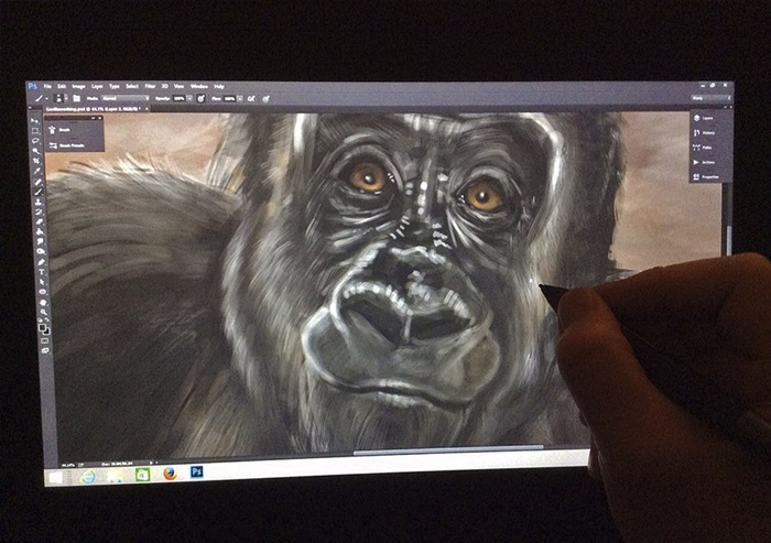
I’ve also been using Wacom devices for well over a decade now, from the early first generation Intuos and Graphire tablets to the Cintiq 24HD display that I use today, and I wouldn’t be able to do the work I do without one.

One of those fortunate souls who works at home every day, I have a dedicated office and spend the majority of my time at my desk, drawing and painting on my Cintiq 24HD, a display I’m very happy with.  Everything I need to be productive on a daily basis is in my office.  In the evenings, however, I like to sketch the next day’s cartoons or other images with pencil on paper while relaxing on the couch in front of the TV.  Sometimes I’ll do rough paintings and sketches on my iPad as well.

But lately, I’ve wanted to paint more detailed work or move on to the digital ink and paint stage of a cartoon without having to go upstairs to sequester myself in the office that I’ve already been in all day.

001

The newer Cintiq 13HD has abandoned the power brick of the previous 12wx, and while you still have to plug it in and connect it to a laptop, it has the resolution and screen space I want, and the ability to just prop it up on my knees to paint.  So I figured this would be my next portable device.

But then, Wacom recently announced the Cintiq Companion and Cintiq Companion Hybrid Devices.  The first is a stand-alone 13” Cintiq with all of the functionality and power of a laptop.  The Hybrid device works as a fully functional Cintiq 13HD when it’s plugged into a desktop or laptop, but becomes a portable Android device when it’s unplugged.

002Decisions, decisions.

First Option: Having just bought a very powerful laptop I eliminated the Windows 8 Companion quite quickly.  I like to write, which is one of the reasons I wanted the laptop, rather than a portable device with a peripheral keyboard.  The Cintiq Companion Hybrid, however, would allow me to work on the couch and also give me an untethered portable device to take with me on the go.

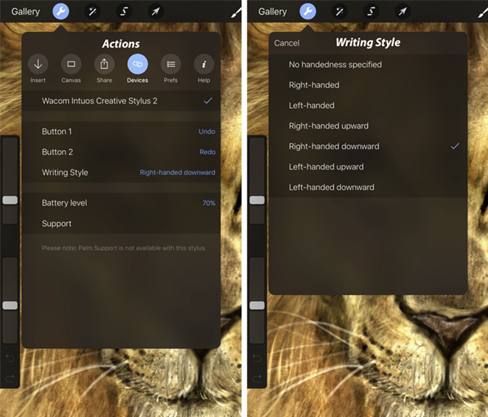
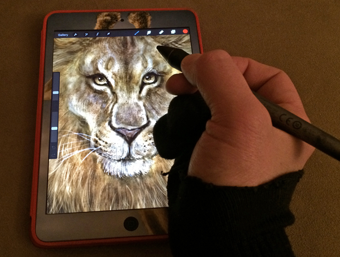
Second Option: Provided Apple doesn’t try to reinvent the wheel with the pending iPad 5, I could pair that with the standard Cintiq 13HD.  This would give me the portability I want for painting outside my office while still tethered to a laptop, plus allow me to keep using the iPad, which has many apps I rely on.  Wacom’s new Intuos Creative Stylus for the iPad (not first-gen) allows pressure sensitivity and palm rejection in some of the apps I already use for iPad painting, which means you can rest your hand on the screen and it won’t be confused with a pen stroke.  Currently, I have to wear a fingerless glove when I paint on the iPad to prevent that problem.

003Break it down, now.

Portability: The Companion and Companion Hybrid are being marketed that you can take them anywhere.  While I do enjoy working in a coffee shop once in a while and have to travel on rare occasions, most of my portable sketching is done with a pencil and sketchbook, especially since I’m usually out in the woods or in a creek canyon somewhere while I’m doing it.  The thought of taking a digital device with me to these wild places is unappealing.  Worrying about charged batteries, dirt and moisture on an expensive device, not to mention that I don’t want to be connected when I’m out in nature, is unappealing to me, which is why I even turn my phone off.  Whether it’s on a hike, camping, or out at a buddy’s cabin, I still prefer to draw in a traditional sketchbook.

When I do want a portable digital device, I already know that an iPad works very well for me and the Hybrid is too big to be a suitable replacement. With the new Creative Stylus, painting/sketching on the iPad when I’m in a coffee shop or other urban setting will do the trick nicely.

004If I lived in a city, had to commute, was constantly out and about and in need of all of the full tools I enjoy on my desktop, an argument could be made for the Cintiq Companion or Hybrid, and I’m sure it will appeal to folks who find themselves in that daily environment.  Living in the mountains, working at home, and wanting to be away from electronics when I’m out in the woods, however, I wouldn’t use this device to its full potential.

Cost: A lot of people are complaining about the cost of these new Wacom devices, but when you own the market, are leading the way in the technology and have put the R&D into creating the tech that every digital creative wants, to give it away is just bad business.  Supply and demand is as old as the hills.

That being said, budget is a factor.  Living in Canada, I have to buy from a reseller since only U.S. residents can buy from the Wacom site.  Despite the U.S. and Canadian dollars being at or near equal the last few years, Canadian prices are significantly higher than in the U.S., an angry reality that Canadians live with on clothing, books, technology, cars, and many other products.

The best price I can find on a Companion Hybrid in Canada is $1749.  That’s more than I just paid for my laptop.  The price on the Cintiq 13HD is $1089.00.

005All weighed and measured, I think I’m going to go with the Cintiq 13HD and a new iPad with the Intuos Creative Stylus.  The cost of all three of those, estimating for the iPad 5 of course, would work out to around $1900.00 and would give me the all-around best solution to fit all of my creative portable needs for a few years to come.

It’s important to understand that the reason I’m explaining all of this is not to tell you what you should buy.  It’s to illustrate the point that we all have individual needs and wants when it comes to technology.  Rather than buy every new phone, TV, tablet, computer or other piece of tech that comes out simply because it’s new, take a step back and ask yourself if what you want is really what you need.  Make a list of what you want to be able to do and buy the devices that fit you best.  Take the time to tailor your tech to your needs and you’ll be a lot happier in your work.

Posted on

Rebuild the Calgary Zoo

PenguinThe flooding in June of this year was the worst disaster in Alberta’s recorded history. One of the casualties of that flooding was The Calgary Zoo. The closure of the zoo has resulted in layoffs of the majority of the staff, a significant loss of revenue, relocation of some animals to other cities and a massive cleanup and fundraising effort.

Some of my Totem prints have been sold in their main retail outlet over the last year, something I was quite proud of, considering how much I enjoy going to the zoo.  To be able to take reference photos for paintings, sit and sketch, and just enjoy some time with the animals is a great pleasure and I hope to go again soon.  The main reason I painted my Rockhopper Penguin Totem in the series was because of this wonderful facility and their Penguin Plunge habitat.

With that in mind, I’ve decided to sell all of my inventory of that print at a discounted rate, with all proceeds PLUS a portion of my own costs going to the Calgary Zoo. Open to residents of Canada and the continental U.S., it’s a first come, first served offer, until the inventory runs out.  All prints are hand-signed.  I’ve also discounted shipping to a flat rate, as specified in the image.  For Banff & Canmore residents, I’m happy to deliver at no charge.

To order, send an email to lamontagne@nullcartoonink.com, indicate which print you want with mailing address and I will send you a PayPal invoice.

This offer is not officially affiliated with the Calgary Zoo, but it will certainly benefit from it.  If you have any questions, I’m happy to answer them, please send me an email to the previous address listed or via my Contact Page.  Thank you for supporting the Calgary Zoo rebuilding efforts.

RebuildTheZoo4

Posted on

Giraffe Totem

GiraffeTotemThe latest in my Totem series, this giraffe was a lot of fun to work on.  Well, not the whole time.  Mostly at the end, if I’m being honest.

The reason this one was a little different is that I recorded much of the process.  While I’ve done that a number of times before, the previous videos were done with screen capture software which runs in the background and you don’t really have to pay attention to it.  There’s always a fair bit of editing work after the fact, but that doesn’t affect the painting itself.  With the current video, it’s a mix of screen capture and footage from my GoPro on a tripod, which was sitting just off my left shoulder while I worked.  I’ve often shown the software, Photoshop CC in this case, but wanted to show the hardware this time as well, since the Wacom Cintiq 24HD is such a great display.  What this meant was that I couldn’t shift position and had to constantly be aware that this camera was there.  The lighting was also different than what I’m used to working with.   This changed how I felt about the painting process, but I really wanted to record this video, so sacrifices had to be made.  I’ll be editing it this week and hopefully the footage I got was worth the effort.  As always, photos are only used for reference in my paintings.  It’s all brush work.

RecordingIn a perfect world (hey, it could happen!), my painting sessions involve a hot cup of coffee, music in my headphones and a darkened room with no distractions, allowing me to get lost in the work.  With having to think about the camera all the time, I could never quite get all the way into it until I neared the end.  That’s when I forgot to recharge the GoPro for that session and the battery was dead.  Rather than ruin a perfect Saturday morning painting session by waiting, I decided to just do screen capture for the end of the painting and I had a blast!

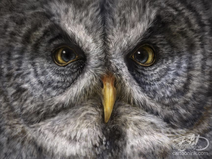
GiraffeBlogCloseupI know I say this whenever I finish a painting, but this is one of my favorites.  I just love the expression on his (or her, your call) face.  Anybody who has followed my work on these critters for any length of time knows that I don’t take all the credit for the personality.  It just seems to show up and the funny thing is, it showed up twice while painting this one.  I thought it did a couple of days ago, it was the same great moment that always happens, but then there was another moment in the final hours of painting when something just popped and it seemed to come even more alive.  It was a bonus.

Prints will likely be available for the Giraffe Totem in the next month after I’ve done my proofing and I can’t wait to see them.

Posted on

Pet Portrait – Odin

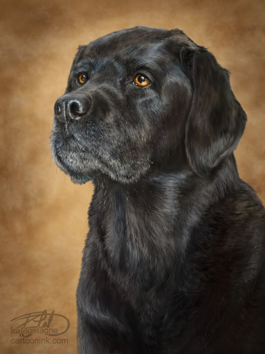
Odin

My latest painting, this is a memorial portrait for a purebred yellow lab named Odin.  Odin passed away at the age of 12 and a half in December and while the clients like both my Totem and portrait work, they felt a portrait was the best fit for the memory of their dog and I’m inclined to agree.  As a result, there is no whimsical grin or exaggerated expression.  He is painted as he was, a senior gentleman with his own character.  While the size hasn’t been decided yet, the final print will be on canvas, which is how I feel my work is best represented in print.  As I’m a sucker for furry faces and cold wet noses, memorial paintings are sometimes a little tough, because I know what this kind of loss feels like.  As such, I tend to spend a lot more time making sure it’s as good as I can possibly make it given my current painting skills.  I enjoyed painting this portrait a great deal and it might just be my best work to date.  Most importantly, however, the client is happy and said that I captured Odin’s likeness and personality.

Without fail, whenever I finish a pet portrait, I get a number of commission inquiries.  Here’s  a link to a blog entry I wrote recently with current pricing and details.  I painted this with Photoshop CC on a Wacom Cintiq 24HD display.  No photos were used in this painting, except for reference.  It was entirely done with brush work.

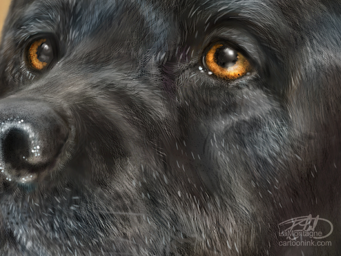
Finally, here’s a closeup of Odin.

CloseupSample