Posted on

A couple of hours at the zoo

Penguin2

This past Thursday found me in Calgary, running a few errands that had been piling up.  Had to exchange a faulty hard drive, buy some office supplies, and meet with the Retail Manager at the Calgary Zoo.  I’ve had Totem prints in their store for a little while now, and we’re still learning what works and finding new ways to promote the work.  I also wanted to show her the shirt samples I received recently, as the zoo sells The Mountain tees already.  So while I did get a cartoon out that morning before I left, it was largely an out-of-office day.  I had been trying to get into the city for about a week, but the roads and weather kept putting the kibosh on that.  Calgary is only about an hour drive from Canmore, but Hwy 1 can get slick and the main city routes are even more treacherous in bad weather, especially considering that many Alberta drivers are notoriously aggressive.  My rule of thumb has always been, if the weather is bad and I don’t have to be on the road, don’t bother.   It only takes one wing-nut in a hurry to ruin your whole week.

Turns out that the repeated delays benefited me a great deal.  When I finally did get into the city, the weather was downright warm for winter, thanks to Chinook winds, and a day running errands turned into a great outing.  Considering I was at the zoo already and have an annual membership, I brought my camera to see if I could get some reference photos.  I’ve said many times that I’m not a good photographer, largely because I have no interest in putting in the work required to become one.  I take snapshots.  On recent trips to the zoo, I had a borrowed zoom lens and tripod for our camera, an older Nikon D-60, which is basically just a higher end point-and-shoot, or at least it is the way I use it.  With the zoom lens, I just couldn’t take a decent shot to save my life, so this time I left it at home.  Setting the camera on automatic, I figured I’d wing it and take what I could get.

The strategy worked well.  The Calgary Zoo is very popular and is often quite busy.  Their newest exhibit, the Penguin Plunge that opened last year, can often have very long lineups in the summer months.  When you do get in, you only have a limited time to spend, as others are waiting.  It’s a great enclosure, designed so that you’re so close it would be simple to reach out and touch a penguin as it swims by, the water’s surface at chest level.  Of course, there are attendants on hand to ensure people don’t touch them, but it’s great to have that proximity.

Penguin

On Thursday, the zoo was so quiet, that after my meeting, I just walked into the Penguin Plunge, and spent almost a half hour in there just snapping photos.  The penguins were active, talkative and a lot of fun to watch.  At any one time, there were only about 10 people in the enclosure.  Must have taken a hundred or more photos, and about 10 of those ended up being great for painting reference.  While I’ve already painted a Rockhopper Totem, I’ll be painting a Gentoo at some point as well.  That’s the species in the above image.

Meerkat

Once I got to this little meerkat, she seemed to have no issues with me taking photos of her.  Turning her head this way and that, only about three or four feet away, she stood tall, crouched down, gave me almost every angle I could want.  A gentleman standing near me actually said, “She’s posing for you!”  It certainly seemed that way.

And finally, while I was hoping for some photos of the red pandas, just before I reached their enclosure, a woman deliberately changed her direction, walked over to me and said, “They just fed the tigers.  They’re all right there if you want to get some pictures.”

I thanked her (it really was a nice gesture on her part) and walked over to their nearby enclosure.  Sure enough, the mother and her three cubs, who aren’t small anymore, were lying down together eating whole raw chickens.  A real treat to see as one cub snarled at another for getting too close to his meal, the mother grooming one of the other cubs, just getting to see them so close and active on a such a nice day, with very few people around.  Even through glass, the shots turned out quite well.

KittyWhile I`d thought I’d taken 500 photos,  turns out it was around 400 as there were already a bunch on the card.  The wonders of digital cameras, taking as many shots as you like without incurring any expense.  Once I got home, I just opened up the card in Adobe Bridge and started deleting everything with bad focus, light, composition and within 10 minutes, I had about 20 photos that will serve me well for future painting reference.  I had a very enjoyable day, one of the best I’ve had at the zoo.  Not bad for an errand day in the city.


Posted on

To thine own self be true

SnowmanThe last few weeks have been less than stellar.  While I find winter tough to take most years, a cold snap hits my mood especially hard.  When the temperature drops to -20C and below, I’m about the unhappiest camper you’re going to find.  Vitamin D, sunlamps, and other home remedies, I’ve tried ’em all.  Short of moving away to a warmer climate for 6 months of the year, I’ve just learned I have to ride it out.  Add to that the holiday season, of which I am not a fan, and a nasty cold that knocked me down hard on my one slow week of the year, and the last few weeks have felt like I’ve been living at the bottom of a deep dark hole.  Don’t get me going again on the fact that I’m supposed to be in Vegas this week.

There seems to be this ridiculous belief that if you are fortunate enough to love what you do for a living, you’re happy and upbeat all the time, and everything is right in the world, every minute of the day.  Trust me, that’s not the case.  While I’d much rather chart my own course than have somebody else tell me where to go and how to do it,  there will always be bad days and bad weeks, just like at any job, even one you enjoy.  Think of it this way, if somebody offered you your favourite food for dinner tonight, you’d jump at the chance.  If they offered it to you tomorrow, you might still be happy.  Now, imagine you have to eat it every night for the next year.  Would it still be your favourite, or would you be willing to pay anything for a rice cake?

It is not only in an artist’s nature to keep trying new things and new ways of being creative, it’s an absolute necessity.  If new challenges don’t present themselves, you have to go looking for them, otherwise what used to be exciting just becomes routine.  Creativity doesn’t do well with routine.  It withers and ends up on life support.

There is an elusive state of being that we all seem to be looking for called ‘balance.’  Parents try to find the balance between a fulfilling work and home life, workaholics need to balance their schedule and time off, creatives look for a balance between inspired work and selling out.  I’ve come to the conclusion that this balance is an illusion, it doesn’t exist, and that to try to find it leads to a futility that only makes  a person feel even worse about their situation.  This is largely because your perception of balance is fluid.  Find that extra hour in a week to read a book, and you’ll be looking for two next week.  Manage that, and you’ll be wanting a whole day off, then two, then three and pretty soon you’re running out of money because you’re never working.  Balance is the pot of gold at the end of the rainbow.  The closer you move toward it, the further it moves away.

Perhaps you’ve heard the fable about the scorpion and the frog.  The scorpion needs a ride across the river and asks the frog for a lift.  The frog declines saying the scorpion will just sting him.  The scorpion argues that it if he did that, he’d sink, too, so the frog gives in to a logical argument.  The scorpion climbs up on the frog’s back and they start off across the river.  Before too long, the scorpion stings the frog, and the frog says, “Why did you do that?  Now we’ll both drown!”

The scorpion says, “I can’t help it.  It’s just my nature.”

Rather than listen to all of the people that tell me I should relax more and take time off and try to find some balance, I’ve decided to make peace with the fact that I’m only content when I’m working.  Even when I’m not working, I’m thinking about work.  With that in mind, I’ve packed my next few months, and most of it will be quite challenging, because a lot of it will be new ground.  I’ll be recording a new DVD on painting portraits, something I’ve been talking about for months but haven’t actually gotten around to doing.  I’ve been commissioned to paint a couple of cat portraits and have received inquiries about two more pet portraits this week.  Another Totem is being prepped to paint as is another portrait, a painting of one of my absolute favorite characters in film.  The last one, I’ll be trying to paint in Corel Painter.  I haven’t used the Painter software since Painter Classic many years ago, and I’ve been wanting to try Painter 12, bought this past week.  The best way to do so is to just throw myself into a painting and learn as I go.  I have no desire to stop painting in Photoshop, but I also don’t want to be restricted to it, either.

There are a couple of online courses I’ve wanted to take for awhile, and there’s no time like the present.  Waiting for my schedule to slow down is just another way of saying that it’s never going to happen.

And finally, I’m well into the planning for my booth at the Calgary Expo in April.  There’s a lot to think about and organize, everything from which prints to sell and how many of each, banner design, and all of the other logistics involved with having my own booth and selling my own work at the event.  It’s very intimidating, I’m likely going to be stressed about it, but at least it’s not routine.

Some of the work will be fulfilling, some won’t.  Some of the deadlines will be ridiculously short, others will give me far too much time, which inevitably leads to procrastination and working at it last minute, anyway.  There will be up days, low days, but mostly just middle of the road days where it feels just like punching a clock, just like any other job.  That’s the cold hard truth of it and anybody who is thinking about being creative for a living should know that.

Motivation and inspiration, these are wonderful things.  Sometimes it’s the kick in the ass that will get you moving when you feel like you’ve got cinder block boots on.  But when everybody is telling you to be Polly Anna, optimistic, happy go lucky, and you-can-do-it, it can also wear on you.  Chasing that high will eventually lead to an overdose.  From time to time, you just need to turn off all of that noise and just get the work done, regardless of how you feel about it.  That’s all anybody does, no matter what they do for a living.

So what’s the point of this melodramatic post?  Simply put, sometimes it’s OK to feel bad even when things are good.  Don’t beat yourself up about it.  The pressure as a freelancer to be ‘up’ all the time is maddening and I’d bet that a lot of folks out there, the ones you think are riding high all the time, are either faking it as a marketing tool or they’re heavily medicated.  Even the most optimistic of personalities has down days, too, and you’re entitled to yours.  I’d rather share with you the reality of being a self-employed creative than be a complete hypocrite and sell you a bill of goods.  In my experience, it can do a lot more harm than good.

But this too shall pass.  For while I’m having a few down days lately,  I know that two weeks from now, you’ll see me giddy with excitement when I pick up a certain painting from the printer.  Bet on it.  After that, there will be something else exciting, and before too long, it’ll be Spring again, my favourite time of the year.  Enjoy the highs, resent the lows, but be who you are and stop trying to please everybody all the time.  It’s exhausting!

You may not be happy all the time, but at least you’ll be sane.


Posted on Leave a comment

The Hidden Power of Blend Modes in Adobe Photoshop

http://www.adobepress.com/ShowCover.asp?isbn=0321823761

While Adobe Photoshop can easily be called the most versatile imaging toolbox on the market, it is a monster piece of software and monsters are often frightening.  With so many features and often multiple methods of accomplishing similar tasks, it can be very intimidating for even the most experienced user.  Because of that, there is an abundance of training resources on the market, from large phone book manuals that try to tell you everything to books that dissect specific features in the software.

Trying to learn everything there is to know about Photoshop is an exercise in futility.  True there are a number of experts out there who know a lot more than the average person, but even the most educated and skilled of those professionals will agree that there is always something more to learn.

Even though my use of Photoshop is limited to what I do, which has very little to do with photos, I’m constantly looking for new ways to improve my painting skills and to streamline how I work.  Speed and efficiency applies to art as much as it does to technical operations, especially when you venture into the land of commercial art and deadlines.

I don’t recall when I started using blend modes in Photoshop, but I can’t remember a time when I wasn’t, so it has been awhile.  There isn’t a painting, editorial cartoon, or illustration that I do these days that hasn’t been touched by at least one blend mode during the process.  The four blend modes I use most in my work are Soft Light, Multiply, Screen, and Color.  In fact, I even have Actions set up in my Wacom Tablet Radial Menu for them.  If your eyes are starting to glaze over, don’t worry about it.  This happens to a lot of people when you start breaking down the building blocks of images in Photoshop.

The thing about blend modes is that the more you dig into them, the more uses you find for them.  Scott Valentine’s new book, “The Hidden Power of Blend Modes in Adobe Photoshop,”  from Adobe Press,  has answered a need that a lot of people likely didn’t realize they had.

With Photoshop evolving every 18 months or so, anybody who uses it has to keep learning and the information in Scott’s book is as current as you’re going to find.  But even if you don’t have the latest version of Photoshop (CS6), you’ll be able to apply the knowledge to previous versions, as blend modes have been around for awhile.

So what are blend modes?  It’s funny, but if you’d asked me that question before I read Scott’s book, you’d have been met with a long pause.  The truth is, I had a good idea of what blend modes are, I knew what they did and how to use them for my own work, but I really wouldn’t have given you an answer that would have left you satisfied.  Today, my answer would be this book.

Without going through chapter by chapter, I’ll simply say that Scott has done an excellent job of breaking down what blend modes are and how to use them.  He gives very technical information for those who want it, but he also offers explanations for those who don’t.

No matter how you use Photoshop, you’ll find a reason to try blend modes, but without real world examples from different disciplines, it would be easy to get lost in the information and you might fail to see the practical uses.  In this book, Scott has assembled Photoshop professionals from a number of digital creative mediums to show how they use blend modes in their own work.  In other training materials I’ve seen, you usually only get one professional’s perspective, opinion and methods.  While there is value in that, it’s great to see how many ways others use blend modes, because one artist may offer a technique that is of no use to you, but the next one could reveal the buried treasure you’ve been looking for.

In the interest of full disclosure, my own blend mode techniques are featured in this book.  I was happy to offer some of my tips for using blend modes in cartooning, painting and illustration, but even without my small contribution, I would have still bought this book.  I’ve been through it a couple of times and I’ve no doubt I’ll continue to reference it, because I learned a lot about a feature I already thought I knew.  Turns out I had just scratched the surface.

What this book does very well is reveal possibilities.  Rather than give you a step-by-step for one procedure or just give you tips and tricks, “The Hidden Power of Blend Modes in Adobe Photoshop” shows you solutions that can be applied to a number of problems, even if you don’t know what those are yet.

I’m not exaggerating when I say I’d be very disappointed if I was no longer able to use blend modes in my work.  It would take longer to do my work and painting light and shadow (which is what I primarily use them for) would feel less dynamic and more difficult.  I’m certain there are more uses for blend modes in my own work than I am currently using and I will be looking to this book to help me find them.

The tools for art and creativity are like anything else.  When you first begin to use them, you may feel awkward and it’ll take some time before you develop any finesse in your methods.  When it comes to developing that skill with Photoshop, I’d recommend giving blend modes a closer look.  Scott’s book is the best resource I’ve seen to help you do that.

To find out more and to purchase the book, follow this link to Adobe Press.

Posted on 1 Comment

Otter Totem

This is my latest painting, the Otter Totem.  Under normal circumstances, I’d publish this post on the same day that I finish the painting.  In this case, however, I was a little swamped with other deadlines and it kept moving down on the priority list.  But better late than never.

This Totem was done in about a week, which is the fastest I’ve ever painted one of these.  While I’m sure the hours spent were close to the same as prior Totems, I had a few very late nights and early mornings, largely due to the fact that this was being used in another deadline, a painting video for Wacom.  Despite the quick turnaround, I’m pretty pleased with how it turned out.  As I’ve said many times before, I don’t pre-plan the expressions and they’re often as much a surprise to me as they are to anybody else.  The personality just seems to ‘show up’ at some point during the painting and I just go with it.  In this instance, the personality was there very early on and I really loved the curiously goofy face that emerged as I spent more and more time on the details.

This was also my first painting on the new Wacom Cintiq24HD and the experience of painting on this display was very enjoyable.  While I’ve never had any complaints about the Intuos tablets for painting, I just felt a lot more connected to the brush strokes with my pen directly on the screen.  I’ve always enjoyed digital painting and never felt that I was missing any of the tools I needed to get my best work onto the canvas.  The Cintiq, however, gave me something I didn’t know I was missing and improved the experience.

As for that video for Wacom, it is part of something else that will be coming a little later on, but they posted it on their YouTube channel, which means I’m able to post it here as well.  If you haven’t seen it already, it shows a high speed time lapse of the Otter Totem, from start to finish.  The narrative is aimed at traditional artists who might be considering the digital medium, but haven’t yet taken the plunge.

Enjoy!

Posted on 1 Comment

My Wacom Cintiq 24HD Settings

For this second blog entry on the Wacom Cintiq 24HD (read the first one here), I wanted to show all of the different settings I’ve chosen for the Express Keys, Touch Ring and Radial Menu.  I’m very comfortable using these hardware features on the Intuos tablets, but had to change everything up for the Cintiq for two reasons.  The first is that there are more settings to choose from.  The second is that working directly on the screen changed how I do things.

These Photoshop settings are in no way being shared in order to tell you what you should do.  Feel free to borrow anything you see here, of course, but I would encourage you to experiment with the settings and find ones that work best for you.  There are so many possible configurations that you can almost program each of the Express Keys, Touch Rings, and Radial Menu for anything you want Photoshop to do.  The feature I like best is that you can even program different settings for every piece of software you have.

My buddy Jeff Foster is an Author, Producer and VFX Artist at Sound Visions Media.  My setting for brush size on the pen, which I’ll explain later, was his suggestion and it works very well.  Since I’m no longer using the Touch Ring for brush size, he also suggested that the Touch Ring can be used for any keystroke operation at all, so it’s important to think differently and creatively.  I still haven’t finished experimenting with my Touch Ring settings, so some of the ones I show here will likely change.

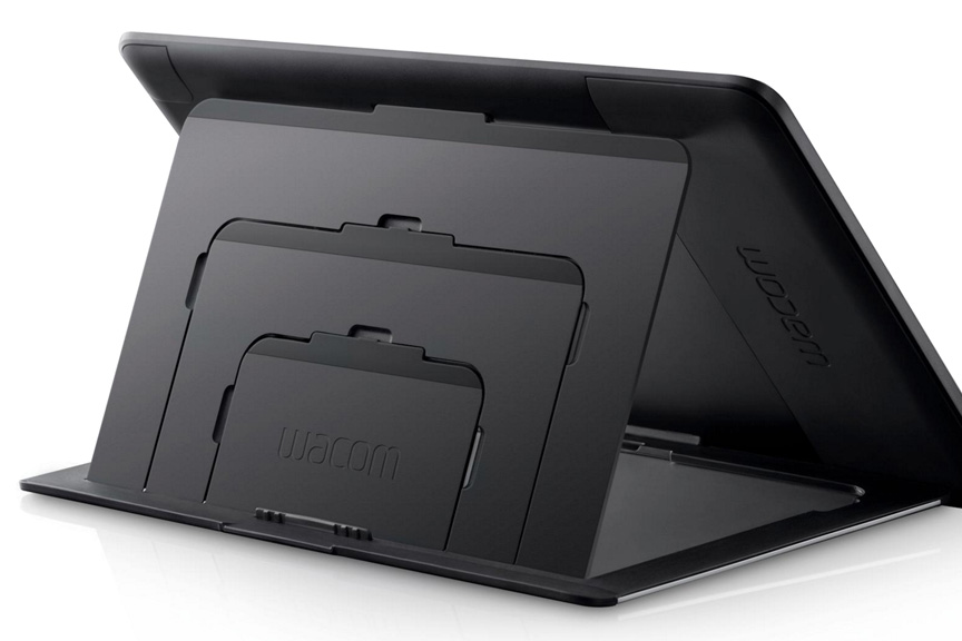
Because there are so many settings to explain, I’ll just get right to it.  Here are some photos that show you what the buttons I’ll be talking about look like on the actual hardware.  I got these images directly from the Wacom site, so if you want to know even more about the Cintiq 24HD than what I’ve shown here, just click on any of the images and you’ll be instantly transported to their website.  It’s like magic, don’t you know?

As you can see from the image at the beginning of this post and the ones above and below, there are five Express Keys and a Touch Ring, with three settings each, on either side of the display.  Additionally, there are three buttons above the display for features I’ll explain later.  On the top edge of the display, which you can’t see here, there are a series of buttons like you would find on any monitor, to adjust your display color, brightness and contrast settings.  Incidentally, I like to work with my monitor brightness a lot lower than most people.  I have my Contrast set to 50, my Brightness to 13, and my Backlight to 0 (Zero).  You might think that a little odd, but it works very well for me.  My monitors have always been set to low brightness and my eyes don’t get strained as easily from long hours in front of a display.

Let’s talk about those three little buttons at the top right above the display.  From left to right, there is one that has a lower case letter i, one that looks like a keyboard, and one that looks like a wrench.  The i is for information, and when you press that, you get the image that you see below.  It fills the display, regardless of the software you’re using, BUT the settings you see displayed will be the ones you have set for that particular piece of software, or the default settings.  What you see here are my settings for Photoshop.  This is a great feature because you might forget what you have a button set for and this will show you in real time.  We’ll zoom in on all of these in a minute.

The second button will bring up the on-screen keyboard, which is pretty self-explanatory.  Sometimes you just want to type in a layer name, or press a number, and you don’t want to have to go fishing for your actual keyboard, especially since it might be under your Cintiq.

Finally, there is the button with the wrench on it, which will bring up your Wacom Tablet Properties.  I just think this is very clever to include this as a hardware button because sometimes you just want to make a quick change to your settings, and you don’t want to leave your software or go searching for it in your menus.  Press the button, it will bring up the panel you see here, make your change, close it and go right back to work.

Now let’s take a closer look at how I have my Express Keys, Touch Rings and Radial Menu set up.  I won’t show you how to make these changes, because that will require a whole new post.  If you want some help, I recorded a couple of videos for the Intuos5 and those will show you how to change your settings, even on the Cintiq.  Here are a couple of links, one for the Express Keys and Touch Ring and another for the Radial Menu.

Let’s take a look at the Express Keys and Touch Ring Properties.  As you can see below, the three buttons for the Touch Ring are currently set to Zoom, Brush Size, and None.  Rather than use the default Zoom, however, I have mine set to Ctrl- and Ctrl+ (Cmd- and + on the Mac) shortcut for Zoom.  The reason is that will zoom in and out in increments that keeps my painting sharp and crisp.  Some of the other increments in between can make images a little blurred and I don’t like that.  So my zoom isn’t a smooth transition, it goes in steps.

Brush Size is self-explanatory, although I now have that on my pen, so I’ll be finding another use for this spot, I think.  The third one is normally set for Rotate, as in rotating the canvas, but I have it set to None simply because I was recently recording a video and didn’t want to accidentally zoom in while recording if my finger touched the ring, so I set this to none and left it there while I recorded.  Again, I’ll be finding another use for this one, too.

For the Express Keys on the left of the display, I have them set as follows:

1) Undo – Ctrl-Alt-Z. (Cmd-Option-Z on the Mac).  When I’m painting, I pretty much keep a finger on this most of the time and it allows multiple undos.

2) Color Picker – This is not a normal keyboard shortcut, so I had to create one, which is fairly easy to do in Photoshop.

3) Shift – a Modifier Key that will give many tools more options.

4) Ctrl – (Cmd) another modifier key.

5) Pan/Scroll – In Photoshop, this is the Hand Tool and it will allow you to move around the canvas.

On the right side of the display, the Touch Ring again is still set for the default settings.  I know I’ll find a use for it, I just have to get creative and even more efficient.

For the Express Keys, they’re set as follows:

1) Gamut Check – Ctrl-Y (Cmd Y).  I draw and paint in sRGB, but I’m always aware that my editorial cartoons are printed in CMYK and some of my paintings and illustrations may be printed that way as well.  My color picker is set so I can only choose colors that are ‘in gamut’, which means when converted to CMYK, they won’t shift.  But sometimes when I make a Levels or other Color adjustment, it will shift colors too far, so I’m always checking Gamut to make sure everything looks as it should.  Newspapers do not have universal color settings.  Some publications have downright hideous printing, so I try to find a happy medium to please everybody.  Yeah, I know…good luck with that.

2) Hide – Ctrl-H (Cmd-H) When I’m working with selections, this hides the little ‘marching ants’ that define a selection, because I hate looking at the moving dotted lines when I’m painting.

3) Radial Menu – This is Wacom’s way of giving you even more choices.  It’s an onscreen heads-up display that gives you an opportunity to program your own menus and submenus.  I’ll show you my Radial Menu settings in a minute.

4) Fit Screen – Ctrl-0 (Cmd-0) Zooming in and out of a painting or drawing, often I just want the image to reset to fit screen.

5) Display Toggle – I have multiple displays, my other one is above the Cintiq.  When I want to access the other display, I press this button and my pen can move the cursor to my other screen, which makes the top half of the Cintiq display work just like a traditional Wacom tablet.  It’s a great feature.

My Pen Settings are as follows:

Erase – This button is a waste for me and I can’t even think of a reason to use it for something else, either.  I’m sure other people do use it, but I never have.

The button on the pen is actually two buttons.  Originally, it’s set for a Left Mouse and Right Mouse configuration, but as mentioned previously, my friend Jeff gave me a reason to consider other options.  For the left Mouse Button, the one furthest from the tip, I have it set to the keystroke configuration you see in the image.  What this allows me to do, when I have the Brush selected in Photoshop, is change brush size very fluidly.  I press the button, move the pen left or right and I can see the brush size change on the screen.  This was one of those, “I wish I’d known this sooner!” moments, because I would have had my Intuos tablet set to this as well.

The Right Mouse button, the one closest to the tip, is set to Alt (Option on the Mac).  When I have the brush selected in Photoshop, this toggles the Eyedropper Tool for easy selection of color in a painting.  I use this constantly for better blending and color transitions in my work.  So now I can change brush size and select color quickly and easily right from the pen.  It’s a very enjoyable way to paint.

And finally, here are my Radial Menu settings.

When you press the Radial Menu button, you get the circle on the right, which is fully customizable.  If you wanted to, you could make every one of those pie pieces into a submenu.  I currently only have three.  When you click on each of those submenus, you get  the images on the left.  Each submenu can not only have a full selection of pie pieces, but those can be submenus as well.  I’m no math wizard, but that gives you a LOT of choices for custom configuration.

Obviously I don’t need to explain every one of them, but I’ll give you some thoughts on what some of the more unique ones do.

Blend Modes Submenu – I use four Photoshop Actions for Blend Modes all the time in my drawing and painting.  OK, that one that reads ‘Cartoon Websize’ is an Action for something else, but I had nowhere else to put it and I use it every day.  But the rest are for Blend Modes, I assure you.  If you don’t know about Blend Modes in Photoshop, my buddy Scott Valentine just wrote a great new book that explains them very well.  I’ll have a review of the book very soon, but if you want to check it out, here’s the link.  The Hidden Power of Blend Modes in Adobe Photoshop.

Flip Canvas – Often when I’m painting, I want to shift my perspective, so I’ll flip the image I’m working on horizontally.  You’d be surprised how helpful this can be, especially when it comes to likeness in portraits.  Sometimes I’ll just know that something doesn’t look right but I can’t put my finger on it.  By flipping the canvas, the problem will almost always become immediately apparent.  Your brain gets lazy and this will often give your perception a bit of a slap.

So there you have it.  These are my settings on the Cintiq 24HD…for now.  I fully expect to make little changes and tweaks as I get more used to the display, but these settings are working very well for me at present.  There really is no excuse for not being able to customize this display to work exactly the way you want it to.  Yes, it will take some time to get it perfect, but it’s worth it.  Wacom has not only provided hardware that will allow you to create the best drawing and painting experience possible, but the software takes it even further.

Don’t be afraid of making changes.  There is a default button in the Wacom Tablet Properties.  If you mess it up too much, you can always start again.  When you do get the settings you want, however, back them up!  I can’t stress this enough.  Computers aren’t perfect, software can conflict with other software, and stuff happens.  There is a Wacom Tablet Preferences Utility included with the software.  It will allow you to save and restore your preferences should the unthinkable happen.  Just as you should back up your images and files, you should also back up your preferences.

If you have any issues, Wacom’s technical support is very helpful.  And finally, if you just have any questions, I’m happy to help, too.  Thanks for stopping by and hopefully this helped you see some possibilities you might not have considered, whether you’re using Wacom’s Intuos tablets or their Cintiq displays.


Posted on 2 Comments

Whose life are you living?

Art is a weird job.  Whether you’re a musician, painter, photographer or any other professional in a creative field, your job is largely going to be one where you’re flying by the seat of your pants.  When you’re first starting out, you spend a lot of time looking to the people who’ve come before you to see how they got where they were going and that’s a good thing.  Most success stories start that way.  If you’re lucky, as I have been, you’ll find a few mentors along the way, people who might see your potential and give you a helping hand.  It’s important to listen to those people because they just may save you from making some mistakes.  Oh, you’ll still make lots of mistakes, but if you’re smart, you’ll skip a few, too.

While you’ll always have something to learn as an artist, eventually it’ll dawn on you that you’re no longer a student.  You’ll start to realize that not only are you really uncomfortable at the kids table, but you’ve felt that way for some time.  Getting up from that table will be uncomfortable as well, because you may not be sure that you’re entitled to.  There are some who may turn to look at you with distrust and stern expressions when you do so.  Resist the urge to sit back down.

Deferring to your elders will eventually reveal itself to be a double edged sword.  While their experience and expertise should be respected and admired, their course is not your course, and in an artistic career, modeling yourself after someone else’s successful career will not propel you forward.  It will, in fact, keep you prisoner.  At some point, you’ll begin to realize that what worked for somebody else is not going to work for you, based on nothing more than your gut instinct and the knowledge gained from your own experience.  Chances are that some who’ve come before you won’t see what you see, and they’ll tell you that you’re doing it wrong.  Some will even resent you for your audacity.  To move forward, you have to learn to make peace with that and hopefully won’t turn around to see smoke rising from any bridges behind you.

We get caught up in following every little trend and bit of advice, flailing about to hop onto the coattails of others because they may appear to be more successful, and we feel that if they’re doing it, it must be right, even if everything in our being tells us its wrong for our own path.  Successful people don’t become so by copying someone else’s dance steps.  Photographers that try to be Annie Liebowitz, painters that try to mimic Van Gogh, and actors that pattern themselves after Tom Hanks are eventually going to realize they have no identity of their own and that their life’s work is a poor copy.

Learn from your predecessors, evaluate their methods, and admire their successes, but be yourself.   Someone else’s judgment should not supersede your own, simply because they appear to be more successful or have had a longer career.  If you only get this one go round, and you’re fortunate enough to be able to do so as an artist, don’t waste it living someone else’s life.


Posted on 1 Comment

Mocha

MochaFinished working with this little lady yesterday morning, a commissioned painting for a happy client.  When this commission came about, I was a little apprehensive as I had never painted a horse before.  Not that I’d ever painted a Moose, Grizzly, Raven…(you get the idea)…before I’d done those, either, but horses just seem to have their own challenges.  Such beautiful animals, I was most worried that I wouldn’t be able to realize what I saw in my head.

The photos I had to choose from were great, as the client is a talented photographer.  Won’t say her name quite yet as this was commissioned for a gift, and while I have permission to post it, I don’t want to leave easily searchable clues.  I’ll link to her work in another post later.  I’ve had the pleasure of working with a number of talented photographers on commission work and I never get tired of it.  Nothing like working with clean crisp detailed photo reference.

One of the big challenges with this painting was the horse’s mane, especially the section that falls down between the ears.  I had to create a whole new brush just for that, something I really enjoy doing.  It’s almost like artistic engineering, creating new brushes to get a specific look.  A lot of trial and error.  I had to modify an existing brush to get the short little hairs on her face to look the way I wanted them to as well.

I know I say this on every piece, but I really had a lot of fun with this painting.  Her personality showed up early and I found myself smiling a lot while working on it.  Couldn’t be happier with how it turned out.

Posted on 2 Comments

What’s in a name?

As I often do, I was listening to the radio this morning while working on a cartoon.  My buddy, Eric, and his co-host Matt on JACK-FM in Calgary were talking about how many new parents have taken to buying the website domain name of their child’s name.  Even though the guys were kidding around about it, I know exactly why parents are doing this.  I’m sure at one point or another, every parent considers that their child may be somebody famous and their name will be well known.  The cost of registering a domain name really isn’t all that much, but the difficulty comes in getting it before somebody else does.

When I first started my business, I didn’t really know where things were going.  I figured I might be doing more graphic design or be known more for my syndicated cartoons through my business name, so I put that as a priority.  Thankfully, I got to cartoonink.com before anyone else did.  I’m sure if I hadn’t, and tried to register it now, it would have been long gone.  I did try to get lamontagne.com but it has been registered, and even lamontagne.ca (the Canadian suffix) was taken by a chocolate company in Quebec.  I figured I had Cartoon Ink and that would be good enough, because most English speaking people can’t even pronounce my last name, let alone spell it.  I was shortsighted.

The radio conversation, however, got me thinking.  Many artists, photographers, and designers are known because of their own names, difficult to spell or not.  Ten years ago, I had no idea where I’d end up, and things have turned out a lot better than I could have hoped for.  As I have no intention of slowing down now, it would seem prudent to assume that ten years from now,  I could very well be in a much better place than I imagine.

With that in mind, I contacted my web host this morning, and I finally bought www.patricklamontagne.com.  While I’ll still promote my business as cartoonink.com for now, in a few days (takes time for it to go through the system), anyone who types in the new domain name will end up on this site as well.  Almost every successful person out there was once a nobody on their way up.  When it comes to preparing for a future promoting your skills and talents, it is in your best interest to plan for being much bigger than you anticipate.  It is not arrogance or ego to think that, either.  Ambition and self-confidence can easily exist in harmony with humility.   An artist gains nothing by setting limiting goals or playing small.  Better to put that carrot out there on the stick where you can see it, to remind yourself that you can be more than you are, provided you’re willing to work for it.

Today, buying www.patricklamontagne.com was that carrot, and perhaps when my name and work becomes very well known, people will just type that into the address bar, assuming that they’ll find my work there.

Posted on 2 Comments

The upside of 2011

Bighorn Sheep TotemAll things considered, 2011 was a great year.  While every year will have it’s challenges, I’ve been fortunate that I’m honestly able to see each year of the past decade as having continual forward momentum.  The work I’m doing is far beyond what I had hoped for when I first started in this profession and I’m very grateful for it.

I became nationally syndicated in September of 2001, sending cartoons out across Canada each week, and got very few bites.  For two years, I had no more than three newspapers, paying the bare minimum rate, and I will admit to almost giving up on it more than a few times.  With a full-time job to pay the bills, I had to get up at 5:00am each morning to get a cartoon out before I went to work.  When I came home, I had to sketch in the evening and work on the weekends in order to manage it all.  Finally I started making progress, got a few more papers, took advantage of other opportunities, and about six years ago, I was able to leave my job and play this game full-time.

Through it all was my ever supportive wife, Shonna, and I’m incredibly grateful that she never told me not to do any of this.  The only caveat given when I went full-time was that if I couldn’t pay my half of the mortgage and bills, I had to go back to work.  Canmore is an expensive place to live and we couldn’t do it on one income.  Fortunately, it never came to that, and each year has been better than the one before.  At the time, it was an incredible struggle, but in retrospect, I’m glad I had to go through it because it makes the present all that much sweeter.

If my 2001 self could see the work I’m doing now, he’d be pleasantly surprised, and I try to think about that when I’m having a bad day or feeling sorry for myself because of a heavy workload or when money is tight.  So far, I’ve not only gotten what I wanted, I’ve gotten much more.  Best of all, I discovered that I loved getting up at 5:00am to work, I still sketch in the evenings, and being self-employed means you often work weekends anyway, so I was already used to the routine.  Now, I can’t imagine doing anything else.

Here’s a recap of my professional highlights of this past year, some of which I’d forgotten about until I went back through the blog entries month by month.

iPad Painting: Started playing around with this in January, and damn if it hasn’t been a lot of fun figuring it all out.  Ended up trying four different styli and half a dozen apps.  It would seem that I’ve finally settled on the Wacom Bamboo Stylus, the Nomad minibrush, and the procreate app.  The combination of those three gives me the best results, and while I don’t consider anything I paint on the iPad to be finished work, I would go so far as to call it advanced sketching, and I plan to keep doing it.

PhotoshopCAFE DVDs:  In March, I finished my first DVD, called Cartoon Illustration Techniques in Photoshop.  Easily one of the most difficult projects I’ve ever worked on.  Having only done a little bit of sound and video editing for a failed Flash animation project a few years back, it was a struggle.  But I finished it, it went into production, and is selling well.  I’ve heard from many who bought the DVD that have learned a lot from it and complimented me on my instruction, so I’m guessing I didn’t do so bad a job.

The second DVD, Animal Painting in Adobe Photoshop, was a lot easier and a lot more enjoyable as I wasn’t teaching raw Photoshop beginners.  It was more about the painting than the software and while it was a challenge, the difficulty I went through with the first DVD paid off while recording the second as there were few problems I hadn’t already solved.  Recording one DVD this year would have been enough of a milestone, but I never expected to record two, and to be very pleased with both of them.

Cartoon Ink: While my old website was ‘fine,’ it had become difficult to use and it was no longer the image I wanted to project.  While I had always done my own website in the past, this time I realized one of the most important business practices that so many have learned before me.  Hire professionals to do their job, so you can focus on doing yours.  With that in mind, I hired Erik Bernskiold of XLD Studios in Sweden to create a new website for me.  I knew Erik’s work and know him personally, so I was confident he would deliver much more than I could create myself.  With the help of Elizabeth Gast at Design by Firgs, another colleague and good friend who consulted on the site, and created an improved evolution of my logo, I was very pleased with the final logo and website and would highly recommend both of their work.  The time I saved was well worth the money spent and reduced stress.

Wacom: I began to form a relationship with the great folks at Wacom at Photoshop World in 2010 after I won the Guru Awards for two of my Totem paintings and I couldn’t be happier about it.  Having used their tablets since the late 90’s, you won’t find a bigger fan, so I’m very pleased to be working with them from time to time.

Over the course of the year, I’ve been featured in the Wacom eNews, have represented the company and demonstrated their products at one of Scott Kelby’s seminars in Calgary, and have been a featured guest on two of their one-hour Wacom webinars.  The people I’ve worked with at Wacom have been incredibly supportive and are absolute pros at what they do and I look forward to a continuing relationship with them.

The photo shown here is Joe Sliger demonstrating the new Wacom Inkling for me at Photoshop World this year.  He is also one of the moderators of the webinars.

Island Art Publishers: In July of this year, I began a licensing deal for some of my Totem paintings to be produced on art cards.  These are distributed throughout Western Canada and the northwestern U.S. and time will tell whether this arrangement bears any fruit.  An artist friend once told me that art cards are often your best advertising, because not only does the person buying it see your work, but so does the person receiving it.  You may not make much money early on, but it’s enough to get your work out there to a market that otherwise might not see it.  And the cards look really good.

Photoshop World: While it’s true that I didn’t learn much about technique or improving my work at this year’s Photoshop World in Las Vegas, I still think it was worth attending because of the networking opportunities.  Having recorded two DVDs for PhotoshopCAFE, it was great to finally meet the owner of the company in person, and see their operation on the Expo Floor.  I was able to meet a few more of the Wacom folks in person, and talk with other industry professionals I otherwise might not have had the opportunity to talk to.  Online interaction is fine, but it doesn’t compare with face-to-face conversations.  So while I won’t be going back as an attendee, I still think this year’s trip was well worth it.

knmadventuresAt the time, I was doing some illustration work for wildlife photographer and instructor, Moose Peterson as well, and being able to go over sketches with him in person was a real treat, as most of the time this would have all been done online.  The other benefit of the Photoshop World conference is that I get to meet with so many talented photographers, many of whom I consider close friends.  For somebody who relies on great photo reference for my painted work, their skills and talent are often one of my most valuable resources, not to mention their generosity with their work, and the support they offer for mine.

Paintings: Saved the best for last.  I am so very pleased with the progress I’ve made on my painted work this year.  The first half of the year, I was so busy with the DVDs and other work that I only painted one animal in my Totem series, the Great Horned Owl.  When I realized this in the latter half of the summer, I was ticked off.  The work I love to do most, I had placed in last priority.  In retrospect, however, I’m glad it happened because when I realized it, I vowed it would never happen again and it stoked the fire.  The end result is that from September to December, I’ve painted a number of new images and I feel they are my best work to date.

I had been becoming bored with painted caricatures of people in the past couple of years, but recently, I’ve realized that it wasn’t people I was bored with painting, just caricatures of them.  Beginning with a couple of iPad paintings, I’ve discovered how very much I enjoy painting portraits, and I’ve done a couple of pieces recently that I’ve really enjoyed.  Inspired by the work of Drew Struzan and others, I think I’ll be painting a lot more portraits of people, if nothing more than for the sheer enjoyment of it.  While style is always evolving, I think my paintings now have a definitive look that is mine, whether it’s people or animals, and it’s one I want to continue to develop and refine.

I’m now getting commissions to paint pet portraits and caricature this year, and it’s really enjoyable work.  The painting of Don Diego that I did for my DVD, the memorial to Titus the cat, and to being able to finally create a real painting for my folks of their dog, Bailey, it’s looking like this could be a big part of my work in the coming years.  Working on another commission at the moment, and having fun with it.

My real passion, however, is still the Animal Totems.  Nothing I’ve ever done in my career has filled me with as much joy as that I get from painting these whimsical caricatures of wildlife.  Not only are they fun to work on, but they sell well in the galleries which means others like them, too.  I’ve been fortunate that a number of wildlife photographers I know have been willing to sell me the license rights to use their photos as reference, or have enjoyed my work enough to want to trade me the use of their images for canvas prints of the painting when it’s done, both of which I’m more than willing to do.

Humpback Whale TotemEach of them is my favorite for different reasons, but the one I was most happy with this year was the Humpback Whale Totem.  I don’t know if it’s because I’ve wanted to paint it for so long or that it was such a challenge to paint an animal with no fur or hair, and the end result lived up to my expectations.  Either way, these paintings are the only work I’ve ever done that I still enjoy months and even a year after I’ve painted one.  That alone tells me this is the work I’m meant to do, at least for now.

As you can see, I’ve had a very good year, and I’m grateful for it.  For all of you that follow my work, your messages of support here on the blog, through social media, and email are all appreciated.  It’s a solitary existence, this freelance lifestyle, and it’s nice to know that others are getting enjoyment out of the work I do.  And if you’re struggling with your own creative endeavors, whether you’ve just begun or are just trying to keep going, I would urge you not to give up.  It may not seem like it in the moment, but I assure you, if it’s something you love to do, it’s worth the effort.

Posted on 2 Comments

The Perfect Bait

This morning, I finished listening to Bobby Chiu’s new book, The Perfect Bait.  It far exceeded my expectations.

While I have met Bobby before at the Calgary Comic and Entertainment Expo a few years back, and have taken a couple of courses from instructors at his Schoolism.com site, I don’t actually know him.  But I do know his fantastic work, and have followed his career.  Bobby is a successful artist, and while I know his work is ever evolving and he is nowhere near where he intends to be, his example is one that many artists can learn from.   One of his recent more famous projects is that he worked as a creature designer on Tim Burton’s ‘Alice in Wonderland.’   Here’s a look at his creature design work on his CGSociety portfolio.

It should come as no surprise why I’m a fan, and not just because he’s a fellow Canadian.  But it’s not just his work that’s impressive, it’s his philosophy on the business of art.  One of the benefits of buying the book is that you get access to the audio version as well.  So while I haven’t yet received the book, I have listened to the entire thing already while working yesterday and this morning.  Many art books end up being simply motivational ‘you can do it!’ publications, but Bobby talks about real world examples of how specific things worked out for him and why others didn’t, and how failure is as much a recipe for success as any award or accolade.  And best of all, he puts more stock in hard work than talent, something I’ve believed in for years, as I’ve seen artists far more talented than I, fall into obscurity because they simply didn’t apply themselves.

The benefits to me personally were two-fold.  First, there was a fair bit of confirmation in the book that I’m doing a lot of things right.  Had I read the book five years ago, that would not have been the case, but I’ve made plenty of mistakes, learned from them, made course corrections and carried on.  The second benefit was being made aware of a number of things I’m fully capable of doing to better my career but either had not thought of them, or I didn’t think they were important enough to bother with.  I stand corrected and feel better equipped to continue my forward momentum.

Most importantly, Bobby emphasizes the importance of passion in your work.  I’ve heard many times over the years that the work an artist should be doing is the work they would still do even if nobody paid them.  I am incredibly fortunate that with my animal paintings over the past couple of years, I have discovered that work, and am grateful for it.  I was already passionate about painting, but this book stoked that furnace even more.  In a perfect world, everybody would realize their passion and find it within themselves to pursue it.

So if art is your passion, no matter what kind of art that is, I would like to help ONE of you take a step forward.  On Friday afternoon, I will draw a name on my business Facebook page, and then I’ll buy that person a copy of Bobby’s book.  All you have to do is leave a comment on the post that links to this blog entry.

If you would like to buy Bobby’s book, visit the webpage, www.ThePerfectBait.com and get yourself a copy.  You’ll be glad you did.