Posted on 4 Comments

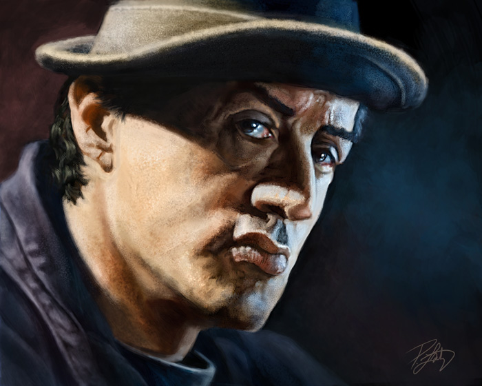
Portrait of Rocky Balboa

This painting, like many that I do these days, was an absolute pleasure to work on.  For the past couple of years, I’ve been focused on my Animal Totems, and although they are still where I plan to continue investing my creative energy, I realized that I hadn’t done a full painting of a person in quite awhile.  Yes, I’ve done a few on the iPad, but not a fully finished painting.  I think the last one I did was a caricature of Bert Monroy, and that was in June of 2010.  I figured it was time to do another one, and rather than a caricature, I wanted to paint a portrait.

Regular readers will know how much I love movies.  One of my favorites is Rocky Balboa, the sixth movie in the series.  I think the reason I like it is because it’s not so much about Rocky’s battle with an opponent, it’s his struggle with getting older, but still feeling he has left something undone.  Some critics panned it for being overly romanticized and unrealistic, but I disagree.  Very much like the tone and writing of the first Rocky movie, the movie that won and was nominated for a slew of Oscars in 1976.   Rocky Balboa inspired me, much like Sylvester Stallone’s own personal story does.  If you aren’t familiar with it, you might want to take the time to listen to how Tony Robbins tells it.

Rather than paint him as the fighter in the ring, I wanted to paint the real character.   His wife has passed on, his son is now a young man living on his own, and Rocky spends his evenings at his restaurant telling people old ‘war stories’ from his glory days.  But there’s still that hunger.  The movie reminds me that one of my own biggest fears is becoming an old man and regretting the things left undone.
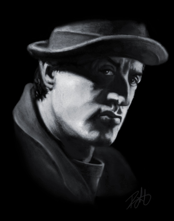
This was started as a painting on the iPad, shown here.  I used the procreate app, the Wacom Bamboo Stylus, and the Nomad mini brush.  As much as I enjoy painting on the iPad, and a number of my recent portrait paintings have stopped there, I brought this one into Photoshop and painted over it to get the look and texture I wanted.  While my animal paintings are very detailed, this one is intentionally rougher.  The tone of the piece, and the age of the subject called for a little less polish.  The finished painting was done in Photoshop with a Wacom Intuos4 medium tablet, and the image size is 16″X20″ at 300ppi.

Even though I’ve never had any of my own work printed for myself, I think I will get this one printed on canvas and framed for my office.  Never hurts to be reminded that our time here is short.

Incidentally, one of my favorite onscreen speeches is from this movie, this one from Rocky to his son.

Posted on Leave a comment

Tom Richmond

While there are many artists I admire, there are a select few whose artwork continues to inspire me and makes me want to be a better artist.  I’ll consistently tell people who ask me for career advice, to find and learn from artists whose work you like and who are better than you are.

The first part is important.  While it’s easy to find people who are better artists, if you don’t like their work, it just won’t make you want to be better by seeing it.  Consistently, I can go to artists like Drew Struzan, Neville Page, and Jason Seiler and know that I’ll find work I’m not able to do yet, but because I love their work, it inspires me to try.  Better artists will almost always have something to teach you, because hopefully by the time you’ve gotten better, so have they.

Another artist who consistently makes me green with envy (in a good way) is Tom Richmond, a very well known and popular MAD magazine and caricature artist.  I’ve been a fan of his for many years.  If you draw caricatures, and haven’t seen Tom’s work, you might want to take a look.  He’s got a great website and blog.  I especially enjoy his Sunday Mailbag posts where he answers reader questions.  Tom’s got a great reputation in the industry not only for his work, but he’s active in the community and always willing to offer helpful advice.

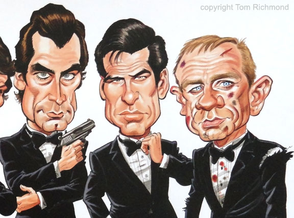
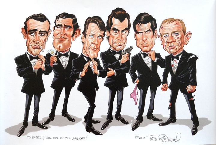
Recently, he mentioned that he had taken a bunch of limited edition prints of the one you see here to Comic-Con in San Diego and ended up coming back with some.  When I saw the print (shown here, with permission), I knew I was buying one.  It made me laugh out loud.  There’s just something in Tom’s style  of drawing that I’m missing in my own cartoons, some life and action I want to capture but am not quite there yet, and I knew this would inspire me to keep trying.  So it will be matted and framed and hang in my office where I can easily see it.  It’s a great print.  Still some available here, if you’re interested.

Incidentally, Tom’s long awaited book “The Mad Art of Caricature” (which I ordered this morning) is going to be released next month.  If you want to draw caricatures, there are a lot of great books out there, but without even having seen it yet, aside from sneak peeks on his blog, I have a feeling this will be at the top of the list.

Thanks, Tom!

Posted on 1 Comment

iPad Painting: Daniel Day-Lewis


Here’s another painting drawn on the iPad for fun and practice. This is Bill ‘The Butcher’ Cutting from the movie ‘Gangs of New York.’ According to the DVD extras, Daniel Day-Lewis was so committed to the role, that he stayed in character while on set, even when the cameras were off. I’ve seen this movie a few times, and for me, the character of The Butcher is the best part of it.

Had a few requests for progress shots from the last iPad painting I did, but since I hadn’t saved any file copies, I kept that in mind while painting this one. Click on any of these images to see them a bit larger, although size is limited by the iPad resolution.

Image 1-3

Image 4-6

Closeup

Now that I’ve done a couple of paintings and a number of cartoons with the iPad, I’m aware of a few limitations, aside from the resolution, that make it difficult to ever really do any finished work.

First, the brightness of the iPad. If I paint on full brightness, it’s a little hard on the eyes, so I paint with the brightness set to about half or 60%. When I send the images by email to my desktop computer, they’re a fair bit darker than they are on the iPad, so all of these images have had exposure adjustments in Photoshop.

My desktop and laptop computers are colour calibrated, so it’s a little unnerving to paint in colour on the iPad, because it doesn’t look the same when I bring it into Photoshop. This is why I painted in black and white first, in order to get the values right. After that, I added a colour layer in the ArtStudio app, then I flattened it and continued painting. As you can see, most of the work, however, was done in black and white.

While I’m pleased with the way this painting turned out, I might have chosen a difference reference photo to work from, as I think I could have found a better pose for the character. But since this is as far as I intend on taking this image, no harm, no foul. It was good practice.

Posted on 12 Comments

iPad Painting: James Whitmore


Here is another painting done on the iPad, very different than my usual style. This is a value study of the great character actor, James Whitmore. If I were to title this piece, I’d probably call it ‘Brooks Was Here,’ as it’s not so much the actor that I wanted to paint, but his character, Brooks Hatlen from The Shawshank Redemption.

For every larger than life Brad Pitt or George Clooney on the silver screen, there are a hundred brilliant character actors like James Whitmore. The sort of actor that everyone recognizes, even if you don’t know his name, and have never see him on the cover of People magazine. I love rich characters in movies, but those characters can just as easily fall flat without the right actor breathing life into it.

This painting was a pleasure to work on, as Brooks Hatlen has always been one of my favorite film characters. It didn’t feel right to paint this as a caricature, and even with the resolution limitations of the iPad document size, I could have spent many more hours on it. It really was a joy to paint.

Once again, I used the ArtStudio app and the Targus stylus. In a reversal of my usual method of painting on a white canvas, I filled the canvas with black, and then painted in shades of grey. This next image is zoomed in to 100 percent, so making it any larger would have given way to pixelation.

I’ve recently realized that I need to always have a painting or image to work on that has no deadline. While I spend all day drawing or working on my business, this piece was done over two evenings while watching TV, and an hour at the coffee shop yesterday morning. It was a nice break from the commission work.

With no shortage of wonderful character actors to choose from, I would imagine I’ll be painting many more of these.

Posted on Leave a comment

iPad Painting: Billy Connolly


With my heavy workload lately, almost everything I’ve been doing has been for a deadline. Even the animal paintings have now become one more item on my ‘to-do’ list. It has begun to wear a little thin, so I wanted to work on something this week that was just for fun.

I’m really enjoying working on the iPad, and despite the fact that some people lament that it’s not pressure sensitive like a Wacom tablet, the drawing apps available are incredibly versatile. I haven’t painted any people in awhile, and I’ve been itching to get back at that, if for nothing else, than to improve those skills. Billy Connolly is on a growing list of people I’ve always wanted to paint, so he was as good a subject as any.

A few years ago, I read his biography, entitled ‘Billy,’ written by his wife Pamela Stephenson. I was already a fan of his comedy, but I’ve grown to become a fan of him personally as well. ‘The Big Yin’ is such a talented musician and actor, a brilliant comedian, and a dangerously intelligent man.

At one point, I had intended to do a full painting of him, and someday I still might. But for now, this was just an exercise to take drawing on the iPad a little further than just drawing a cartoon character. With the Targus stylus I recently acquired, I felt I could finally do some painting on the device.

I could have done this in colour, but I thought for this first go ’round, I’d stick with black and white. While I didn’t keep track of the time, as I worked on this off and on over the course of a week in the evenings, I would estimate that it took about four or five hours, working on the ArtStudio app. Somebody recently asked me on Facebook if I preferred this one over the Sketchbook Pro app. Having used both, I do prefer ArtStudio to Sketchbook Pro, even though the latter is still a very fine app to work with. I just find the tools in ArtStudio easier to use, and there are more of them.

It’s doubtful that I’ll ever do finished work on the iPad, because the resolution capability of the app doesn’t allow for extreme detail, but I will definitely keep stretching, to see how far I can take it. This is undoubtedly the first of many paintings I’ll experiment with on the iPad.

Posted on Leave a comment

Inspired by Drew


Every artist should have other artists they look to when they need to find that spark to take their work just a little further. Lately I’ve been working through the winter doldrums and feeling a lack of inspiration largely due to a difficult project I’m currently working on, one that isn’t very creative. While very worthwhile, I’m not really having any fun with it and that’s frustrating.

It’s only temporary, and the end is in sight, but in the meantime, I went looking for a little inspiration this morning, and found it in a very familiar place, in a book called, “The Movie Posters of Drew Struzan.”

I’ve written about Drew Struzan before on this blog. Having reread that blog entry this morning, I realized that anything else I say about him would be repetition. He is easily my favorite artist (no really, my absolute favorite artist.) While the size of the images in this video do not do his work justice, you’ll still get the idea of why I continue to be in awe of and inspired by, the work of Drew Struzan.