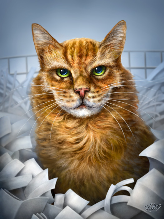
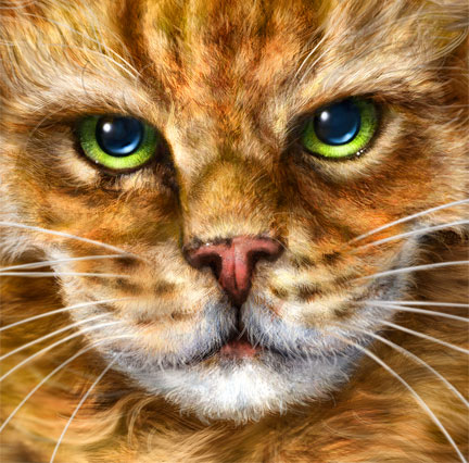
 This painting was finished in mid-August, but I couldn’t post it until today. The client had it done to give to her sister for her birthday this past weekend. I had a lot of time to work on this, as it was ordered early in the year, so it was a long deadline, which is a rare but welcome thing. It was printed and stretched on canvas at a size of 12″X16″.
Titus is an interesting story. He passed away last year at the very ripe old age of 24, which is VERY senior for a cat. Apparently he lived a great life, was a home and shop cat for their printing company and very lovable. Having lost one of our own cats earlier this year, I’m recently acquainted with the pain of that loss, and was actually going through it while working on this one. This gift was a very special one and I worked long hours on it. The client was very happy with the final result and told me that her sister was as well, so that makes me happy.
Some challenges on this one. While I had a LOT of reference photos to choose from, they were all low-res in an online photo album. Basically no detail shots to work with at all. The client couldn’t very well ask her sister for better photos without giving away that a gift of some sort might be in the works. So I just had to work with what I had. On my DVD for painting, I talk about different tricks to make less-than-great photos usable for reference and I had to use them all. I found myself looking at my own cat for some of the more detailed fur and features, even though her colouring is completely different. It worked, though.
 I gave her the option of my usual caricature style or the more portrait style that I did of Don Diego for my DVD. I was a bit relieved that she chose the former, because even though Titus still doesn’t look really happy in this painting, it’s a lot better than any of the photos depicted. Dogs seems to smile naturally, just because of the shape of their mouth and muzzle. Cats, not so much. They just don’t often look pleased, but that’s part of their attitude that cat people love so much. Good thing they purr and can make their eyes seem three times bigger when they want something.
Titus apparently liked to sit in the ‘paper cage’, a really large recycling bin for a mix of scrap and shredded paper and the client thought he should be in that setting. I thought it was a great idea, because it made it even more of a personal image. Painting the paper was tough, because I still wanted detail so that it didn’t look muddy, but not so much that it took away from the cat, because he is obviously the most important part of the painting. This is the reason I left out any text on the paper.
I enjoy painting commissions. Unfortunately, because of the work involved, not everybody can afford to give such a gift. I’m very aware of this when I create a painting, and try to put my best effort into each one of them. This was no exception and I consider it one of my best pieces.
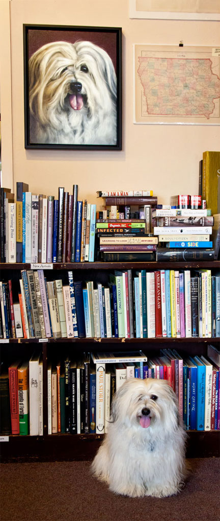 Regular readers will know the story by now, but long story short, my friend Pat Wendt in Lincoln, Nebraska has this wonderful little dog named Don Diego. When it came time to record my animal painting DVD for PhotoshopCAFE, I thought he’d be the perfect subject. Since Pat is a talented photographer, I knew I’d get a great reference photo to work from, and I certainly did. In exchange for the use of her photo (and her dog), I gave her some prints, copies of both of my DVD’s, my undying gratitude and the framed stretched canvas painting that you see here.
