Posted on

Wacom One Inspiration

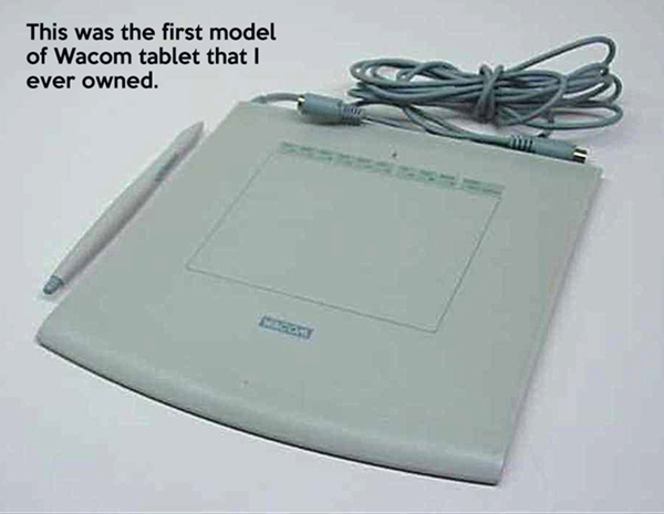
One of the unexpected benefits of having been a digital artist since the late 1990s is that I’ve been able to see all of the advances in the medium. My first Wacom tablet was an original Intuos with only a 4”X5” drawing surface.

It seemed so futuristic.  I could move the stylus on this tablet, which would be mirrored on the screen by the cursor, and then DRAW. To some, it seemed complicated, but to me, it seemed like a prosthetic limb I’d been missing.

I don’t know how to paint with oils, acrylics, or watercolours. My sketching skills with a pencil are adequate; my pen and ink skills less so. I’ve tried charcoal, woodcarving, sculpture, but just barely, and all of it felt clumsy.

This is obviously a personal problem, given the centuries of incredible artwork created with those tools.

But digital tools always felt right to me. It has been my medium for more than twenty years.

When it came to software, there was Photoshop, Painter, and a few others. I tried them all. But for the hardware, if I wanted to work digitally, a Wacom tablet wasn’t an option. It was a requirement.

Since then, I can only guess how many Wacom devices I’ve owned, upgrading when I felt the need and could scrape together the funds. For the first half of my professional career, I used tablets rather than displays. That’s where you look at the screen but draw on the device sitting on your desk. It’s not difficult to get used to since we all use a mouse the same way. We look at the cursor, not the device in our hand, and our brain figures it out pretty fast.

Drawing with a Wacom tablet was easy for me.

But in 2011, I got my first Wacom Cintiq display, a 12WX, where I could draw right on the screen. These days, that seems unremarkable, considering how many screens and mobile devices we have at our fingertips. But at the time, it was a huge deal for me.

The 12WX was pretty thrilling, even though it could be a bit clunky at times. Marketed as a portable model,  being the first one that didn’t take up your whole desk, it was more like the prototype for what would come next.
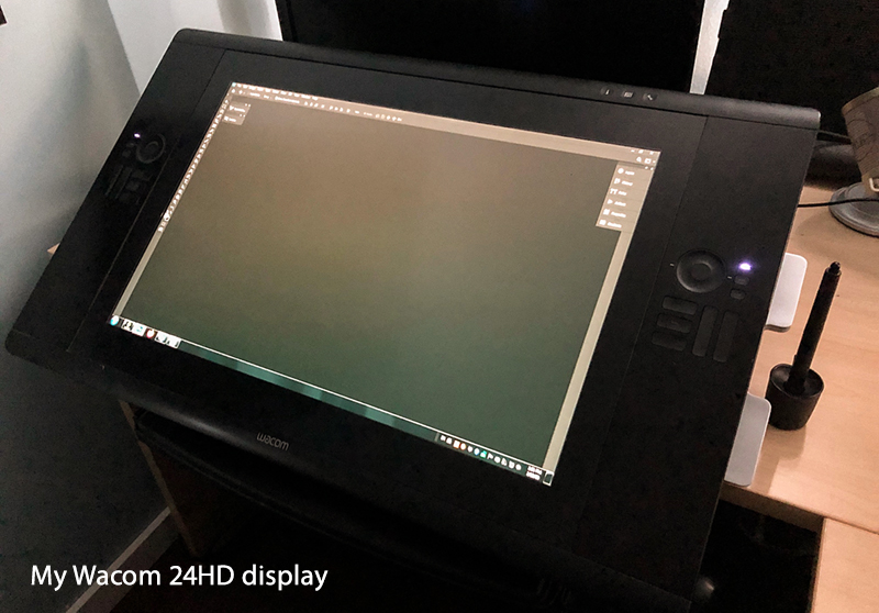
When I got my Cintiq 24HD in 2012, everything changed for me. Not only was I now using their most professional display model, but I also had a working relationship with Wacom.

That display is still the one I use every day, and while there are newer models available, I have a sentimental attachment to this display, and I never feel it’s lacking. Yes, it’s a piece of technology, but like a reliable car, years out of the showroom, my 24HD is like an old friend. I’ve created many of my favourite paintings on this display.

In the past six months, Wacom has sent me a couple of their newer portable models to evaluate and work with, recording videos with them. The Cintiq 16 I received last summer is a welcome addition to my digital toolset.  I use it while working on my laptop, often on the couch in the evenings while watching TV. You can see a recording I did with that one in a blog post from late last year.
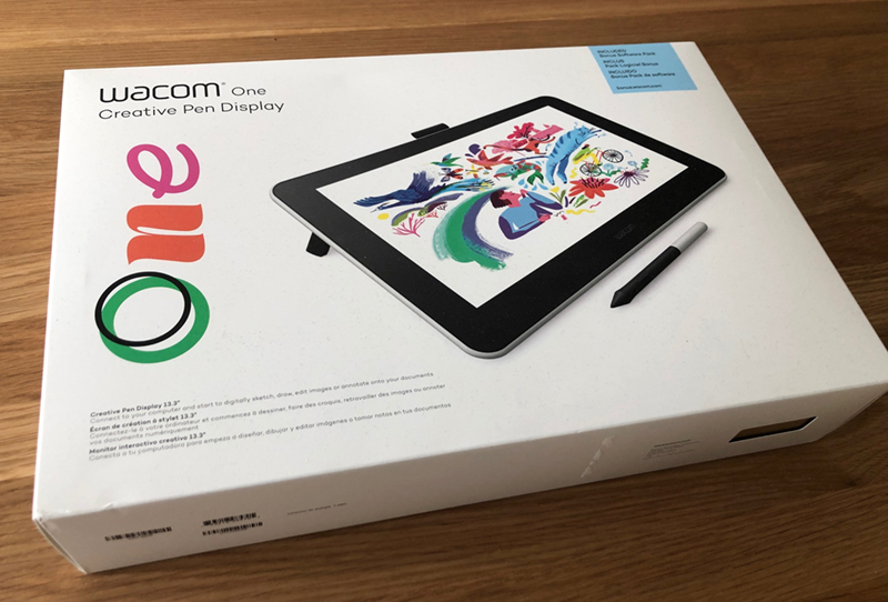
Just recently, I was asked if I would take their new Wacom One display for a spin. Pitched as an affordable solution for artists looking to make the jump to digital or for those just starting, it’s an entry-level display.

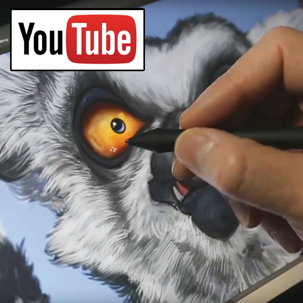
After using it to paint my latest Ring-tailed Lemur, however, I find that notion rather amusing. This display is better than all of the tablets and displays I used for most of my professional career.

Without getting too technical, it’s a comfortable experience. From the feel of the stylus on the screen, the pressure sensitivity, the image quality of the display and the simple setup and installation, this is a display I would have been thrilled to have worked with early in my career.

I know many people these days draw on the iPad Pro with the Apple Pencil, and I’ve seen some incredible work done with those tools. I have an iPad Pro, I use it every day, and when I bought it, I expected I’d be doing a lot of drawing with it. There’s even a professional level painting app called procreate that’s pretty incredible.

But no matter how often I work with the iPad, it never feels quite right to me.

Whether it’s the stylus on the screen, the display itself, or the size, I can’t seem to get comfortable with it. To be fair, the iPad is a standalone device, where a Wacom display has to plug into a computer, whether a PC, Mac, Notebook or Laptop. But most people have those already.

I’ve often said that the best tools are the ones you don’t have to think about. When I’m in the zone, painting fur, feathers or details, I don’t want to have to stop because the tools aren’t doing what I want them to do. I’ve invested quite a bit of time on the iPad Pro, and it just doesn’t feel as comfortable as a Wacom display.

I’m well aware that we resist change, so I’ve tried other devices and displays. But I keep coming back to Wacom time after time. Part of me knows that being sent the display, tasked with doing a video, it’s my job to pump it up and promote it.

But honestly, if I didn’t like it, I wouldn’t. And I know my friend Pam at Wacom wouldn’t want me to. I was thankful I didn’t have to find a way to put a positive spin on this display. There is nothing about this display that I can criticize. For what was promised, it over-delivered.

The only thing I missed while using it was the Express Keys I have on my Cintiq 24HD. I use those all the time. Those are buttons and dials that you can program to access features you use often. Those features are now automatic to me. Thankfully, in recent years, Wacom introduced a device called the Express Key Remote. It’s a standalone device, and it worked flawlessly with the Wacom One.

A beginner might find Express Keys too intimidating at first, and I understand why they left out of this entry-level display, both for price and function. But it’s nice to know that if a user wants to try them, there’s an affordable add-on option.

As for the video above, called ‘Voices,’ my task was to offer a message to new artists, something to inspire them to give their creativity the chance it deserves. I spent a great deal of time thinking about what I would have wanted to hear when I was new at this artist’s life, trying to gather the courage to stick my neck out.

Ultimately, I ended up speaking to myself two decades ago, that twenty-something kid who was scared to death of being a fraud, having never gone to art school. I’d have wanted to let him know that it isn’t easy for anybody. The only way to navigate this world is through experience. Decades later, it’s still scary to do this for a living, but I can’t imagine doing anything else.

I’d like to think the message I recorded would have given him hope.

Cheers,
Patrick

© Patrick LaMontagne
@LaMontagneArt
If you’d like to receive my newsletter which features blog posts, new paintings and editorial cartoons, follow this link to the sign up form.
Posted on

Ring-Tailed Ringleader

Here’s a new painting, a Ring-tailed Lemur just finished this morning.

Wacom sent me their new Wacom One display to take for a test drive and to record a video for them. The video has an inspirational theme, rather than a technical one. I’ve written the script, recorded the video, but now I need a few days to edit all of the footage and record the audio, especially since I have my cartoon deadlines as well. It’s a lot of work to take a painting that took about 15 hours and compress it into a 3 or 4 minute video so people won’t get bored.

Seriously, I love painting hair and fur, but it would be effective torture to make me watch many hours of somebody else doing it.

Initially supposed to be more of a cartoony creation, I wanted to see what kind of advances Wacom had made in their display technology, so I painted with it instead. The Wacom One is being marketed as an entry-level display, but I enjoyed working with it and didn’t feel hobbled at all.

I’ll have a more technical evaluation post a little later, but for those of you who just like looking at my funny looking animal paintings, I’ll save those details.

The Ring-tailed Lemurs at the Calgary Zoo are fun to watch, and the Land of Lemurs is an immersive experience. Their enclosure allows them to freely roam where they like and it’s the people who are restricted in the center, but with no barrier. With zoo staff on hand to make sure people follow the rules, the open-air concept allows for some great photo opportunities.

I’ve taken many shots of these critters and plan to paint a group of them together as they like to huddle in a ball. All of the expressive faces peeking out is quite comical.
While going through my photo reference, however, I came across the image above. She’s a female, as are all of the ring-tailed lemurs at the zoo (or were at the time of this photo), and I liked what I saw. I even loved the blue sky background, and saw no need to change it. I don’t know if she really has a bad attitude, but part of the reason I paint the personalities I do is that I actually see that in the photo reference I take. The painting definitely looks male, however.

This was a lot of fun. I know I say that about many of my paintings, but I’d put this painting experience in the Top 3. Many of my paintings could be labelled cute, but this one borders on psychotic, which is probably why I liked it so much. Those crazy eyes suggest a critter that isn’t quite all there.

As my friend Pam at Wacom said this morning on Instagram, “He looks like an evil ringleader.”

So while I don’t know if it’s the kind of image that will be popular on a print or licensed product, some of my best images were ones I did for myself. I never expected my cantankerous Ostrich image to be popular and that one has developed a strange cult following I don’t fully understand.

I worked a very long day on Sunday drawing three editorial cartoons so that I could spend all day yesterday putting the final hours in on this piece. I could have finished it last night, but I erred on the side of patience and decided to sleep on it. When I opened the image this morning, I laughed out loud. It’s such a ridiculous expression.
Another hour on the fine hairs, tweaks here and there, tunes cranked in the earbuds, and I’m glad I waited. It was a great way to start my day.

I’m looking forward to sharing the video soon.

Cheers,
Patrick

© Patrick LaMontagne
@LaMontagneArt
If you’d like to receive my newsletter which features blog posts, new paintings and editorial cartoons, follow this link to the sign up form.

Posted on

Where’s the Camera?

When I was in my early twenties, at the end of my five years in the Reserves, I had the opportunity to work as a paid extra on the movie Legends of the Fall.

It was a fantastic experience, full of great stories. I’ve written about this before, here’s the link if you’re interested.

If the story is moving and you’re captivated, a good movie should allow you to suspend your disbelief. Sure, there might be continuity errors from time to time, and we all know that the science behind a lot of movies is pretty loose. But a good story should keep you interested, a willing participant in the fantasy delivered on screen.

Even movies based in reality will stretch and squash the truth to tell a better story. We welcome the lie because even with amazing real-life stories, the movie version will be better.

People will say they want to know how the magician performs his illusions, but it’s almost always disappointing when you do. The fun lives in the fantasy and when that’s gone, it’s just a trick.

When filming began on Legends of the Fall, there were about 1000 extras. It might have been 600-700, but it was a lot. As it was a First World War epic drama, we were all young men, each in period uniform. We filmed each night, all night long, and while there was plenty of downtime on set, it was exciting when the cameras were rolling.

After the first few days, the main army was sent home, and there were 60 of us left for the next two weeks, all of whom required military experience. The reason was that we fired authentic Lee Enfield rifles in successive scenes and even blank rounds can kill if used irresponsibly.

The main battlefield looked as you would imagine. Mud everywhere, large craters, uneven terrain, burnt trees, and rows of barbed wire fence, with meandering trenches along either side. For the first few nights, all we did was run back and forth across the field, an army whose only enemy was time and money.

We did quite a few rehearsal runs, choosing our routes to minimize collisions, or tripping on obstacles in the way. Before each run, an Assistant Director would walk down the line, pointing to every second, third or fourth man and say, “Dead.”

This meant that at some point during your run, from one side of the field to the other, you were to fall and stay still. No theatrics, no crying out, drop and don’t move. If you weren’t supposed to die, but you tripped and fell, or an explosion went off near you, you were to consider yourself dead, resurrected only when the director yelled, “Cut!”

A few from the larger group were kicked off the set for goofing around. One guy ran across the front of the camera, looked right into the lens and gave a big smile. They dismissed him.

There were huge stadium-style lights on stands, pointed toward the field. We filmed all night long but it was almost like daylight. When you see a night scene in a movie, it’s quite bright so that the camera can see everything. Sometimes they’ll add a deep blue filter to the camera so that a scene filmed during the day looks like night. One of the giveaways for that trick is a landscape scene where you can see shadows or light details in the distance.

In those battlefield scenes, with the cameras on a hill, facing east, all the viewer would see is an army running across a field. There’s smoke, explosions, yelling, screaming, and it looks like chaos.

But that’s not what we saw.

Take another camera, position it on the eastern edge of the field and turn it west, and you’d see another army of production people, lights, tents, vehicles, cameras, and activity just behind the camera. You would also see several figures in bright orange jumpsuits, sitting in front of built-up mud mounds all over the battlefield. In front of them were control boards, their job to set off the pyrotechnics while we ran around them.

If the main actors were involved in any of the scenes, you would see a sawdust trail in the mud, the path they were supposed to run, and the rest of us were to avoid.

When I watch a movie today, if the pace is slow and my mind wanders away from the illusion, I’ll often think about how it was made and ask myself, “Where’s the Camera?”

They film quite a few movies around here in Canmore and Banff. A favourite is The Edge with Alec Baldwin and Anthony Hopkins. I watched it again recently and there are many scenes where they’re supposed to be lost in the wilderness, far from civilization. But if you’re from around here, knowing the true locations is amusing.

One particular scene was filmed just around the corner from where we live, in an open field called Indian Flats. In the movie, they’d just killed a bear, were exhausted and wondering if they were going to make it back to civilization. The mountains loom high above them, and it looks like extreme wilderness.

If the camera were raised just ten feet higher or turned 45 degrees left, however, you would see Highway 1A right beside them, the TransCanada less than a kilometre away, the light industrial area of Canmore and no shortage of local infrastructure.

It’s not something we think about while watching the movie, because we’re invested in the lie. We want to be entertained.

A side effect of that long-ago experience is that I find myself asking the same question in other areas of life as well, where the lie is not so obvious or welcome.

Where’s the camera? What am I not seeing?

While we recently killed our cable because we found we were primarily watching streaming services, I hadn’t been a fan of reality TV for this very reason. When you see people arguing, a scary suspense-filled moment, or a near-death experience on one of these shows, it gives you a whole new perspective when you start thinking about the camera and crew filming the scene. Suddenly, it seems more like a bad performance, not scary at all, and nobody is even remotely close to injury or death. The insurance people would hate that.

These shows not only film conflict, but they try to instigate it. It’s entertainment, but not reality.

The same can be said for all of the selfies and carefully curated images and videos posted on social media.

One of the most visited locations around here is Moraine Lake, near Lake Louise. It gets so busy in the summer that they periodically close the road and limit traffic, because there are so many people up there, taking photos of the Valley of the Ten Peaks.

It’s easy for one person to stand near the edge of the water, take a photo and have it look like they’ve just completed this arduous hike and are in this serene location all by themselves. But move the camera back thirty feet, and you’d see hundreds of other people taking the same photo, right beside a parking lot full of cars and buses.

You’re likely familiar with the beach feet photo, where someone takes a picture of their own feet stretched out before them on a towel or deck chair, the beach and ocean filling the rest of the scene. The caption usually reads, The Good Life or Lost in Paradise.

Meanwhile, move the camera back twenty feet, and they’re one of many people on a crowded beach, at an all-inclusive resort complete with loud music, gangs of drunken college kids and screaming children who’ve had too much sun.

Did you know that you can take a perfect picture of the Sphinx and pyramids while standing in front of a Pizza Hut in Cairo? It’s right across the street. It’s now become an online gag to take the photo from inside the Pizza Hut to capture the scene with the logo on the window. Google ‘pyramids Pizza Hut’ and you’ll see.

My favourite would have to be the one where somebody shows themselves at the gym, or in a contemplative moment looking out at the ocean, or sitting in a Zen-like lotus pose trying to convince you that they’re one with the universe. It becomes completely ridiculous when you consider that they had to set the camera/phone up, put it on a timer, rush back to pose to show you how Zen and peaceful they are before they check the photo, decide they look fat in that one and try it all over again.

Add in photo filters to change the weather or light, some feature manipulators, and a softening filter to make you look younger, which most of the time makes you look plastic.

These exercises in camera trickery happen for two reasons. One, to convince others that our best-laid plans are even better than they appear, and two, to make us feel a little better about our own lives that aren’t quite measuring up to unrealistic expectations.

And while we’re making ourselves feel better, we’re making others feel worse, and they do the same in return when they post their own staged photos. No wonder we’re all so miserable, angry and dissatisfied with life.

Whether it’s movies, reality TV, social media, the news, politics, or any other information we’re fed daily, realize that it’s all designed to sell you something. It could be a product, an experience, or an illusion, but simply put, it’s a manipulation.

A friend’s vacay pics making you jealous? Ask yourself how much time they spent snapping and uploading filtered photos instead of enjoying where they were. They were probably looking at their phone more on vacation than they do at home.

The perfect family Christmas dinner photo? The credit cards are all maxed, the turkey’s overcooked, Grandpa’s drunk and being racist again, and the dog just threw up under the table.

The politician blaming everything on his opponent and promising you he’ll fix all that ails you? That always changes right after the election, no matter who is in power. The same middle-class family he posed with at that campaign rally now can’t make ends meet, because that same politician eliminated their jobs in his first budget.

Now with deep fake technology and other software, a photo or video is no more evidence of truth or fact than a nosy neighbour gossiping over the back fence.

Fake news works because we choose to believe it.  It’s designed to spread because it plays on our bias. When one person believes one of these lies, they share it with others, and as Nazi propagandist Joseph Goebbels once said, “Repeat a lie often enough and it becomes the truth.”

With a new year upon us, I would make a simple suggestion. No matter what you read, see, hear, or experience, take a moment to consider that you do not see the whole picture, especially if it’s something you want to believe. That should be your first clue.

Ask yourself if the camera is showing you something real.

Ask yourself what it’s not showing you.

Then ask why.

© Patrick LaMontagne
@LaMontagneArt
If you’d like to receive my newsletter which features blog posts, new paintings and editorial cartoons, follow this link to the sign up form.

Posted on

A Christmas Reindeer

Yes, it’s a Christmas miracle. Even though I’m a confirmed Grinch, Scrooge and fan of Krampus, I decided to create a painting of a Christmas reindeer, complete with time lapse video and festive music to go along with it. Call it a temporary lapse in Bah Humbug, emphasis on the temporary.

This was painted in Photoshop on my trusty Wacom Cintiq 24HD. Feel free to share it, either from this post or from Youtube.

Cheers,
Patrick

@LaMontagneArt
If you’d like to receive my newsletter which features blog posts, new paintings and editorial cartoons, follow this link to the sign up form.

Posted on

Season’s Greetings – A Video


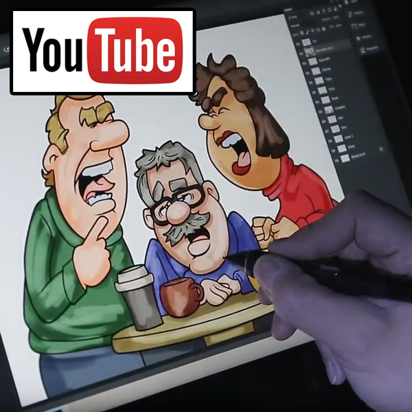
Every so often, I like to record a high speed ‘how it’s made’ video for a cartoon or a painting. I’d love to do more of these, but they’re time consuming.

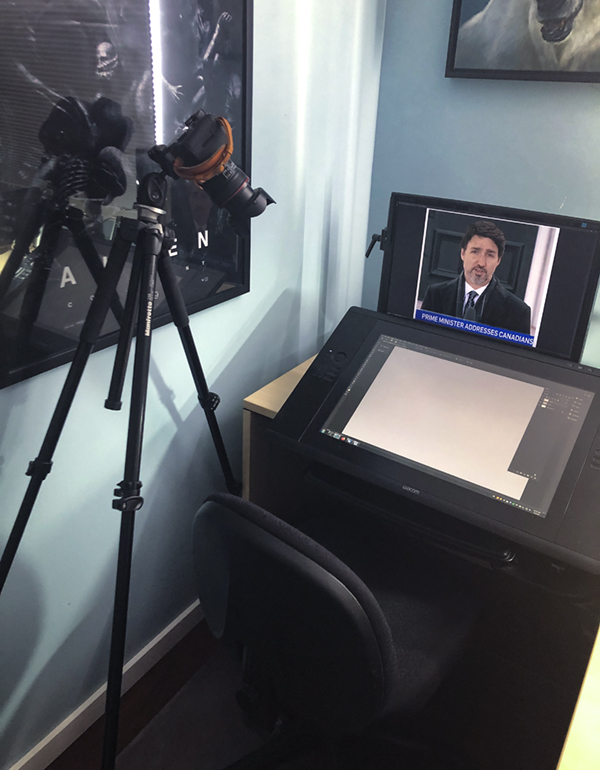
With the over-the-shoulder view, the kind most people want to see, I used my Canon DSLR on a tripod for the best result. The challenge is that it needs to be close enough to capture the pen on the display, but back far enough so that I don’t bump into it with my shoulder or chair.

I’ve been drawing on Wacom tablets and displays for almost twenty years, so a lot of it is muscle memory. I go through the motions without thinking about the technology. As any artist in any medium can attest, once you’ve been using them for any length of time, the tools become extensions of your hands and arms. You think about the image you’re creating, not about the tools you’re using.

When I record the process, however, the tools are front of mind, which means the cartoon or painting takes longer. There’s really no flow to it and the process feels clunky.

When I’m painting, I can go for an hour without thinking about much else. When recording, I have to stop the camera after about ten minutes. Software is hardly perfect and by recording multiple short segments, it wouldn’t matter too much if I lost one. If I recorded all of it at once, however, that one file becomes a lot more precious.

I don’t record every brush stroke because it would be incredibly boring. I record ten minutes, shut the camera off, draw or paint for ten or twenty more minutes, then record again. There needs to be a big enough change between segments to keep the viewer’s interest.

Once I have enough from the camera, then I’ll often record some screen capture.  It’s no longer the display itself, but software in my computer recording what is happening on the screen. This doesn’t work all that well for painting detailed hair and fur because the cursor, brush and detail is so small, that it’s barely discernible to the viewer.

And again, incredibly boring.

Once I have all of the files recorded, from the camera and computer, I’ll bring them into my video editing software.

How I decided on the length of the video was the music I used as accompaniment. That isn’t always the case, but usual for cartoon videos. I can shorten visual segments, change the playback speed, and more easily mess with the footage than I can with the audio. This Christmas tune is around two minutes, which is a good length for a Youtube video, since our attention spans keep getting shorter.

I didn’t record the whole sketching process because I knew I’d have to mess about with the poses to get all three characters in, plus the talk bubbles.  That’s why you can see my tracing over my own sketch. While that would no doubt be of interest to the beginner or student, not so much for the average viewer.

These videos, it’s all about compromise for content.

For those interested in the tech part, I draw almost exclusively in Photoshop on a Wacom Cintiq 24HD. This recording, however, was done on a Wacom Cintiq 16 display, as they sent me one in August. I put it through its paces while painting my White/Amur Tiger video.

It’s a nice display and I enjoy drawing with it, so that’s why I chose it again for this video.

For recording and editing, I use Camtasia Studio 8. It’s a simple interface that gives me what I need without complicating things. I’ve been using this software for many years and it gets the job done.

While this video added an extra few unpaid work hours to my Sunday morning, I created it to give my newspaper clients some added bonus content for their websites and social media feeds. In any business, you’ll rarely go wrong by offering added value from time to time.

As always, feel free to share it, along with any of my other work.

Cheers,
Patrick

@LaMontagneArt
If you’d like to receive my newsletter which features blog posts, new paintings and editorial cartoons, follow this link to the sign up form.

Posted on

Wacom and Happy Accidents

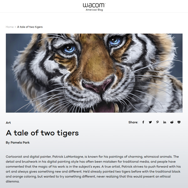
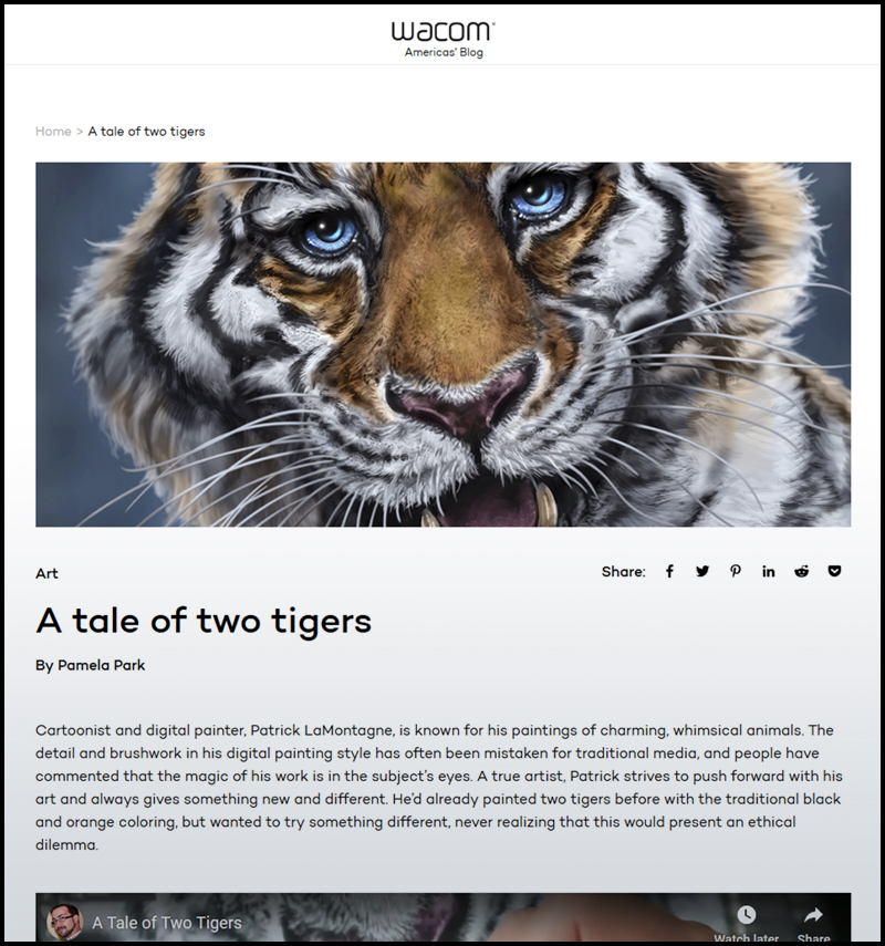
My friend Pam, who is the Database Marketing Manager at Wacom, posted a very nice blog post on the Wacom Community Page, featuring the video they had me do for them. She also  shared the story of my tiger painting that went awry.

Funny, but Pam and I talked after the fact and both of us agreed that the strange twist with that painting actually made for a better story to tell in the video. Something I’ve learned over the years is that the stories behind the art are as interesting to folks as the art itself. That’s nice because not only are the stories about why I paint some of these critters important to me, but I enjoy telling them.

There’s a common term among creative types, that describes how sometimes your art or experience delivers a better result than what you had initially planned, from being forced to adapt to the unexpected. We call them happy accidents. I’ve had them happen while creating brushes, trying new painting techniques, program crashes that required creating handy shortcuts to deliver on deadline, and just like hindsight, you never quite realize what happened until you’ve had time to reflect. Some of those happy accidents became part of my process.

I’ve heard from a number of people this week who not only appreciated learning about the controversy surrounding white tigers, but also preferred the second painting over the first. Who knew?

Here’s the blog post on the Wacom Community Site.

Cheers,
Patrick

If you’d like to receive my newsletter which features blog posts, new paintings and editorial cartoons, follow this link to the sign up form.

Posted on

Working with Wacom

In the late nineties, when I first started to create art professionally, I had primarily drawn in pencil or pen on paper. Up until my first editorial cartoons for a local newspaper, I had never considered art as anything more than a hobby.

I had played around with some art on a computer from time to time, but only using a mouse. If you’ve never done that, it can be a rather frustrating experience, especially when you try to include any detail.

Digital drawing tablets were in their infancy, but I knew I wanted one. My ever-supportive parents bought me my first one as a gift. It was the first generation Wacom Intuos tablet, quite small, with a working surface of just 4 X 5 inches.

I thought it was one of the coolest things I ever owned. I’ve been drawing and painting on a computer ever since.

The technology was so new then, that you had to explain it to people. The worst part was that as soon as you said you worked on the computer, people figured that the computer was doing all of the work. It certainly didn’t help that one of the most popular and widespread pieces of art software on the planet was (and still is) Adobe Photoshop.

So not only was the computer doing all of the work, but all a digital artist was doing was changing a photo. I can’t count how many times I heard that stated with authority.

I’ve spent over half of my career explaining to people that digital drawing and painting is just as much of an art medium as oil, acrylic or watercolour. These days, the stigma surrounding digital art is largely gone and people realize that it’s more than just pushing a button or applying a filter. There are countless skilled artists around the world now creating digitally, each an ambassador for the medium.

One of the pillars of my two decade career has been that I’ve always worked on a Wacom tablet or display. They were the only name in digital art tools when I first started and they’ve remained the industry standard for quality and innovation. Whenever I’ve replaced one, it has been to take advantage of something new they’ve come up with that would make my work more enjoyable or efficient, never because it broke or stopped working.

 I still have a backup Intuos 5 tablet in my closet; ready as a substitute should my Cintiq 24HD display ever stop working. It’s like an insurance policy, but one I never really expect to use. I would never want to be without a Wacom device.

Even today, with advances in mobile drawing technology, I only use my iPad Pro and Apple Pencil for practice pieces and sketches. All of my finished work is done on my Wacom Cintiq.

In 2010 at the Photoshop World Conference, my funny looking animal paintings were still pretty new and I was thrilled to win the Guru Award for the Illustration category AND the Best in Show Award. In a strange twist of fate that would change the course of my career, the emcee of the event, Larry Becker, misspoke and said that the top prize was a Wacom Cintiq 12wx display.

I was pretty excited about that since it was Wacom’s first crack at a portable drawing display on an actual screen.

When I went to the Wacom booth at the Expo to claim my prizes, I was told that the 12WX wasn’t actually one of them. I was disappointed but I understood that mistakes happen and wasn’t going to hold them to it. But Wacom being who they are and Larry Becker being a class act, they made good on the slip and sent me the display shortly after the conference.

As great as that was, however, the best part was that I met Pam Park.

In every career, there are people who show up to mentor, encourage and give you the right push or connections when you need it. I’ve been fortunate to have some great support over the years from some special people, without whom I believe my work and life would be significantly diminished.

I loathe the phrase, “it’s not personal, it’s just business,” because it’s most often a cop-out people use for bad behaviour.

We don’t really have relationships with companies; we have them with people, so it’s always personal.

From that first meeting with Pam at Photoshop World in 2010, I then became acquainted with two others at Wacom, Joe and Wes. Over the next five years, the three of them hired me to do webinars for them, inspirational videos for new products, blog posts and I even represented the company at a training seminar in Calgary in 2011.For one demo I did for them, the subject of the painting was Pam’s dog, Brisby, seen above.

On one visit to the Banff High School in 2014, to talk about and demonstrate digital art, Wacom generously donated a number of tablets to their new media program that I was thrilled to deliver personally.
At Photoshop World, I would give presentations at their booth; one of those rare cases where doing it for the exposure was well worth my time. Being associated with Wacom has always been good for my career and professional credibility.
As the saying goes, however, all good things must come to an end. At one point, they had wanted to hire me to come down to the Consumer Electronics Show in Las Vegas and work at their booth. Being Canadian, I realized I couldn’t go without a work visa and there just wasn’t time to get one. A few years ago, as my friends at Wacom moved to other positions and one left the company, the opportunities for me to work with them fell off.

A new person in marketing took things in a different direction and I had resigned myself to the fact that I’d had a great experience for quite a few years with Wacom, but that it had run its course with no hard feelings. It sure was fun while it lasted. The only regret was that I lost touch with those people who made it happen and who had such a positive impact on my career.

Then out of the blue a couple of weeks ago, I got a personal email from Pam, checking in to say Hi. It was great to hear from her and in the course of catching up, she mentioned that she was back in a marketing and promotional position with Wacom and if I ever wanted to work with them again, they’d be happy to have me.

I had to give that some serious thought, for about a millisecond.

Considering the wealth of talent they have representing their products these days, it was a real honour to be asked once again to add my voice to the chorus.

After some back and forth catching up, Pam told me she was sending me the new Wacom Cintiq 16. I’ll be putting it through its paces, doing some painting on it and recording some videos for Wacom, the first of who knows how many in the near future. It’ll be a nice replacement for my Cintiq 13HD, which for the record, still works just fine.

The Cintiq 16 arrived by UPS before I was finished writing this post, and I realized that the feeling of receiving a new piece of Wacom tech, it just never gets old. In fact, I’m probably more excited about this display than I was at receiving my very first tablet twenty years ago.

Because now I know what I can do with it.

Cheers,
Patrick

If you’d like to receive my newsletter which features blog posts, new paintings and editorial cartoons, follow this link to the sign up form.


Posted on

Liftoff for LaMontagne Art


My first website came to life almost two decades ago in 2000, built with a piece of Adobe software called Dreamweaver. It was clunky, frustrating, images would end up where I didn’t want them, text would be misaligned and I hated website design.

A few redesigns of my own followed, but in 2011, I hired a professional to create something new for me and he did a very nice job. Erik at Bernskiold Media introduced me to WordPress, dealt with all of the coding issues on a poorly designed theme I’d bought, and for the past seven years, my website has done its job well.

But just as a new car is great when you get it, technology changes, little things you once tolerated become inconvenient distractions, that rattle near the rear right fender gets louder (what the hell IS that?!) and you start thinking trade-in.

When I first started Cartoon Ink, my business was editorial cartooning, custom caricatures, and illustration. I didn’t have the foresight to see twenty years down the road to the work I’m doing now. My last name is sometimes difficult for people to say (La-Mon-Tang), and like a number of people around that time, I thought I was being kind of clever and unique by the play on words of Ink vs. Inc.

As time wore on, my work became better known and more people now associate my name with my work, rather than Cartoon Ink. I’m still a nationally syndicated editorial cartoonist and draw those every day, but my painted work is just as important, so I figured it was time to own that.

Six years ago, I bought patricklamontagne.com and a few years later, I bought lamontagneart.com. But cartoonink.com has been in use for a very long time and most of my clients, friends and family contact me through email tied to that name. There’s a lot of material out there in the world with that web address on it. Business cards, prints, magnets and plenty of other products direct people to find me through cartoonink.com. So, it will still live on, both in email and as a web address. If you type in cartoonink.com into your web browser, you’ll still end up here. In fact, all three of my domain names will bring you to this new website.

When I first decided I needed a new site, I considered doing it myself. I know a couple of friends who have had great success with that. But I also knew the work involved and even with some really good drag-and-drop options out there, I wanted it professionally done. I didn’t see the benefit in banging my head against the screen when there are plenty of skilled web designers who can design a better site than I in a fraction of the time. I hire professionals to do what they do best so that I can spend my time doing the same.

Erik did a great job for me for quite a few years, but we don’t travel in the same circles anymore. He lives in Sweden so the time change can be challenging in the design phase, and I wanted a new perspective, even though it’s not as big of a change as one might think.

I also wanted to buy Canadian.

At the recommendation of a long-time friend, Ken, who used to build my computers and host my site, I hired Dustin at Robb Networks and we really got along well, both personally and professionally. I’ll just give him a ringing endorsement right off the bat, without reservation. I wouldn’t hesitate to work with him again or refer his services to anyone looking to improve their web presence.

Coding stuff that confuses the hell out of me is simply a second language to him. I had told Dustin I wasn’t in a rush and I meant it. He already had a full plate of work which is always a good sign and I was willing to wait. When he told me earlier this month that he was ready to get it done, I didn’t expect it to go as quickly, or as smoothly as it did. Seemed like one day we’re choosing a WordPress theme and the next we’re talking about launching it.

This wasn’t a complete redesign, just the introduction of a new theme, getting rid of things I didn’t like, adding a few I wanted, but when you go behind the curtain, it has very much the same content as before. It was like replacing the body of a car but keeping the rolling chassis.

So, other than the name, what’s changed?

On my last site, I chose a black background to make the images really pop. What I didn’t think about, however, was the blog. There’s over ten years’ worth of writing in there and it was less than a year into that last site that somebody sent me a private message saying the white text on the black background was tough to read.

That has stuck in my head for years, because she was absolutely right. That was the first thing I wanted to change.

I wanted a clean, minimalist look. No motion graphics, no floating panels when you scroll down, no extraneous bells and whistles. I wanted the images to speak for themselves, front and center.

There is a new logo, to go with the new name. On the site, there is text below the logo to identify where you are, but the text isn’t actually part of the logo. For those of you who read the story of the tattoo I got last year, you’ll recognize it. It was never intended to be my logo when I designed that. After living with it for almost a year, however, it fits.

The portfolios are now divided into Creature, Character and Companion, to showcase the three different types of paintings I do. I’m keeping the number in each to twenty or less. Since I’ve painted more than fifty animals for prints and a lot more than that in different stages of detail, it was tough to choose.

The store looks much better and I’ve added an additional close-up image to each print page so you can see the detail I put into these paintings. A lot of the current prints are on sale and will be retired when that stock is depleted. I’ve got plenty of animals I want to paint and need to make room for them.

I haven’t written anything in the blog since November as I toyed with the idea of phasing it out in favour of the newsletter, which I’ve been sending out regularly. Now that I have the new site, I’ll be reviving the blog. Instead of the entire article or post being in the newsletter, you’ll get a preview of the first paragraph or so and then if you’d like to read more, a link will take you to the full post. After all, the whole reason I have a newsletter is to attract more interest and eyes on the work. The best place to see that work is here.

This was a big deal, rebranding my business, and I’m pleased with the decision and the new site.

Thanks for taking the time to be here, especially if you got here via the newsletter. Your support is greatly appreciated. If you’re new to my work and want to come along for the ride, you can sign up for my newsletter here.

Now that this site is up and running, I’m off to paint some more funny looking animals.

Cheers,
Patrick

Posted on

Dabbling in Something New

Before I became self-employed full-time, I was the admin assistant for a physical therapy office here in Canmore. For a lot of the time, it was just my boss Shane (the physiotherapist) and occasionally a massage therapist working there in the small clinic. If I recall, Shane and I are close to the same age, both into technology, and he was well aware of my eventual plans to work for myself, as my business was thriving part-time on the side. I only worked for him for a little over two years, I think, and I often tell people that it was the best last job to have. That was more than ten years ago. I left on good terms and when I run into Shane on the street once in a while, I’m always happy to see him.

Because we talked about our mutual interests a fair bit when it was slow, he knew that I had been looking into 3D modeling. I had no designs on getting into it hard-core, but just enough so that I could occasionally add some 3D to my editorial cartoon work. At the time, I wasn’t painting more than the occasional caricature for a client and definitely no animals. I was still exploring my options, however, dabbling in Flash animation, trying new things to see where my career might take me.
boardgameMy first year working for Shane, he ended up buying me one of the earlier versions of Carrara by Daz3D as a Christmas bonus. He and I had talked about the software earlier and I remember thinking that was quite thoughtful. Instead of just a cash bonus, he bought me something I wanted but really couldn’t prioritize as a valid expense as I was still very much a struggling artist and it wasn’t cheap.

Shane now has a much larger clinic in another location, with a number of physiotherapists, massage therapists and staff working for him and I’m glad his business is such a success. Both Shonna and I have gone there for physiotherapy since.

I loved working with Carrara and bought a supplement for it called Hexagon, which was a basic modeller. Stuff I created in those programs ended up being part of a number of editorial cartoons. Rather than search for reference or work out difficult perspective on some things, I just built basic models of what I was envisioning, brought them into Photoshop, traced over the bones and moved on from there.

Sometimes, I just built the whole cartoon in 3D, like the chess pieces below. It was a real time saver. It also allowed me to move models around to get better angles, more interesting perspectives and revealed possibilities I might not have considered. Four of those cartoons you can see in this post, all built in 3D, with some drawing in Photoshop after the fact. A few of these were way more complicated than they needed to be, but I was also experimenting.
checkmateThis Checkmate cartoon was for the Alberta PC Leadership race. Not knowing the outcome, I was able to create three different versions, with the names changed to reflect all three possible winners. When the result was in, I just sent out the correct one you see here.

Over time, I stopped using 3D because I wasn’t interested in doing more than I was doing with it, every new release of the software involved learning new things I didn’t need, and a simple process I enjoyed became a complicated mess as they often fixed software that wasn’t broken. Eventually, the software wasn’t being supported anymore and I just let it go. I had also moved on to doing a lot of painting and the animal work that is now such a big part of my life.

Every so often, however, I’ll start drawing an editorial cartoon and think, “this would be so much easier if I just built a 3D model first.”

That’s been popping up in my head more often the last couple of years. I’ve also thought that it might be fun to build some 3D caricatures of both people and animals. To be honest, it’s been some time since I’ve yearned to learn something new, even though this would actually be revisiting an old interest with new tools and a new perspective.

I’ve investigated other 3D software here and there and it’s often too expensive to justify and too complicated for my needs. It would be like learning to fly a Boeing 747 when all I need is to drive to the grocery store. I have limited time to learn new things and keep up with everything else I do. I also knew that I would lose interest in it fast if I had to essentially follow stereo instructions just to create a flower pot.
blocksOne of the best programs out there, however, is one called ZBrush. A lot of professionals use it in conjunction with other software and some of the results I’ve seen are incredibly impressive. But for the cost and learning curve, it looked like the same story. Too big.

In recent months, however, I’ve been hearing a lot about the recently released ZBrushCore, which is a trimmed down version of ZBrush. I’ve watched a number of videos and it reminds me a great deal of Hexagon and Carrara, those early pieces of software I enjoyed so much. The difference is that it’s more sophisticated, streamlined and offers more functionality without being a complicated mess. Few artists are programmers and when it goes so far toward the tech that it no longer feels like creating, then I’m lost.

After watching a number of tutorials the past couple of days, I bought ZBrushCore this morning for $200 Canadian, which I consider very affordable.

I’m a little excited about this, and while the challenge will still be to make the time to learn it, use it, and have fun with it, I’m optimistic. Learning something new this winter might also be a partial antidote to my usual seasonal doldrums. So, it’s likely I’ll be adding some 3D elements to my editorial cartoons in the coming year, and might even try out a funny looking animal or two. If nothing else, I hope to have a little fun sculpting.

My animal Totems started as an experiment, painting a funny looking grizzly bear. Who knows where this might lead?
electionbox

Posted on

You Don’t Say

eaglecrop
Things People Said to Me at Calgary Expo Holiday Market

with real (and not so real) responses.


You should draw children’s books!”

I hear this a lot from people, along with other ‘suggestions’ from out of the blue.

I could draw children’s books and I’ve had many offers to do so over the past 15 years or so. One of those ended up being very successful for the author and the illustrator to whom I introduced her. They were a good match and the books they’ve done turned out great.

So why didn’t I draw them? I don’t like being around children. I’m not a parent, never wanted kids, and you won’t find me attending the birthday parties that friends have for their kids. Shonna is the same way. We’re monsters. We know. We’re OK with it.

When you create a children’s book, you have to promote it. That means doing readings for children, attending events for children, going to schools where there are children and pretending you want to be there. If I produced a children’s book, there would be a large crowd of people who know me well, shouting, “Hypocrite!”

And they’d be right to do so.

Occasionally I will speak to school classes. I even mentored at the school for a couple of years some time ago, a worthwhile program for kids who showed aptitude in the arts. Once a week, I would go to the school, meet my student in a room near the office and spend an hour on drawing exercises. We’d come up with a project that they’d then present to their class at the end of the program.

I did it because it’s something I would have enjoyed at that age and out of a sense of community guilt, felt I should contribute in some way. There were some good kids, I did my best for them, but it wasn’t personally rewarding and felt like another obligation. Because of that flawed perspective, I won’t do that again. But I will still speak to classes from time to time.

I could have been more politically correct here in my explanation, but I erred on the side of honesty. Feel free to judge me harshly. It’s what makes the internet go ‘round.


“Is this digital? Ohhhh.”

That “Ohhhh” is usually incredibly condescending. What it really says is, “You must have a really good program that changed a photo into whatever this is.”

If I tell them I did it with Photoshop, then they’re even more certain that I’m a fraud.

There are still those who figure if you do your work on a computer, then you’re not really a skilled artist, you’re more like a programmer who just knows how to press all the right buttons.

I could explain at great length about the countless hours I’ve spent working to improve my art skills, through practice, study, and a ton of happy accidents, but I usually just smile and let them have their illusions. As I heard Katey Couric say on a podcast recently, “People aren’t looking for information these days, they’re looking for affirmation.”

You think the computer creates my artwork? Give it a shot.

I’ll wait here.


“Are these photos?”

No. They’re not photos. I use photos for reference, but no photo is ever part of my work.


“So what do you do for your real job?”

This is it. Drawing, colouring and answering stupid…

Sorry. I’ll be nice.


“You should draw an Elephant, Hippo, Badger, Horse, Ocelot, Orangutan, Marmoset, Jellyfish, Narwhal, Praying Mantis, Spider, Kangaroo, Duckbilled Platypus, Anemone, Sloth, Barracuda, Goldfish, Parakeet, Boa Constrictor…
(it’s an endless list)

And will you buying one of those when I do? Just checking.


“They’re all smiling!

“I just love your work!”
“We bought a print of yours last year and it hangs in our hallway.”
“Is that new? I’ll take it!”

Thank you. Thank you very much.

Cheers,
Patrick