Posted on

Another iPad Painting

JeffTamagini

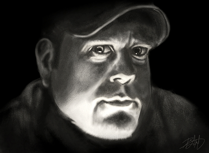
My  buddy, Jeff Tamagini, is a photographer and architect who lives in Boston.  While we keep in touch online during the year, we only see each other in Vegas at Photoshop World.  This past September, he and I were having lunch at The House of Blues in Mandalay Bay.  The place has kind of low lighting, like a lot of bars, so when Jeff was checking something on his iPad, the screen lit up his face from underneath and I thought it looked pretty cool.  So I asked him to hold the pose, and I took a few shots with my phone.  As the only real light was the iPad and I couldn’t use a flash, the photo didn’t end up being all that sharp for detail, but I thought it would make a good practice piece for an iPad painting.

For the tech details, I was using a Wacom Bamboo Stylus, alternating between the regular version and the newer Pocket Bamboo Stylus.  I wanted to use the very expensive Jaja stylus I just bought for close to $100 with shipping, but turns out the damn thing is a huge disappointment.  It’s supposed to be pressure sensitive by way of a triple A battery and an ultrasonic speaker that communicates with the iPad microphone.  You can adjust the volume of the pen to better communicate with the iPad, but I when I turned the volume up (because it wasn’t working right), I could actually hear it, which was annoying, and the battery life is ridiculously short.  The manufacturers recommend you don’t use rechargeable batteries.  Not exactly the most environmentally friendly device.  It was pressure sensitive, sure, but the lines weren’t smooth, the performance was twitchy, basically I used it for a half hour and then went back to the Bamboo.  You  shouldn’t have to think about your hardware while painting.  The Wacom Bamboo Stylus is still the best one I’ve used.

I’m still using the first generation iPad, bought it a few months after the initial release.  While I’ve got a lot of use out of it, and my money’s worth, it’s starting to show it’s age and it’s beginning to have performance issues.  Apps crash often enough to be annoying, despite my turning off location services, running only one or two apps at the same time, and doing everything else that’s been suggested to streamline operations.  The fact is, every time Apple releases a new iOS. it has a harder time running on the old hardware.  Pretty smart…force your consumers to buy the new tech by rendering the old tech useless.  My next tablet might not be an iPad as I’ve become aware of better options out there for a more reasonable price.  For example, the new Wacom Bamboo Stylus feel technology exists in some newer tablets, rendering them truly pressure sensitive out of the box.  The usability will depend on what apps I can get for painting on another device.

The app I use to paint on the iPad is procreate.  I’ve tried a number of them and that’s been my favorite for awhile.  It just has a great interface.  To get around the lack of pressure sensitivity, I just manually adjust the opacity of the brush with my thumb via a convenient slider on the left of the screen, and I’ll also adjust the opacity of different layers.  Anybody who is expecting their tablet to perform like a Cintiq is kidding themselves, so you make do with what you have.  Limiting your options can actually make you a better artist.  The work I’ve seen done with this app on the newer iPads that have better resolution is very impressive.

Which brings me to WHY I paint on the iPad.  The simple answer is that it’s a challenge.  With only low-resolution options, especially with the first-gen iPad, I have to work with what sometimes feels like a blunt instrument to get the likeness down.  There’s no way of painting in details later, because I’m stuck with one size.  The best I can manage is to brush in some speckled texture to suggest detail.  Also, the iPad is portable, just like a sketch book.  This painting was done almost entirely while sitting on the couch watching TV.  I started it in the Fall, but haven’t done anything on it in quite awhile.  Finally picked it up again last week and finished it yesterday morning, working on it in my spare time.  No deadline, no expectations, just practice.  I’m reasonably happy with it, but I think I could have done better if I’d had a better reference photo.

Finally, because I don’t like working with the iPad at full brightness, I always seem to paint darker than I’d like the end result to be.  My eyes get used to it, so I don’t see just how much brightness I’m missing.  Once a painting is done, I bring it into the Snapseed app, make some very harsh brightness and contrast adjustments, then bring it back into procreate on a new layer.  By adjusting the layer opacity, I get the right mix of what I like.  My iPad paintings lack the finesse of the work I do in Photoshop, they’re rougher looking and lack detail, but I find they’re still worth doing.  And it’s fun.


Posted on 1 Comment

Otter Totem

This is my latest painting, the Otter Totem.  Under normal circumstances, I’d publish this post on the same day that I finish the painting.  In this case, however, I was a little swamped with other deadlines and it kept moving down on the priority list.  But better late than never.

This Totem was done in about a week, which is the fastest I’ve ever painted one of these.  While I’m sure the hours spent were close to the same as prior Totems, I had a few very late nights and early mornings, largely due to the fact that this was being used in another deadline, a painting video for Wacom.  Despite the quick turnaround, I’m pretty pleased with how it turned out.  As I’ve said many times before, I don’t pre-plan the expressions and they’re often as much a surprise to me as they are to anybody else.  The personality just seems to ‘show up’ at some point during the painting and I just go with it.  In this instance, the personality was there very early on and I really loved the curiously goofy face that emerged as I spent more and more time on the details.

This was also my first painting on the new Wacom Cintiq24HD and the experience of painting on this display was very enjoyable.  While I’ve never had any complaints about the Intuos tablets for painting, I just felt a lot more connected to the brush strokes with my pen directly on the screen.  I’ve always enjoyed digital painting and never felt that I was missing any of the tools I needed to get my best work onto the canvas.  The Cintiq, however, gave me something I didn’t know I was missing and improved the experience.

As for that video for Wacom, it is part of something else that will be coming a little later on, but they posted it on their YouTube channel, which means I’m able to post it here as well.  If you haven’t seen it already, it shows a high speed time lapse of the Otter Totem, from start to finish.  The narrative is aimed at traditional artists who might be considering the digital medium, but haven’t yet taken the plunge.

Enjoy!

Posted on 1 Comment

My Wacom Cintiq 24HD Settings

For this second blog entry on the Wacom Cintiq 24HD (read the first one here), I wanted to show all of the different settings I’ve chosen for the Express Keys, Touch Ring and Radial Menu.  I’m very comfortable using these hardware features on the Intuos tablets, but had to change everything up for the Cintiq for two reasons.  The first is that there are more settings to choose from.  The second is that working directly on the screen changed how I do things.

These Photoshop settings are in no way being shared in order to tell you what you should do.  Feel free to borrow anything you see here, of course, but I would encourage you to experiment with the settings and find ones that work best for you.  There are so many possible configurations that you can almost program each of the Express Keys, Touch Rings, and Radial Menu for anything you want Photoshop to do.  The feature I like best is that you can even program different settings for every piece of software you have.

My buddy Jeff Foster is an Author, Producer and VFX Artist at Sound Visions Media.  My setting for brush size on the pen, which I’ll explain later, was his suggestion and it works very well.  Since I’m no longer using the Touch Ring for brush size, he also suggested that the Touch Ring can be used for any keystroke operation at all, so it’s important to think differently and creatively.  I still haven’t finished experimenting with my Touch Ring settings, so some of the ones I show here will likely change.

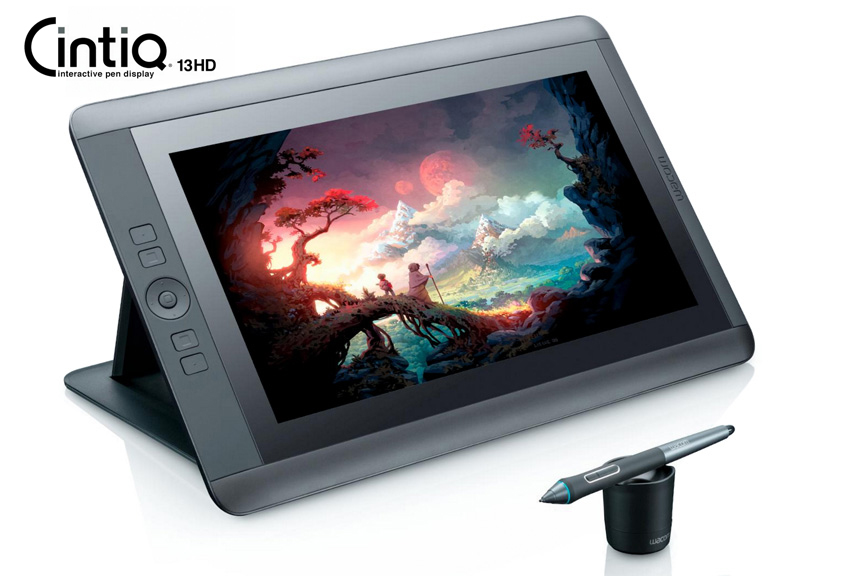
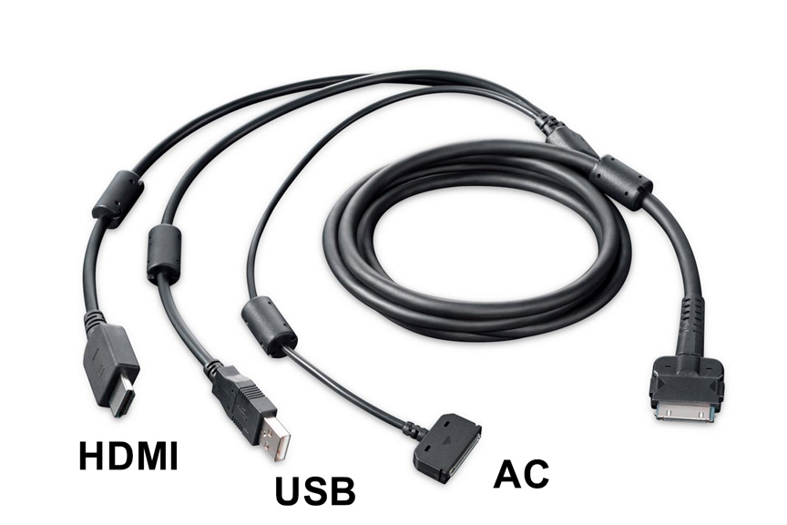
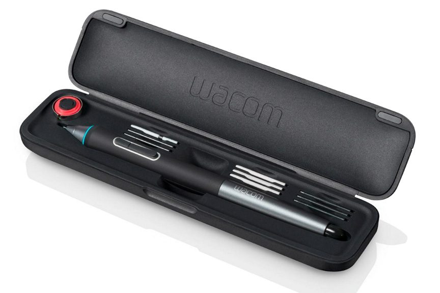
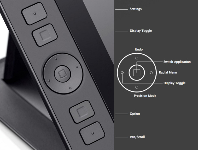
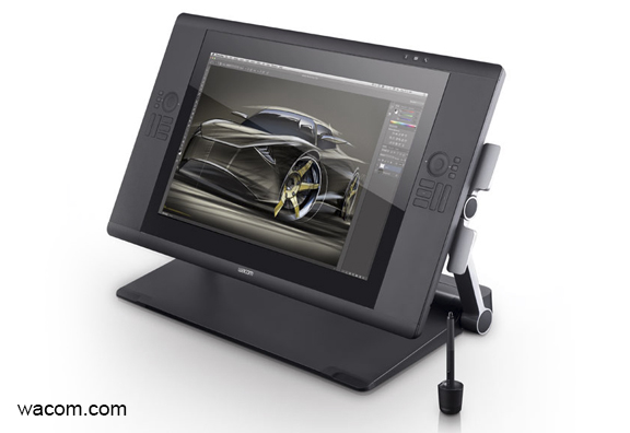
Because there are so many settings to explain, I’ll just get right to it.  Here are some photos that show you what the buttons I’ll be talking about look like on the actual hardware.  I got these images directly from the Wacom site, so if you want to know even more about the Cintiq 24HD than what I’ve shown here, just click on any of the images and you’ll be instantly transported to their website.  It’s like magic, don’t you know?
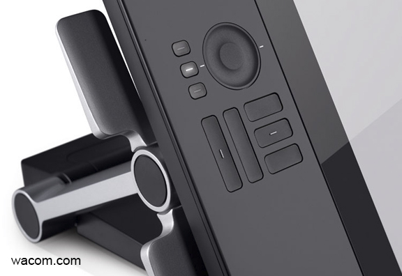
As you can see from the image at the beginning of this post and the ones above and below, there are five Express Keys and a Touch Ring, with three settings each, on either side of the display.  Additionally, there are three buttons above the display for features I’ll explain later.  On the top edge of the display, which you can’t see here, there are a series of buttons like you would find on any monitor, to adjust your display color, brightness and contrast settings.  Incidentally, I like to work with my monitor brightness a lot lower than most people.  I have my Contrast set to 50, my Brightness to 13, and my Backlight to 0 (Zero).  You might think that a little odd, but it works very well for me.  My monitors have always been set to low brightness and my eyes don’t get strained as easily from long hours in front of a display.
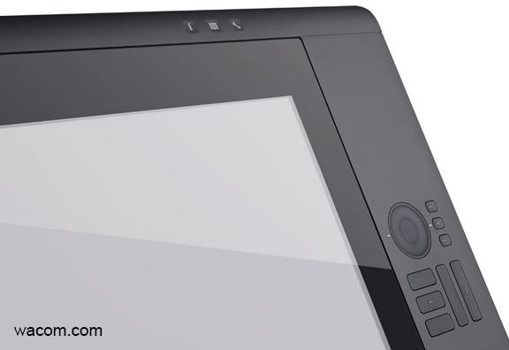
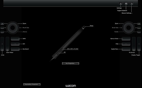
Let’s talk about those three little buttons at the top right above the display.  From left to right, there is one that has a lower case letter i, one that looks like a keyboard, and one that looks like a wrench.  The i is for information, and when you press that, you get the image that you see below.  It fills the display, regardless of the software you’re using, BUT the settings you see displayed will be the ones you have set for that particular piece of software, or the default settings.  What you see here are my settings for Photoshop.  This is a great feature because you might forget what you have a button set for and this will show you in real time.  We’ll zoom in on all of these in a minute.
The second button will bring up the on-screen keyboard, which is pretty self-explanatory.  Sometimes you just want to type in a layer name, or press a number, and you don’t want to have to go fishing for your actual keyboard, especially since it might be under your Cintiq.

Finally, there is the button with the wrench on it, which will bring up your Wacom Tablet Properties.  I just think this is very clever to include this as a hardware button because sometimes you just want to make a quick change to your settings, and you don’t want to leave your software or go searching for it in your menus.  Press the button, it will bring up the panel you see here, make your change, close it and go right back to work.
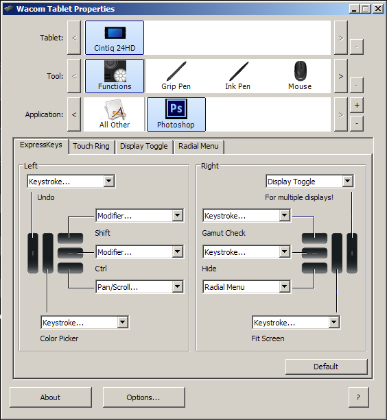
Now let’s take a closer look at how I have my Express Keys, Touch Rings and Radial Menu set up.  I won’t show you how to make these changes, because that will require a whole new post.  If you want some help, I recorded a couple of videos for the Intuos5 and those will show you how to change your settings, even on the Cintiq.  Here are a couple of links, one for the Express Keys and Touch Ring and another for the Radial Menu.

Let’s take a look at the Express Keys and Touch Ring Properties.  As you can see below, the three buttons for the Touch Ring are currently set to Zoom, Brush Size, and None.  Rather than use the default Zoom, however, I have mine set to Ctrl- and Ctrl+ (Cmd- and + on the Mac) shortcut for Zoom.  The reason is that will zoom in and out in increments that keeps my painting sharp and crisp.  Some of the other increments in between can make images a little blurred and I don’t like that.  So my zoom isn’t a smooth transition, it goes in steps.

Brush Size is self-explanatory, although I now have that on my pen, so I’ll be finding another use for this spot, I think.  The third one is normally set for Rotate, as in rotating the canvas, but I have it set to None simply because I was recently recording a video and didn’t want to accidentally zoom in while recording if my finger touched the ring, so I set this to none and left it there while I recorded.  Again, I’ll be finding another use for this one, too.
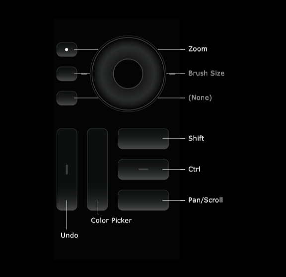
For the Express Keys on the left of the display, I have them set as follows:

1) Undo – Ctrl-Alt-Z. (Cmd-Option-Z on the Mac).  When I’m painting, I pretty much keep a finger on this most of the time and it allows multiple undos.

2) Color Picker – This is not a normal keyboard shortcut, so I had to create one, which is fairly easy to do in Photoshop.

3) Shift – a Modifier Key that will give many tools more options.

4) Ctrl – (Cmd) another modifier key.

5) Pan/Scroll – In Photoshop, this is the Hand Tool and it will allow you to move around the canvas.

On the right side of the display, the Touch Ring again is still set for the default settings.  I know I’ll find a use for it, I just have to get creative and even more efficient.
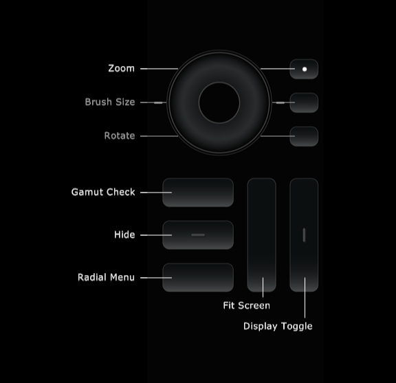
For the Express Keys, they’re set as follows:

1) Gamut Check – Ctrl-Y (Cmd Y).  I draw and paint in sRGB, but I’m always aware that my editorial cartoons are printed in CMYK and some of my paintings and illustrations may be printed that way as well.  My color picker is set so I can only choose colors that are ‘in gamut’, which means when converted to CMYK, they won’t shift.  But sometimes when I make a Levels or other Color adjustment, it will shift colors too far, so I’m always checking Gamut to make sure everything looks as it should.  Newspapers do not have universal color settings.  Some publications have downright hideous printing, so I try to find a happy medium to please everybody.  Yeah, I know…good luck with that.

2) Hide – Ctrl-H (Cmd-H) When I’m working with selections, this hides the little ‘marching ants’ that define a selection, because I hate looking at the moving dotted lines when I’m painting.

3) Radial Menu – This is Wacom’s way of giving you even more choices.  It’s an onscreen heads-up display that gives you an opportunity to program your own menus and submenus.  I’ll show you my Radial Menu settings in a minute.

4) Fit Screen – Ctrl-0 (Cmd-0) Zooming in and out of a painting or drawing, often I just want the image to reset to fit screen.

5) Display Toggle – I have multiple displays, my other one is above the Cintiq.  When I want to access the other display, I press this button and my pen can move the cursor to my other screen, which makes the top half of the Cintiq display work just like a traditional Wacom tablet.  It’s a great feature.
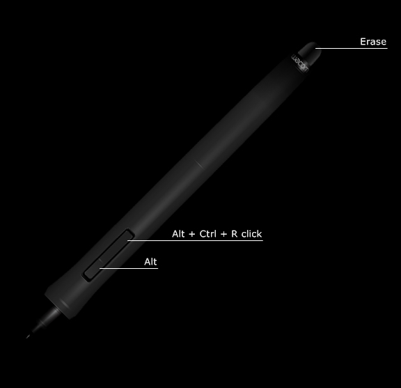
My Pen Settings are as follows:

Erase – This button is a waste for me and I can’t even think of a reason to use it for something else, either.  I’m sure other people do use it, but I never have.

The button on the pen is actually two buttons.  Originally, it’s set for a Left Mouse and Right Mouse configuration, but as mentioned previously, my friend Jeff gave me a reason to consider other options.  For the left Mouse Button, the one furthest from the tip, I have it set to the keystroke configuration you see in the image.  What this allows me to do, when I have the Brush selected in Photoshop, is change brush size very fluidly.  I press the button, move the pen left or right and I can see the brush size change on the screen.  This was one of those, “I wish I’d known this sooner!” moments, because I would have had my Intuos tablet set to this as well.

The Right Mouse button, the one closest to the tip, is set to Alt (Option on the Mac).  When I have the brush selected in Photoshop, this toggles the Eyedropper Tool for easy selection of color in a painting.  I use this constantly for better blending and color transitions in my work.  So now I can change brush size and select color quickly and easily right from the pen.  It’s a very enjoyable way to paint.

And finally, here are my Radial Menu settings.
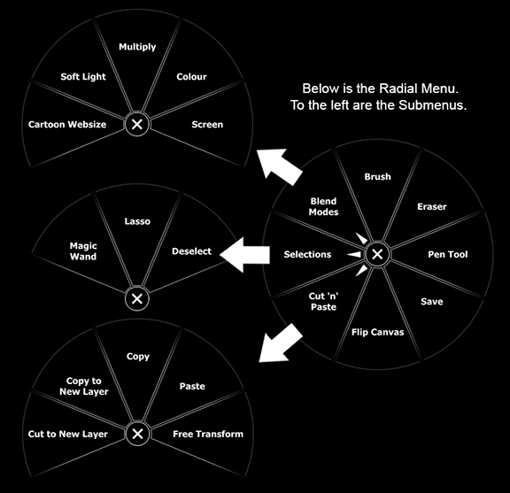
When you press the Radial Menu button, you get the circle on the right, which is fully customizable.  If you wanted to, you could make every one of those pie pieces into a submenu.  I currently only have three.  When you click on each of those submenus, you get  the images on the left.  Each submenu can not only have a full selection of pie pieces, but those can be submenus as well.  I’m no math wizard, but that gives you a LOT of choices for custom configuration.

Obviously I don’t need to explain every one of them, but I’ll give you some thoughts on what some of the more unique ones do.

Blend Modes Submenu – I use four Photoshop Actions for Blend Modes all the time in my drawing and painting.  OK, that one that reads ‘Cartoon Websize’ is an Action for something else, but I had nowhere else to put it and I use it every day.  But the rest are for Blend Modes, I assure you.  If you don’t know about Blend Modes in Photoshop, my buddy Scott Valentine just wrote a great new book that explains them very well.  I’ll have a review of the book very soon, but if you want to check it out, here’s the link.  The Hidden Power of Blend Modes in Adobe Photoshop.

Flip Canvas – Often when I’m painting, I want to shift my perspective, so I’ll flip the image I’m working on horizontally.  You’d be surprised how helpful this can be, especially when it comes to likeness in portraits.  Sometimes I’ll just know that something doesn’t look right but I can’t put my finger on it.  By flipping the canvas, the problem will almost always become immediately apparent.  Your brain gets lazy and this will often give your perception a bit of a slap.

So there you have it.  These are my settings on the Cintiq 24HD…for now.  I fully expect to make little changes and tweaks as I get more used to the display, but these settings are working very well for me at present.  There really is no excuse for not being able to customize this display to work exactly the way you want it to.  Yes, it will take some time to get it perfect, but it’s worth it.  Wacom has not only provided hardware that will allow you to create the best drawing and painting experience possible, but the software takes it even further.

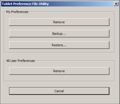
Don’t be afraid of making changes.  There is a default button in the Wacom Tablet Properties.  If you mess it up too much, you can always start again.  When you do get the settings you want, however, back them up!  I can’t stress this enough.  Computers aren’t perfect, software can conflict with other software, and stuff happens.  There is a Wacom Tablet Preferences Utility included with the software.  It will allow you to save and restore your preferences should the unthinkable happen.  Just as you should back up your images and files, you should also back up your preferences.
If you have any issues, Wacom’s technical support is very helpful.  And finally, if you just have any questions, I’m happy to help, too.  Thanks for stopping by and hopefully this helped you see some possibilities you might not have considered, whether you’re using Wacom’s Intuos tablets or their Cintiq displays.



Posted on 2 Comments

What I like best about the Wacom Cintiq 24HD

A couple of weeks ago, I finally got the new Wacom Cintiq 24HD Display.  There are two versions of this device, and people keep asking me if I got ‘the Touch,’ meaning the one that has touch features along with pen input.  The answer is ‘No,’ and the reason is because even though I like touch features on my iPad and phone, I don’t feel the need for it on my main display.  I know a lot of people want that, so it’s great that this display is available with and without the option.  Keep in mind, there is also a significant cost difference between the two.

I’ve had my eye on the new Cintiq since it was launched earlier this year.  Many of the new features that Wacom included finally pushed me over the edge to get one.  Rarely do I develop an infatuation for new and shiny tech.  I waited two months before I got my first-gen iPad, just to be sure it was going to be useful and not just a toy.  Having used it every day since, I wasn’t disappointed.  That being said, it’s two years old and I’ll only replace it for a newer version when it stops working well.  I’ve never owned an iPhone and can’t think of any piece of technology I would line up for.

Now you might be thinking, why am I talking about Apple stuff, I thought this was about Wacom.  The reason is that I want to be clear up front that I’m not a gadget person who gets something just because it’s new and trendy.  If it’s not useful, I’m not interested.  So with years under my belt with the Intuos line of tablets and being very pleased with those, why did I suddenly feel the need to get the high performance sports car of Wacom tablets?

I’ve never had a problem doing all of my detailed painted work on the Intuos tablets.  They’re solid, they work well, they last forever and they get the job done.  The size wasn’t an issue, working off the screen wasn’t an issue, resolution and pressure sensitivity worked well.  The simple answer is that it was time.  This is the top of the line professional tablet and I want my work to be the best it can be.  From all I’ve heard from colleagues and other reviewers, their endorsement of what this display does for their workflow and better use of their time was enough for me to feel I needed to make the jump.

I’ve had the Cintiq 24HD for almost two weeks now.  Normally I’d write a review for something new a lot sooner than this, but I’ve been swamped with work, which as a freelancer is not a bad thing at all.  The upside of waiting this long for the review is that I’ve used it a lot.  There is nothing that I do in my scope of work that I now haven’t done on the Cintiq.  Daily editorial cartoons, illustrations, writing, and a brand new Totem painting from start to finish, I’ve really put it through its paces, and I am incredibly impressed.

There is just too much to talk about to do this in one post, so I’ll be spreading it out over two or three.  For this one, I just wanted to talk about the features that impressed me most.  I’ve never been one to do those ‘let’s unpack it’ reviews.  There are plenty of those out there.  As for the technical specs, you can see all of that as well as videos and other images on Wacom’s website.  I just want to tell you how this will impact my own work and why I like the display so much.  I made note of things that made me raise my eyebrows over the last couple of weeks.  A few of these things even made me say, “oh cool!” out loud.  They are in no particular order of importance.

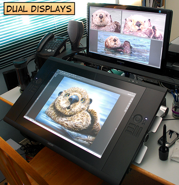
1)  With a dual monitor system, I used to have my Photoshop palettes on a separate monitor.  The Cintiq is so big and has so many Express Keys along with the Radial Menu, that I don’t need that anymore.  I can do everything on this big screen.  But I still like my second monitor, so I have it positioned above the Cintiq, and I can keep all of my other windows, browser, music player open on that display.  By pressing one of the Express keys to ‘Toggle Display’, I can temporarily jump to the other monitor, and the Cintiq becomes just like a traditional Wacom tablet.

LOVE the new monitor configuration for reference photos!  Just feels so natural to look up from my ‘drafting table’ to see the pics.

2) They put a USB port right on the display itself.  Might seem like a small thing, but I frequently take images with me or grab them from a USB key.  This is just convenient.

3)  Wacom put a Tablet Properties button on the device itself.  This is great because it gives you quick options to open the properties, make changes, then get back to work.  It’s important to experiment with the Tablet Properties and more than a few times, I found myself thinking, “I should be able to program an Express Key to (insert operation, tool selection, or toggle here.)  They made it easier to do that.  I’ll detail all of my new settings in another post.

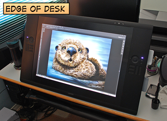
4) Pulling the device down over the edge of your desk, means forcing yourself to avoid using your keyboard.  This is a good thing!

5)  More buttons!  I really like the fact that with Express Keys on both sides of the screen, plus two (count ‘em, TWO) touch rings, you get plenty of options on how to customize your Cintiq so it works perfectly for the way you work.  A word of caution, however.  Computers aren’t perfect and sometimes program conflicts or an accidental pressing of the Default button in the Wacom Tablet Properties can erase all of your settings, so be sure to backup your settings with the Wacom Tablet Preference Utility.  I learned that lesson the hard way last week.

6) The display was so easy to set up.  OK, I did have to wait for my wife to get home from work so she could help me bring it up two flights of stairs from the garage to my office.  It’s 63lbs out of the box, quite large, and awkward to carry.  I wasn’t about to risk any damage by trying to do it myself.  Once I got it on my desk (oh, it’s staying there, now), the instructions were simple and straightforward.  It was very much like setting up any new display.  I use the Eye-One Color Calibrator and it was just as simple to calibrate the Cintiq as it is for any other type of monitor.

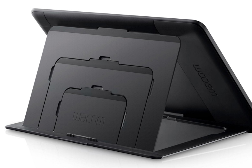
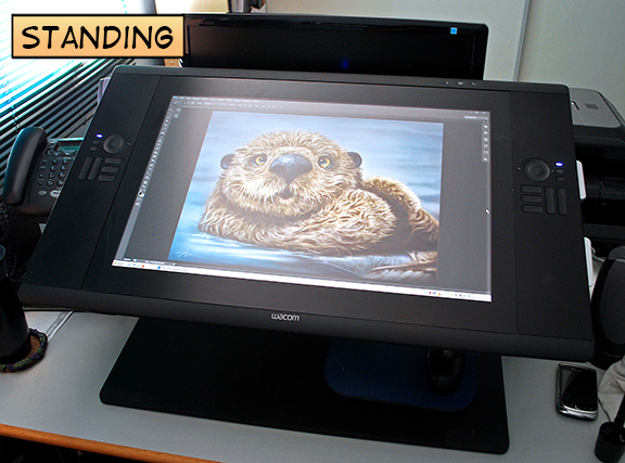
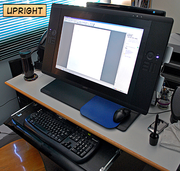
7)  The Cintiq is just a joy to work on.  The base is so well designed that I can’t think of any way to improve upon it.  As shown in the images here, it locks in place when it’s fully upright, so it can be used like a standard display (a BIG standard display) or it can be used flat in the upright position.  As someone who sits all day long while I work, I have contemplated getting one of those very expensive adjustable desks that allows a person to work standing up once in awhile.  I no longer have to think about that, because the Cintiq lets me do that when I need a break from the chair.  I did that a number of times in the past couple of weeks and loved having the option.

8)  Word of caution.  This thing is BIG.  I have a great coffee cup that I got at Costco (three of them, actually) made by Contigo.  You can see it to the left of the display in the photos.  It seals completely and to take a drink, you have to press a button on the back to open it.  It’s great because it not only keeps coffee hot for well over an hour, but it if you drop the cup or knock it over, it doesn’t spill.  Because I start work very early in the morning and work in low light as often as possible, my office is usually near dark.  In the first week of using the Cintiq, I knocked over my coffee cup three times when I went to adjust the display with the handles on the sides.  It’s just so big!

And finally, it’s solid!  There is nothing about this display that feels cheaply made.  The enjoyment I’m having drawing and painting on the screen is difficult to explain.  Working on little hairs with the pen at the same point of contact as my brush strokes just feels so much more natural.I’ve often dealt with back pain off and on over the years, usually stress related from working hunched over too much.  As I said, I was so busy with deadlines that I’ve spent a LOT of time on this device.  One thing I noticed, a great surprise, is that I had no significant neck or back pain as a result.  Sure, tight shoulders and strain just from sitting so long and working, you’ll get that in any job when you’re working long hours, but nothing that didn’t go away with rest and nothing that I had to take an Advil for.

So, yes, I’m enjoying the Cintiq 24HD a great deal, and I’m sure I’ll continue to discover things that make me say, “Oh, cool,” and I’ll be sure to share them.  Next time, I’ll talk about having to change all of Express Key, Touch Ring and Radial Menu settings.  When you’re working directly on the screen, it’s a whole new ballgame.

Posted on 3 Comments

Wacom’s Bamboo Splash Tablet and ArtRage Studio

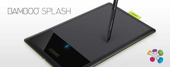
Wacom just released a new entry level tablet, the Bamboo Splash, and I had an opportunity to put it through its paces.

The Bamboo Splash tablet is designed for the amateur or beginner digital artist.  It’s perfect for kids and teenagers, allowing them to experiment with digital art without having to spend a bundle to do so. Best of all, even though it lacks the bells and whistles of the more advanced tablets, it doesn’t sacrifice much in performance.

As I draw syndicated editorial cartoons almost every day, I wanted to see if I could still get real work done using the Bamboo Splash, rather than with the medium sized Intuos5 that I use every day.

The Wacom Intuos5 is a professional tablet.  With the programmable Express Keys, the Touch Ring, high end pen, and the onscreen customizable features, not to mention the larger size, it’s unfair to compare the two tablets as they are designed for different skill levels.  As I’ve been doing this for a living for many years, I’ll admit that the Bamboo Splash isn’t tablet enough for my daily needs, but then again, it isn’t meant for me.

The Bamboo Splash tablet was simple to set up.  Plug it in; install the drivers from the CD, restart the computer and it was working flawlessly.  Visiting the preferences utility, I found that very little aside from ‘Tip Feel’ was changeable.  For a beginner, that’s ideal.  It’s ready to go, out of the box, nothing confusing.

Put simply, it’s a great device.  The Bamboo Splash has 1,024 levels of pressure sensitivity, which is plenty.  While a number of people may wonder about the size, your mind figures it out fast.  I work on a larger tablet every day, mapped to two screens.  I keep all of my Photoshop tools on one screen and draw on the other.  That means I’m really only using half the tablet for drawing.

When using the Bamboo Splash, I didn’t change my screen mapping, so I was only drawing on half of the smaller tablet, too.  After a few minutes, I didn’t even think about it.  My mind just figured out that brush and pen strokes required less movement.

This cartoon (with the political commentary left out) was drawn and painted entirely with the Bamboo Splash in Photoshop and it worked very well.  While I did keep reaching for the Express Keys and Touch Ring of the Intuos5 out of habit, once I got used to their absence and reverted to using keyboard shortcuts or drop down menus in Photoshop, I was able to work smoothly and still got my cartoon out to my newspapers on time.

Trying to draw with a mouse is an exercise in futility.  You really do need a Wacom tablet to draw with a computer.  While the Intuos5 tablets and Cintiq devices will represent more of a financial investment, you’re not risking too much with the Bamboo Splash.  The tablet comes in at well under $100.  Best of all, it comes with two very nice pieces of creative software.  One is Autodesk’s Sketchbook Pro and the other is ArtRage Studio.

I spent some time with ArtRage, and it was very enjoyable to use. While it’s not designed to be a professional illustration and painting tool like Photoshop or Painter, it offers a lot to anybody wanting to try their hand at digital art.  With pencils, crayons, chalk, oils, watercolors and a number of other tools, there’s very little to limit your creativity.  It even supports layers and blend modes, and has a number of other fun tools and settings to mess around with.

Pairing ArtRage Studio with the Bamboo Splash was a great idea, because they’re both designed to allow you to create digital art, without a steep learning curve.  You can start working with both right away and if you’re like me, preferring to figure it out as you go along, you’ll be able to get pretty far without having to look through the manual.

When you do want more info, the ArtRage website has plenty of tutorials.  You can also upgrade the software to ArtRage Studio Pro and they have iPhone and iPad drawing apps as well.  If you do want to try out the mobile apps, I’d recommend the Wacom Bamboo Stylus as a drawing device to go with them.

Here’s a video I recorded for Wacom’s ‘See What You Can Do’ campaign, designed to share a little bit of my thoughts on digital painting, and to show some of the drawing and painting tools available in ArtRage Studio.


Posted on 2 Comments

Painting a Bison Totem

This is the latest in my series of whimsical wildlife paintings, the Bison Totem.  As usual, I have the most fun when I’m working on this type of painting, especially since each one presents its own unique challenges.  With this one, it was trying to get the ‘wool’ to look right, and it took some trial and error.   One of the great reference photos I worked from, was courtesy of one of my favorite wildlife photographers, Moose Peterson.  I also used a couple of other photos I bought from a stock photo company, so it wasn’t such a problem seeing the great detail, as it was to replicate it with brushes.

One of the things I’ve learned from working on these animals, is that I could spend weeks painting every little hair that I see in the photos I reference, but it would be a wasted effort.  For one, these animals are caricatures (although not extremely exaggerated) of the real thing, so replication is not the goal.  But also, people aren’t looking at a painting in actual pixel size, so nobody really cares if every hair is perfect, and they’re not holding up the three photos I used for reference to compare them inch by inch.  If they are, they should really get a hobby, because that energy could better be spent elsewhere, like cleaning out the garage or something.

I do obsess about the details, though.  It’s part of my nature (ask anybody who knows me well), and I use it to my advantage in these paintings.  That being said, there comes a point in every painting when any further detail is a waste of time because the viewer won’t see it.  It has to look great at full size, but zoom into any painting close enough and it just becomes a mosaic of pixels and colored noise.  I really do enjoy it, though, painting all those little hairs, music playing in the headphones, just being in the image.  Most of my perfect moments in life, those instances of peak experience (read Maslow), are when I’m painting.

If you’d like the technical info, this painting was done on a medium sized Wacom Intuos5 tablet in Photoshop CS5.  No idea how long it took me, but it was many hours.  The full size painting is 18″X24″ at 300ppi.  Something different this time was that I switched out the nib in my Wacom pen.  Having always used the standard nibs that came with the tablet, I read a blog entry by Wacom’s Joe Sliger about the different nibs and figured I’d try the flex nib for this painting.  That’s the one with the little spring in it.  While it had nothing to do with what the painting looks like, I absolutely loved painting with this nib.  Had a little bit of give to it and while I got used to it quickly and didn’t think about it, I really think I’ll be using this nib more often.  Just feels better in the pen.  Here’s a link to Joe’s article if you’d like more info on the different nibs.

While working on this painting, I saved the image at different stages so that I could make the following video.  It’s a time lapse of different stages in the painting, this being one I’ve been planning for quite awhile.  I’ve had the reference for the bison for over six months, and the music, bought specifically for this painting, for almost as long.  As a big fan of movies, I love soundtracks and this dramatic piece just seems to add something to the video.  It was fun to put together.

Thanks for stopping by to see the latest piece and for reading my thoughts on it.  I feel privileged to be able to paint these creatures and I’m pleased when others like them, too.

Posted on Leave a comment

No Strings Attached

The Wacom Intuos5 tablet is a welcome evolution to the line, and while I never felt that the Intuos4 was lacking in any way, it has quickly become apparent that I didn’t know what I was missing.  The new design, heads-up display for the Express Keys and the Touch Ring, along with the improved pen response are reasons enough for me to love this tablet.  The Touch features just ended up being a bonus.

One of the best new features of the Intuos5, however, is the add-on Wireless Accessory Kit.  Even though one or two of the previous tablets had wireless capability, this is the best solution I’ve seen for the feature and it’s impressive how well it works.

The instructions for using the kit couldn’t be simpler, and after charging the battery while I worked, I was anxious to try it out.  My whimsical wildlife paintings hang in galleries in Banff, Canmore, and Calgary, Alberta.  From time to time, I’ll do painting demonstrations, to coincide with a long weekend or the launch of new paintings, both of which happened in May.

The basic setup of the demo is that of me sitting behind a table with the laptop and tablet, and a large secondary display facing outward so that viewers can talk to me, but also see what I’m doing.  With the Wireless Accessory Kit installed, I was able to come out from behind the table, stand beside some of the viewers, and even let them try the tablet right out in front of the secondary display.  It was a very interactive experience for the viewers.

While that would have been enough of a successful test, I recently found myself with another opportunity when I was asked to give presentations to a couple of 7th grade classes at the local school.  This is something I do from time to time, and it usually consists of my running a PowerPoint slideshow presentation from the classroom computer, while the students watch on the peripheral smart-board.   A smart-board is an interactive blackboard sized display screen that many schools are using now.

At the end of the slideshow and talk about editorial cartooning and painting, the students always want me to draw, and I usually end up showing them some rudimentary cartoons on a dry erase board.  While it works well, there’s really no ‘wow’ factor, and I can’t show them how I paint.

For the recent presentation, I hooked up my laptop directly to the smart-board, connected the Intuos5 tablet and was able to wirelessly control the slideshow from anywhere in the room.  The range of the Wireless Accessory Kit far exceeded my expectations.  With the laptop in one corner, I could stand by the door at the opposite corner of the room and there was no performance loss whatsoever.  It was easily 25-30 feet between connections, and I could paint as if I was sitting directly in front of the laptop.

While I was well aware that I would be able to control Photoshop with the tablet, I knew that controlling PowerPoint with it was going to free me up even more.   In the Wacom Settings, I customized the Functions specifically for PowerPoint.  I programmed four of the Express Keys for the operations I would need.   In order from the top, I chose Next Slide, Previous Slide, Start Slideshow, and End Show.  While you can see a screen shot of the ‘Express View’ here, I disabled it during the show, so that it wouldn’t pop up over my slides, and I could just keep my finger on the ‘Next Slide’ button.  Under the Touch Options, I had the touch features disabled for the length of the presentation.

I use the Keynote app on my iPad for a duplicate of the slideshow with my presentation notes, and I saw no reason why I couldn’t be free of my laptop for the entire session.  Since I only needed the Express Keys for the slideshow, I put my iPad on the tablet and carried it around (with both hands, of course) activating the slide buttons with my left thumb.So I had my notes, my slideshow, a controller for the presentation and freedom to move around the room.  It is true that the iPad has apps that can control presentations like this wirelessly, but in my experience, they’re pretty twitchy, especially when connecting to unfamiliar WiFi.

As I was using the tablet for multiple applications during the presentation already, this was a great plug-and-play solution, with no problems.  When the slideshow was finished, I removed the iPad, sat down at a desk in the center of the room in front of the Smart-board, launched Photoshop and proceeded to show the students a little on how I draw and paint digitally.

The two presentations took about three hours of my time, and with the Intuos5 tablet and wireless control of the smart board, I never once needed to go back to my laptop.  The integration was flawless, and this is how I’ll do presentations and demos from now on.

If you’d like to know more about how I setup the Express Keys, Touch Ring and Radial Menu for Photoshop, check out these videos.

 Wacom Intuos5 – Express Keys and Touch Ring


 Wacom Intuos5 – The Radial Menu


Posted on Leave a comment

Wacom Intuos5: The Radial Menu

Here’s the third post about the new Wacom Intuos5 tablet.

I tried to show how to customize the tablet in one video, but it ended up being over 30 minutes long.  Since most of us have trouble sitting still for that long these days, I figured I’d break them up.  The previous one was on the Express Keys and the Touch Ring, while this one is about the Radial Menu.  The third one will be all about the new Touch features on the Intuos5, saving the best for last.

So here’s the second video, hope you like it.  It’s all technical stuff, but if you’re using Photoshop and a tablet in your work, this might give you a couple of tips and tricks to customize your tablet and get the most out of it.  Probably best to watch it at full screen, too.

Posted on 4 Comments

Wacom Intuos5: Express Keys and Touch Ring

Here’s the second post about the new Wacom Intuos5 tablet.  While my original intent was for these videos to just be reviews, I figured I’d make them more of a tutorial style.  If you’re looking for a review of the new features, I’ll just be up front and tell you that there’s really nothing I don’t like.  In my opinion, Wacom hit it out of the park with this tablet.  I’m really pleased with it.

I tried to show how to customize the tablet in one video, but it ended up being over 30 minutes long.  Since most of us have trouble sitting still for that long these days, I figured I’d break them up.  This one is on the Express Keys and the Touch Ring, while the next one will be on the Radial Menu.  The third one will be all about the new Touch features on the Intuos5, saving the best for last.

So here’s the first video, hope you like it.  It’s all technical stuff, but if you’re using Photoshop and a tablet in your work, this might give you a couple of tips and tricks to customize your tablet and get the most out of it.  Probably best to watch it at full screen, too.

Cheers!

Posted on 3 Comments

Welcome to the Wacom Intuos5 Touch

One of the things that sometimes irks me about product reviews is that they can often end up being many pages long and nobody really has that kind of time anymore.  With that in mind, I thought I’d talk about my new Wacom Intuos5 tablet in a few different blog entries, this being the first, partly because I need to use it for a little while before writing about the new features in detail.

Anybody who reads this blog, has watched my DVDs or heard me talk about my work knows that I’m a big fan of Wacom tablets.  In fact, without a tablet, I couldn’t paint the way I want to paint.  I’m usually pretty ‘live and let live’ when it comes to painting software and when people ask about Painter vs. Photoshop or other choices out there, I’ll usually say to try a few of them, and see what you like best.  But when it comes to hardware, you absolutely need a tablet to draw or paint digitally, and Wacom is the gold standard.

I’ve had a number of different tablets over the years, my first one in the late 90’s.  That was the first generation Intuos 4X5 tablet, and it worked so well, that despite changing nibs and a couple of transparent overlays, the only reason I upgraded was because I’d bought a new computer.  The original Intuos had a 9-pin connector and the new computer only had USB ports.  But that original Intuos tablet never failed me over many years.

In addition to that tablet, I had a 4X5 Graphire for my laptop.  Since then, I’ve had a medium Intuos3, a medium Intuos4, a small Intuos4, and a Cintiq12wx.  The Cintiq12wx  may be smaller than the latest massive 24″ HD Cintiq (which I am currently saving up for), but it’s a great tablet for live painting demonstrations.  Sometimes, when I’m tired of working in my home office, I’ll often set up in front of the TV in the living room with the Cintiq and paint while watching a movie, too.  The small Intuos4 has always been a great travel tablet, and since I worked on that size for years at the beginning of my career, I’ve never felt hindered by the smaller work space.  If I needed to, I could still do all of my work on the small size tablet today, even the paintings.

But the tablet that fits right into the Goldilocks zone (just right!) is the medium sized Intuos.  A few years ago, when I heard they were launching the Intuos4, I remember thinking that my Intuos3 was just fine.  Why would I bother upgrading?  Of course, once I saw the  new configuration of the Express keys and the Touch Ring, not to mention those pretty blue LED lights, I knew I’d be getting one.  The Intuos4 medium has been my day to day tablet every day since it was launched in 2009 (has it been that long?) and to be honest, I’m a little sad to see it go.  It has now been relegated to my laptop bag, and I’ve donated my small Intuos4 tablet to a graphic designer friend who didn’t have one yet.

I’ve been watching videos online and read some reviews about the Intuos5 before mine arrived, so there were really no surprises about the new features.  However, hearing about it and watching somebody else talk about it pales in comparison to actually using it.  Even though I’m not going to show pics of me un-boxing the thing, because it’s already set up, one of the things I do like about Wacom products is the packaging.  The devices themselves have always felt sturdy and I’ve never questioned the quality of the materials.  But when a product arrives in slick looking packaging, it makes you feel just a little bit better about your purchase, and this tablet came in a very nice, well designed box that almost looks like a case.

All of the individual pieces, as few of them as there are, were well wrapped and configured inside.  The tablet, connection cord, pen, and pen holder (which contains ten spare nibs of different design), along with the documentation, are all that you need.  The physical look of this tablet has changed, as should be expected, but the texture of the materials is also different, although the pen itself feels pretty much the same.  The main body of the tablet now has a bit of a rubbery feel to it.  Not as pliable or spongy as the pen grip, but not the typical hard plastic of most computer components either.  This rubbery surface now completely covers the express key buttons and most of the touch ring, and the LED lights are absent.  A little disappointed those are gone, because I kind of liked them, but I really like the look and feel of this new design.

The main drawing area feels different to me as well, a little more textured, but still smooth enough for easy pen movement.  Not that I’ve ever disliked a tablet surface, but I think I prefer the way the pen feels on this surface over any that I’ve used before.  I’ll reserve my final opinion on that until I’ve spent some real time painting with it.

Apparently I’m a slow learner.  When Wacom first announced the Intuos5, I once again thought, “What could they have possibly done to make it better than the Intuos4?”

Well, they added touch features.  In my mind, that changes everything.  After downloading the new driver from the Wacom site, and restarting my computer, all of the new touch features on this tablet came to life.  I’ve never really liked track pads on laptops, as I found them too small.  What the touch features have done on this new tablet, however, is turned it into a BIG track pad, and it’s great.  I normally use the pen to navigate my way around the computer, no matter what program I’m using.  Now, I’ll only need to pick up the pen when I’m drawing and painting.

After an initial exploration of what each of the touch features does in the Tablet Properties and testing them out in Photoshop, I don’t mind admitting that I might have giggled a little.  I’m such a nerd for this stuff, and I can see having a lot of fun learning how to incorporate these new touch features into my workflow.  The whole goal with a tablet, at least for me, is to eliminate using the keyboard at all.  I’ll have to spend some time configuring and using the new features, but that’s what I’m aiming for.  I’ll talk about setting up those features in the next blog entry on this tablet, and I’ll include some video.

First impression, I love this thing, but I never expected not to, having never been disappointed by a Wacom tablet.  More later once I get a better feel for it, but right now, I want to get painting.

.