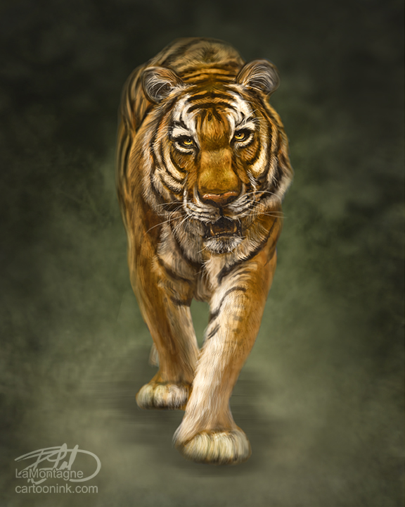
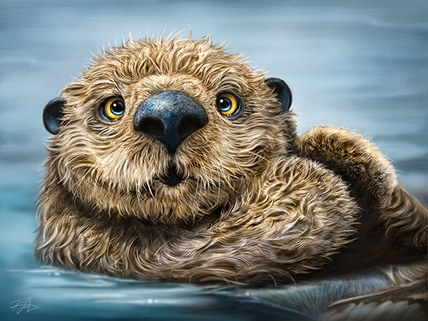
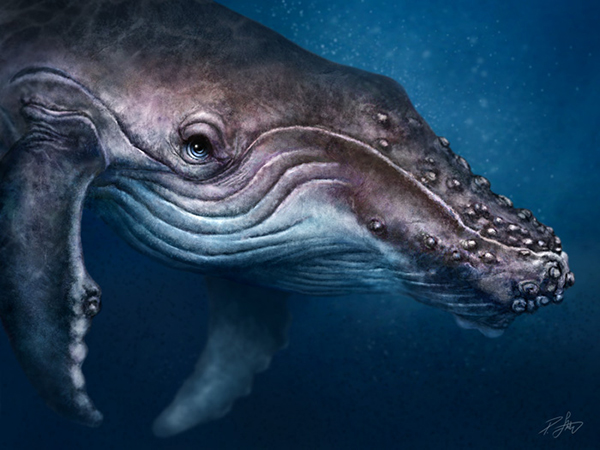
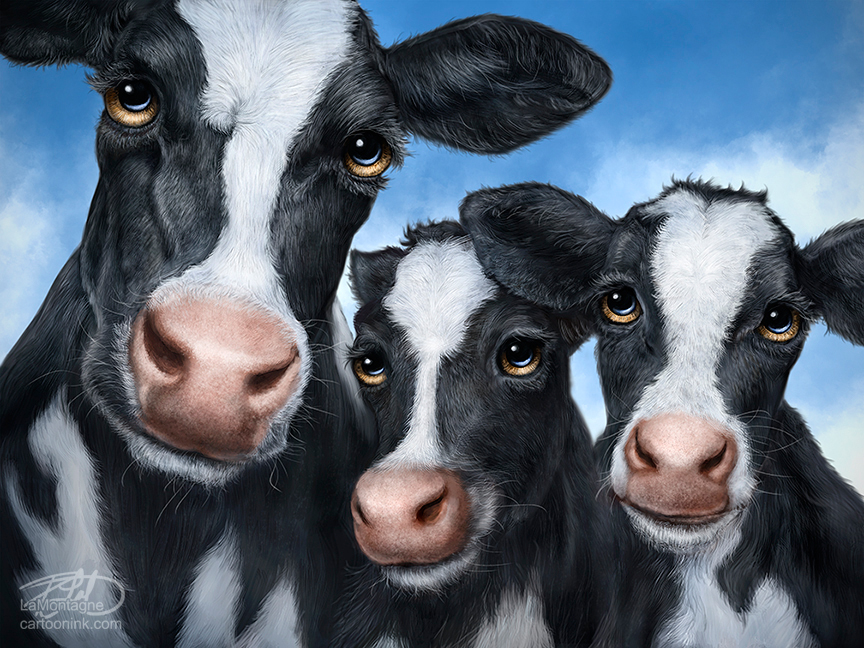
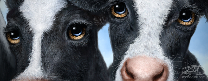
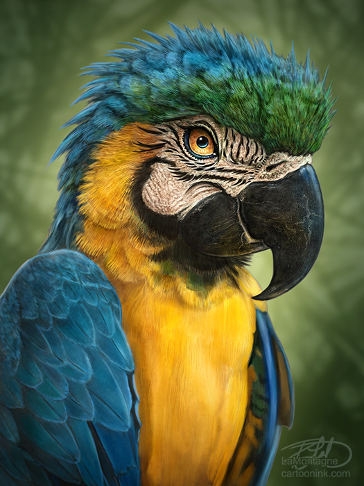
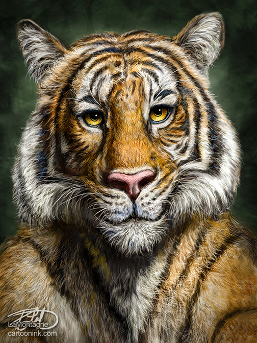
 The latest in the series, this is the Tiger Totem. Specifically a Malaysian Tiger, but most people won’t be too concerned over the species.
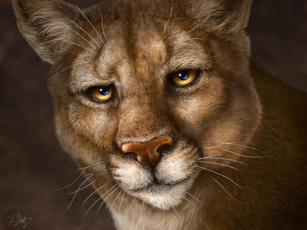
It’s funny how these always turn out. I start with a vision in my head of what I think it will look like but every Totem always becomes something different than what I’d expected. I don’t think that’s a bad thing, because the final image is usually a pleasant surprise. For example, with this painting, I rather expected the tiger to look stern and a little menacing along the lines of my Cougar Totem. Clearly it didn’t end up that way, but I kind of like it.
I’ve often said that the personality just shows up at some point in each of these paintings and this one was no different. Many artists will speak of their muse, that ‘other’ that contributes to their work, provides a spark that isn’t entirely their own. Define it how you will, but it’s that which infuses these animals with something that doesn’t quite feel like it was mine to begin with. So when the personality shows up and is different than what I’d envisioned, I just go with it.
When I posted this online yesterday, one person said that this one looked a little more anthropomorphized than my others. That’s basically a ten dollar word (one I’ve always liked) to describe a human quality or character in something that isn’t human. It definitely fits for my work. As for there being more or less in this one, that’s up to the viewer and I would refer you back to the previous paragraph.
A couple of other people said that it looked like the tiger was taking a selfie. Likely it’s because of the lighting and the way I painted the body below the head, making it look like his front legs are outstretched. In point of fact, the tiger was resting on his front legs in the reference image and I decided to keep that pose. Did I get it wrong? Maybe. Do I wish I could change it? No.
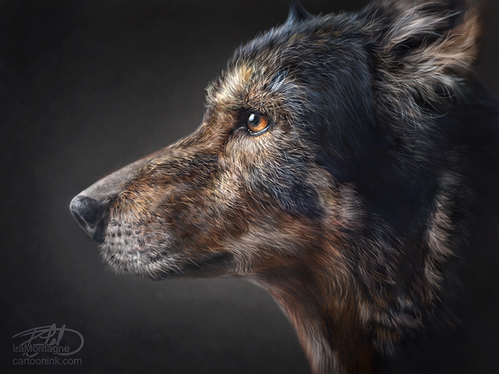
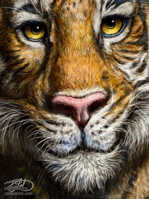 Each of these paintings comes with a decision tree where one choice leads to another and so on. I thought about putting foliage in the foreground, might have added more depth. I thought of putting a darker and lighter background. The reference featured the entire body of the tiger and I thought about putting more of that in as well. But my Totems are all about the detail and I can only show that in a close-up of the face on a larger animal. Somebody else might have chosen differently.
Just as I paint what I see, everybody sees something different as well. If to some it looks like he’s taking a selfie, then that’s what it looks like, and they’re not wrong. I’ve learned that with signature or niche pieces, creations that aren’t done for a client or somebody else, an artist just has to paint what they see and separate themselves from the result and how others will interpret it.
Some will love my work, some will downright hate it, and there’s nothing I can do about it. It’s a constant struggle to be at peace with that and every artist I know has been through it.
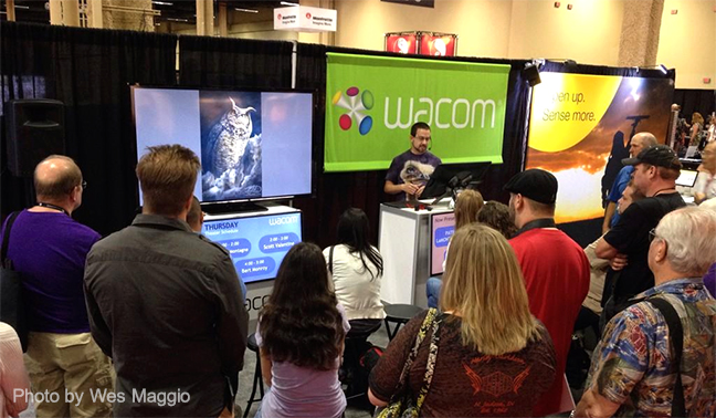
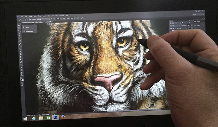 This was painted in Adobe Photoshop CC using both a Wacom Cintiq 13HD and Cintiq 24HD displays. Photos were only used for reference and the painting was done entirely with brush work. On a personal note, a big thank you to Alan Hess, a photographer friend who gave me the main reference photo I used for this piece, a shot he took at the San Diego zoo. I’ve had the photo for many months, but it finally felt right to paint this Totem.
Alan is a talented professional photographer, author and instructor. I would recommend taking a look through the images on his website as you’ll find some great shots on a wide range of subjects.
Thanks for stopping by.
Patrick
If you’d like to receive my newsletter which features blog posts, new paintings and editorial cartoons, follow this link to the sign up form. Thanks!

