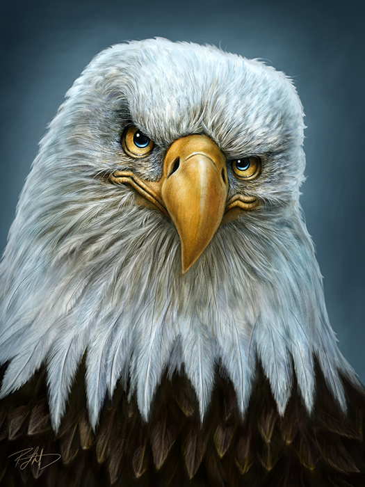
Here’s my latest painting, the Bald Eagle Totem. This one was a real challenge because of the ‘white’ feathers which really aren’t white at all. I used three different reference photos for this one. The main image was from well-known wildlife photographer, Moose Peterson. It was a full body shot of a bald eagle and while all of the main features I needed were there and it was a very good photo to work from, I had to buy a couple of stock photos as well, ones that focused on the close-up details of the main features. I’ve started to use a minimum of three reference photos for my paintings this year, all paid for or used with permission, of course. I find that more images provides more insight and I can do a better job with the details.
 From looking at the three reference photos, I quickly realized that bald eagles are just like people. Their features can be very different from one another, the colouring of their feathers, even the shape and texture of their beaks. So between the three images, I had to make my own choices, based on what I liked and which features from all three would best contribute to the final painting.
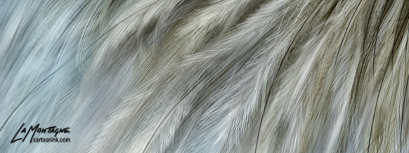
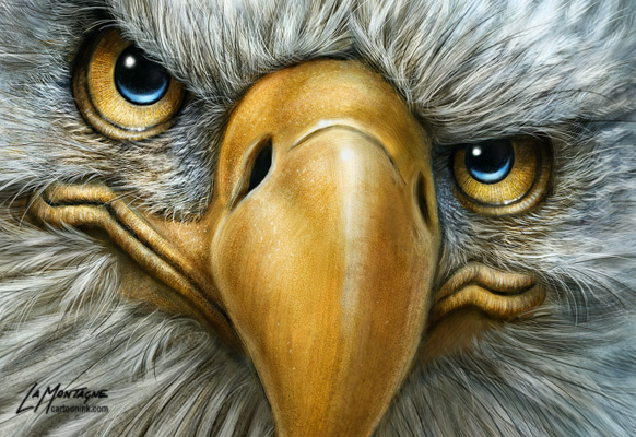
One choice I made was to include warmer tones around the face, blending out to cooler colours around the edges and shadows. As I said, white really isn’t white, so painting the feathers was about finding a balance between yellow and blue and the tones in between. There’s even some magenta in there. While another artist might not have chosen to make the blues so prominent, I really liked how those tones contributed to the overall mood of the image. It felt right, so I went with it and while it still fits the look of my other Totems, it has a different light quality to it.
 As for the expression, I don’t know where that comes from. As I’ve said about many paintings before this one, the personality just seems to show up at some point during the painting process and I’m really pleased with this one. Pardon my candor, but he just looks like an absolute bad-ass, and I love that.
On to the next one!

