Posted on 1 Comment

Fear and loathing of photo-painting

Anybody who knows me in professional circles knows that I’ve never been a fan of photo-painting.  While I don’t go out of my way to rant and rave about it, I’ve been pretty clear that I don’t like the practice of painting on top of a photo, that I’ve always felt it had a cheat quality to it, very much like paint by numbers.  I’ve had to bite my tongue and hold my anger in check whenever somebody has suggested that my paintings are just photos that I’ve painted over or manipulated.  It happens often enough that I have a chip on my shoulder about it.

I’ve always felt that if you’re going to learn how to use paint brushes in Photoshop, how to make them work for you, why not go all the way and just start with a blank canvas?  Use the photo for reference, but don’t go sampling the colours and painting on top of it.  I’ve pretty much dismissed it as something not worth my attention, resigning myself to loathing the practice, and making a concerted effort to ignore it.  People are going to do it, regardless of what I think, so why bother wasting my energy on it?

Now, I’ll admit to thinking twice (three, four times) about writing this piece, because it reveals flaws in my character.  While we all have them, of course, most of us don’t like to out ourselves when it comes to the things we keep hidden under the image we like to project.  But, there is rarely an opportunity to grow when you lie to yourself and as someone who follows the antics of politicians for a living, I can only stomach so much hypocrisy without pointing a finger at it, even when it comes to my own.

This week, I had occasion to throw open the door to my feelings on photo-painting for three reasons, all of which were revealed through posts on social media.

The first, was a link posted by a friend, an article by a vegetarian who had to deal with some of her ‘friends’ shunning her when she chose not to eat meat anymore, even though she wasn’t expecting them to do so as well.  I went looking for the article to include here, but I couldn’t find it.  Suffice it to say, it spoke a lot about our innate fear of change and how often the things we hate (strong word, there) are things we fear.

The second, was a piece written by Sam Spratt,  a guest on Scott Kelby’s blog this week.  While I enjoyed the whole blog entry about his thoughts on digital painting, the part that resonated most with me, was about artists who fear technology and how people skilled in one medium will often look down on those who work in a different medium.  I’ve talked about the latter myself in previous blog entries.

Third, and finally, Russell Brown, one of the pioneers of Photoshop and somebody who continues to look for new ways to push the technological and creative envelopes, revealed an add-on extension for Photoshop called the “Adobe Painting Assistant Panel” which is designed to help turn photos into paintings.  To be clear, I have nothing but the utmost respect for Russell.  In fact, I even painted his portrait recently.

I’ll admit that if somebody ever told me that I feared technology, I’d be taken aback.  My tools of the trade are all about technology.  Photoshop, Wacom tablets, my computer, laptop, painting on the iPad, I am a digital artist.   But after being exposed to those three sources this week, I began to ask myself, “Is it possible that I might be afraid of technology?”

The answer, it turns out, is No.  It’s not technology that I’m afraid of.  What I am afraid of, is obsolescence.

I know a lot of photographers who lament the fact that anybody can buy a DSLR camera these days, set it on automatic, take a photo and call themselves a photographer.  If you go looking for them, you’ll have no trouble finding MANY discussions online, often heated, that complain about people who are being hired to shoot weddings, portraits, and events, who are mediocre at the craft, essentially taking money away from ‘real’ photographers.

This is clearly a case of anger motivated by fear.  If the paying public can’t tell the difference between somebody with a point-and-shoot and a dedicated professional photographer, then how is anybody expected to continue making a living at it?

I’m not a photographer, so whenever I see this fear being played out in arguments and discussions, it’s pretty easy for me to see what’s going on.  It’s easy for me to pass judgment.

And yet, I didn’t see it in myself until just this week.

The reason I don’t like photo-painting is because I’m afraid that the paying public can’t see a difference between painting over a photo and the work that I have devoted years of my life to becoming skilled at.

That wasn’t easy to admit.  In fact, it’s downright humbling.

I’ve also realized that the same thing applies to how I feel about similar practices playing out in editorial cartooning.  I’ve seen competitors take a photo they found on the net, apply a few filters to it, slap on a caption and it gets published in a major daily newspaper.  This is happening quite often these days and I’ll admit to being pretty angry about it, upset that they were cheating.  The reality is that I’ve been afraid that if that’s all it takes to get published, then anybody can call themselves a cartoonist and they won’t need me, that the time I spend drawing is wasted, because some editors just don’t see the difference, or they don’t care.

My wife, Shonna, always a sobering voice in discussions where my emotions get the best of me, spelled it out quite well when I broached the subject with her this week, about my realized fear of photo-painting.

While I can’t recall her exact words, she basically suggested that it doesn’t matter how somebody creates their work.  If they take a photo, apply a few filters to it and call it a painting, it doesn’t really affect me at all.  They still have to sell it.

That was my moment of clarity in all of this and what will finally enable me to put it behind me.

Art isn’t about how it’s done.  Art is about how you feel when you experience it.  That applies to photography, sculpture, painting, music, performance, etc.  If you take a photo-painting that somebody has done and put it beside one of my paintings, the viewer most likely won’t care how it was created.  They’re just going to care if they like it or not.  If both pieces are for sale, they’re going to buy it based solely on that.  That’s how it has always been with art.

Some people really like my whimsical animal paintings and some don’t like them at all.  Some people buy them, some people don’t.  The fact that there are folks out there painting on top of a photo in Photoshop doesn’t change that in the slightest.

I’m still afraid of obsolescence.  I can freely admit it.  But I can use that, because fear is a great motivator.  It makes me try harder and scramble, eagerly seeking out opportunities to further my business and to ensure that I remain self-employed doing what I love to do.  While I have no intention of doing any photo-painting myself,  I’ve decided to no longer fear it.   As a consequence of that, I choose to no longer despise it, either.  It’s just another method for creative people to express themselves and that’s a good thing.  That’s art.

Posted on 3 Comments

Wacom’s Bamboo Splash Tablet and ArtRage Studio

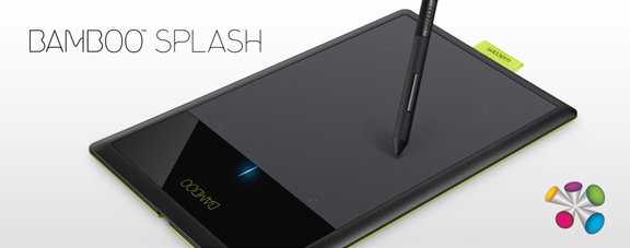
Wacom just released a new entry level tablet, the Bamboo Splash, and I had an opportunity to put it through its paces.

The Bamboo Splash tablet is designed for the amateur or beginner digital artist.  It’s perfect for kids and teenagers, allowing them to experiment with digital art without having to spend a bundle to do so. Best of all, even though it lacks the bells and whistles of the more advanced tablets, it doesn’t sacrifice much in performance.

As I draw syndicated editorial cartoons almost every day, I wanted to see if I could still get real work done using the Bamboo Splash, rather than with the medium sized Intuos5 that I use every day.

The Wacom Intuos5 is a professional tablet.  With the programmable Express Keys, the Touch Ring, high end pen, and the onscreen customizable features, not to mention the larger size, it’s unfair to compare the two tablets as they are designed for different skill levels.  As I’ve been doing this for a living for many years, I’ll admit that the Bamboo Splash isn’t tablet enough for my daily needs, but then again, it isn’t meant for me.

The Bamboo Splash tablet was simple to set up.  Plug it in; install the drivers from the CD, restart the computer and it was working flawlessly.  Visiting the preferences utility, I found that very little aside from ‘Tip Feel’ was changeable.  For a beginner, that’s ideal.  It’s ready to go, out of the box, nothing confusing.

Put simply, it’s a great device.  The Bamboo Splash has 1,024 levels of pressure sensitivity, which is plenty.  While a number of people may wonder about the size, your mind figures it out fast.  I work on a larger tablet every day, mapped to two screens.  I keep all of my Photoshop tools on one screen and draw on the other.  That means I’m really only using half the tablet for drawing.

When using the Bamboo Splash, I didn’t change my screen mapping, so I was only drawing on half of the smaller tablet, too.  After a few minutes, I didn’t even think about it.  My mind just figured out that brush and pen strokes required less movement.

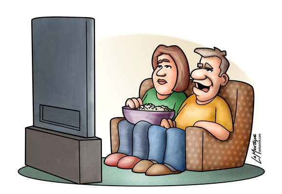
This cartoon (with the political commentary left out) was drawn and painted entirely with the Bamboo Splash in Photoshop and it worked very well.  While I did keep reaching for the Express Keys and Touch Ring of the Intuos5 out of habit, once I got used to their absence and reverted to using keyboard shortcuts or drop down menus in Photoshop, I was able to work smoothly and still got my cartoon out to my newspapers on time.

Trying to draw with a mouse is an exercise in futility.  You really do need a Wacom tablet to draw with a computer.  While the Intuos5 tablets and Cintiq devices will represent more of a financial investment, you’re not risking too much with the Bamboo Splash.  The tablet comes in at well under $100.  Best of all, it comes with two very nice pieces of creative software.  One is Autodesk’s Sketchbook Pro and the other is ArtRage Studio.

I spent some time with ArtRage, and it was very enjoyable to use. While it’s not designed to be a professional illustration and painting tool like Photoshop or Painter, it offers a lot to anybody wanting to try their hand at digital art.  With pencils, crayons, chalk, oils, watercolors and a number of other tools, there’s very little to limit your creativity.  It even supports layers and blend modes, and has a number of other fun tools and settings to mess around with.

Pairing ArtRage Studio with the Bamboo Splash was a great idea, because they’re both designed to allow you to create digital art, without a steep learning curve.  You can start working with both right away and if you’re like me, preferring to figure it out as you go along, you’ll be able to get pretty far without having to look through the manual.

When you do want more info, the ArtRage website has plenty of tutorials.  You can also upgrade the software to ArtRage Studio Pro and they have iPhone and iPad drawing apps as well.  If you do want to try out the mobile apps, I’d recommend the Wacom Bamboo Stylus as a drawing device to go with them.

Here’s a video I recorded for Wacom’s ‘See What You Can Do’ campaign, designed to share a little bit of my thoughts on digital painting, and to show some of the drawing and painting tools available in ArtRage Studio.


Posted on 2 Comments

Painting a Bison Totem

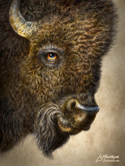
This is the latest in my series of whimsical wildlife paintings, the Bison Totem.  As usual, I have the most fun when I’m working on this type of painting, especially since each one presents its own unique challenges.  With this one, it was trying to get the ‘wool’ to look right, and it took some trial and error.   One of the great reference photos I worked from, was courtesy of one of my favorite wildlife photographers, Moose Peterson.  I also used a couple of other photos I bought from a stock photo company, so it wasn’t such a problem seeing the great detail, as it was to replicate it with brushes.

One of the things I’ve learned from working on these animals, is that I could spend weeks painting every little hair that I see in the photos I reference, but it would be a wasted effort.  For one, these animals are caricatures (although not extremely exaggerated) of the real thing, so replication is not the goal.  But also, people aren’t looking at a painting in actual pixel size, so nobody really cares if every hair is perfect, and they’re not holding up the three photos I used for reference to compare them inch by inch.  If they are, they should really get a hobby, because that energy could better be spent elsewhere, like cleaning out the garage or something.

I do obsess about the details, though.  It’s part of my nature (ask anybody who knows me well), and I use it to my advantage in these paintings.  That being said, there comes a point in every painting when any further detail is a waste of time because the viewer won’t see it.  It has to look great at full size, but zoom into any painting close enough and it just becomes a mosaic of pixels and colored noise.  I really do enjoy it, though, painting all those little hairs, music playing in the headphones, just being in the image.  Most of my perfect moments in life, those instances of peak experience (read Maslow), are when I’m painting.

If you’d like the technical info, this painting was done on a medium sized Wacom Intuos5 tablet in Photoshop CS5.  No idea how long it took me, but it was many hours.  The full size painting is 18″X24″ at 300ppi.  Something different this time was that I switched out the nib in my Wacom pen.  Having always used the standard nibs that came with the tablet, I read a blog entry by Wacom’s Joe Sliger about the different nibs and figured I’d try the flex nib for this painting.  That’s the one with the little spring in it.  While it had nothing to do with what the painting looks like, I absolutely loved painting with this nib.  Had a little bit of give to it and while I got used to it quickly and didn’t think about it, I really think I’ll be using this nib more often.  Just feels better in the pen.  Here’s a link to Joe’s article if you’d like more info on the different nibs.

While working on this painting, I saved the image at different stages so that I could make the following video.  It’s a time lapse of different stages in the painting, this being one I’ve been planning for quite awhile.  I’ve had the reference for the bison for over six months, and the music, bought specifically for this painting, for almost as long.  As a big fan of movies, I love soundtracks and this dramatic piece just seems to add something to the video.  It was fun to put together.

Thanks for stopping by to see the latest piece and for reading my thoughts on it.  I feel privileged to be able to paint these creatures and I’m pleased when others like them, too.

Posted on Leave a comment

Rockhopper Penguin Totem

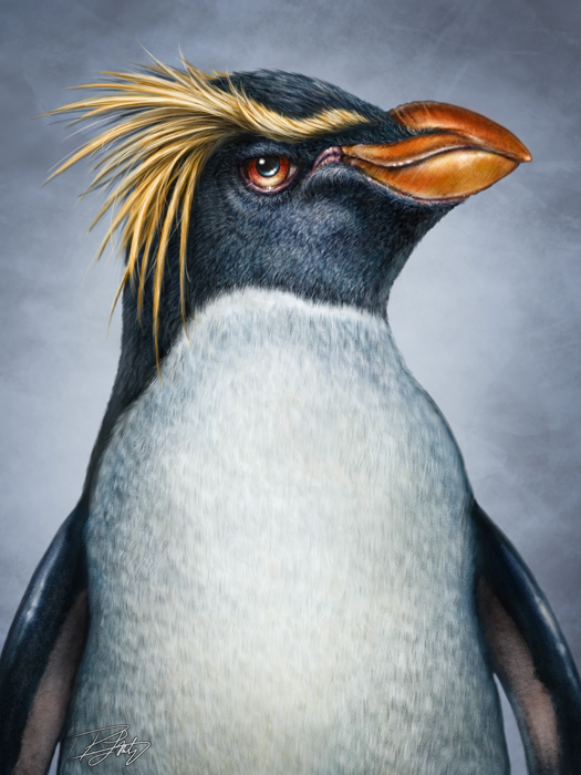
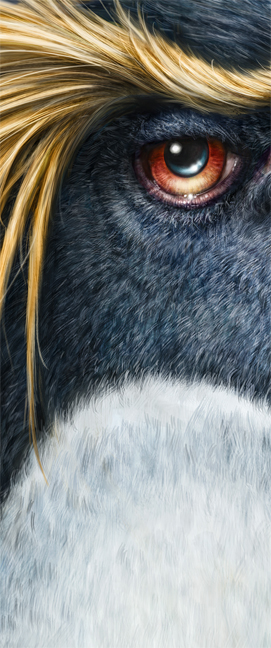
This ornery looking fellow is a Rockhopper Penguin, the latest Totem in the series and one of my more challenging paintings to date.  While I usually have a lot of fun with these, this one was a roller coaster of frustration.

The main reason I added this animal to the series at this point is because the Calgary Zoo had expressed interest.  With their recent addition of The Penguin Plunge habitat to their facility, penguins are a pretty big deal in Calgary this year.  While they have already taken a chance on my Wolf and Moose paintings, I’d like to have more of my Totems for sale at the zoo, so the decision to  paint a penguin right now was a commercial one.  I sent the finished image to my contact at the zoo this morning within a short time of finishing it, and it was well received.  They’ve already ordered a significant number of prints in a variety of sizes, so they should be available at their retail outlet soon.  Right outside The Penguin Plunge.

So why was this so frustrating?  Honestly, with the exception of the Ostrich Totem, I find birds incredibly difficult to paint.  Perhaps it’s because their body structure is so different from mammals, a beak instead of a mouth, usually only one eye visible instead of two, also that they’re very stiff looking…honestly I don’t know what it is.  It wasn’t the detail, because the feathers were a lot of work, but not difficult to paint, just time consuming.  When I’m working on a painting, I start at low-resolution, then as more and more detail gets painted in, I’ll bump up the resolution until it’s around 18″X24″ at 300ppi.  When it gets to this point, the painting is really close to being finished, it’s just a matter of painting in a lot of tiny details.  With this penguin, however, I was trying to fix structural issues at full size, something I would rarely do.  But I’d painted so much detail in a lot of places that didn’t need to be fixed, so I couldn’t go backwards without losing that.

My wife Shonna is not an artist, but she has this uncanny knack of looking at a painting I’m working on and instantly seeing what’s wrong with it.  It’s very annoying, but also very helpful.  When I ask her opinion, I brace myself for what I know is coming, because there is always something.   With this penguin, she saw more than a few problems.  The eye wasn’t in the right place, the yellow feathers didn’t look right, the beak was shaped wrong.  It was brutal.

All of these issues were addressed and repainted, adding at least another five or six hours to a piece I’d already been working on for many more than that.  The personality didn’t even seem to show up until the last few hours, which is very unusual.  So while there’s nothing more I could do to this painting to improve it, I had a hard time ‘feeling’ it while I was doing the work.  There were still times when I was really enjoying myself, but not as much as I normally do.  The Bighorn Sheep Totem was like this as well, and while I love that painting now, I didn’t immediately after I’d finished it.

So what did I learn?  Well, sometimes you just have to plow through and git ‘er done, even when you’re not feeling it.  The finished painting may feel a little different to me at the moment, but anyone buying it doesn’t know the frustrating back story (unless they read it here), so it now stands on its own merit.  It’ll either be popular or it won’t, and time will tell.  Also, I took most of the reference photos myself, and they were average.  For the pose and general features, however, they were good enough.  For the fine details,  I decided to go and buy some stock photos.  After reading their licensing agreement that permits this usage for work like mine, I’ll be doing that more often.  Some great closeup detail reference on stock photo sites, and reasonably priced, too.  This is going to make future paintings a little easier for me.

While I’ve been working on commissions the last little while, turns out this is the first Totem I’ve added to the series since the Cougar in January.  I’ve got a couple of other painting projects up next, but I’m hoping to have another Totem done before the end of the summer.  And no, it’s not a bird.