Posted on

Working for Free and Clearing the Air

This topic seems to be floating around a fair bit lately and that’s a great thing.  Too many artists are doing work for free because many companies expect them to.  While I could write a long post about this, and I have in the past, Stephen Silver says it best in this video below.  If you are a freelance artist and aren’t yet aware of Stephen’s work, I would suggest you follow him.  He is respected for good reason.  He has great advice, is very inspirational and has been working in the animation and design business for a long time.  I’ve even taken an online character design course from him years ago and learned a lot.  While I don’t consider myself as accomplished a cartoonist or character designer as he is, my work is definitely better from having learned from him.  Now this video below is an angry rant, and this is out of character for Stephen, but he’s passionate about protecting artists from being taken advantage of, and you can see that in the video.  If you’re easily offended…well you wouldn’t be here, so never mind.

Before I get to the video, however, I’d like to address something I’ve been taking a bit of flack for the past couple of months, something that has direct bearing on this topic, and that’s the fact that I gave Emilio Estevez the painting of his father for free.  While I could easily dismiss the criticism as ‘some people are just angry at everything,’ I feel it’s important to address this because it’s not just me being slighted in the criticism, it’s Estevez as well.  While I’m sure he has thick skin and is used to being criticized for anything and everything in his profession, it bothers me that some think he got the painting for free because he expected it for free, simply because he’s a celebrity.  That’s not the case.

Throughout our correspondence, he was always offering to buy the painting.  He never expected me to give it to him.  When I explained that I couldn’t sell it because of why I painted it (you can read about that here), he then offered me other incentives from which I could make money from the print and I still declined.  My decision to give the painting was always mine.   I make a good living as a commercial artist, I do not do commission work for free, and nobody is taking advantage of me.  I wasn’t asked to do the painting.  That would have been something entirely different and I would have charged appropriately for my time and effort, just as I would have if the painting was going to be used commercially.

Let’s say that I had been in the same head space I was in when I painted that image of Martin Sheen, but had instead been inspired to paint somebody on the street in Calgary.  Let’s say I took a photo, and painted that person for my own enjoyment.   Let’s also say that person’s son or daughter saw the image and wanted to give that image to their father, the subject of the painting.   I can honestly say that I would have done the same thing, charged them only the printing and shipping and given them the painting, the same arrangement I made with Estevez.  The decision was not about celebrity.  It was about me, where I was at a couple of months ago, and what my instinct told me at the time.  The difference was that the inspiration came from a film, so the painting ended up being a character played by a well known actor.

Estevez was nothing but gracious and genuine throughout the experience and in addition to the signed prints I requested, and paying for the shipping and printing,  he even gave me a copy of the memoir written by him and his father, signed personally to me by both.  Some have suggested I should have gone for the big money grab because he was a celebrity.  That’s just not me.  While the story did get a fair bit of press in Canada and a little bit in the U.S., the experience doesn’t mean anything in the long run to anybody but me and the recipients of the painting.   It’s already long over, as most stories of this nature so quickly are.  To do it all again, I would change nothing.  While I have some very nice souvenirs of the experience,  I’m back to doing what I do best, drawing cartoons, illustrations, and painting funny looking animals for a living.  Throw in the odd portrait for fun and inspiration and that’s where I want to be.

Hopefully that clears a few things up for a few angry people out there.  If not, feel free to continue to wallow in it.  It’s your problem.  For the rest of you, take a look at this video by Stephen Silver.  If you’re an artist, it might inspire you to believe in your own worth.  If you’re not an artist, but someone who might hire one, perhaps this will enlighten you as to the struggles being faced in the industry.  We’re all building our own individual careers, but we also need to look out for one another as well.

Posted on

Painting Choices and Challenges

I’m currently working on a portrait of Canadian Astronaut Chris Hadfield.  The reference that I’m using is from a Youtube video, so even in web HD, the quality isn’t great.  I’m used to working with poor quality reference from time to time, and it’s actually a good thing when it comes to portraits, as long as the quality isn’t too bad.  If the quality were perfect, I might rely too much on the photo and there wouldn’t be enough art in it, just replication.

A common practice in painting from photos is using the grid method.  The short explanation is that you divide your reference photo into grids, then you divide your canvas into equally proportioned grids.  This helps a person establish where the major landmarks fall on the reference photo and suggests that those same landmarks should fall in the same place on the canvas grid.  Here’s a very basic explanation of The Gridding Method if mine doesn’t do a decent job of it.

Norman Rockwell, Leonardo da Vinci and many other artists of note would use the grid method in their work.  Some artists consider it cheating, but then again, I’ve met artists who say I’m not a real artist because I sell my work commercially.  Art for a living is not a profession for anybody with thin skin and there is often no harsher critic than another artist.  I don’t have the rare skill to paint a person’s likeness from memory, so I need photo reference, as do most portrait artists.  My take on the grid method is that it is a tool that has its place, but I wouldn’t rely on it completely.  Photoshop has the ability to apply grids in any configuration over your image.  It’s under Preferences > Guides, Grids, and Slices.  When I do use it, I choose percentages, but you can choose more precise methods of measurement as well.  7 percent is pretty small, but you’ll see why I chose that at the end of the post.

Preferences I never use the grid at all when I’m painting my Totem paintings because they’re not supposed to look like the reference photos.  Nor would I use grids when doing caricature work, because exact proportions would defeat the whole purpose.

Just to prove that I can paint without the grid method, this is a portrait of James Whitmore that I did on the iPad, where grids weren’t possible.  I had a photo, the iPad, and nothing but time.  It did take quite awhile, and a big challenge was the low resolution possible with the first gen iPad,  but I’m pleased with the likeness I was able to achieve.

James Whitmore - iPad painting

I try to only use the grid method when I’m stuck on something in a realistic portrait of a person or know that something is wrong and just can’t quite see it.  For example, when I’m working on a likeness of a person, I may know that there’s something wrong with the eyes, but can’t figure it out.  I’ll flip the canvas horizontally, vertically, try all of my tricks and still be stuck.  By using the grids, I’ll see that it could be something as simple as the corner of the eye is in the wrong place or the iris doesn’t have the correct curve.  I only use the grids when a painting is in the middle stages.  Once the likeness is there, I don’t use them anymore, because I find that relying on it too much makes the subject of a portrait look wooden.  I pride myself in the personality and life in my images and that doesn’t come from accurate placement of features, but from artistic impression of the subject.  This is also the reason I paint people that inspire me or characters I feel a connection with, because that helps me with the feeling of the work.  Having the tools is easy, knowing when to use them comes from experience.

Here’s a challenge I faced this morning on the current painting of Chris Hadfield.  In the reference image I’m using, his mission patch is clearly visible on his shirt.  Because I’m trying to capture a moment, I want to include that in the painting.  I went back and forth on how to do it.  That mission patch is readily available online in pristine condition, just as the designer would have finished it.  One way to do it was just paste the perfect image in position, use the distort and warp tools, maybe rough it up a bit with a texture brush, add a little blur and it’s done, quick and easy.  Another way I could do it, was do a vector trace of the graphic, basically just using the pen tool, trace over the coloured elements, convert them to paths, fill with colour, distort, warp, place, texture, blur, done.

So why didn’t I do either of those?  With a logo in an editorial cartoon, I do that all the time, and I’m fine with it.  Usually on a tight deadline, it’s a satirical commentary, and an accurate logo that I’ve recreated with the pen tool by tracing over it is something I’m comfortable doing because of the context.  It’s part of the job and spending 20 hours on each editorial cartoon would be career suicide.  With the painting, however,  it felt like cheating.  To somebody else, it might not have, and that’s OK.  Everybody needs to make their own choices.  I just know that had I done either of those,  I’d finish the painting, would probably like the end result, but every time I look at that patch, it’s going to bother me.

HadfieldWIP04

So I decided that for the patch, I would use the grid method to help with the accuracy of the pieces in the patch, but paint it as I see it in the reference image.  It’s going to take me quite awhile longer to paint the patch, but I’ll be happier with it in the end.  As you can see from the above reference image on the left and painting on the right, I’ve got a long way to go to get it right, but it’s not like it’s wasted time because I’m still learning from every painting I do.  In the end, I’ll be happier with the painting, so it’s time well spent.

Posted on 1 Comment

Miss Moneypenny

This was my last commission painting of this year, a little lady named Moneypenny.  She’s a young pup with a great personality and I was given the option of painting her in a realistic portrait style or Totem style, artist’s choice.  Believe it or not, there is no exaggeration in this portrait.  She was really smiling like this in the reference photo, so I didn’t see the point of painting her in the Totem style.

Moneypenny’s portrait was finished earlier this month, but I wasn’t able to show it ’til now, just in case the recipient happened to see it online.  Since I know both the client and the recipient, there was a chance somebody would let it slip, so it was best to hold off.  It was printed and stretched on canvas at 12″ x 16″ and framed.

I found out last night that the gift has been given and while her owner loved it, Moneypenny herself was a little freaked out, thinking there was another dog in the house.  Apparently she barked at it.  Either that was a harsh critique or a wonderful compliment.

Here’s a closeup of the details.


Posted on 1 Comment

Martin Sheen – The Details

Martin Sheen - Portrait
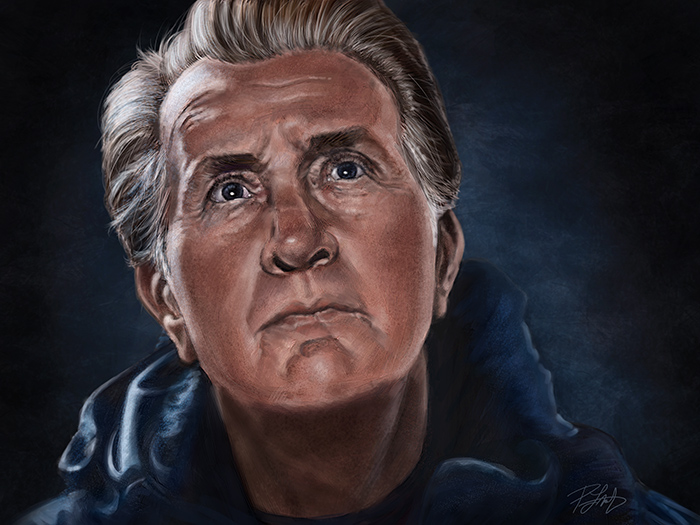
Yesterday, I wrote about why I painted this portrait of Martin Sheen’s character, Tom, from the movie ‘The Way.’  Click on this link, if you’d like to read it.  Today, I figured I’d write a little bit about the how, as there are always artists out there who want to know the technical details, and I’m happy to oblige.

This painting was done entirely in Photoshop CS6 Extended using a Wacom Cintiq 24″HD display.  No photos were used in the painting, aside from reference.  I didn’t keep track of how long it took me to complete it because I wasn’t on deadline or in a rush, so while I could easily say 20 hours, it was probably more, over a few weeks.  Without a deadline, I was able to nitpick it and get it as close to perfect as my current skills will allow.  At some point, however, I just have to call it done, because any changes become so minute that nobody will see them but me.

With all of my previous work, it has become my practice to start a painting at low resolution, usually around 9″X12″ at 72ppi.  Then, as the painting progresses, I will keep bumping up the size and resolution.  I teach this method in my PhotoshopCAFE DVD, “Animal Painting in Adobe Photoshop” and it’s the same practice I use for painting portraits of people.  There used to be two reasons for doing this.  First, when you’re working at low-res, you can’t get distracted by putting in too much detail because the size just won’t allow any.  This forces me to well establish ‘the bones’ of a likeness before working on wrinkles, skin texture, and hair.  The other reason for starting at low-res was that my computer had reached the end of it’s efficient life for this type of work and at full-size and full-res, the brushes just wouldn’t move well enough to make broad strokes across the digital canvas.  A completed painting was never more than 18″X24″ at 300ppi, because at that size, I could only work on the fine details without experiencing some lag.

Recently I had a new computer built and I’m back to working on a very current, high end machine.  Running 64bit Windows 7 with 64bit Photoshop, 16GB of RAM and a 4GB video card, everything is running incredibly smooth.  I could have started and finished this painting at full-res, without any problems at all.  BUT, I’m going to continue using my low-res to high-res workflow for the first reason I mentioned.  It forces me to get the likeness right and it works well for me.  That being said, I decided to push this painting to see if I could make it larger, which also allows more attention to detail.  This final painting is 32″X24″ at 300ppi.  At that size, the brushes were working just fine, and I could have bumped it up even more, with no issues in performance.

I’m still using the regular brushes in Photoshop and haven’t used any of the Mixer or Bristle brushes in my paintings.  Those brushes are designed to simulate traditional media and I honestly don’t feel the need to do that.  Digital painting is a medium all on its own, and I don’t try to make it into something it’s not.  I do intend to give those other brushes a try in the coming year, however, simply to see if they’ll offer me some choices to make my work better.  While I’m pleased with the quality of this painting and very much enjoyed working on it, there will always be room to improve.

Thanks for stopping by.


Posted on 3 Comments

Wacom’s Bamboo Splash Tablet and ArtRage Studio

Wacom just released a new entry level tablet, the Bamboo Splash, and I had an opportunity to put it through its paces.

The Bamboo Splash tablet is designed for the amateur or beginner digital artist.  It’s perfect for kids and teenagers, allowing them to experiment with digital art without having to spend a bundle to do so. Best of all, even though it lacks the bells and whistles of the more advanced tablets, it doesn’t sacrifice much in performance.

As I draw syndicated editorial cartoons almost every day, I wanted to see if I could still get real work done using the Bamboo Splash, rather than with the medium sized Intuos5 that I use every day.

The Wacom Intuos5 is a professional tablet.  With the programmable Express Keys, the Touch Ring, high end pen, and the onscreen customizable features, not to mention the larger size, it’s unfair to compare the two tablets as they are designed for different skill levels.  As I’ve been doing this for a living for many years, I’ll admit that the Bamboo Splash isn’t tablet enough for my daily needs, but then again, it isn’t meant for me.

The Bamboo Splash tablet was simple to set up.  Plug it in; install the drivers from the CD, restart the computer and it was working flawlessly.  Visiting the preferences utility, I found that very little aside from ‘Tip Feel’ was changeable.  For a beginner, that’s ideal.  It’s ready to go, out of the box, nothing confusing.

Put simply, it’s a great device.  The Bamboo Splash has 1,024 levels of pressure sensitivity, which is plenty.  While a number of people may wonder about the size, your mind figures it out fast.  I work on a larger tablet every day, mapped to two screens.  I keep all of my Photoshop tools on one screen and draw on the other.  That means I’m really only using half the tablet for drawing.

When using the Bamboo Splash, I didn’t change my screen mapping, so I was only drawing on half of the smaller tablet, too.  After a few minutes, I didn’t even think about it.  My mind just figured out that brush and pen strokes required less movement.

This cartoon (with the political commentary left out) was drawn and painted entirely with the Bamboo Splash in Photoshop and it worked very well.  While I did keep reaching for the Express Keys and Touch Ring of the Intuos5 out of habit, once I got used to their absence and reverted to using keyboard shortcuts or drop down menus in Photoshop, I was able to work smoothly and still got my cartoon out to my newspapers on time.

Trying to draw with a mouse is an exercise in futility.  You really do need a Wacom tablet to draw with a computer.  While the Intuos5 tablets and Cintiq devices will represent more of a financial investment, you’re not risking too much with the Bamboo Splash.  The tablet comes in at well under $100.  Best of all, it comes with two very nice pieces of creative software.  One is Autodesk’s Sketchbook Pro and the other is ArtRage Studio.

I spent some time with ArtRage, and it was very enjoyable to use. While it’s not designed to be a professional illustration and painting tool like Photoshop or Painter, it offers a lot to anybody wanting to try their hand at digital art.  With pencils, crayons, chalk, oils, watercolors and a number of other tools, there’s very little to limit your creativity.  It even supports layers and blend modes, and has a number of other fun tools and settings to mess around with.

Pairing ArtRage Studio with the Bamboo Splash was a great idea, because they’re both designed to allow you to create digital art, without a steep learning curve.  You can start working with both right away and if you’re like me, preferring to figure it out as you go along, you’ll be able to get pretty far without having to look through the manual.

When you do want more info, the ArtRage website has plenty of tutorials.  You can also upgrade the software to ArtRage Studio Pro and they have iPhone and iPad drawing apps as well.  If you do want to try out the mobile apps, I’d recommend the Wacom Bamboo Stylus as a drawing device to go with them.

Here’s a video I recorded for Wacom’s ‘See What You Can Do’ campaign, designed to share a little bit of my thoughts on digital painting, and to show some of the drawing and painting tools available in ArtRage Studio.


Posted on 2 Comments

Painting a Bison Totem

This is the latest in my series of whimsical wildlife paintings, the Bison Totem.  As usual, I have the most fun when I’m working on this type of painting, especially since each one presents its own unique challenges.  With this one, it was trying to get the ‘wool’ to look right, and it took some trial and error.   One of the great reference photos I worked from, was courtesy of one of my favorite wildlife photographers, Moose Peterson.  I also used a couple of other photos I bought from a stock photo company, so it wasn’t such a problem seeing the great detail, as it was to replicate it with brushes.

One of the things I’ve learned from working on these animals, is that I could spend weeks painting every little hair that I see in the photos I reference, but it would be a wasted effort.  For one, these animals are caricatures (although not extremely exaggerated) of the real thing, so replication is not the goal.  But also, people aren’t looking at a painting in actual pixel size, so nobody really cares if every hair is perfect, and they’re not holding up the three photos I used for reference to compare them inch by inch.  If they are, they should really get a hobby, because that energy could better be spent elsewhere, like cleaning out the garage or something.

I do obsess about the details, though.  It’s part of my nature (ask anybody who knows me well), and I use it to my advantage in these paintings.  That being said, there comes a point in every painting when any further detail is a waste of time because the viewer won’t see it.  It has to look great at full size, but zoom into any painting close enough and it just becomes a mosaic of pixels and colored noise.  I really do enjoy it, though, painting all those little hairs, music playing in the headphones, just being in the image.  Most of my perfect moments in life, those instances of peak experience (read Maslow), are when I’m painting.

If you’d like the technical info, this painting was done on a medium sized Wacom Intuos5 tablet in Photoshop CS5.  No idea how long it took me, but it was many hours.  The full size painting is 18″X24″ at 300ppi.  Something different this time was that I switched out the nib in my Wacom pen.  Having always used the standard nibs that came with the tablet, I read a blog entry by Wacom’s Joe Sliger about the different nibs and figured I’d try the flex nib for this painting.  That’s the one with the little spring in it.  While it had nothing to do with what the painting looks like, I absolutely loved painting with this nib.  Had a little bit of give to it and while I got used to it quickly and didn’t think about it, I really think I’ll be using this nib more often.  Just feels better in the pen.  Here’s a link to Joe’s article if you’d like more info on the different nibs.

While working on this painting, I saved the image at different stages so that I could make the following video.  It’s a time lapse of different stages in the painting, this being one I’ve been planning for quite awhile.  I’ve had the reference for the bison for over six months, and the music, bought specifically for this painting, for almost as long.  As a big fan of movies, I love soundtracks and this dramatic piece just seems to add something to the video.  It was fun to put together.

Thanks for stopping by to see the latest piece and for reading my thoughts on it.  I feel privileged to be able to paint these creatures and I’m pleased when others like them, too.

Posted on 3 Comments

A Portrait of Madeline Kahn

This is a painting of the late, great Madeline Kahn in her role as Elizabeth from the movie ‘Young Frankenstein.’  One of the great comedic actresses of our time, who died too soon in 1999 at the age of 57.

While she had many movie, theatre and television roles to her credit, she was perhaps most famous for her roles in Mel Brooks classics,  ‘History of the World: Part I,’, ‘Blazing Saddles,’ and of course, ‘Young Frankenstein,’ all of which are favorite films of mine.  To this day, any of her comedic performances can still make me laugh out loud and I wonder what valuable information have I failed to retain in favour of storing an endless amount of lines from these movies in my mind.

The technical part of this painting was that it was not only black and white (Mel Brooks insisted on it for this film), but also that it was intentionally grainier than the HD films we see today.  He wanted to recapture the look of those old horror classics for this spoof.  As such, gathering detailed reference was tough as I could find no high resolution reference, even from the DVD itself.  With that in mind, I decided to go with a softer painted look rather than sharp detail.  This was tough for me to do, especially given the fur on that fox around her neck.  I had to refrain from the detail I normally paint into animal fur.  This outfit, by the way, is what she was wearing during one of the funniest scenes in the film.

I painted this portrait for no other reason than the challenge of working with less than ideal reference and to practice my portrait work.

Posted on 8 Comments

iPad Painting and the Wacom Bamboo Stylus

Here’s another iPad painting that I just finished.  This is Marcia Gay Harden in character as ‘Mother Carmody’ from the Frank Darabont movie, ‘The Mist,’ based on the novel by Stephen King.  She is one of my favorite movie villains which made this a lot of fun to work on.  Frank Darabont is one of my favorite filmmakers and Stephen King is my favorite author, so it should come as no surprise that The Mist is one of my favorite movies.  How many times can you use ‘favorite’ in a sentence?

Darabont has made movies out of a number of King’s books.  In addition to The Mist, there was The Green Mile and The Shawshank Redemption.  He is also responsible for the breakout miniseries ‘The Walking Dead,’ which is one of the few television shows I would pay extra to see.  And if that weren’t enough, Darabont has used Drew Struzan (one more favorite) to create the posters for a number of his movies, including the ones I’ve mentioned here.  It’s no wonder I’ve chosen two of his characters to paint on the iPad.

I’ve already written a great deal about the process for painting on the iPad and the ArtStudio app, which is still preferred over all others.  If you’d like to see other iPad paintings and posts, there are links at the end of this entry.  The process is very much like other digital painting, with some limitations due to the nature of the iPad.

What made this current painting different is that I was taking a new stylus for a test drive.  Up until now, I had been using (and recommending) the Targus stylus, but I recently got my hands on the new Bamboo Stylus for iPad by none other than Wacom.  I’ll be honest, I had REALLY high expectations for this stylus.  Wacom has long been established as the go-to company for drawing tablets, and having owned more than a few of them, I’m a pretty big fan.  I couldn’t do my work without a Wacom tablet.

I already knew that the stylus wasn’t going to be reinventing the wheel.  Anybody expecting pressure sensitivity (something Wacom tablets are very well known for) should dismiss it now, no matter what stylus you’re using.   The iPad currently does not support pressure sensitivity, so that discussion ends pretty darn quick.

Without going into great boring technical details, I can sum up the Wacom Bamboo Stylus pretty easily.  It is the best stylus I’ve used so far.  Every other stylus I’ve tried, and there have been four of them, has been a little like drawing with a piece of chalk.  A large surface area with the tip, because the iPad is built to register a finger, not a pen.   What it looks like Wacom did, however, was take that tip size to the ultimate minimum.  The contact surface is significantly smaller than any other stylus I’ve seen so far.  It’s still not fine point tip, but it’s a definite improvement over all others I’ve tried.

What else did they get right?  Well, it’s longer than any other stylus I’ve used, so it feels better in my hand.  It has better balance, too.  They included a clip (something others have failed to do) and it looks good, too.  While I’m sure a lot of work went into the research and development of this stylus, it’s not a complicated device.  It’s a pen that allows you to write, draw, and paint on the iPad.

Many people will recall that I liked the Targus stylus, and up until now, it was all I needed.  Wacom, however, raised the bar with the Bamboo Stylus and it’s now my primary drawing device for the iPad.  I still have to use the glove so I can rest my hand while drawing without activating the app with the heel of my hand, but that’s a compensation for the iPad, not the stylus.

As with all of the stylus products out there, there are metal parts on them, so a little bit of care for your iPad is warranted.  Don’t leave your stylus sitting on the screen or push really hard at a very steep angle as there is always the risk of slipping and possibly scratching the iPad.  You don’t need to push hard with ANY stylus, and if you use the Bamboo Stylus properly, you should have no issues.

I do not have a screen protector on my iPad, so I can’t say how it works with one, but I used my iPad a LOT, do a lot of painting with it, and the only scratches I’ve ever got were from a brief test of the Dagi stylus which put three nice little scars on the screen.  Even those are hard to find, but it was enough for me to abandon it.  The Apple case is all I’ve ever needed for the iPad, so I don’t see the need for a screen protector.

Bottom line, I would highly recommend buying the Wacom Bamboo Stylus.  Yes, at $29.95, it costs a little more than others on the market, but I’ve always believed that you get what you pay for, and this one is worth it.  It’s a joy to paint with and after the first few minutes, I didn’t think about the pen at all, which is the best endorsement I can offer.  I find the best products (hardware and software) are the ones that allow you to think about your work, not the tools you use to create it.

As for those who are demanding pressure sensitivity, talk to Apple about it.  In the meantime, you can easily fake pressure sensitivity with most apps on the market by varying the opacity of the brush in the app itself.  That’s what I did throughout this whole painting and it worked very well.  I rarely use full brush opacity when painting, even in Photoshop.

One final note about painting with the iPad in general…

The iPad has limitations that prevent me from producing ready-for-market paintings.  Just the color calibration and resolution limitations are enough to put the brakes on creating finished work.  This ‘actual pixels’ image is as close as you can zoom in on the first-gen iPad.  Were I to import this into Photoshop, it would serve as a sketch for a painting, with many more hours required to create a finished piece.  Had I painted this in Photoshop, I would consider this to be about half done at this stage.

With that in mind, you might wonder why I bother painting with the iPad at all, when I can get much more detail and a tighter rendering with Photoshop and a traditional Wacom tablet.  The reasons are simple.  With the right app, and the right stylus, the iPad is a great sketchbook.  I also enjoy the challenge of seeing how far I can take a painting, and it’s just great overall painting practice.  Another reason is simply to show that you can create quality artwork on the iPad, despite the critics (fewer all the time) that say it’s of no practical use to artists.  One thing I’ve learned over the years by watching what talented and creative people do with all sorts of mediums in this world is that artists will decide for themselves what is and isn’t of practical use for their own creativity.

If you’d like to see other iPad painting posts I’ve written along and images I’ve painted, here are some links.

iPad Cartooning: An Ongoing Experiment

iPad Painting: Billy Connolly

iPad Painting: James Whitmore

iPad Painting: Daniel Day-Lewis