Posted on 4 Comments

Swimming Upstream

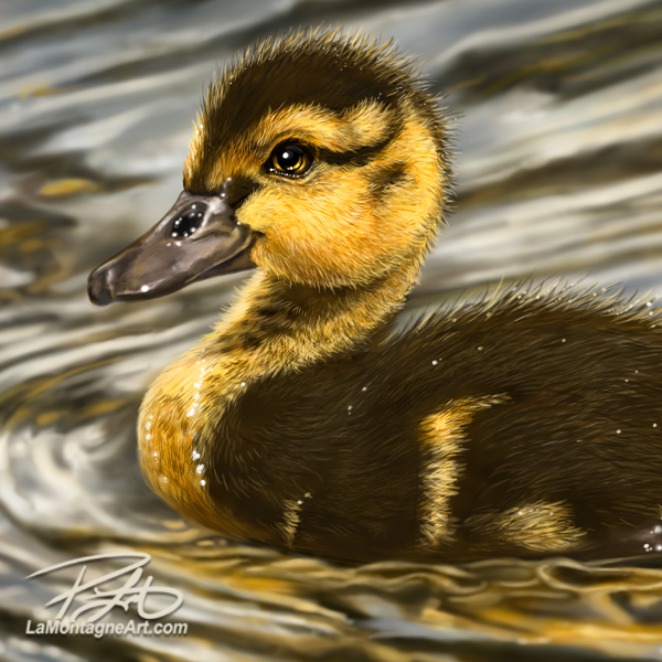
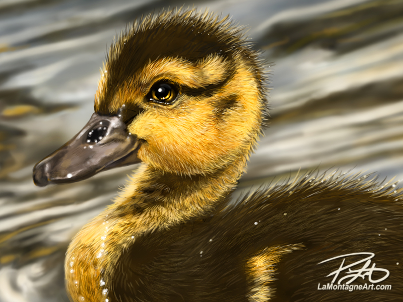
Here’s a little duckling I finished painting this morning. The duckling itself wasn’t difficult, but the water certainly was. Ironic that I began this year with a commission piece where water was also the hardest part of that painting. There will always be room for improvement in any artistic pursuit, so I welcome these unexpected challenges. The work might become boring without them.

When I first began creating digital art more than 20 years ago, there was a common misconception that if you used a computer, then the computer was doing all the work. Press a few buttons, apply a filter or two and anybody can do it. There was also a ‘look’ to a lot of digital art. It was far too smooth, with a blurry airbrushed look, and it all looked the same. Plenty of amateur artists still make this mistake when they get started. After hearing more than enough of this (anything but constructive) criticism, I worked hard to make my work look more like traditional acrylic or oil textures. That effort paid off because I developed a textured brush style evident in all of my work today. People are still surprised to find out my medium of choice and will often say that it doesn’t look digital.

For the water in this painting, however, I had to go backwards, and paint with that smooth, airbrushed look I have deliberately avoided for so many years. Texture in the water would not only have looked wrong, it would have distracted from the subject of the piece. It’s the contrast between the detailed hair-like feathers of our little friend and the water in which he’s swimming that makes the duck stand out.

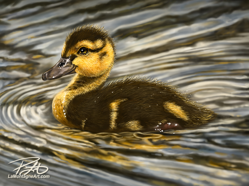
This is the final cropped composition for this painting, but I painted more water than you see here. As most of my paintings end up on licensed products, I painted more of the background to allow for different Pacific Music and Art templates. On some of my older pieces, I’ve had to repaint entire sections to accommodate items like coffee mugs and different-sized aluminum prints.

These days, I keep that in mind while painting a piece. It means more work that most people won’t see but less of a headache when I format the painting for more than a dozen different items in their catalogue. Art (and artists) must be flexible when the work is destined for commercial products.
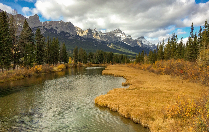
I took the reference for this painting four years ago from the boardwalk that winds through the Policeman’s Creek wetlands here in Canmore. Easily accessible for people of all fitness levels, it’s located in the middle of town and might as well be an urban park. It’s a pretty walk, a nice shortcut from where we live to downtown Canmore, and preferable to walking on the sidewalk of a busy street.

You might think I’d be happier taking photos of bears, wolves, eagles or other more exciting animals, but I’m just as content to spend an hour chasing around a family of ducks with my camera. You never know what critter might end up in a painting.

Only a couple of days ago, I realized just how few paintings I’ve completed this year. I painted the commission of Santé in February and finished my elephant painting in March. In addition, I’ve painted a couple of burrowing owls that are part of a larger piece, but this duckling is only the third finished painting, and the year is almost half over.

Considering I usually produce 10 to 15 pieces each year, I’m well behind where I’d like to be. Of course, one could argue quality vs. quantity, but as this work is a big part of how I make my living, I try to balance them.
The reason for fewer paintings is no mystery. Despite the dramatic decline in the newspaper industry, it’s still a big chunk of my income, and I’m unable to put off or set aside my daily editorial cartoon deadlines. As a result, those take priority every day and painting time is often sacrificed for the cartoons.

On the animal art side of things, I’ve been more occupied this year creating new products, filling and delivering print orders, planning and attending Expo and more local markets, all things that have been on hold the past couple of years. I’m not complaining that I have more sales and increased opportunities to put more work into the world, but it illustrates that art for a living is an illusion.

I don’t spend as much time creating the work as I do promoting and selling the work.

We all struggle with finding enough time to get it all done, whatever ‘it’ is, and most often fail in the attempt. Unfortunately, knowing the solution is simple doesn’t make it any easier.

Saying ‘No’ a lot more often than ‘Yes’ to requests and demands goes against most of our instincts to be friendly, help people out, and put others’ needs ahead of ours. But when it means sacrificing what is most important to us, whether time with our family, the pursuit of hobbies, recharging and relaxing, or time to paint more funny-looking animals, nobody else will make that time for us.

These paintings are a lot of work, but it’s work that I love a great deal, so it makes sense that I’d want to spend more time doing it. I’ll try to remember that for the second half of this year.

Cheers,
Patrick

Posted on 2 Comments

A New Marshal in Town

In November of last year, I finished this painting of Kevin Costner as John Dutton from the top-rated Paramount show Yellowstone. Like many of the portraits I paint, it was a personal project, something I did for my own enjoyment. You can read about that piece here.

I don’t attach any expectations to these portraits, but sometimes they either reach the people I’ve painted or attract some attention after the fact that I couldn’t have anticipated. But I learned long ago that if you try to make stuff like that happen, it rarely works. All I can do is complete the painting, put it out there and move on to the next one.

I have a couple of favourite unexpected results, like when Emilio Estevez wanted to buy the original canvas of a painting I did of his father, Martin Sheen. That was almost ten years ago, so I won’t rehash it again. However, if you’re not familiar with that story, you can read about it here. The print signed by both of them hangs in my office.
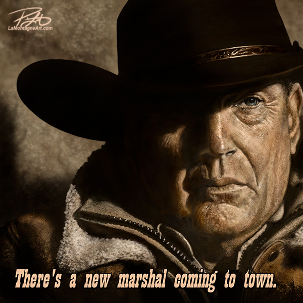
Another was when I painted Canadian astronaut Chris Hadfield while he was in command of the International Space Station. He saw the painting online and sent me an appreciative tweet from space, which was a special moment.

This week, the Calgary Stampede announced that Kevin Costner would be this year’s parade marshal. I’m a fan, or I wouldn’t have painted the portrait in the first place. But I’m not big on crowds, and it’s unlikely I’ll attend the parade or Stampede. Still, the event is a big deal for Calgary. After the last two years, here’s hoping an unrestricted Stampede is a welcome economic boost for the city and surrounding communities, mine included.

As the Calgary Herald has been running my syndicated cartoons regularly for almost 20 years, I emailed the editor and suggested the painting as a cartoon for the announcement, with the caption you see below. He liked the idea, and it appeared in Wednesday’s edition.
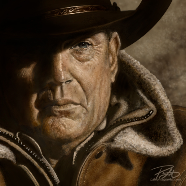
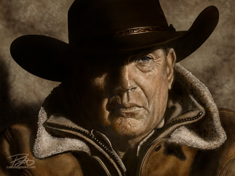
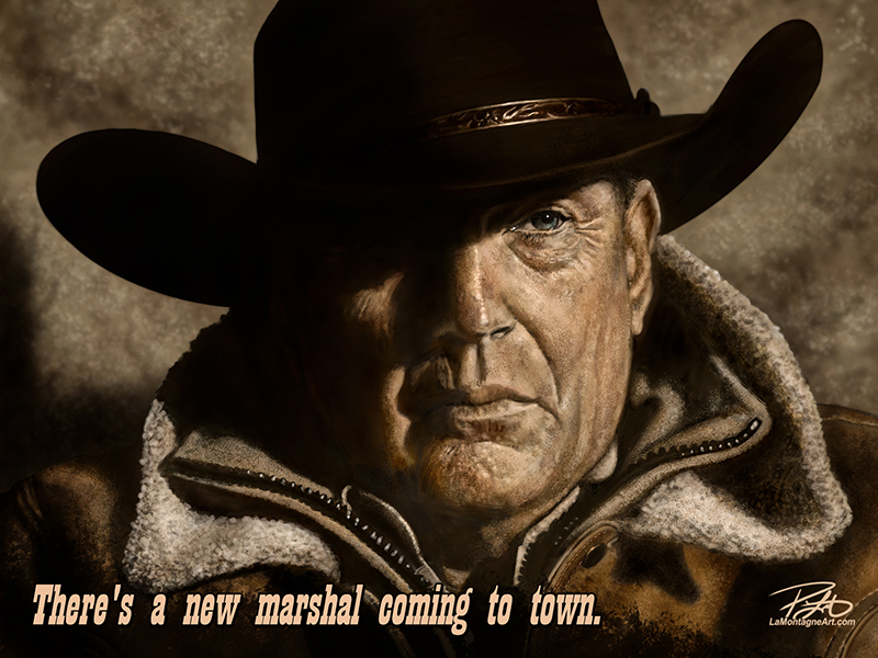
As it also made national news, and Yellowstone is a wildly popular show, I sent it out to my other papers this morning, in case there’s more interest in it. For context outside of Calgary, I added “Calgary Stampede:” before the caption for those other papers.

I’ve done portraits for cartoons before, but most often, it’s for memorials, and they’re never as detailed as I would like. It took more than 20 hours to paint this portrait, so it’s not something I would have done specifically for this purpose. There wouldn’t be a decent return on the investment, and I couldn’t get it done on a tight deadline anyway. To have had the painting done and ready to use for this announcement was a nice moment of serendipity.

Newsprint is unfortunately a muddy medium. Publications use different colour profiles and printers, so a cartoon that might look bright and crisp in one paper might look too bright or dark and desaturated in another. I can do nothing about that, so I adjust the image to find the middle ground for all papers. I put a lot of time into getting the colour right in my work, so I’m most often disappointed when I see it in newsprint, but I’ve had to make peace with that.
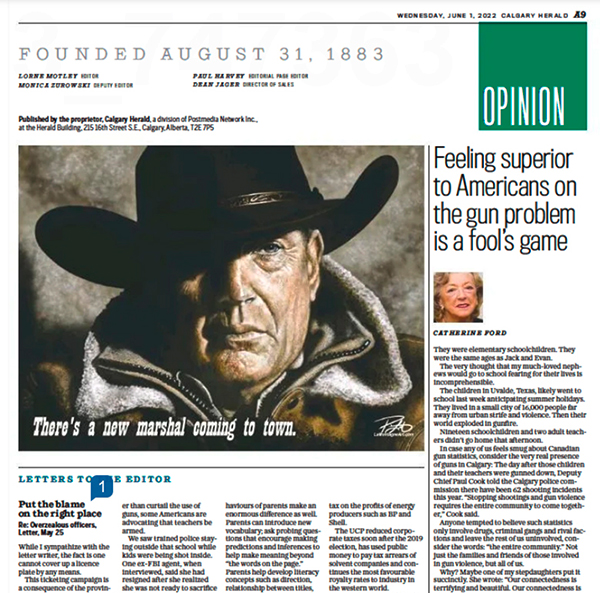
The Costner portrait file is 30” X 40” with a lot of detailed brushwork. To shrink it down and prepare it for newsprint, I had to boost the contrast, oversharpen it, and make other Photoshop adjustments to mitigate a poor result. So while I was happy to see it printed in the Calgary Herald (digital edition above), I couldn’t help but see all the flaws in the reproduction, even though I know that most people won’t notice or care.

As always, I just hope people like it.

Cheers,
Patrick

Posted on 2 Comments

Levelling Up

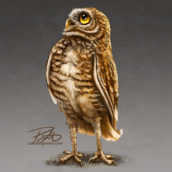
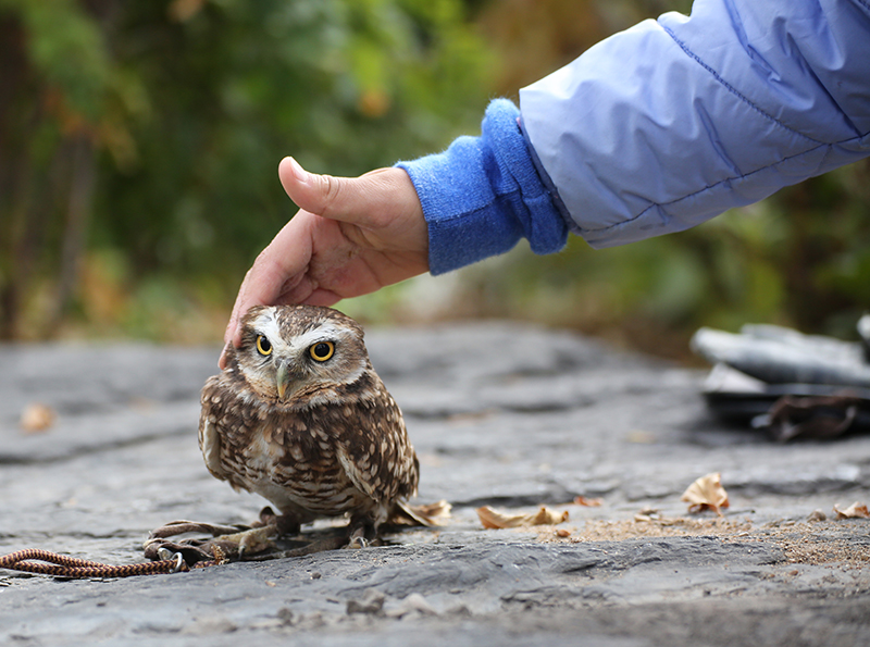
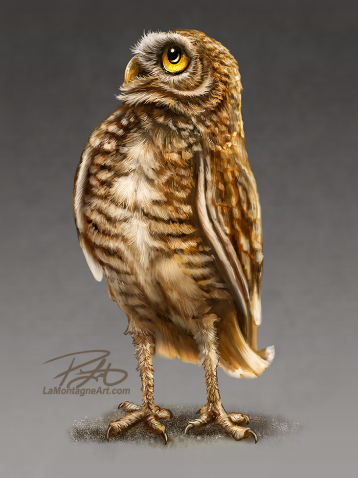
Here’s the fourth burrowing owl in the series, which will be part of a larger piece featuring multiple owls in different poses. I don’t know how many owls yet, and I only have a rough vision of it.

Though I’ve only been to the Alberta Birds of Prey Centre in Coaldale a couple of times, spending two days on each visit, I’ve also seen them on several occasions here in Canmore.

Before the pandemic, The Town of Canmore used to host a WILD event at the Civic Centre. It featured everything from hikes, art activities, educational talks about the environment, etc. Colin Weir and his daughter Amy would bring their ambassador birds to the event, featuring four different owl species and a golden eagle named Sarah.

It allowed the public to get up close and personal with these owls, learn about the Alberta Birds of Prey Foundation’s great work and raise funds for the non-profit organization.

I’ve taken thousands of photos of these birds over the years, and even though I’ve only kept the best of these shots, I still have hundreds in my well-organized archive. Every time I go through these photos looking for my next painting, I often think it a waste to have so much reference that I’ve yet to use.

While most of my whimsical wildlife paintings are single animals in a portrait-type pose, I enjoy the challenge of putting multiple animals in a composition and creating a scene.

There’s the Two Wolves painting where it looks like they’re sharing an inside joke. Another is the three cougar cubs laughing together in Snow Day. One of my favourites and still a very popular painting is One in Every Family, a scene I painted in 2014 featuring four great horned owls.
Part of the reason I love that painting is the story behind it. That painting won the Best of Show award at Photoshop World that year, but the prize for that win was my Canon 5D Mark III camera that has become like an old friend. I baby that thing because it has helped me take the reference that allowed me to paint my best work in the years since.

That owl piece began as a practice experiment. I took several photos of the family up at Grassi Lakes over multiple days, and the experience was more about seeing these wonderful birds in the wild than creating a painting.

I did some individual sketch paintings from better shots than I expected to get. Eventually, I put those rough paintings together and invested the time to render the finished piece above.

Having painted more than 100 production pieces since 2009, I’ll often go through my photo archive and have difficulty deciding what to paint next. Lion? I’ve painted a few of those. Wolf? Several of those. Eagle? Raven? Black Bear? Many of each.

I could quite happily paint Berkley the brown bear repeatedly for a year, and I have more than enough references. But a variety of popular animals is more desirable, to find something new that will be appealing to me and be of interest to my customers and licensing clients.

There’s the difference between art for a hobby and art for a living.

So, when I repeatedly came across dozens of burrowing owl photos, many of which are the same owl, this little fella named Basil, I wondered what I could do with them.
And that’s how I ended up creating a folder called Next Level Projects. About a year ago, I spent a whole weekend going through my photos looking for animals for which I had plenty of reference; that would also look good in a painting featuring a group of them.

The first is going to feature these burrowing owls. I’ll paint several of them individually, like the one at the top of this post. Then, when I have enough, I’ll move them around on a larger digital canvas, come up with a scene, and spend time painting over them, ensuring the light matches up and they look like they belong together.

From a business perspective, each one of the owls will lend itself to an individual painting on different items. For example, Pacific Music & Art could have a set of six burrowing owl coasters, all of which are also part of the same painting in a print. It would work for stickers and magnets as well. But the larger painting, featuring all of them, would work well on a coffee mug, as it’s a longer horizontal layout.

Because I’ve been painting these animals for thirteen years, many in the same popular format of the headshot composition, the routine has started to creep in, and it’s a little concerning. I’m not tired of this work; I still enjoy it immensely. But as the recent commission piece taught me, and the latest elephant painting, it needs to continue to be challenging, or I’ll get bored of my work.

Paintings featuring multiple animals feels like the next step, and I’m focusing on creating more of those this year.

I’ve long wanted to do a painting featuring several meerkats. There’s one I keep coming back to with multiple ring-tailed lemurs, too. I’ve already got titles for both and a lot of reference. And I have so many baby pictures of Berkley and the new cubs at Discovery Wildlife Park that I’ve long wanted to put multiple brown bear cubs in one painting.

I’ll still paint the single animal pieces because I have several in mind as well, but these multiple-animal pieces will present an ongoing challenge to keep me excited about painting.

So instead of sharing as many finished paintings with you this year, I’ll likely be sharing pieces of finished paintings and the stories behind these next-level projects.

In the meantime, I’m always open to suggestions. So, if there’s an animal you’d like to see me paint, let me know in the comments. There is always the chance you’ll come up with something I haven’t considered. Or if you’d just like to tell me which one of my many paintings is your personal favourite(s), that helps me decide on future paintings, too.

Cheers,
Patrick

Posted on 2 Comments

Peaks and Valleys

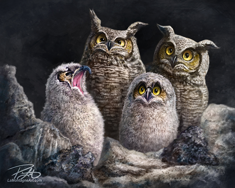
Last month, I finished what could easily be called my favourite commission piece to date. For those who’ve hired me for commissions in the past, don’t take that personally. I’ve enjoyed almost all the pet portraits I’ve painted. But this last one represented some notable artistic growth, which has become a rare thing.

When I first started drawing and painting, it was easy to take large leaps. Looking back on my earlier work, I can see considerable improvement over time as short as six months. Because I wasn’t very good at it, was hungry for new skills, and had no shortage of exceptional artists to learn from, I couldn’t help but get better if I kept putting in the hours.

Over time, however, my skills became more and more refined, as any creative should expect, and my work, especially in my style, reached a plateau. I had found the look that identifies my art, something most artists chase. People who know my work can easily spot it, even if they don’t see my name, just as I can spot the work of artists I follow.

I’m still always seeking to get better, but any improvement is often most noticeable to me. I get better at light and shadow, the way fur and hair flows, subtle shaping of features to reinforce the balance between whimsy and realism without straying too far into that phenomenon known as the uncanny valley.

People often say that my work looks “cartoony, but real.”

I’ve heard it said so often that I’ll occasionally use it myself when somebody tries to describe it but can’t find the right words.

I’m always trying to push the realism, mostly to challenge myself, without going so far that it becomes creepy and unappealing.

So, it isn’t just about painting better hair, fur, skin textures and personality in my funny-looking animals, but knowing when to stop. I suspect I’ll find that out the hard way one day and need to dial it back. I’m confident that Shonna will let me know.

This recent commission taught me I (thankfully) still have plenty of room for improvement. As I wrote about in that post, the client requested a full-body action pose because that’s how she wanted to remember her dog, Santé.

She didn’t insist on it, but it was her preference. And the last thing I want is for a client to be mostly happy with a finished painting but still think, “it’s good, but not what I really wanted.”

It was something I wanted to try but was afraid of because I didn’t think I was good enough to pull it off.

In every painting, there are peaks and valleys. The spark of the idea, taking and choosing reference photos, and imagining different options are always high points. But once the first brush strokes hit the digital canvas, so begins a slow decline. I find that the first half of a painting is simply putting in the hours, and there isn’t a lot of enjoyment there.

But somewhere in the middle, the fun starts when it starts to reveal what it might become. Sometimes it peaks again and then crashes when something doesn’t work, which can take hours to repair. The more time it takes to get through that valley, the more I think the whole piece sucks, I’ve lost it, and there’s no saving it.

But a brush stroke here, some light and shadow there, I solve the issue and again find the joy in it.

The best part of any painting is the last two hours. I have a playlist on Spotify reserved just for this period in a painting. It’s called ‘Pick Me Up,’ With that playing in the earbuds, drinking hot black coffee, often in the early morning hours, I’ll finish the piece and feel good about it.

That euphoria lasts a few hours, but I’m heading back down to the next valley by that evening, wondering what to paint next. Or I’ve shifted back into editorial cartoon mode and following the news, which can be like dark clouds ruining a sunny day.

Of course, there are other peaks for most paintings. The feedback I get from readers and subscribers is gratifying; those who follow my work and are kind enough to post a comment or send an email telling me how much they like the new piece. And if a new painting isn’t one they especially like, they’re usually kind enough to keep that to themselves.

I’m under no illusion that every painting is a winner.

Another peak is the first time I get a print because it never feels real or complete until I see it in real life. Most of the time, it’s when the first poster print proof arrives from Art Ink Print. Proofing with that company has become just a formality. I know how to prepare an image for their press, and they know what my work is supposed to look like, so I can’t remember the last time I had to reproof an image because the first one didn’t look right, but it’s been several years.

When the 18”x24” matte aluminum print of the latest commission arrived, it was a very good day. I checked it for flaws and couldn’t find any. However, I discovered that while the white background was smooth, the painted area was slightly raised with a noticeable texture. This was an unexpected but welcome happy accident that added even more to the print.

And there is the valley of apprehension of packaging and shipping the piece, waiting for it to arrive, or driving to deliver the work to the client. Finally, after more than two months of back and forth, sourcing the photos, discussing the approach, many hours of painting, sending periodic progress updates, her financial investment in the piece, it all comes down to the delivery and reveal.

No pressure.

Suzanne had already seen the image via email, but as I said, it’s not quite real until you see it in print.

Thankfully, she was pleased with it. We had earlier discussed some of her other artwork, and she generously showed me other pieces in her collection, including the first piece she bought of mine online from Wayfair. While I’ve had this license for some time, I’ve never actually seen one of the canvases in person, and I was pleased with the quality.
It’s always flattering to see my work in somebody’s home, especially a canvas of one of my personal favourites, my Berkley painting called “Peanuts.”

Even before I got home to Canmore, Suzanne had hung the print and sent me photos she generously allowed me to share.

As much as I love meeting clients in person, especially one who was such a pleasure to work with, and while delivering the painting is the pinnacle of all those peaks and valleys, there was an unexpected bonus to the day that can’t be minimized.
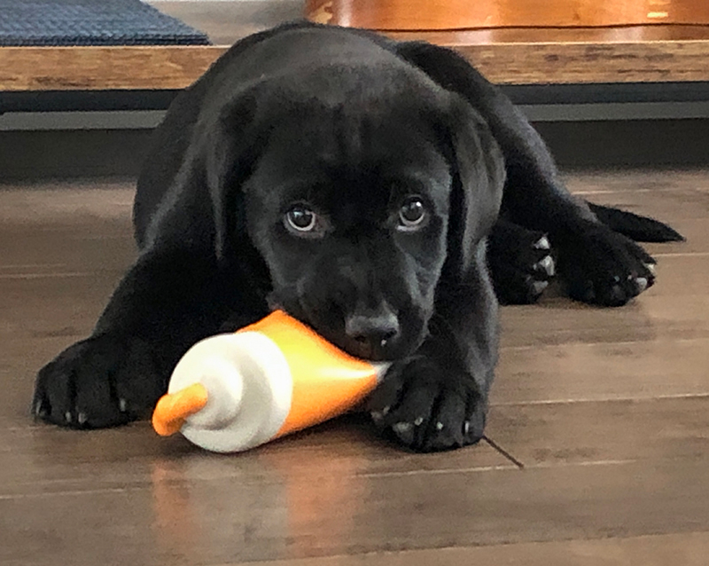
I got to meet Suzanne’s new little wonder, River, a black lab puppy, who is in that lovable, awkward, too small for her big paws stage.

From the dark valley of having to say goodbye to her best friend, Suzanne now gets the peak experience of providing a home to a new dog and introducing her to adventures around every corner.

Under Santé’s watchful eye.
_____

Posted on Leave a comment

An African Elephant

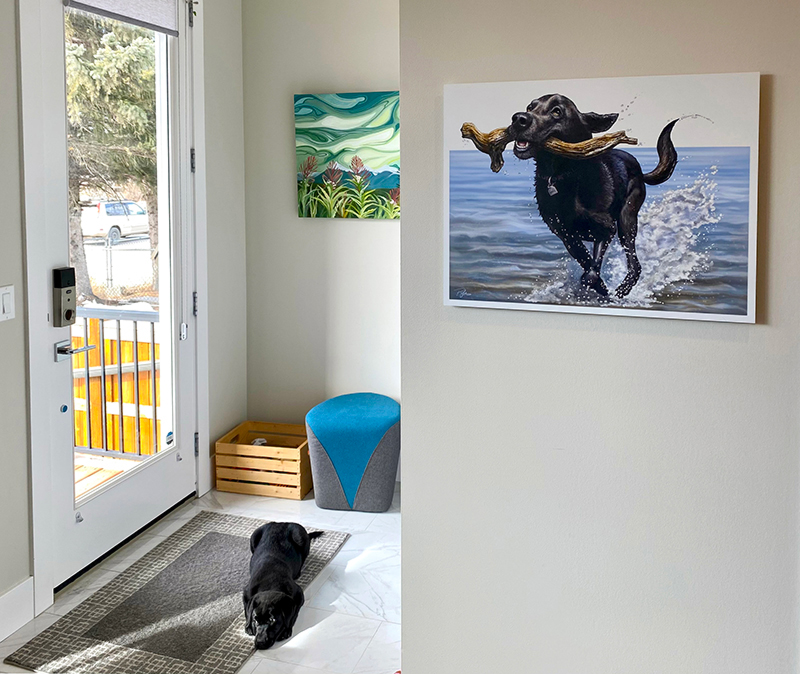
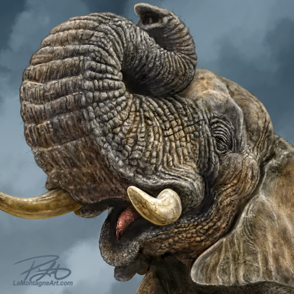
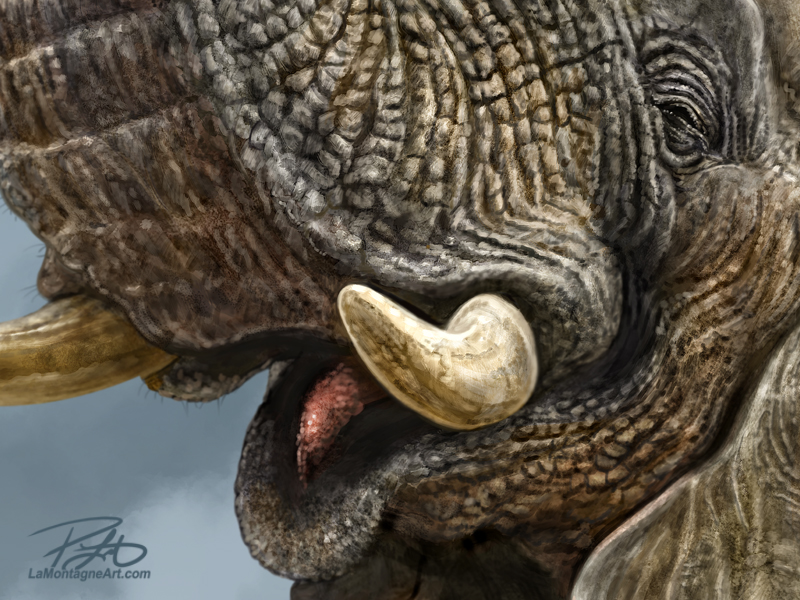
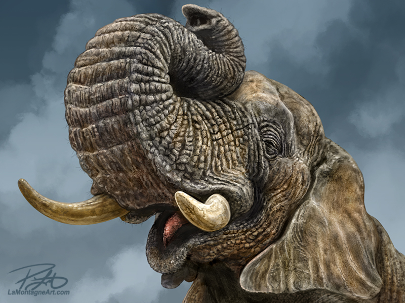
After more than two years of procrastinating, I finally finished this painting of an African elephant.

At the beginning of 2020, our friend Serena, her husband, and their son went on a long-awaited safari to Africa. Little did they know that it would be only a couple of months later that recreational travel would be all but cancelled for more than a year.

Serena takes almost no time off. As the head zookeeper at Discovery Wildlife Park, often raising and caring for orphaned baby bears, cougars, lions, and other rescues, her work requires many long days, seven days each week. So, this safari trip was many years in the planning for her family.

Before she left, she asked me if I wanted any reference pictures. Even though Serena is an excellent photographer, I said there was no way I would impose on her family trip with a laundry list of animal photos.

There are very few elephants in captivity anymore in the western world. Because of their intelligence, family dynamic, social structure, and other requirements zoos can’t meet, elephants don’t do well in isolation, so most reputable zoos don’t keep them anymore, a policy I fully support. Instead, many former zoo elephants have been surrendered to sanctuaries to live out their lives in a herd and in peace.

As it’s unlikely I’ll be going on safari anytime soon, there’s very little chance I’ll be able to take my own elephant reference photos soon.

Since Serena pressed me on it, I confessed that I really needed that specific reference. I told her I’d take whatever she gave me, but she asked for my ideal photo, just in case she had the opportunity.

In a perfect world, I wanted a ¾ view; trunk held up to reveal an open mouth, all so that I had the best chance of painting a happy smiling face.
Serena sent me dozens of photos when she returned, including exactly what I asked for. I was grateful, filed the photos, backed them up online and on portable hard drives, and spent two years painting other animals.

This happens a lot. On rare occasions, I’ll paint from reference right away, but most of the time, that animal gets added to the list, and I wait until the time feels right. I’ll admit that sometimes, however, it’s more about imposter syndrome.

I knew that the details in the skin texture would be complicated, and I worried that I wouldn’t be able to paint what I saw in my head. This is familiar ground. Regardless of how many years I’ve been doing this, the thousands of editorial cartoons I’ve drawn and more than a hundred whimsical wildlife and commission pieces, I still get nervous before every painting. It just never goes away.

Eventually, I push through it, and about halfway through a piece, I realize I’m enjoying myself.

There are two reasons I finally got off my ass to paint this elephant. First, Mike from Pacific Music & Art is putting together my 2023 calendar, and in the most supportive and encouraging way, he pushed me to get the elephant done. While I’m paraphrasing, he said something like, “stop talking about it, and just paint it, already.”
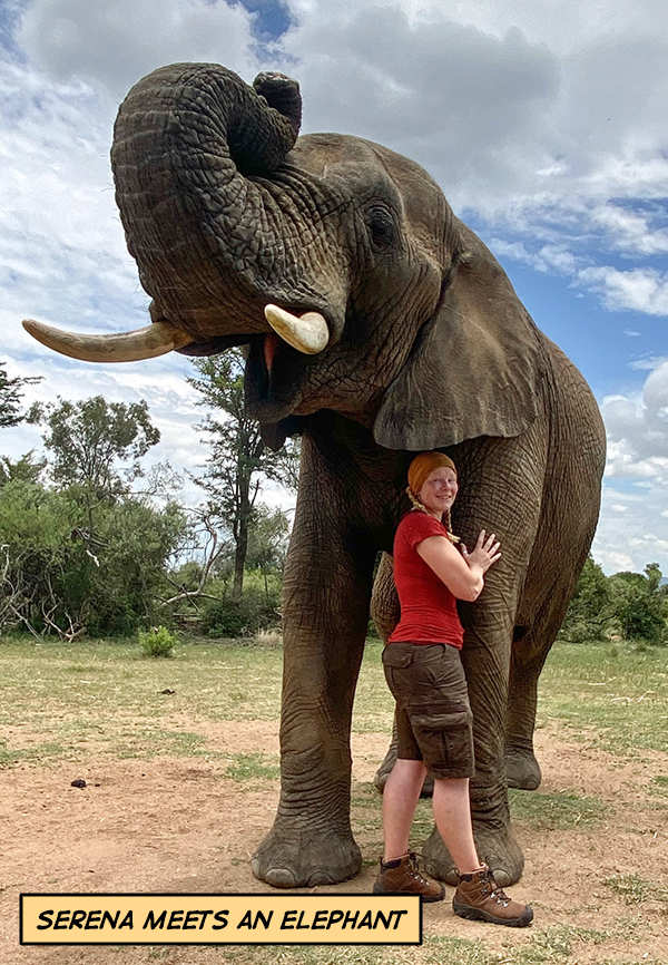
Secondly, the full-size four-day Calgary Expo will return at the end of next month. I’ve had my booth booked and purchased for three years. While I’ve painted many new pieces since the last Expo, I want that elephant in my booth.

Every year, the same guy asks if I’ve painted the elephant, and I sheepishly tell him, “Not yet, but maybe next year.”

I don’t know if he’ll be at Expo this year. I don’t know if he’ll even like the elephant I’ve painted. But if he asks if I’ve got one, I can finally say, “Yes!”

While it took many hours to get the skin texture and anatomy right, it turns out that it wasn’t especially difficult. I just had to put my ass in the chair, paint a lot of brushstrokes, and enjoy the ride. When I completed it, I was happy with the result.

Right up until I sent it to Serena.

I’ve painted several of the Discovery Wildlife Park critters over the years, so I often give Serena an early look at those, a sneak peek for allowing me so much access to the animals in her care. Since she provided the reference, I extended the same courtesy for this one.

When I sent the finished painting in a text yesterday morning, she said, “I love that you did the injured one.”

Say what now?!

I called her for clarification.

As the reference she took was at an African reserve and sanctuary, Serena pointed out that this particular elephant, the one I used for my primary reference, had the end of his trunk amputated from an injury and that it was shorter than regular length.

She thought she had told me that, and I conceded that she very well might have, but it was two years ago, and it didn’t make it into my long-term memory files. So, I honestly thought it was simply the reference angle that didn’t show the tip of the trunk, and I was okay with it. I didn’t know that the elephant itself had that part of the trunk removed. And for some reason, I just didn’t see it.

So, as much as she liked the injured elephant because she looks after orphans and rescues, I explained that I had to paint a fully intact animal for a production piece, even in my whimsical style. So, I looked through the other elephant pictures she sent, found some ‘end of trunk’ reference, and got to work repairing the mistake.
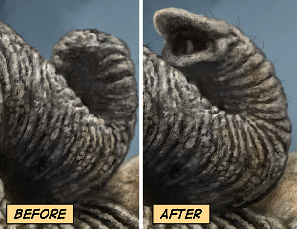
I sent a couple of changes to Serena, and she helped me get it right. She felt bad for having to tell me about it after I’d finished the painting, but I told her better than after I had bought dozens of prints, and coasters, trivets, magnets, and other licensed merchandise had gone into production.

Correcting the mistake added more than an hour of extra painting to the piece, but I’m much happier with the finished result.

I can’t wait to see it in print.

Cheers,
Patrick

Posted on 2 Comments

Wilder Stickers


With the growing interest in my large vinyl stickers, I’m pleased to announce that I’ve released seven more designs into the wild.

Based on feedback at the recent gift shows and online, people wanted the option of buying them individually, so the four-pack of brown bear stickers has been discontinued. Instead, all designs are now offered individually in the shop. Adaptation is a cornerstone of self-employment.

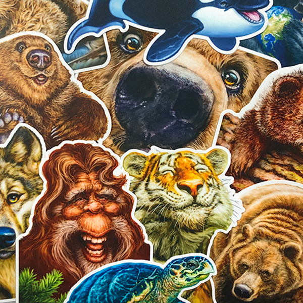
When I first moved to Canmore in 2001, I worked for a sign shop for a few years. Every place I’ve worked taught me skills I’ve applied to my own business. From that job, I learned design techniques, colour theory and how to create vector art. I still use vector paths and Bezier curves for clean ink lines in my editorial cartoons, a skill I learned at Canmore Sign Co.

With many different jobs done for multiple repeat clients, their computer filing system was simple, efficient, and well-organized, especially when searching for reprints or creating variations of older designs. As a result, I adopted the same system for my own files and still use it 20 years later.  

While it’s not something I often need in my current work, I also learned about vinyl printing, cutting and application.

So, when designing and producing these stickers, I was unwilling to compromise on quality.
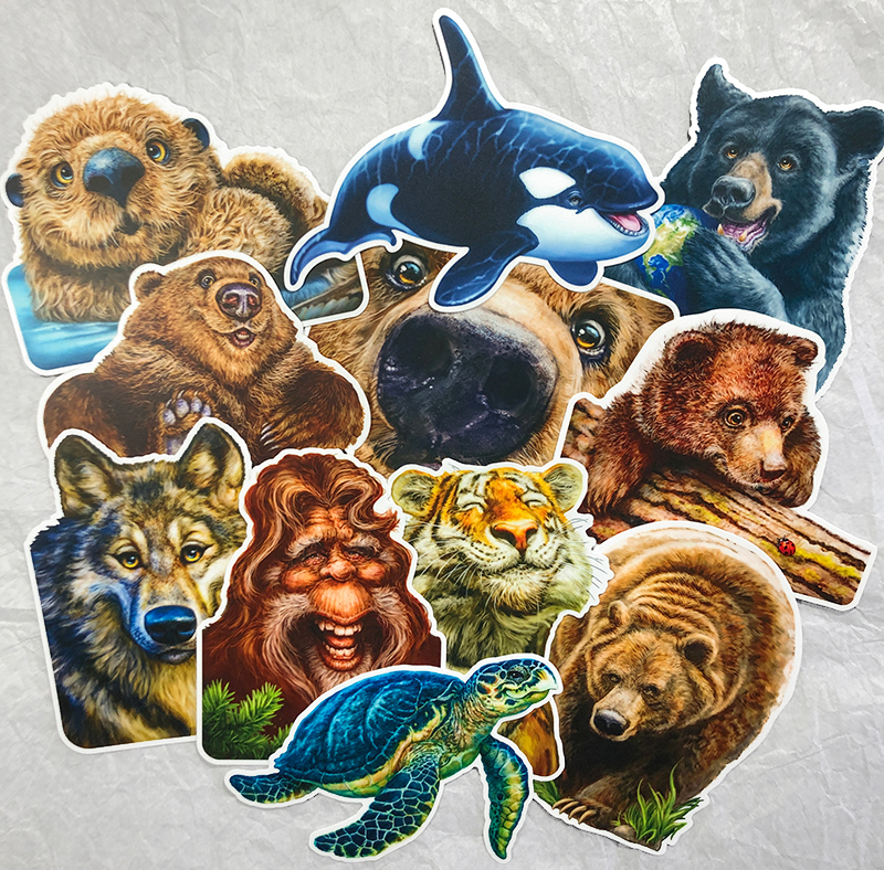
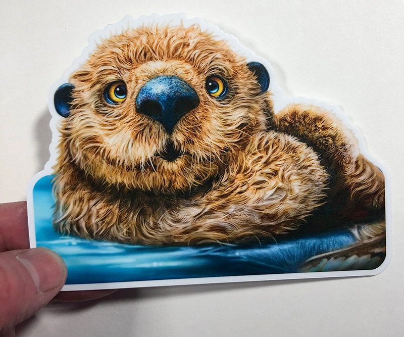
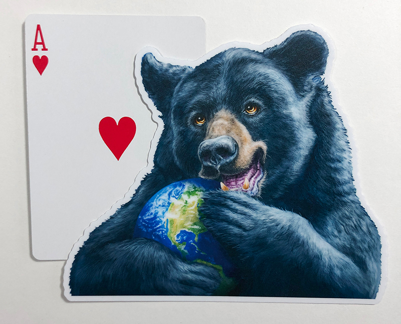
These are larger die-cut stickers than you will generally find, each around 4” X 5”. I didn’t want to shrink them down and lose the personality for which my whimsical critters are known. I also wanted people to have the option of putting them on vehicle windows, so they’re made from long-lasting, weather-resistant, high-quality vinyl. Finally, I chose a matte finish over glossy for better visibility in changing light.

Stonewaters here in downtown Canmore is a great store with a unique quality inventory of furniture, décor and artwork. They placed their first order for the four bear stickers at the end of September, and they did so well that they placed a second order not long after. After dropping off samples this week, they placed a third order that has already been delivered, so all the current designs are available there as well.

But if you’re not visiting Canmore anytime soon, you can get all these designs in my online store. They’re $8 each, with free shipping in Canada, regardless of how many you order. Unfortunately, shipping to the US is $9, and nothing I can do about that, so maybe add them to an order for prints or my 2022 calendar, while supplies last.

Too subtle? 😉

Cheers,
Patrick

Posted on Leave a comment

Red-tailed Hawk

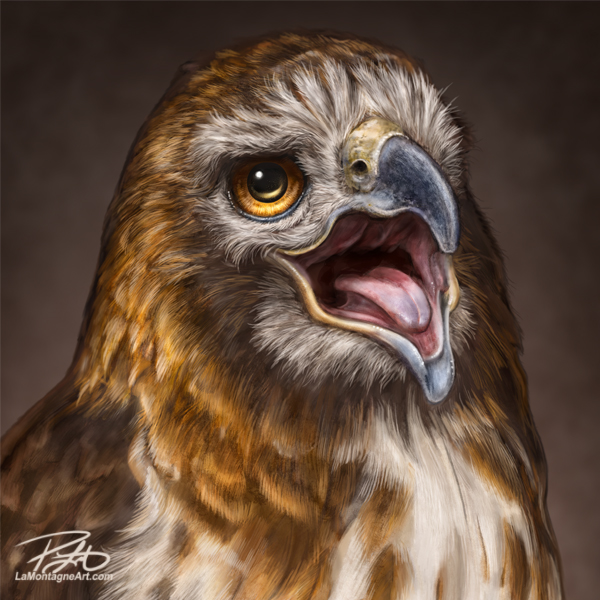
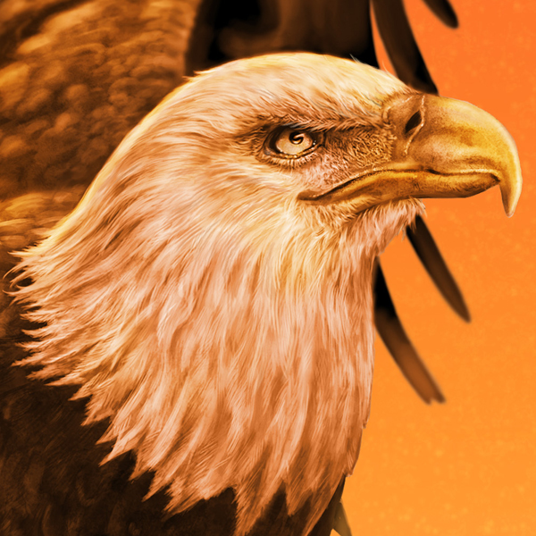
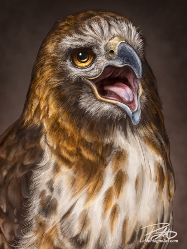
I’ve wanted to paint a Red-tailed Hawk for quite some time but could never seem to find the right reference. Though a common bird, my sightings in the wild have often been a comedy of bad timing.

If I happen to be out with my camera, I’ll see one flying high but never stationary. I can pass three or four of them sitting on fenceposts alongside the highway, with nowhere to pull over if I’m driving.

The shots I took on that first visit to the Alberta Birds of Prey Centre a few years ago didn’t provide what I needed. It was a rainy weekend, and even though I took plenty of photos, the Red-tailed hawk still eluded me.

So, when I drove down to Coaldale to visit the Centre in August, I was on a mission to finally get some reference for this piece. Sorting the photos, I realized there were many possibilities.

I started this painting just over a week ago and was surprised at how quickly it came together.

I asked Shonna’s opinion this morning in the piece’s final moments, and she said that it’s not her favourite pose. She has always been my harshest critic, which is a double-edged sword. On the one hand, she can often spot problems I’ve failed to notice, minor changes that might help the likeness, especially in my portraits of people.

On the other hand, it’s a bit of a kick in the crotch when she’s blasé about a painting. If you think that harsh, I know of many artists, writers, photographers, and other creative types whose spouses and partners are not big fans of their work. It’s probably a good thing.

A couple of my most popular paintings, consistent sellers that people seem to love, are not my own personal favourites. No, I’m not going to tell you which ones, as I wouldn’t want to take the shine off a piece you might like or love.

Not every creation is destined for print. Just as there are paintings I didn’t anticipate reaching best-seller status, there are ones for which I have high hopes that wither on the vine of public opinion. I just paint my funny-looking animals, do the best job I can with the creative tools I’ve got, and release them into the wild.

Where they go after that is out of my control.

Now that I’ve got plenty of reference, with more to take on future visits to Coaldale, I’ll no doubt paint another Red-tailed Hawk in the future. I like most of my paintings while I’m creating them, and for about five minutes after each is finished, but I’m always eager to move on to the next one.

Cheers,
Patrick


Posted on 2 Comments

A Portrait of John Dutton

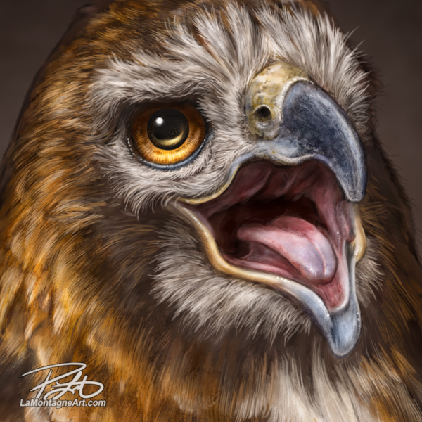
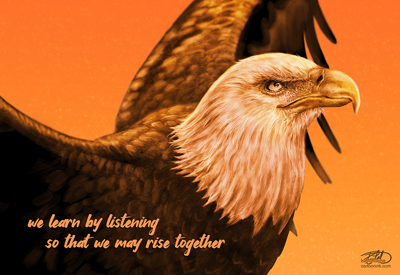
When I’m not drawing and distributing daily syndicated editorial cartoons, I’m painting whimsical wildlife portraits for prints and licensing. Add in the usual office administration, marketing, writing and everything else that goes along with self-employment, and that’s pretty much how I spend my days.

However, I enjoy painting portraits of people, most often characters from movies. I usually make the time for a couple of these a year, but I’ve only managed this one in 2021.

I’ve often mentioned that I paint these when I’m feeling the need to reconnect to art for art’s sake or when I’m in a low place creatively, but thankfully I’m not feeling that this year. The whole year has been low for obvious reasons, and I just felt like painting a portrait.

I have no interest in painting the publicity or paparazzi headshots of movie stars or celebrities. The less I know about the gossip or their personal lives, the better. Instead, I’m more interested in the characters they play. Those characters are created by skilled writers, directors, and gifted actors, including the supporting cast and professional crews that bring it all together.

When I painted Quint from Jaws, it wasn’t just the actor Robert Shaw I was painting, but the character he inhabited, written by Peter Benchley, directed by Stephen Spielberg and brought to life in a scene with Richard Dreyfuss and Roy Scheider.

I love movies, but we’re living in an age with great television, too, with plenty of writing and acting that can easily go up against any Academy award-winning film.

One of the shows I’ve enjoyed most in recent years is Paramount Network’s Yellowstone. Written and often directed by Taylor Sheridan, Yellowstone chronicles the lives of a generational ranching family in Montana, led by the patriarch, John Dutton.

It’s simply a great show, but not for the faint of heart. If you’ve got issues with language, violence, nudity, sex, lawlessness, smoking, gambling, alcohol, and more, you should seek your entertainment elsewhere.

There are no flawless heroes here. Instead, it’s a family of broken people, each with their dark pasts and demons. One moment they’re prey, the next predators, and you’re never quite sure when they’re right or wrong. But with incredible writing, scenery, and rich characters played by a stellar cast, it’s never dull. I am fulfilled and disappointed after each episode because I must wait a week for the next one.

But I’m glad they dole it out. If they released the season all at once, we’d easily gorge ourselves on it in a few days.

I realized that I wanted to paint John Dutton, played by Kevin Costner, about the middle of last season. Tough as nails, Dutton tries to keep his ranch and family together, while outside interests plot to take it away from him, piece by piece. Even though he knows he’s fighting a losing battle against progress and the future, he won’t resign himself to his inevitable fate.

As often happens when I want to paint other characters, I won’t know what I’m looking for until I see it. Near the end of last season, there’s a scene where Dutton is sitting on his porch, and he looks off to the horizon in the fading light. The moment clicked with me, and I had found my reference, thanks to Cinematographer Ben Richardson’s lighting and cameras.

I painted the scene more sepia tone than the reference, with more contrast, making my own choices for the painting. I like to be inspired by moviemakers and their vision, but I don’t want to create a carbon copy. Otherwise, what’s the point?

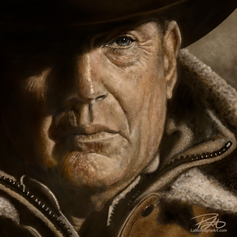
I started this painting in July, and I worked on it for a couple of hours here and there whenever I could find the time. I had planned to have it done before the fourth season began this month, but the paying gigs always take priority. So this past week, I put in the last ten or so hours over a few days. With no deadline, there was no reason to rush it, but I also didn’t want this painting to last for too much longer. As much as I loved the work, the best part is calling it done.

If you’re already a Yellowstone fan, I hope you like my rendering of this great character.

If you haven’t yet seen the show, I envy you. You get to start at the beginning with almost four seasons of great storytelling ahead of you.

Cheers,
Patrick

Posted on Leave a comment

One More

One of the reasons I enjoy taking my own reference photos for paintings is that the animals often surprise me.

When I began painting these critters, before I took my own photos, I’d often have a pose in mind, and I’d go looking for it on the internet. I’d eventually find something I liked, but it would often look similar to the pose I used for a previous painting of a different animal.

If it were a stock photo, I’d pay the licensing fee for reference. Failing that, I’d contact the photographer, arrange for a high-res image and pay or barter for the use.

Australian photographer Scott Portelli allowed me to use his underwater photo for my Humpback Whale painting in exchange for a rolled canvas of the finished piece. Moose Peterson allowed the use of several of his animal images in exchange for my drawing a caricature of him and a business partner for a course they taught. We already had a connection through Photoshop World, so he was familiar with my work.

I paid a U.S. park warden $100 for his photo I found online for my first Wolf painting. He confessed surprise at my offering to pay since that image had been stolen and published illegally more times than he could count.

The problem with online reference photos is that I know that no matter what I find, there’s a good chance another artist has used the same image. Certainly, I’ll paint it with my spin and style, and it won’t look the same as another artist’s work, but it will undoubtedly share similarities.

By taking my own photos, it stands a better chance of being unique.

On a recent visit to Discovery Wildlife Park in Innisfail, I had another opportunity to take photos of their black bears during their presentation to the public. As I’ve known the keepers and staff for several years, they allow me into the large enclosures with them, though I’m behind a hot-wire. It’s an electric fence about a foot off the ground that the animals avoid, for obvious reasons. The keepers, however, interact up close and personal with the bears.

These animals are all orphans and rescues who came to the facility under conditions prohibiting their release into the wild. Many of them have been raised here since they were very young. They receive exemplary care and clearly have an affectionate relationship with their caregivers.

The keepers use the bear presentations each day to educate the public about wildlife. They teach how to be bear-aware while hiking, what to do if you encounter a black bear or grizzly in the wild, how to use bear spray, and keep a clean campsite so that the local fauna doesn’t learn to associate people with food.

The hope is that by educating the public, fewer orphans will end up in captivity, remaining in the wild where they belong.

One of those rescues is a big black bear named Gruff. With a genial and gentle personality, he has been hand-raised at the park since he was a cub.

Sadly, Gruff had a rough start in life. A hunter poached his mother in the Grande Prairie area, and people passed the frightened little cub from home to home.

Fish and Wildlife eventually confiscated the sick and frightened cub, and my friend Serena, the head keeper at Discovery Wildlife Park, was asked if she could take him.

He was malnourished, in shock from his ordeal, and sick from untreated pneumonia that has since resulted in permanent left lung damage. Because he was in such bad shape, Serena didn’t know if she could save him. But with proper food, medication, round-the-clock care and a lot of patience, Gruff has grown into one of the most beautiful black bears you could ever see.

He is currently eight years old and 709 pounds at his last weigh-in.

I’ve painted Gruff several times, and I expect I’ll paint him again as I enjoy his expressions and antics. The bond between him and the keepers is evident, and he never fails to put a smile on my face.
While visiting in June, I was happily snapping pics of Gruff when he made a clumsy attempt to sit up from lying on his back. He looked right at me, with his tongue out, and immediately reminded me of a large guy trying to do a sit-up. With the camera on rapid-fire, I got quite a few shots of this funny situation and was delighted at the photos when I got home.

As none of them were quite right on their own, I used three different reference pics for this piece. One had the best head position, another one revealed a better overall pose and the third, while a bit out of focus, had some lighting I liked.

Could I have found these shots online, taken by another photographer? Unlikely. Would I have even thought to have looked for images like this? Not a chance.

I could list dozens of paintings I’ve created that have been inspired by situations and experiences I couldn’t have anticipated. It’s why taking the photos is as much a part of the finished pieces as the paintings themselves. Each of them has a story and conjures up fun memories.

Whether it’s a pose, lighting, or simply a look, I can’t tell you how many times I’ve discovered future paintings while sorting through photos.

When I came across the photos of Gruff, looking like he was trying to get in shape, there was no doubt of a painting. But, before I put the first brush stroke on the digital canvas, I already knew that I would call it ‘One More.’

I imagine it 10 feet high on the wall of a gym somewhere.

Here’s a high speed video of ‘One More’, from start to finish. Prints of this piece are available NOW in the store.
__

© Patrick LaMontagne

Posted on Leave a comment

Learning, Listening, and Rising Together

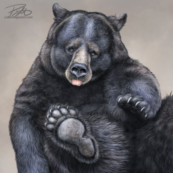
Early in this editorial cartoon profession, somebody once told me that editorial cartoons are supposed to make you laugh, think, and hopefully do both. I think it was Terry Mosher (Aislin).

I have repeated that line often. In interviews, blog posts, talks to school kids or simply as an explanation when somebody challenges me on the content of a cartoon.

As we’re all now attuned to our individual offensensitivity meters, convinced that if something makes us uncomfortable, it must be inappropriate; I’ll often get emails chastising me for drawing a cartoon, telling me, “that’s not funny.”

Cartoons aren’t always meant to be.

Several times a year, I’m required to draw cartoons for tragedies, recurring events, serious moments and on topics where any levity would indeed be inappropriate by any metric.

Nobody drew funny cartoons the day after 9/11. You’ll be hard-pressed to find a knee-slapper in any newspaper in Canada on Remembrance Day. And there’s nothing funny about what went on for decades in Canada’s Residential School System.

When the federal government announced that September 30th would mark the first annual National Day for Truth and Reconciliation, I knew I’d have to draw something.

An editorial cartoon isn’t unbiased. I don’t consider myself a journalist. While I do try to consider all sides of an issue, my cartoons are my illustrated opinions. So when you see them on the editorial page, it means the editor shared my opinion or at least thought that many of their readers might.

I can’t just spout off and draw something about whatever might cross my mind. I must consider whether it’s fair comment, reasonably concluded, and if it might get myself or my client in trouble. The standards for your local newspaper are a lot higher than Facebook or Twitter.

When it comes to residential schools, the last thing an indigenous person needs is yet another colonial descendant analyzing their history, whitesplaining it and offering up his conclusions. So, I won’t.

But I still had to draw a cartoon because it’s my job.

I’ll admit that my more serious cartoons have a distinct look to them. Often a more painted illustration, rather than a crisp ink line cartoon, accompanied by some text. Sometimes I’ll use a quote, especially if the cartoon is about a notable person who has just died, some of their own words or song lyrics.

But I prefer to use my own words, a couple of lines to complement the artwork so that the entire piece is my own creation. And these always take a lot longer to draw.

I’ve drawn cartoons about this topic before and wanted to avoid the same imagery. I avoided using the recently revealed Survivor’s Flag, as it felt like I would be appropriating the artwork painstakingly created by those who directly experienced this dark history.

We all have our own ways of connecting to what I call ‘the other.’ For some, it’s through organized religion, or it might be an individual faith and relationship with their god, whatever that means to each person. For others, it might be the connection they feel when they volunteer, do charitable works, or anything that makes them feel that there’s more to the world around them than what they see, hear, smell, touch, and taste.

While I don’t believe in a god, heaven or hell, or practice any organized religion, I frequently feel connected to something I can’t define. I most often feel closest to that when I’m painting, and I’m grateful to that something else for granting me the ability and the means to create.

I feel it most when I’m painting my whimsical wildlife paintings. It’s what I imagine Maslow meant when he defined the peak experience.

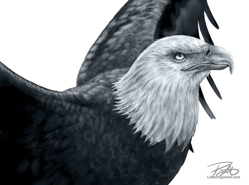
When I first created my animal art, I called them Totems but stopped the practice a few years ago.

About the change in 2018, I wrote, “What (totem) meant to me was paying homage to the animal spirit meaning of the word. The personality and character I paint in these animals make them feel alive to me. I’ve had some unique and special experiences with animals in recent years and can’t help but feel a connection with them, so it’s for personal reasons that I decided on that name.”

But as I explained in the post, having read and learned more about the difficult conversations surrounding cultural appropriation, I didn’t want the work I enjoy most to be tainted by misunderstanding. I didn’t want to imply or claim any connection to native culture, so I no longer refer to my animal paintings as Totems.

And yet, it’s through this work and these animals where I feel the most tethered to that something I can’t explain.

When I had the opportunity to create this cartoon, I felt that the sincerest offering I could make to this difficult discussion was to combine all my skills into one image.

In much of First Nations culture, the eagle is a sacred image. In my most basic understanding, it represents the closest connection to the creator, and it’s a conveyor of messages and prayers.

To illustrate just how sacred the beliefs surrounding this animal spirit are, it is illegal in Canada and the U.S. for any non-indigenous person to own any eagle parts, including feathers. I’ve learned more about this from my visits to the Birds of Prey Centre in Coaldale, Alberta, where they rescue and rehabilitate eagles, among other species. It’s also where I took the photo reference for this eagle image.

Any eagle feathers dropped by the birds at their facility are collected and sent to Alberta Fish and Wildlife. After examination for conservation research and screening for disease, they’re distributed to different tribal councils.

The National Day for Truth and Reconciliation is about honouring the children who died in residential schools, healing for the survivors and promoting understanding and education about our history. So the eagle image seemed the best fit for what I wanted to say.

Whether it resonates with my editors or their readers is beyond my control. But hopefully, I did my job.

 If not, then I will try harder next year.

___
© Patrick LaMontagne
To find out more about The National Day for Truth and Reconciliation, please begin here.