
My first website came to life almost two decades ago in 2000, built with a piece of Adobe software called Dreamweaver. It was clunky, frustrating, images would end up where I didn’t want them, text would be misaligned and I hated website design.
A few redesigns of my own followed, but in 2011, I hired a professional to create something new for me and he did a very nice job. Erik at Bernskiold Media introduced me to WordPress, dealt with all of the coding issues on a poorly designed theme I’d bought, and for the past seven years, my website has done its job well.
But just as a new car is great when you get it, technology changes, little things you once tolerated become inconvenient distractions, that rattle near the rear right fender gets louder (what the hell IS that?!) and you start thinking trade-in.
When I first started Cartoon Ink, my business was editorial cartooning, custom caricatures, and illustration. I didn’t have the foresight to see twenty years down the road to the work I’m doing now. My last name is sometimes difficult for people to say (La-Mon-Tang), and like a number of people around that time, I thought I was being kind of clever and unique by the play on words of Ink vs. Inc.
As time wore on, my work became better known and more people now associate my name with my work, rather than Cartoon Ink. I’m still a nationally syndicated editorial cartoonist and draw those every day, but my painted work is just as important, so I figured it was time to own that.
Six years ago, I bought patricklamontagne.com and a few years later, I bought lamontagneart.com. But cartoonink.com has been in use for a very long time and most of my clients, friends and family contact me through email tied to that name. There’s a lot of material out there in the world with that web address on it. Business cards, prints, magnets and plenty of other products direct people to find me through cartoonink.com. So, it will still live on, both in email and as a web address. If you type in cartoonink.com into your web browser, you’ll still end up here. In fact, all three of my domain names will bring you to this new website.
When I first decided I needed a new site, I considered doing it myself. I know a couple of friends who have had great success with that. But I also knew the work involved and even with some really good drag-and-drop options out there, I wanted it professionally done. I didn’t see the benefit in banging my head against the screen when there are plenty of skilled web designers who can design a better site than I in a fraction of the time. I hire professionals to do what they do best so that I can spend my time doing the same.
Erik did a great job for me for quite a few years, but we don’t travel in the same circles anymore. He lives in Sweden so the time change can be challenging in the design phase, and I wanted a new perspective, even though it’s not as big of a change as one might think.
I also wanted to buy Canadian.
At the recommendation of a long-time friend, Ken, who used to build my computers and host my site, I hired Dustin at Robb Networks and we really got along well, both personally and professionally. I’ll just give him a ringing endorsement right off the bat, without reservation. I wouldn’t hesitate to work with him again or refer his services to anyone looking to improve their web presence.
Coding stuff that confuses the hell out of me is simply a second language to him. I had told Dustin I wasn’t in a rush and I meant it. He already had a full plate of work which is always a good sign and I was willing to wait. When he told me earlier this month that he was ready to get it done, I didn’t expect it to go as quickly, or as smoothly as it did. Seemed like one day we’re choosing a WordPress theme and the next we’re talking about launching it.
This wasn’t a complete redesign, just the introduction of a new theme, getting rid of things I didn’t like, adding a few I wanted, but when you go behind the curtain, it has very much the same content as before. It was like replacing the body of a car but keeping the rolling chassis.
So, other than the name, what’s changed?
On my last site, I chose a black background to make the images really pop. What I didn’t think about, however, was the blog. There’s over ten years’ worth of writing in there and it was less than a year into that last site that somebody sent me a private message saying the white text on the black background was tough to read.
That has stuck in my head for years, because she was absolutely right. That was the first thing I wanted to change.
I wanted a clean, minimalist look. No motion graphics, no floating panels when you scroll down, no extraneous bells and whistles. I wanted the images to speak for themselves, front and center.
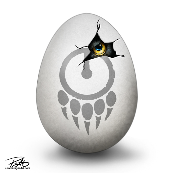
There is a new logo, to go with the new name. On the site, there is text below the logo to identify where you are, but the text isn’t actually part of the logo. For those of you who read the story of the tattoo I got last year, you’ll recognize it. It was never intended to be my logo when I designed that. After living with it for almost a year, however, it fits.
The portfolios are now divided into Creature, Character and Companion, to showcase the three different types of paintings I do. I’m keeping the number in each to twenty or less. Since I’ve painted more than fifty animals for prints and a lot more than that in different stages of detail, it was tough to choose.
The store looks much better and I’ve added an additional close-up image to each print page so you can see the detail I put into these paintings. A lot of the current prints are on sale and will be retired when that stock is depleted. I’ve got plenty of animals I want to paint and need to make room for them.
I haven’t written anything in the blog since November as I toyed with the idea of phasing it out in favour of the newsletter, which I’ve been sending out regularly. Now that I have the new site, I’ll be reviving the blog. Instead of the entire article or post being in the newsletter, you’ll get a preview of the first paragraph or so and then if you’d like to read more, a link will take you to the full post. After all, the whole reason I have a newsletter is to attract more interest and eyes on the work. The best place to see that work is here.
This was a big deal, rebranding my business, and I’m pleased with the decision and the new site.
Thanks for taking the time to be here, especially if you got here via the newsletter. Your support is greatly appreciated. If you’re new to my work and want to come along for the ride, you can sign up for my newsletter here.
Now that this site is up and running, I’m off to paint some more funny looking animals.
Cheers,
Patrick
