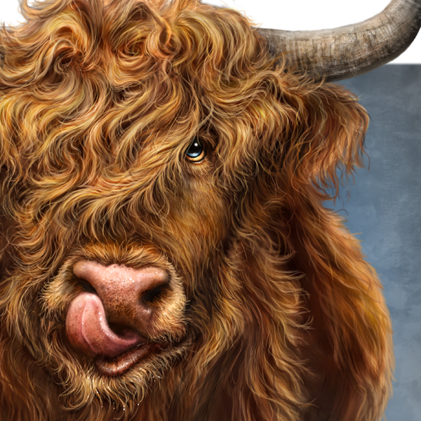
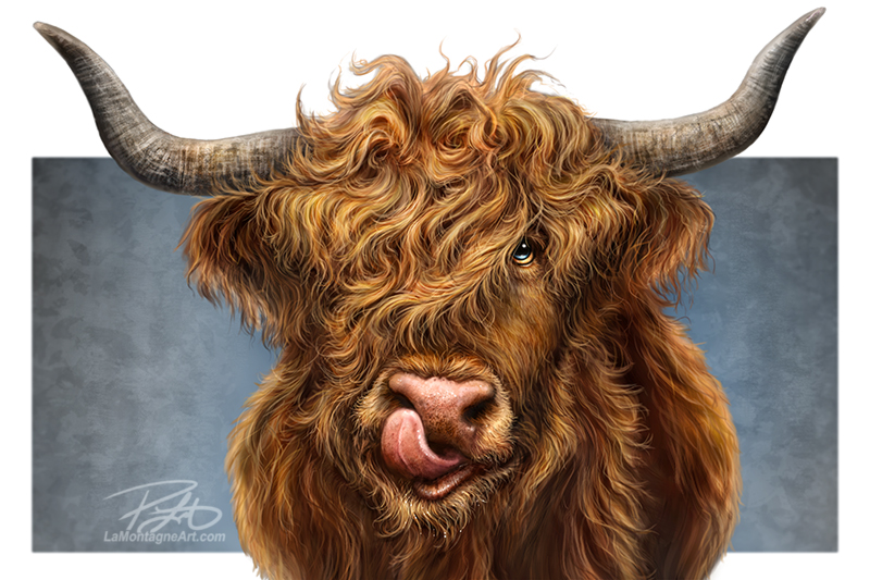
 At the Banff Christmas Market late last year, I received several requests for a Highland Cow painting.
Many artists have drawn and painted this noble Scottish bovine breed, but I had never considered it. I don’t know what about Highland cattle excites people, but who am I to argue?
But of course, having never seen a Highland cow or Heilan coo, as they say in Scotland, I had to buy some stock photo reference to get it right. As I’m fond of saying, I can’t exaggerate reality without knowing what it looks like.
At the cabin my friends and I rent in the central Alberta foothills, there are often cows just over the fence in two large pastures. I have a lot of cow photos, some with their tongues up their noses. It’s a ridiculous look I thought I might use for a future cow painting, so why wait? I decided to make it more of an exaggerated lip-licking rather than a full-on nostril excavation.
I wasn’t excited about this painting, and had it not been for all the requests, I likely wouldn’t have done it. But since a hairy Highlander was in demand, I wanted it finished for The Calgary Expo. Once I got into the work, though, I really enjoyed this piece, so much that I didn’t want to finish it. I like obsessing about details, and hair is one of my favourite things to paint, so this was fun.
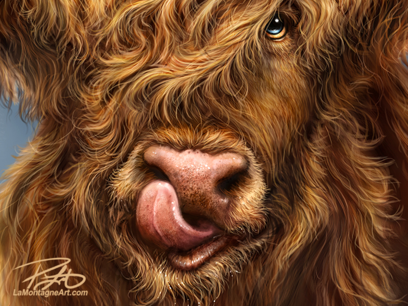 And still, every painting comes with challenges and choices.
Initially, it had a full background, the horns weren’t as big as they are now, and the canvas dimensions would have made the final piece 30×40. But at one point, thinking I was nearly finished, I asked Shonna’s opinion.
While she liked the face and hair, she said the horns looked “too spindly.”
Artists have fragile egos, so criticism of my work is uncomfortable, even when I ask for it. I spent countless hours alone, painting every little feature and hair, and I’ve solved a lot of the problems myself, so just tell me it’s pretty, dammit!
But I also want to grow as an artist; the only way to do that is to ask for and accept constructive criticism. Shonna has a good eye and can often spot something that isn’t working.
Just like you can read a letter three times and still miss a typo, it’s easy to stare at a painting for hours on end, over days and weeks, and still miss a problem. Once it’s pointed out, however, it seems like it should have been obvious.
So, to create my best work, I grit my teeth and ask for Shonna’s critical eye, knowing she will almost always see something. And while we have disagreed a few times, her suggestions usually improve the painting. The changes can often be so minor that most people wouldn’t notice either way, but once she points it out, I can’t unsee it.
To make the horns bigger and less spindly (?!), I had to change the composition, or else I’d be cutting off so much of the horns that one of the defining features of a Highland cow would be gone. Now, the focal point of all my paintings is the face, so cutting off the horns isn’t necessarily a wrong choice, as plenty of painters have done the same thing, and their paintings look great. But I wanted them there for the original piece, even though I’d still have to crop some for the poster prints. Here’s what that will look like.
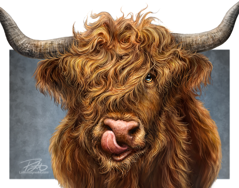
For consistency and practicality, I size my poster prints to 11×14. It’s annoying to buy a print for $30 or $40, then spend another $100 plus on a custom frame because it’s a weird shape. One of the bestselling features of my prints is that I can tell people that 11×14 is a standard size, and it’s easy to find an off-the-shelf frame at stores that sell them.
You wouldn’t believe how often that’s the clincher on making the sale.
I sized the blank canvas to poster-print dimensions when I started this piece. Had this been a traditional piece on canvas, you couldn’t change sizing when the painting was almost finished. However, working digitally offers welcome flexibility.
I made the canvas wider and upsized the horns. I could have made them even more prominent, but that would make for a very wide painting, even more challenging to offer a poster print later. What you see here is the compromise.
I also chose to crop the background down to a smaller rectangle, which makes the horns look even more prominent and the features pop.
These changes added a few more hours of work to what was essentially a finished painting, but I’m much happier with the result. So, once again, asking for help made for a better piece.
Regarding criticism, nasty comments from the cheap seats are easy to come by, and that’s usually more about them than you. The trick is to ask advice from people you trust who genuinely want to help you become a better artist. But then you must resist the urge to bite when they point out areas for improvement.
When it comes to my painted work, I have Shonna and my buddy Derek, an excellent painter and tattoo artist. His critiques have always been good, and he has asked for and accepted my opinion on his work more than once. For editorial cartoons, I’ve often run ideas by my friend Darrel. If he doesn’t think one works, I either tweak it or toss it out.
I still have to remind myself to let a painting rest before calling it done. Yesterday morning, I thought this one was finished. But I kept nitpicking it until I eventually started to feel the whole thing was garbage.
This clearly showed that I had been obsessing about it for far too long. I wasn’t seeing the image accurately anymore and couldn’t trust my judgment. So, I let it sit for 24 hours. I spent the rest of the day working on my month-end invoicing, sketching a couple of editorial cartoons and writing this post you’re reading now.
When I woke up this morning, this cow looked much better to me. I spent another couple of hours correcting errant brush strokes I hadn’t noticed and painted more stray hairs here and there, which adds to the realism of a piece. When all the hair is perfectly smooth, running in the same direction, it can look fake. For detailed work, you must introduce flaws. That’s what makes it look natural.
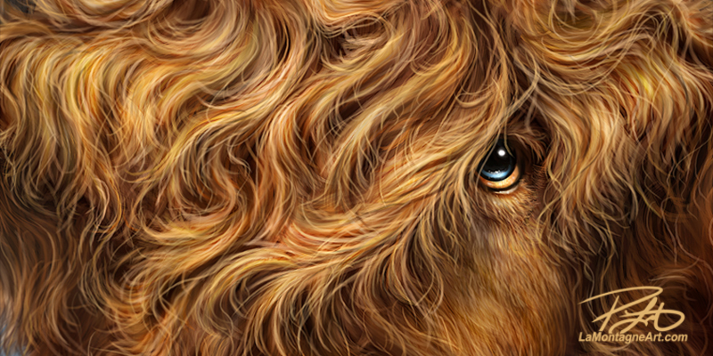 I could have worked on this painting for another week, and nobody would know the difference but me. Eventually you just have to call it done, let it go, and start on another one.
I’ll have prints of this piece for the Calgary Expo, but I’ll also order a 24×16 metal print for the wider composition to show the uncropped horns.
Given all the requests for this painting, perhaps I should bring two.

