When beginning a new painting, it’s tempting to scour my photo archives for an animal I haven’t painted before. Sometimes that intent works, but often I end up sacrificing my enjoyment of the work because I chose the animal for the wrong reasons at the wrong time.
My photo reference files are well cataloged, a folder for each animal. With thousands of photos to choose from, having them all in a big pile makes life a lot more complicated than it needs to be.
I try to steer myself away from painting too many bears. I could happily paint ten of those in a row, but not everybody has the same affinity for my favourite creature, though I have no idea why.
I’ve painted three wolf images, four if you count that one of those paintings has two wolves in it. So, it came as a surprise to me that I chose to paint another one. Often I’ll decide to paint an animal because it feels right at the time.
 My friend Serena, the head keeper at Discovery Wildlife Park, gave me a folder of wolf images a few years ago, a large collection of shots she’d taken over the years. These orphaned and rescued wolves had all died of old age long before my first visit to the park.
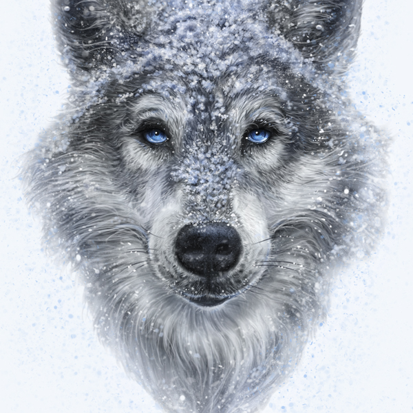
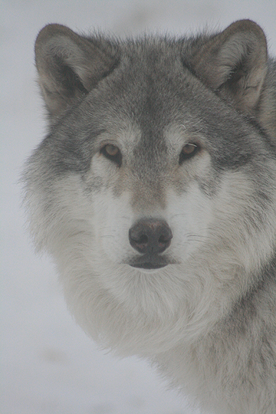
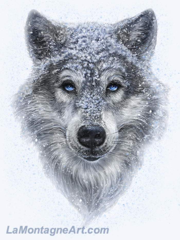
I came across one image from 2010 that inspired the above painting and asked Serena who it was. She said it was “Smith. He was a sweet wolf.”
The photo has low light, grainy, and taken on a foggy winter day. Serena is a skilled photographer, and many of the images in the folder were much better. But still, I kept returning to this one.
Rather than fight it, I decided to go with it and paint another wolf.
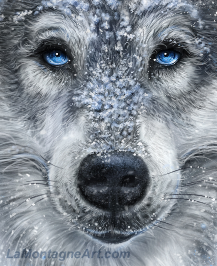
The finished piece looks nothing like Smith. It has a more feminine feel, and I’ve taken liberty with the eyes, expression and everything else. I used five other reference shots for the detail I needed. A couple were Serena’s photos, the others my own.
There are two or three hours of work painting fur detail that I later covered up with snow, which was the most challenging part of this piece. I had to decide between too much or too little snow and where to put it.
Leaving the background white felt uncomfortable, as I often use colour and texture to make the foreground image pop or establish more mood. I added some blue flecks to the background to take the edge off the sharp contrast and accent the eyes, but it’s still a predominantly nondescript backdrop. I did add a subtle light blue to make it softer and mute the contrast a little more at the end. From a commercial perspective, it will make it easier to adapt this painting to various licensed products.
While I enjoyed working on this piece and its challenges, I’m not sure how I feel about the finished painting. I’ll need to let it rest awhile. Still my style, not as whimsical as my other pieces and a departure from the usual composition, but the same could be said for my Roar and Sire paintings, both of which have become popular.
I can control the work, the choices I make, and the art I send out into the world. After that, it’s out of my hands.
 I’m starting a new painting right away on Monday, something completely different, Mike’s suggestion at Pacific Music and Art. I’ve said no to him on this critter before, for reasons I’ll explain later. I’m a little nervous about it as it will be tough. The detail alone will double my usual painting time. But if I can manage to bring it to life, it might be a fun piece with a lot of personality.
Cheers,
Patrick
___
© Patrick LaMontagne
Follow me on Instagram @LaMontagneArt
Sign up for my newsletter which features blog posts, new paintings and editorial cartoons, follow this link to the sign up form.

