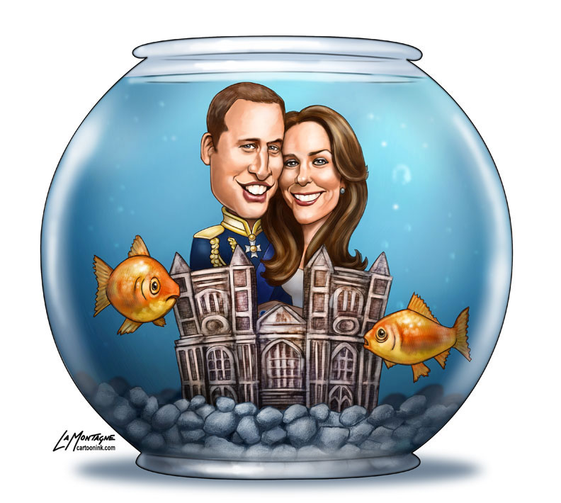
 Let me begin by saying, I am NOT a royal watcher and there is no chance I’ll be up watching the wedding in the middle of the night. That being said, a lot of people are following the media feeding frenzy leading up to the nuptials, so I had to do a cartoon or two on the event.
One of the most difficult things for me to do is create an image like this for an editorial cartoon. Newsprint is a muddy, ugly medium for illustration. The usual effort that I put into a painting is completely lost when the image is printed in a newspaper, so I have to be careful not to waste my time on detail that will never be seen.
Skin, hair, texture, subtle transitions of light and shadow…it’s all a big waste of time. Unfortunately, it’s also what my painted work is becoming known for, so when it comes to including it in my portfolio, I’m on the fence. It doesn’t belong with the painted portraits and caricatures of people, but probably will be fine in the Illustration portfolio.
Another reason an image like this is tough is that there is a tight deadline on it. Editorial cartoons need to be drawn and sent as quickly as possible. Not only am I often competing with other cartoonists for freelance spots in many newspapers across Canada, but the news changes so quickly, that the work put into an editorial cartoon often has to be balanced against the likelihood of getting paid. This is a big event, most of my newspapers will want to cover it, so I felt it was worth putting a lot more time into this cartoon, as it can be used not only in the usual editorial cartoon slot, but as an editorial illustration as well. I planned ahead and started sketches three or four days before I intended to send it out. While I didn’t keep track, I’d estimate that from sketch to finish, it took around eight to ten hours.
For those who have purchased my DVD, you already know the process of sketch, ink, flat colour and shading. I changed it a bit for this image. While I did do an initial sketch of William and Kate, I went right to painting on a different layer, with the sketch layer as a guide. All of the other elements were roughed out in Photoshop, with no paper sketch.
I was pleased with the painted image, and it if it were for a magazine or online publication, I would have continued with the painted look, but had to add an ink layer for newsprint, so it would be sharper and stand out more. It wasn’t until all of the shading and painting was done that I added the ink. Many publications have different printing processes, so the cartoons end up lighter in some newspapers. The ink layer ensures that the image will still look decent, even if the shading gets washed out a bit. You’ll notice, however that the ink layer was done with much thinner lines than I normally use, because the thicker lines wouldn’t work for this image.
Other challenges with this image included creating a fishbowl castle version of Westminster Abbey, which is very tall and narrow. You’ll notice mine is squashed, which was something I had to do to fit it in the fishbowl. I also intentionally went with the molded porcelain ‘fishbowl castle’ look for the Abbey, rather than the crisp pristine stone look of the real church. It really didn’t end up looking all that much like the real building, but people should get the gist of it.
Not knowing if Kate would be wearing a veil or tiara or what her dress would look like (oh the suspense is just KILLING me, don’t you know?), I didn’t worry about it. I just put William in the same outfit his father wore when he married Diana. While I do prefer painting more detailed work, I did have some fun on this. Were it not for the deadline looming over me on the day I put the most work into it, I might have enjoyed it a little more, but that’s the necessary compromise every commercial artist needs to make peace with. It’s an enjoyable job, but at the end of the day, it’s still a job.
